The network for creativity
Join 1.25M professional creatives like you
Connect with clients, get discovered, and run your business 100% commission-free
Creatives on Contra have earned over $150M and we are just getting started
Back to feedPost

How do you design a kids brand that parents trust and children get excited about?
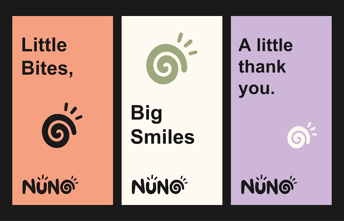
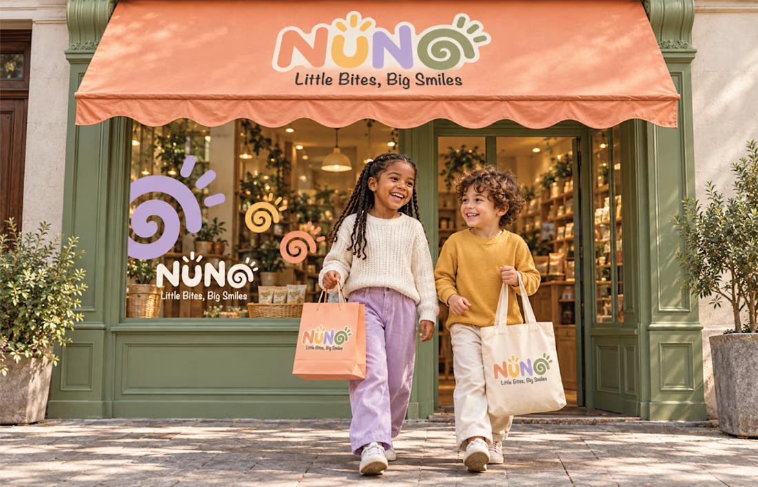
That was the challenge behind NUNO, a playful kids brand identity built on one line: Little Bites, Big Smiles.
The decisions that shaped it:
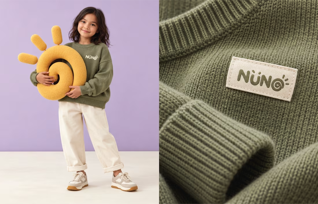
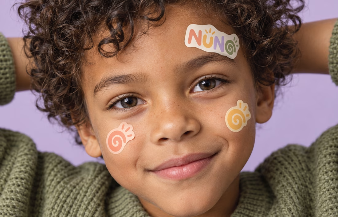
The wordmark carries a spiral inside the final O. That spiral became the hardest working element in the system, repeating across stickers, patterns, labels and packaging.
The palette is warm pastels: peach, mustard, lilac and olive. Soft enough to feel safe to parents, bright enough to hold a child's attention on a crowded shelf.
And it was built as a system, not a logo. The same identity runs across snack packaging, shopping bags, stationery and the storefront, so the brand reads as one everywhere a family meets it.
Designers, when you build a kids brand, what do you protect first: the playfulness, or the consistency? Genuinely curious how others balance the two.
#KidsBranding #BrandIdentity #PackagingDesign #LogoDesign #BrandDesigner
The network for creativity
Join 1.25M professional creatives like you
Connect with clients, get discovered, and run your business 100% commission-free
Creatives on Contra have earned over $150M and we are just getting started











Related posts




Clean and confident work! The green gradient with the mark feels very modern for fintech - trustworthy but not boring. The app screens look really polished. Curious how you landed on this mark, does it represent growth / movement?

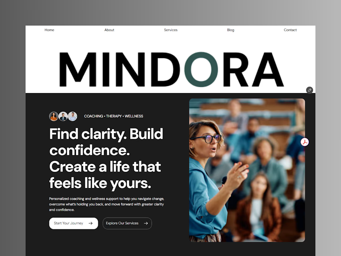
Introducing Mindora — a Life Coaching & Wellness Framer Template.
I designed Mindora for life coaches, wellness professionals, and personal growth brands looking for a calm, modern, and welcoming online presence.
Inspired by clarity, confidence, and meaningful growth, Mindora features a thoughtful layout, dedicated service sections, a blog for sharing valuable insights, and a clean visual style designed to help brands connect with their audience.
Built with Framer, it's a customizable starting point for creating a professional coaching or wellness website.
Explore Mindora and bring your next website idea to life.
Kindly check it out the template: https://www.framer.com/marketplace/templates/mindora-life-coach/



Great work

🎨 Graphic Design Is More Than Just Making Things Look Good!
Great design is about telling a story, communicating a message, and creating a lasting impression. ✨
From a memorable logo to eye-catching packaging, every design element plays a role in how people recognize and connect with a brand.
I believe effective graphic design combines creativity, strategy, and simplicity to turn ideas into meaningful visual experiences.
💡 My design philosophy:
✨ Keep it creative and purposeful.
🎯 Make every detail meaningful.
🎨 Build a consistent and memorable brand identity.
💫 Design with the audience in mind.
Whether it’s branding, packaging, social media graphics, or digital design, my goal is to create visuals that make brands stand out.
here is my portfolio
💬 What do you think makes a design truly memorable — its colors, typography, or overall concept? Let’s discuss!
#GraphicDesign #BrandIdentity #LogoDesign #PackagingDesign #CreativeDesign #Contra
sites.google.com
SARA
Hi Hi, I’m SARA! A creative Graphic Designer who loves turning ideas into eye-catching designs. I specialize in logo design, branding, packaging, UI/UX, business cards, flyers, brochures, presentations, and social media graphics. My goal is to help businesses stand out with unique, professional,

Absolutely graphic design is about visual communication great advice 🎉🔥