The network for creativity
Join 1.25M professional creatives like you
Connect with clients, get discovered, and run your business 100% commission-free
Creatives on Contra have earned over $150M and we are just getting started
Back to feedPost
Case Study | Quality Warehouse & Distribution
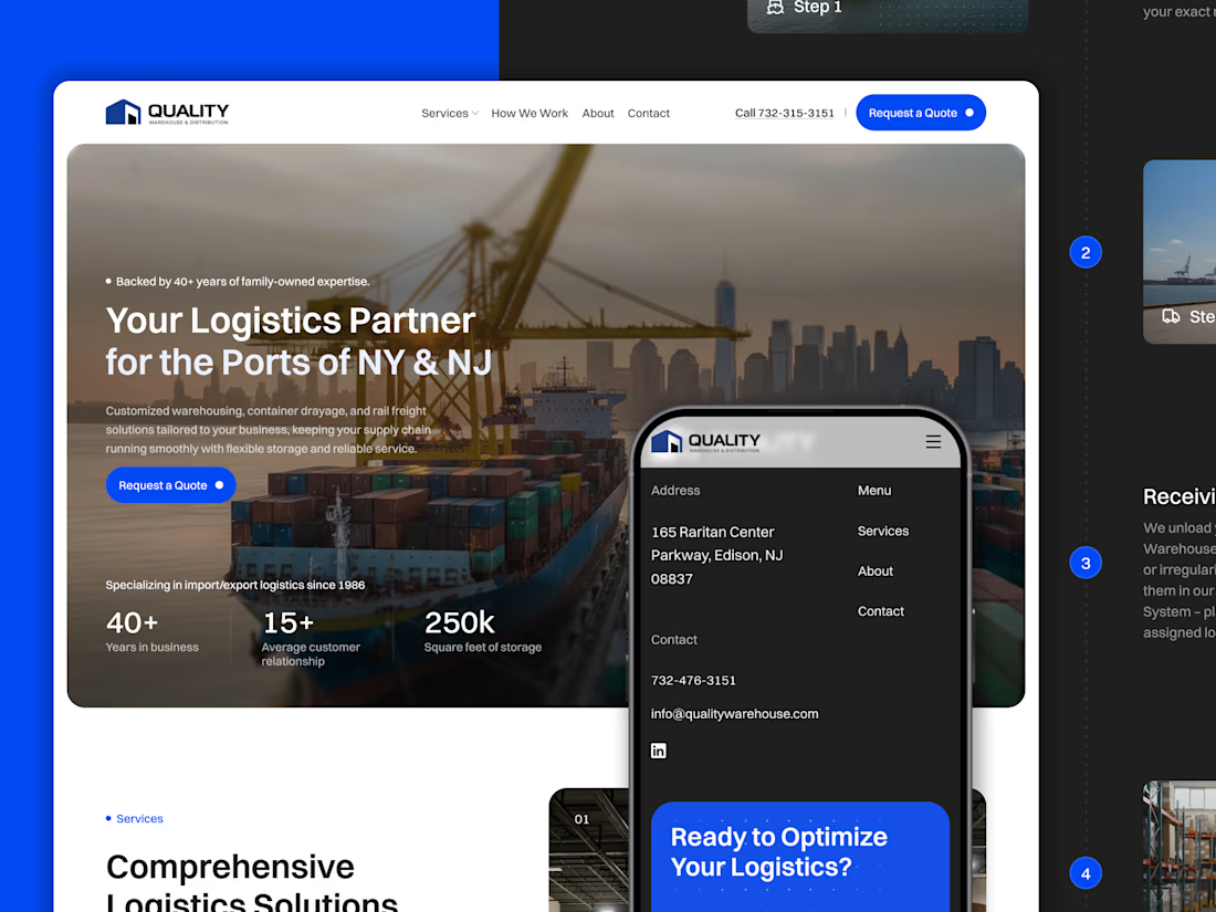
Quality Warehouse & Distribution is a logistics company operating across the NY/NJ ports, with over 40 years of experience in warehousing, drayage, and rail freight.
We redesigned their brand and website to reflect that level of expertise and scale. The focus was on creating a structured, credible experience that clearly communicates their services and builds trust from the first interaction.
The result is a more modern, reliable digital presence aligned with the reality of their operations.


Absolutely amazing work!

Amazing Work!


Thanks a lot Vladimir.

Yes! Amazing work
Thanks a lot!

good

Great Design

Looks good

Love this case study! The redesign feels so solid for a brand with that much history.

Nice. That redesign was worth it.
Thanks a lot Gideon!

Impressive!


Clean work, Really did gave their brand a premium look...


Great work!

Premium 😍

efficient work

good job

Looking good! Love it

Great work!!

Amazing work Jeremie

Clean work. The positioning is clear and the tone feels credible. I like how it focuses on trust and structure without overhyping it. If anything, one concrete detail or outcome would make it hit even harder.


Amazing Work!

Awesome design


The redesign looks polished well done that's a great idea

Good work


nice
The network for creativity
Join 1.25M professional creatives like you
Connect with clients, get discovered, and run your business 100% commission-free
Creatives on Contra have earned over $150M and we are just getting started






Related posts

Winder is a bold brand identity built around a geometric W-inspired symbol, combining sharp angles and forward movement to represent progress, speed, and direction.
The identity uses a striking red and deep burgundy palette, supported by clean typography and a consistent visual system across brand guidelines, digital applications, and product mockups.
Progress in Motion.




Great logo it feels it really has an identity 🎉🎉

Solene: skincare e commerce website, built in Framer
Skincare shopping should feel as good as the routine itself. For Solene, I designed and built a full online store with a soft, warm identity: a bold maroon and pink palette, big expressive type and real-skin photography.
What's inside:
A hero that sets the brand tone straight away
A Bestsellers section for quick browsing
Category pages for Cleanse, Hydrate and Protect
A shop page with price slider, filters, sorting and hover image previews
An Our Story page with brand values
A clean, confident footer
Need a website for your beauty or lifestyle brand? Let's talk.


The hover image previews on the shop page caught my eye - they let shoppers sense texture instantly without an extra click.

Still waiting to hear back from @Contra HQ
So I did what any designer would do: I made the card myself 😂
Brushed metal. Laser-engraved logo. Holographic Mastercard rings. Full 360° spin. I'm going to keep polishing this until the real one shows up in my mailbox. Your move, Contra 👀
(Concept / fan design, not an official Contra product..Yet 🙌 )


“Okay, this looks WAY too good 🔥 Contra needs to make this real 👀”