The network for creativity
Join 1.25M professional creatives like you
Connect with clients, get discovered, and run your business 100% commission-free
Creatives on Contra have earned over $150M and we are just getting started
Back to feedPost
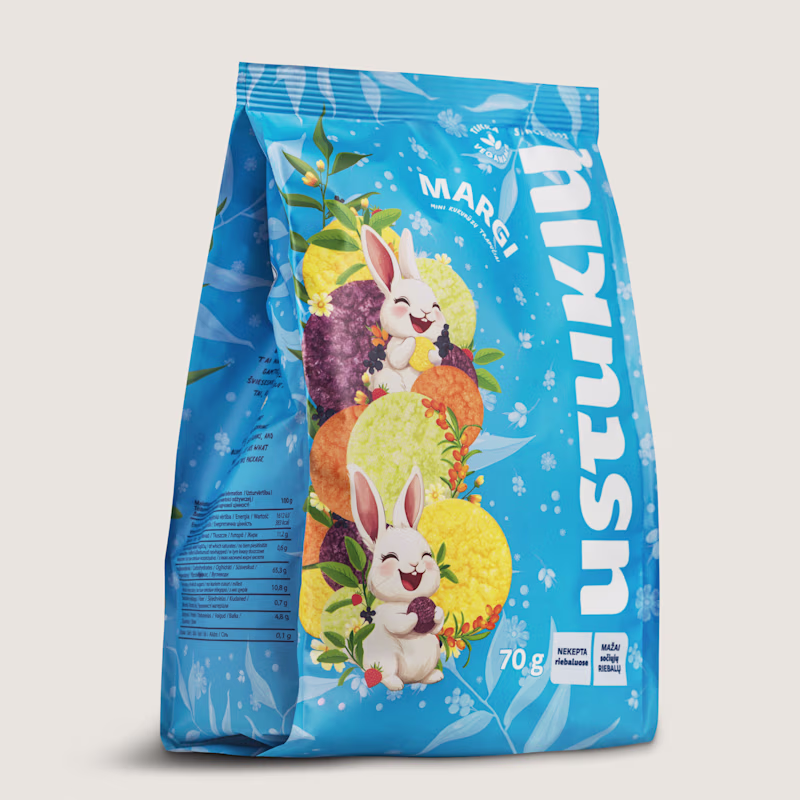
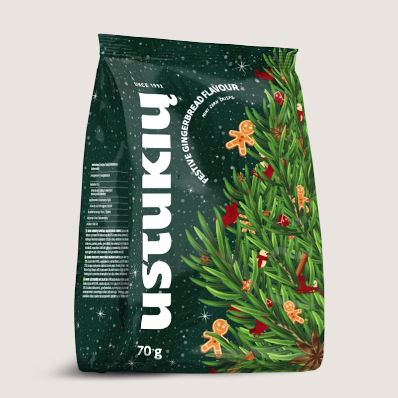
Taste Test
Two seasons, one brand. Here's how that works.
So Ustukių Malūnas came to me twice: once for spring, once for the holidays. Two completely different vibes. Spring is all lightness and fresh starts. Holiday is cozy, warm, gingerbread-scented everything.
The fun part? Making both feel like them while telling two very different stories.
Here's what I leaned on:
The brand's bones stayed the same (layout, type, core elements)
Color and illustration carried the seasonal mood
I love this kind of problem. How do you keep a brand recognizable when the energy shifts completely? That tension between consistency and surprise is where the good stuff happens.
Which packaging do you like more?
33 voted
49%
35 voted
51%
68 votes
Closed
Spring just because bunnies
Awesome Work
Love them both, but the holidays feel more natural
we really need these type of cool packaging designs so that it makes consumer feel something thats what they are paying us for
Give me holidays
The Holidays stand out
Impressive 😍
Holidays one looks more premium, elegant but I picked the Spring one, because of its colors & more fun visuals! 👍
I like the Holidays packaging, it looks unique!
Spring
beautiful
The network for creativity
Join 1.25M professional creatives like you
Connect with clients, get discovered, and run your business 100% commission-free
Creatives on Contra have earned over $150M and we are just getting started
Related posts
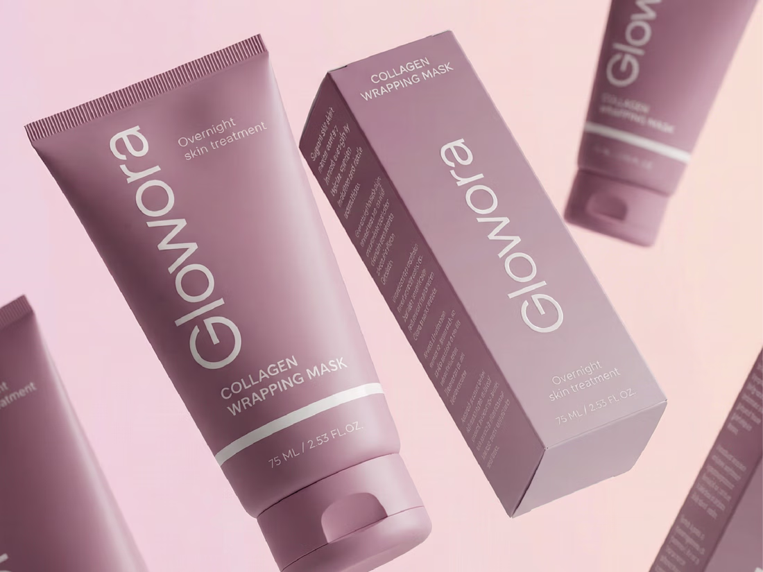
It's been a while since I last posted a project on my portfolio and today I am happy to bring this one to you!
Glowora approached me with a clear foundation already in place: a defined logo and brand identity that was not being consistently applied across their existing products. The challenge was to translate that identity into packaging and label designs that truly reflected the brand’s premium positioning.
I love your use of color and composition here.
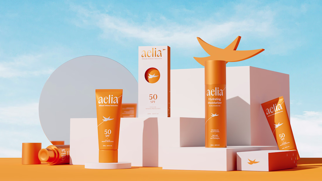
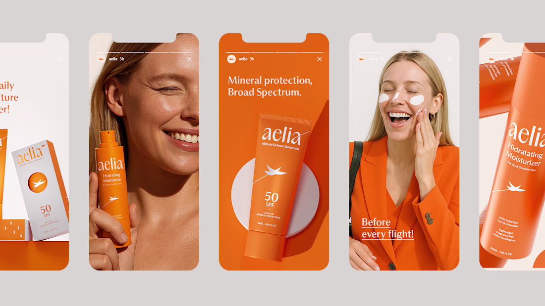
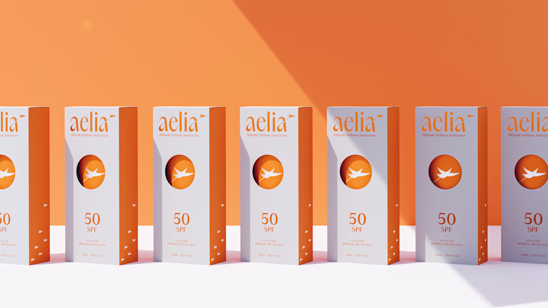
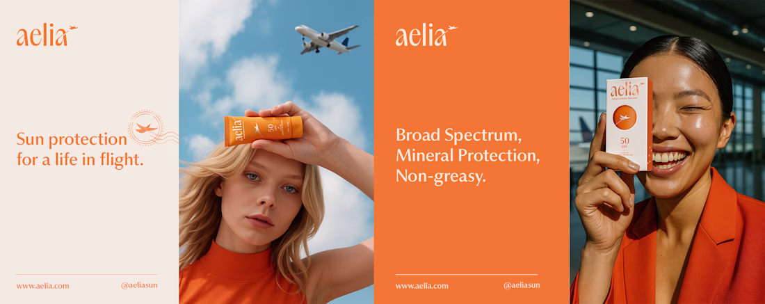
For Aelia, I was responsible for developing the brand strategy, visual identity, packaging design, and the overall creative direction of the project. My goal was to transform the founder’s unique perspective as a pilot into a distinctive brand experience, creating a clear connection between skincare, travel, and life at high altitudes.
The project began with defining the brand positioning and core narrative, which guided every design decision that followed. I created a visual identity inspired by freedom, protection, and elevation, expressed through a custom symbol, a carefully crafted color system, and a modern aesthetic designed to resonate with frequent travelers and modern explorers. The packaging was designed to reinforce this story, featuring a distinctive circular cut-out that references both the sun and an airplane window, creating a memorable and meaningful brand asset.
By aligning strategy, identity, and packaging under a single concept, I helped build a cohesive brand that feels premium, functional, and emotionally connected to its audience.
I love your use of color and composition here.
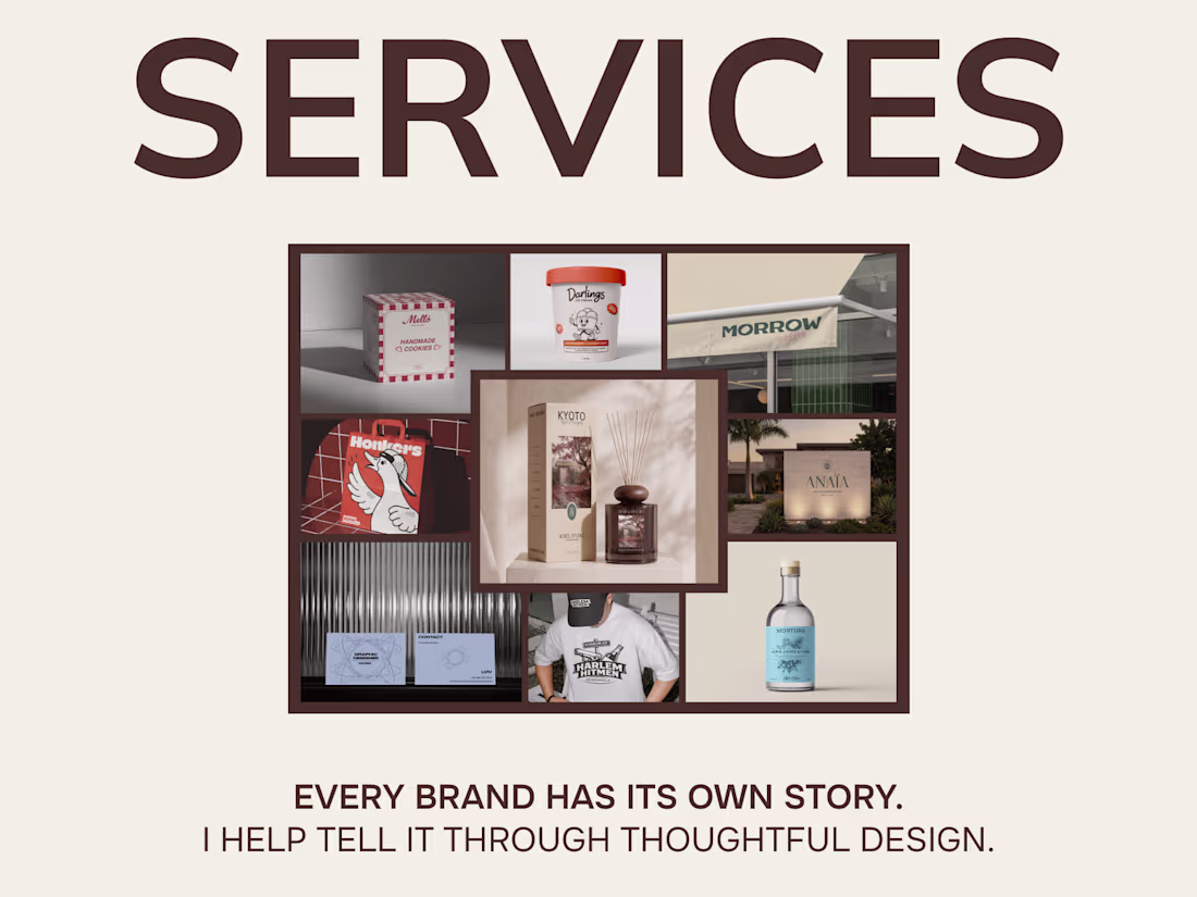
Today I finally finished setting up my services on Contra 🎉
You can now find:
• Logo Design
• Brand Identity Design
• Packaging Design
• Print Design
It's important to me that clients clearly understand what’s included in each service, what the process looks like, and what results they can expect before we even begin working together.
But I’m not stopping here.
Since my background combines both design and marketing, I’m planning to introduce a new service that bridges brand strategy and visual design.
Before creating a logo or visual identity, we’ll define:
• Target audience
• Brand positioning
• Competitor insights
• Brand personality
• Tone of voice
I truly believe that strong design starts with strategy and a deep understanding of the business behind it.
My portfolio and service offerings are still evolving, so I’d love to hear your thoughts and feedback 💛
I really love your work and services 😍 I hope your profile grows significantly so that as many people as possible will know about you 🎉
Trending
Claude
Claude has entered the design space. How are you using Claude Design?
Contra University
Learn from expert creatives how to earn more using next-gen AI tools.
MagicPath
The canvas is infinite, and exploration is becoming the workflow. How are you using MagicPath?
creativeaiflow
Creative AI workflows are evolving. What tools do you use, and what are their strengths and weaknesses?
freelancerlife
Freelancer life is wins, pivots, and everything in between. What’s yours right now?