The network for creativity
Join 1.25M professional creatives like you
Connect with clients, get discovered, and run your business 100% commission-free
Creatives on Contra have earned over $150M and we are just getting started
Back to feedPost
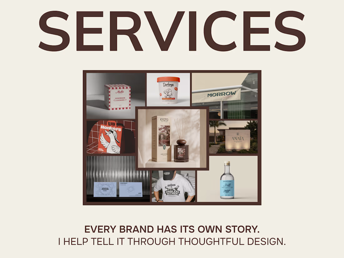
Today I finally finished setting up my services on Contra 🎉
You can now find:
• Logo Design
• Brand Identity Design
• Packaging Design
• Print Design
It's important to me that clients clearly understand what’s included in each service, what the process looks like, and what results they can expect before we even begin working together.
But I’m not stopping here.
Since my background combines both design and marketing, I’m planning to introduce a new service that bridges brand strategy and visual design.
Before creating a logo or visual identity, we’ll define:
• Target audience
• Brand positioning
• Competitor insights
• Brand personality
• Tone of voice
I truly believe that strong design starts with strategy and a deep understanding of the business behind it.
My portfolio and service offerings are still evolving, so I’d love to hear your thoughts and feedback 💛



Congrats on launching your Contra profile! 🎉 The clarity you provide for clients right from the start is amazing. Completely agree with your take on bridging brand strategy and visual design — aesthetics without a solid foundation just don't work as effectively.


I really love your work and services 😍 I hope your profile grows significantly so that as many people as possible will know about you 🎉

Huge congrats on setting up your services! 🎉 Wishing you many amazing clients and exciting projects here! 🔥🚀

Good luck 🤞

You're a great girl for starting this. Your work looks great.🎉

Really clean and confident work. Love it.

Nice

I completely agree with the idea that design starts long before the visuals.
Whether it's a brand identity or a digital product, understanding the audience, positioning, and business goals usually has a bigger impact than any color palette or logo choice.
Curious — have clients...

In my experience, it's a mix of both. Some clients immediately see the value of strategy and understand that a strong brand starts with positioning and clarity. Others come looking for "just a logo," but once you explain how strategy influences every design decision, they're usually much more open to the process.
The network for creativity
Join 1.25M professional creatives like you
Connect with clients, get discovered, and run your business 100% commission-free
Creatives on Contra have earned over $150M and we are just getting started



Related posts

What should a creative agency website actually feel like?
For Orvika, we didn't want another agency site built around the same safe layouts and predictable sections.
We pushed the visual direction further with oversized typography, editorial layouts, bold imagery, and stronger contrast, while keeping the experience structured enough to communicate the agency's work and capabilities clearly.
The goal wasn't just to make it look different.
It was to make the agency feel different.
Designed in Figma and built in Framer.
We're sharing more of the websites and digital experiences we've been working on here over the next few weeks.



Very neat man

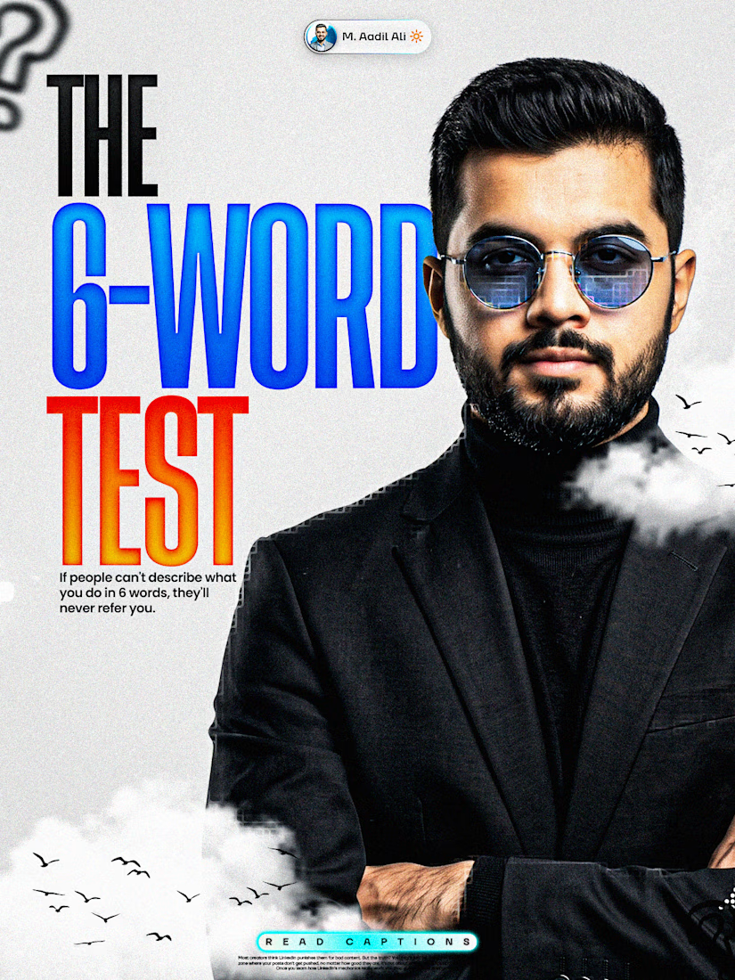
If people can't describe what you do in 6 words,
they'll never refer you.
They like you. They just can't repeat you.
That's a positioning problem, not a talent problem.
Here's why the number matters:
Referrals happen inside a 10-second gap in someone else's
conversation.
"Do you know anyone who...?"
Whoever comes to mind in that gap gets the work.
Usually that's the person with the simplest sentence
attached to their name.
Not the best portfolio in the city.
So try it right now.
Say what you do out loud. Count the words.
If you needed 20, cut with these 3 rules:
1. Name the person, not the industry
"I work with brands" becomes "I write for
dental clinics"
2. Name the outcome they'd brag about
Skip your process. Keep the result they'd repeat to a
friend.
3. Delete every word that could describe 400 other people
Strategic. Data-driven. Storytelling. Solutions. Nobody
passes those along.
The template:
I help [who] [get specific outcome].
Six words. Boring on purpose.
"I help dentists fill empty Tuesdays."
"I write SEO pages that rank."
(Six words is brutal. That's the point.)
If you can't compress it, nobody else can either.
Impressive sentences get compliments. Repeatable ones get
referrals.
What are your 6 words?
Drop them below and I'll tell you which one to cut.




“Repeatable beats impressive” is the real takeaway here. 🔥
Simple positioning is underrated.

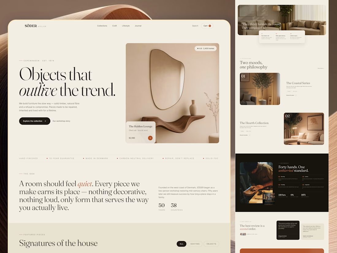
Most furniture websites try to help you buy faster. This concept for SÖDER ATELIER explores a different idea:
What if the experience helped you choose better?
The design is built around the values shown throughout the concept craftsmanship, natural materials, longevity, repairability, and thoughtful living. So instead of treating the homepage like a catalogue, the experience gives space to:
→ The story behind the pieces
→ Curated collections
→ Craft and material details
→ Long-term value
→ Customer perspectives
→ Clear product discovery
The visual language stays quiet and editorial, letting the furniture carry the attention. Because when a product is made to live with for years, the website shouldn't make it feel disposable.
SÖDER ATELIER — a responsive furniture e-commerce exploration.
🏀 Full Design Showcase – Better View on Dribbble.
↗ Furniture E-commerce Product Website


The homepage sells longevity, and Signatures of the house still gives you category chips to browse by. Curious whether the product page carries the craft and repairability fields too.