
Urte Gl
Solving Problems Visually


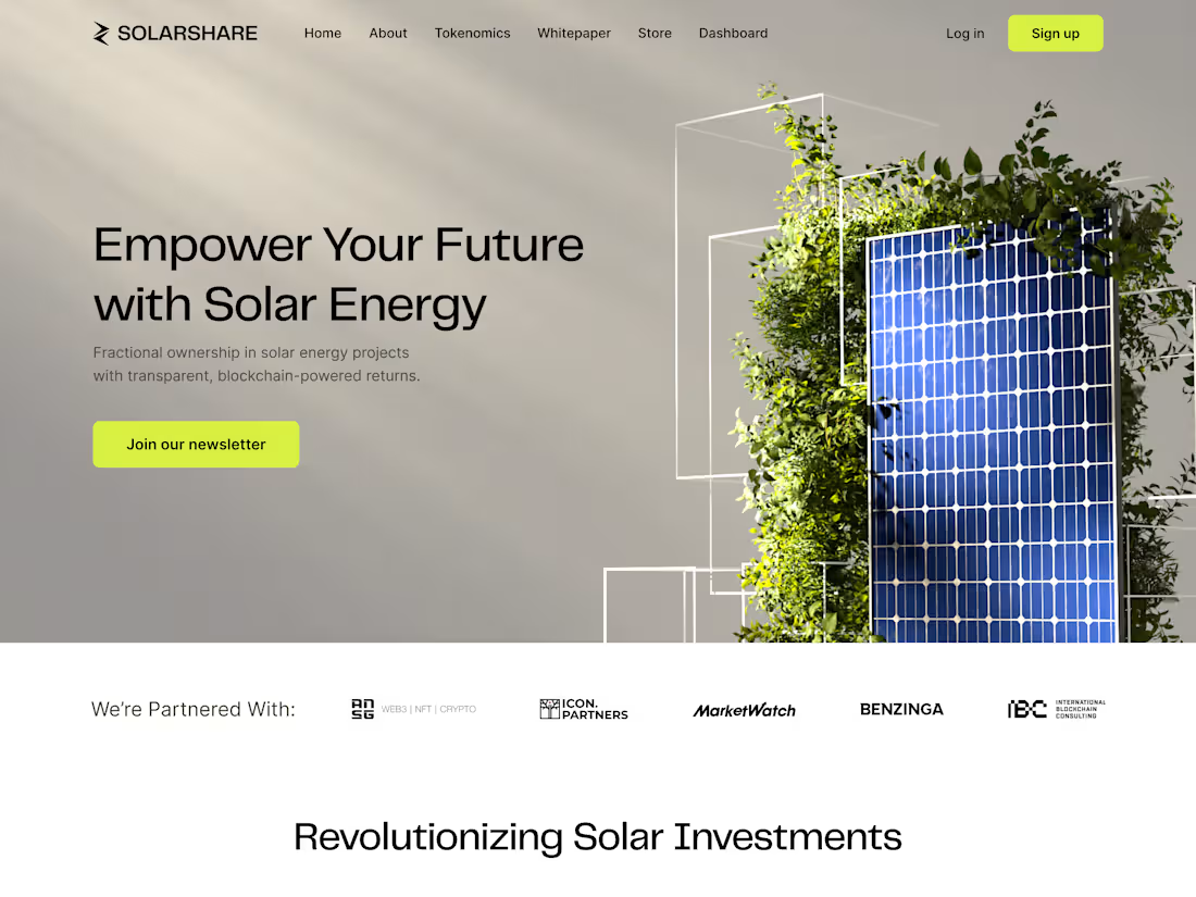
Got the opportunity to completely change the look of SolarShare. Their old branding was dated and wasn't working for their solar panel blockchain vision.
Before and after below. What do you think?
2
122
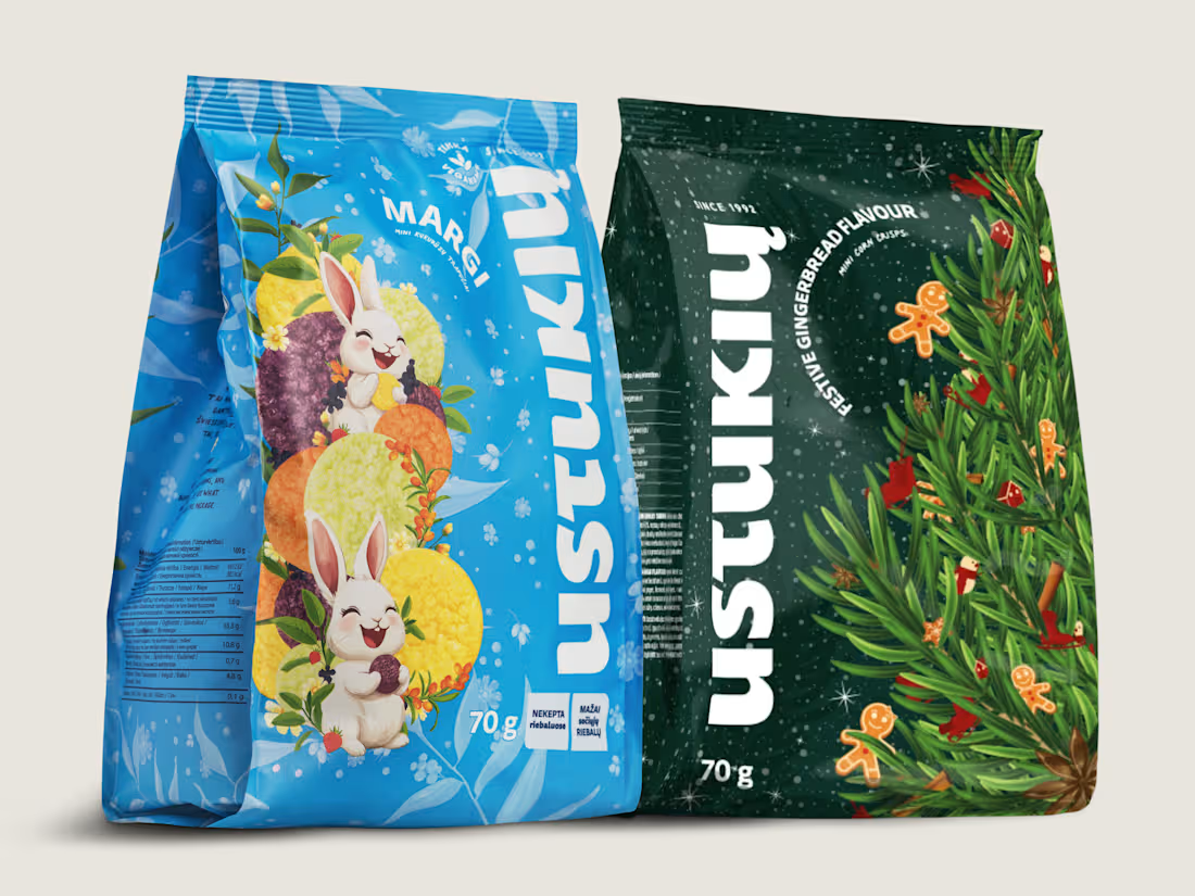
Two seasons, one brand. Here's how that works.
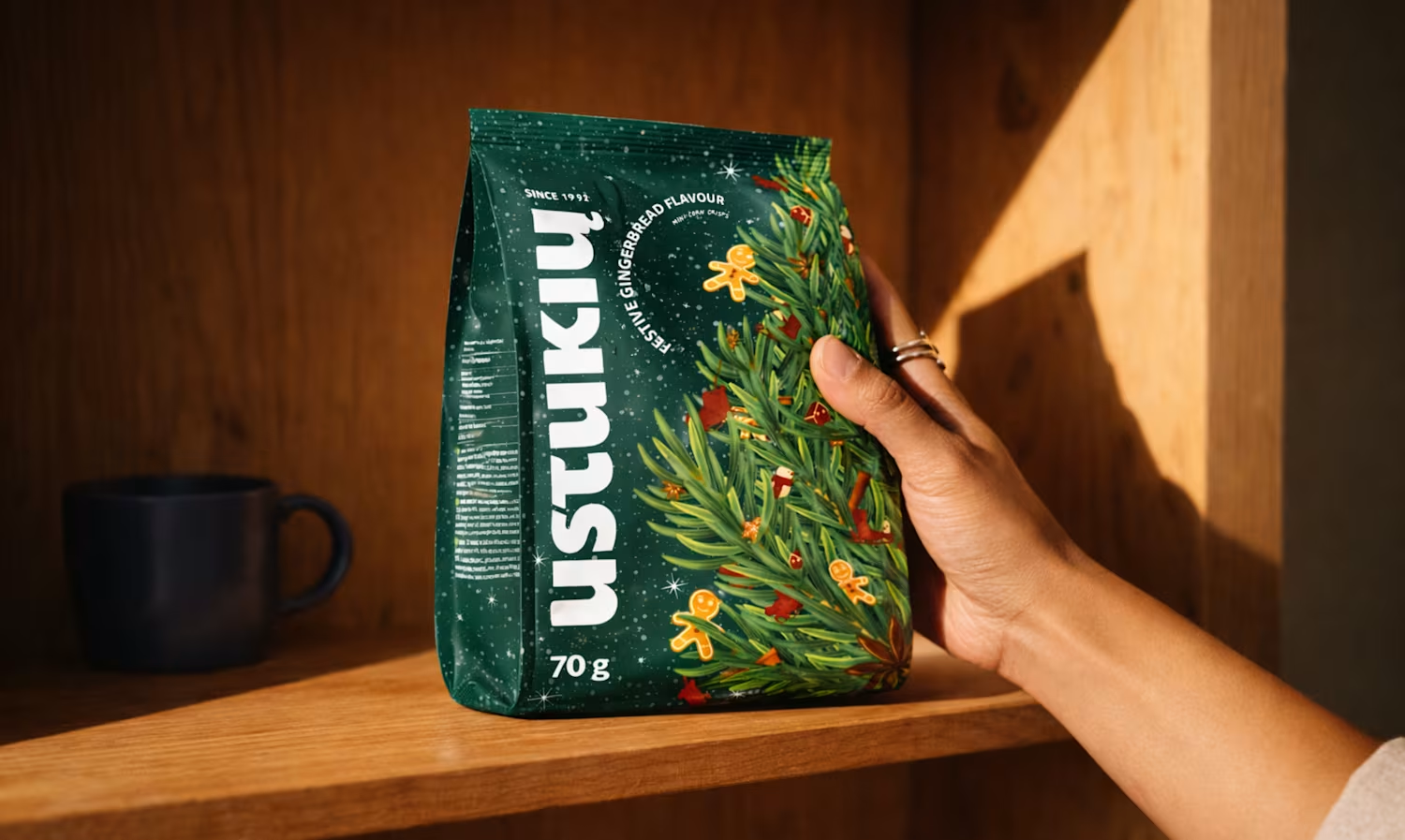
So Ustukių Malūnas came to me twice: once for spring, once for the holidays. Two completely different vibes. Spring is all lightness and fresh starts. Holiday is cozy, warm, gingerbread-scented everything.
The fun part? Making both feel like them while telling two very different stories.
Here's what I leaned on:
The brand's bones stayed the same (layout, type, core elements)
Color and illustration carried the seasonal mood
I love this kind of problem. How do you keep a brand recognizable when the energy shifts completely? That tension between consistency and surprise is where the good stuff happens.
Which packaging do you like more?
12
52
504
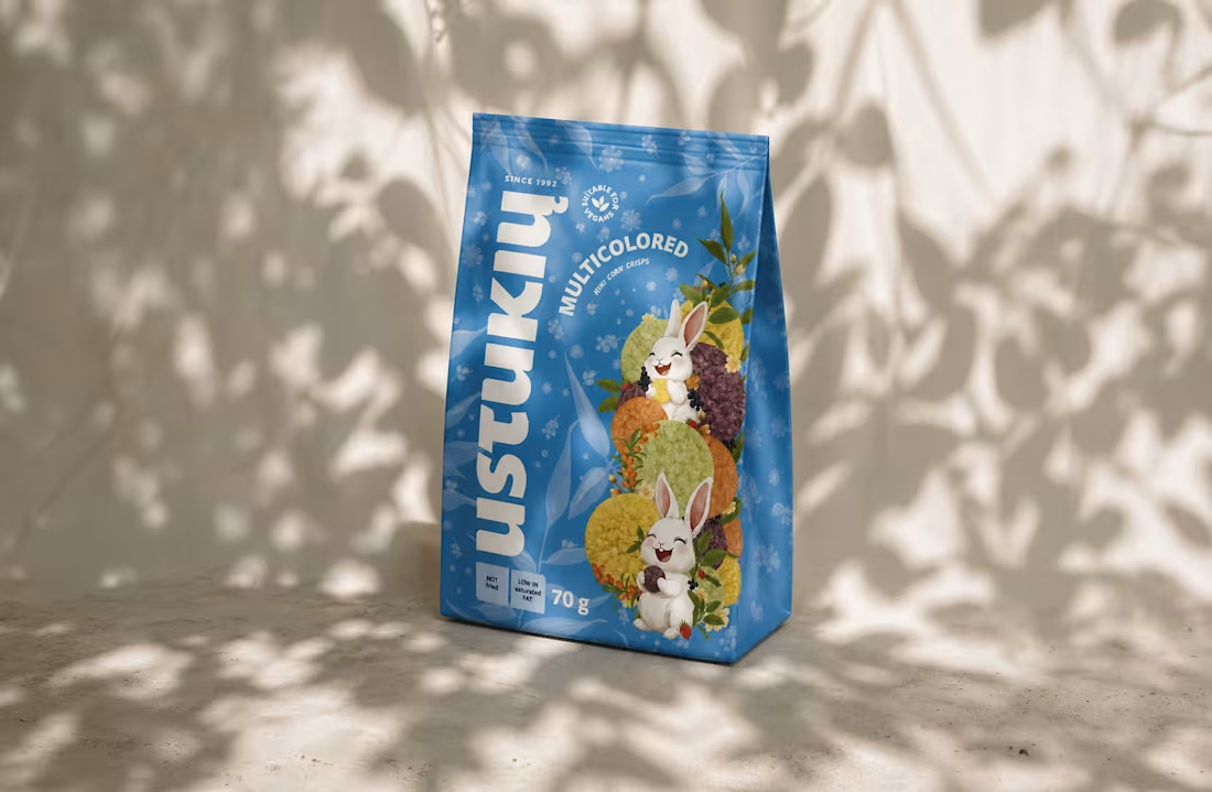
Spring Collection Packaging for Ustukių Malūnas
1
10
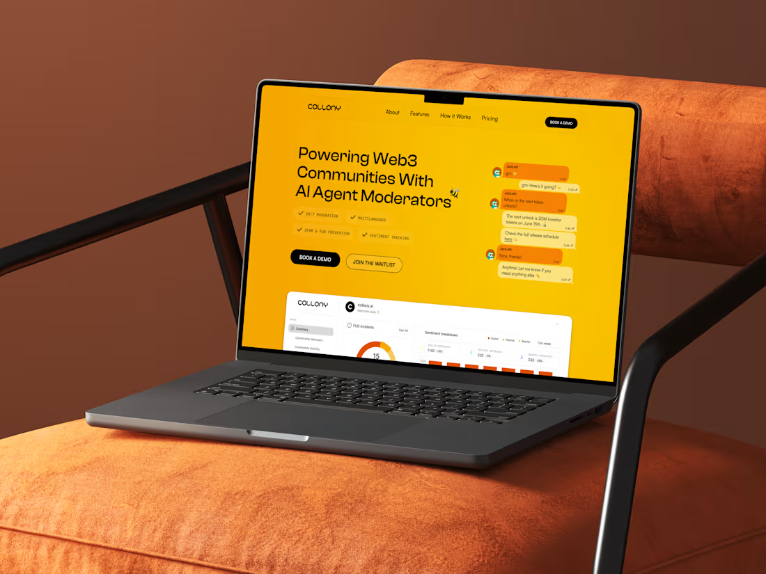
Collony.ai | Brand Identity and Website Design
1
12