The network for creativity
Join 1.25M professional creatives like you
Connect with clients, get discovered, and run your business 100% commission-free
Creatives on Contra have earned over $150M and we are just getting started
Back to feedPost

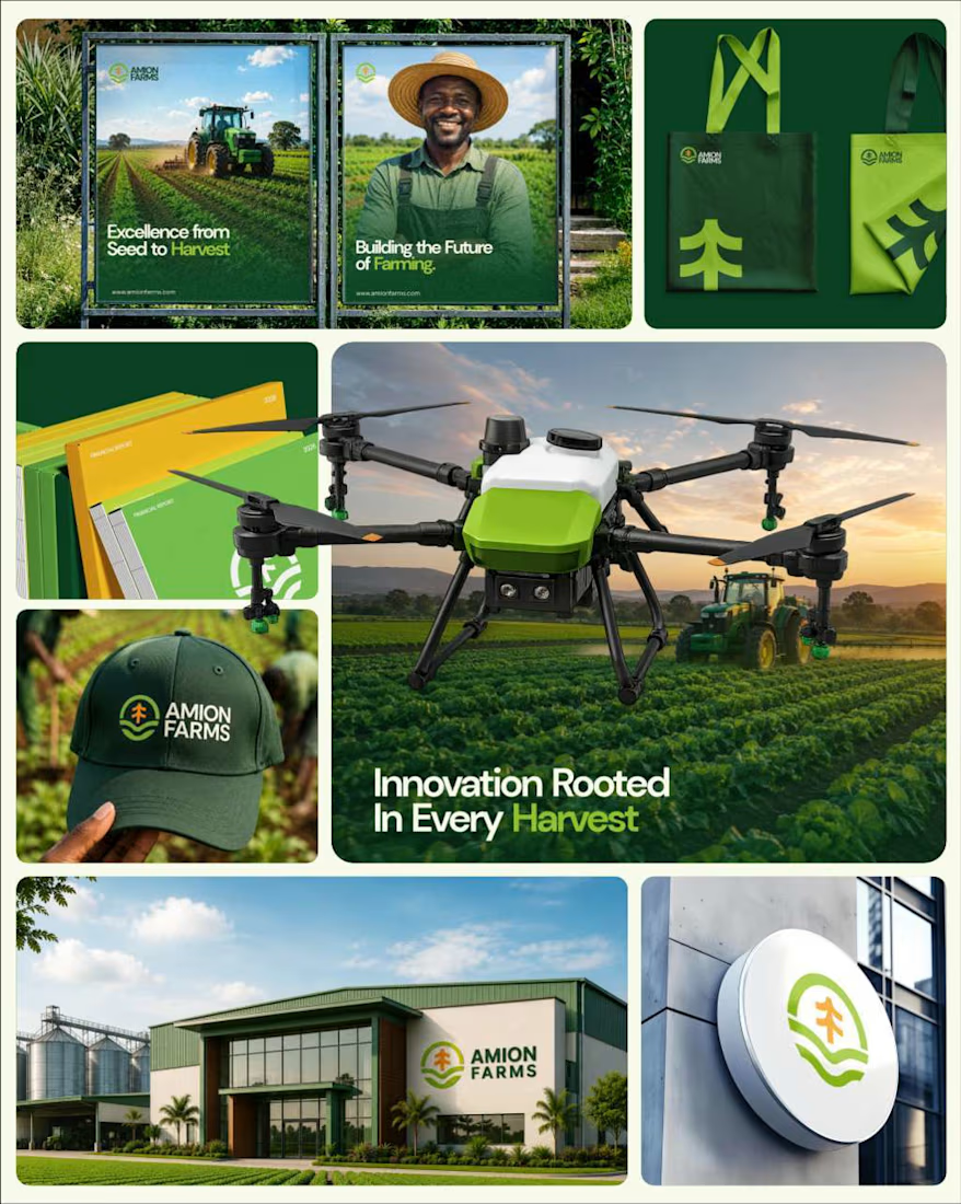
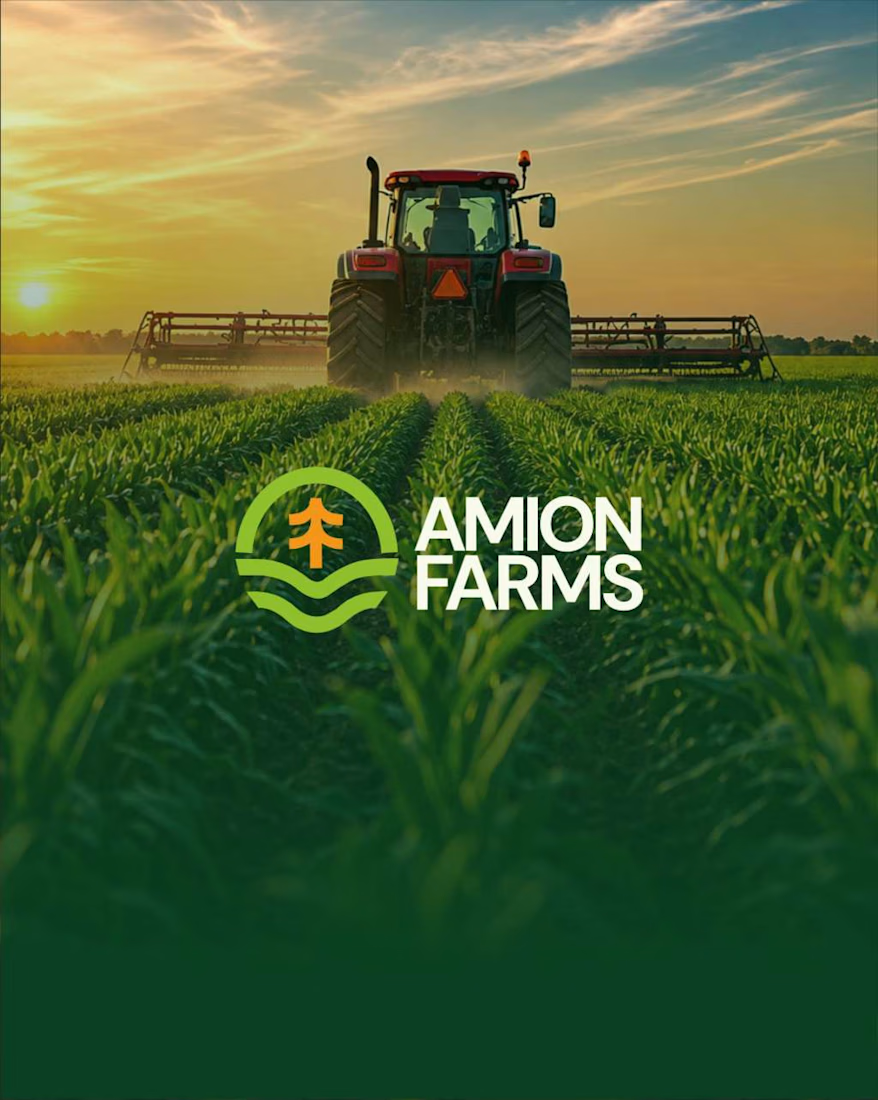
Proud to share one of our latest branding projects from the studio Amion Farms, an agricultural brand created to represent a modern, responsible, and forward-thinking approach to farming.
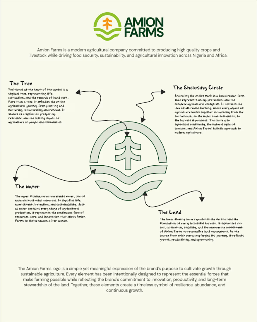
The challenge was to create more than just a logo. We wanted to build a complete visual identity that communicates what Amion Farms stands for: sustainability, integrity, quality, innovation, and food security.
From the logo and colour system to brand applications, environmental branding, agricultural machinery, workwear, stationery, and digital touchpoints, every element was thoughtfully developed to create a consistent and credible brand experience.
The identity is rooted in the relationship between land, water, growth, and harvest, while the visual language brings a clean, confident, and contemporary feel to agriculture.
For me, the most rewarding part of this project was transforming the idea of farming into a brand that feels professional, ambitious, human, and ready for the future.
#BrandIdentity #BrandStrategy #BrandDesign #Agriculture #Agribusiness #LogoDesign #VisualIdentity


The network for creativity
Join 1.25M professional creatives like you
Connect with clients, get discovered, and run your business 100% commission-free
Creatives on Contra have earned over $150M and we are just getting started



Related posts


Which brand showreel preview design would you choose - Silver & Ropes or Purple Stones? ⚡
Lynksen is cooking something fire...
and we need your expert eyes on this one 🔥😎
Vote and tell why! 👇


12 voted
24%
37 voted
76%
49 votes
Closed

Going with Purple Stones. It feels more distinctive and memorable for a showreel, Silver & Ropes is clean but a bit safer.

Ovéa — care with character.
One skincare identity across bottles, jars and tubes. I designed the wordmark, pink-and-cobalt packaging system, campaign applications and digital mockups, then brought the collection into motion.
A consistent visual language, with room for each product to feel individual.
View the full case study. Building a skincare brand? Let’s talk about your identity and packaging.

Love the colour direction and the visual language. Everything feels so well thought out. The overall look is beautiful.

Brand identity for an ongoing project
A look at the visual direction, from the logo and color palette to typography and brand applications.
More to come as the project takes shape.


Great work