The network for creativity
Join 1.25M professional creatives like you
Connect with clients, get discovered, and run your business 100% commission-free
Creatives on Contra have earned over $150M and we are just getting started
Back to feedPost
We're starting a little experiment at ideapeel.
10 YC startups. 10 website redesigns.
Over the next few weeks, we're picking recently funded Y Combinator startups and looking at their websites through a product and conversion lens.
Not just:
“How can we make this look better?”
But:
Is the product immediately clear?
Does the hero communicate why it matters?
Is the hierarchy helping or slowing people down?
Does the visual direction fit the product?
And is the next step obvious?
For some, we'll redesign the hero.
For others, it might be positioning, product storytelling, UX, or the conversion path.
And sometimes, the right answer might be that we wouldn't change much at all.
We'll share the original, what we noticed, what we'd change, and why.
YC Redesign 01 coming next.
Which YC startup should we put on the list?

Looking at YC sites through a product and conversion lens instead of just visuals is the right framing, most of them lose people at the hero. Curious to see which patterns repeat across the 10.

That’s one of the things I’m most curious about too. After 10, we should have enough to see whether the same clarity and positioning problems keep showing up, or whether each product creates a completely different challenge. We’ll keep track of the patterns as we go.

Love this lens. One thing I'd add from the dev side: a redesign is only a win if it ships fast and keeps its rankings. Check Core Web Vitals before and after, and 301 every old URL, or the new site quietly loses the traffic the old one earned.
Good point. A redesign that looks better but costs the company performance or existing search traffic isn’t really an improvement. Core Web Vitals, redirects, and what already works should absolutely be part of the implementation side of this.

Good framing. For the YC list, I'd pick sites where the hero names the category but not the product, because that is where positioning beats layout. Curious whether the fix you land on most is copy or visuals.
That’s a good filter. I’d probably lean toward copy first when the category is clear but the actual product or value isn’t. But if the positioning is already strong and the hierarchy is burying it, then the visual structure becomes the problem. I suspect we’ll find both across the 10.
Love that you will track the patterns. My bet is copy shows up first, with hierarchy a close second. Excited to see what the 10 say!

Great experiment. One angle worth adding for startups selling across borders: the website often makes promises (pricing in USD, data handling, terms of service) that don’t match how they’re actually set up legally in each market. A quick check of ToS, privacy and the contracting entity could be a nice extra lens in the audit.
The network for creativity
Join 1.25M professional creatives like you
Connect with clients, get discovered, and run your business 100% commission-free
Creatives on Contra have earned over $150M and we are just getting started



Related posts

Deep Focus is a fictional macOS app that silences notifications so people can do deep work. The catch is the audience: people who need a productivity app are already tired of apps. Every competitor promises more features, so this page had to promise relief and turn it into a download within seconds.
What I did
I started from the pain, not the product. The second screen lists what a normal day looks like: push notifications, endless pings, 142 unread emails, context switching. I styled those chips like the four benefit chips in the hero, only white instead of frosted, so the visitor reads before and after without a line of explanation.
The hero section design shows no interface on purpose. This product is about absence, and a screenshot would add noise, so a person alone in a field does the proving. The headline “Deep focus. Anywhere.” is a high-contrast serif because every tool in this category speaks in a grotesque, and a serif sounds calm and human.
I kept one action, Download for macOS, with no pricing and no form. The first job of this landing page design is a download, and everything else can wait until after it.
Would you keep the serif for the headline, or switch to a grotesque so it feels more like software?


Love this!


Here’s a little piece from my current project. As I watch the Swiss design concept become a part of my creative DNA, I find myself constantly gravitating towards this direction in web design.
What’s really interesting is that Volume 3 studio and I are experimenting here, mixing things that seem completely unmixable at first glance.
Since Volume 3 is a CGI and VFX studio, it was crucial to incorporate a 3D dimension into their brand communication. On top of that, a Terminal UI is exactly what keeps that technical vibe going.
So, the final mix is International (Swiss) style, a Terminal UI, and a 3D feel brought to life by neumorphism. Crazy, right???
It looks simple and clean, but behind the scenes, there’s a massive amount of work on the details. We focused on all those little things that push the UX/UI into the premium segment — the things you don't necessarily see right away, but you definitely feel when you're on the page.
The work is still ongoing, so I can't dive into reflecting on the whole process just yet, but I'm gonna keep revealing small parts here.


Swiss grids on the web never get old when they're this clean. What are you and Volume 3 mixing it with?

Design Agency Website
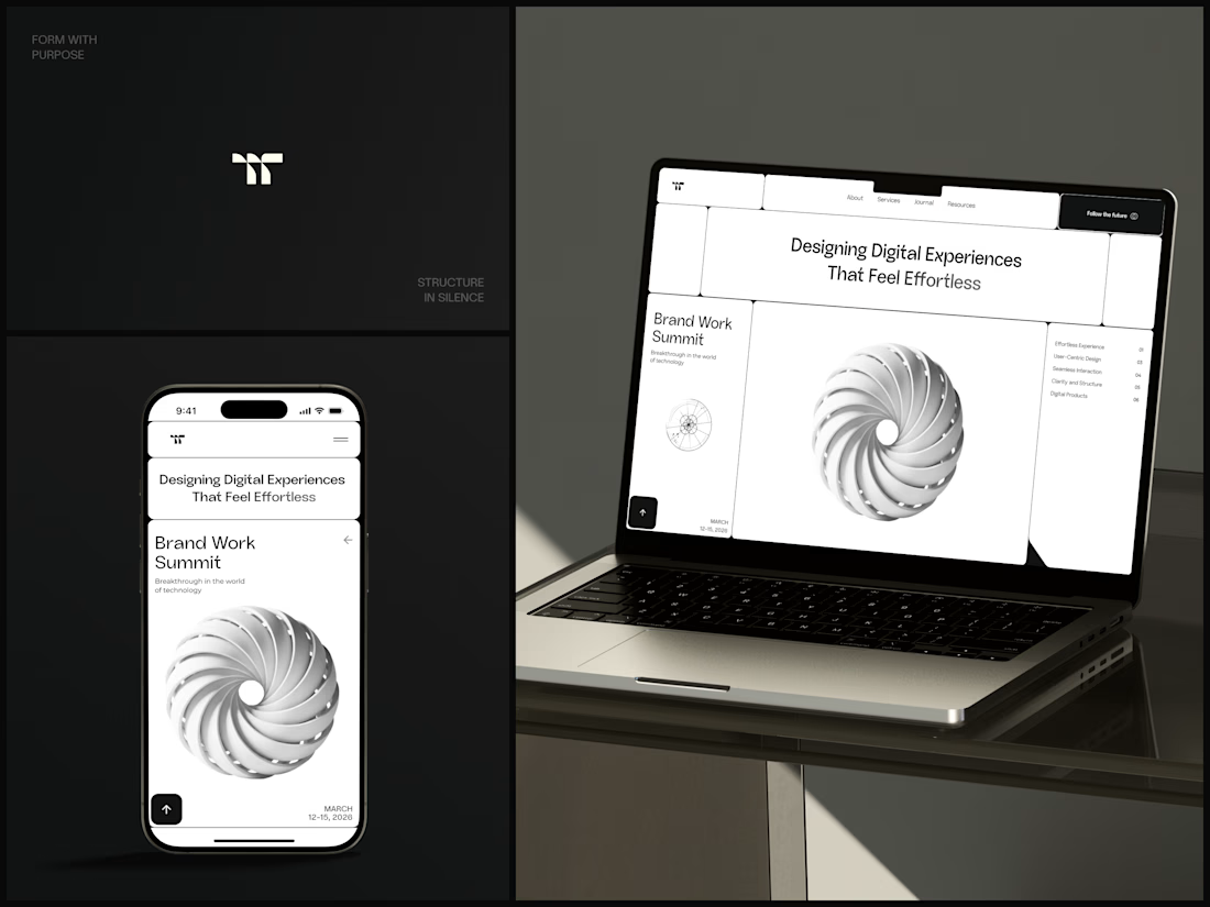
Only one cell on this homepage is black.
The rest of the page is a grid of rounded white cells: the headline, an event card, a white 3D spiral and a list of services. The black one, top right, holds the "Follow the future" button and stands out against all that white.
On the phone, the cells stack into a single column. The navigation folds into a menu icon, and the event card and spiral merge into one cell.
The headline reads "Designing Digital Experiences That Feel Effortless", so the grid has to look organized before anyone reads a word.
Designed by the Hue & Machine team.
#DesignAgency #WebDesign #AgencyWebsite #LandingPage #BentoGrid #MinimalDesign #UIDesign #ResponsiveDesign #MobileDesign #FigmaDesign


Looks cool