The network for creativity
Join 1.25M professional creatives like you
Connect with clients, get discovered, and run your business 100% commission-free
Creatives on Contra have earned over $150M and we are just getting started
Back to feedPost
Taste Test
Hi there!
I'm working on a medical website and looking for a balance between usability and accessibility, along with modern UI solutions. What do you think – is Option 1 too complex for an audience aged 40+?
I checked it using Claude’s accessibility skill, and it says: “In terms of text and button readability, both options are absolutely on par – the numbers are nearly identical because they use the same typography on different backgrounds. Both are safe for an audience aged 40+"
What do you think?

7 voted
54%
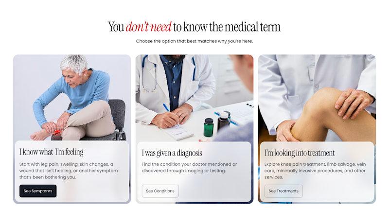
6 voted
46%
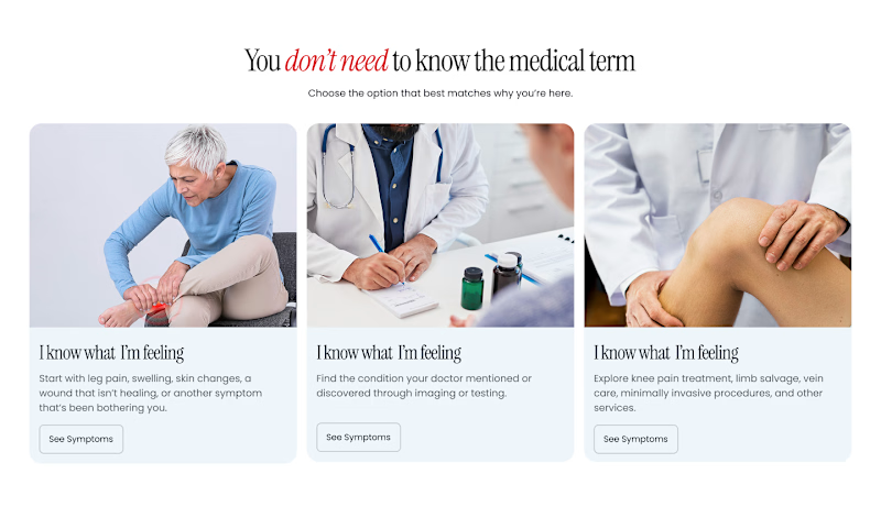
13 votes
Closed


I’d say Option 1 isn’t too complex if the hierarchy is clear. For a 40+ audience, readability and easy navigation matter more than keeping the UI super minimal.

I like the version 1 more but for Medical website, version 2 would be better

Thanks for your opinion! 🙌

Version 2 is easier to scan because the service cards and buttons stand apart. I would still test whether people can find the right service and book at 200% zoom before calling either option accessible.

Version 1 definitely feels sleeker, but Version 2 gives the content more breathing room and makes the information easier to scan.


version 2, medical needs the calmer one

Interesting that you ran it through Claude's accessibility skill first, most people just eyeball it. If the typography checks out equal on both, I'd lean toward whichever version feels calmer for someone reading it while already anxious about a diagnosis. Have you tested either...

For healthcare, confidence and clarity should probably guide the final decision.
Version 2🔥


version 2 for me nina, the red words are easy to spot

Outstanding work
The network for creativity
Join 1.25M professional creatives like you
Connect with clients, get discovered, and run your business 100% commission-free
Creatives on Contra have earned over $150M and we are just getting started





Related posts

You leaned toward Atmospheric in my last taste test, so I took it beyond the hero.
Here’s the full homepage for the same fictional lighting studio, with two different scroll experiences: Fluid and Cinematic.
Which one makes you want to keep exploring?
Continuing from this post: https://contra.com/community/KacW2yxF-homepage-design-comparison-product-photography-vs
22 voted
46%
26 voted
54%
48 votes
Closed

I can't recognizable the difference but both of them are great 🎉🎉

Which hero visual feels right for this brand?
While working on the homepage for Halfspace, a website design and SEO agency, I explored two different hero visuals for the same headline and layout. Same message, same structure, just a different visual metaphor and mood.
Option 1 - Rocket Launch. Bold, literal, and energetic, visually reinforcing the "launch your business" message with motion and fire.
Option 2 - Glass Cube. Abstract, sleek, and premium, giving a more refined, tech-forward feel without relying on a literal metaphor.
Would love your honest UX/UI take, which direction feels more impactful, memorable, and aligned with a web design/SEO brand, and why?
11 voted
41%
16 voted
59%
27 votes
Closed

Both design are great; it's hard to choose one





Option B feels nothing but premium