The network for creativity
Join 1.25M professional creatives like you
Connect with clients, get discovered, and run your business 100% commission-free
Creatives on Contra have earned over $150M and we are just getting started
Back to feedPost



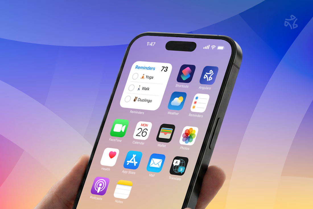
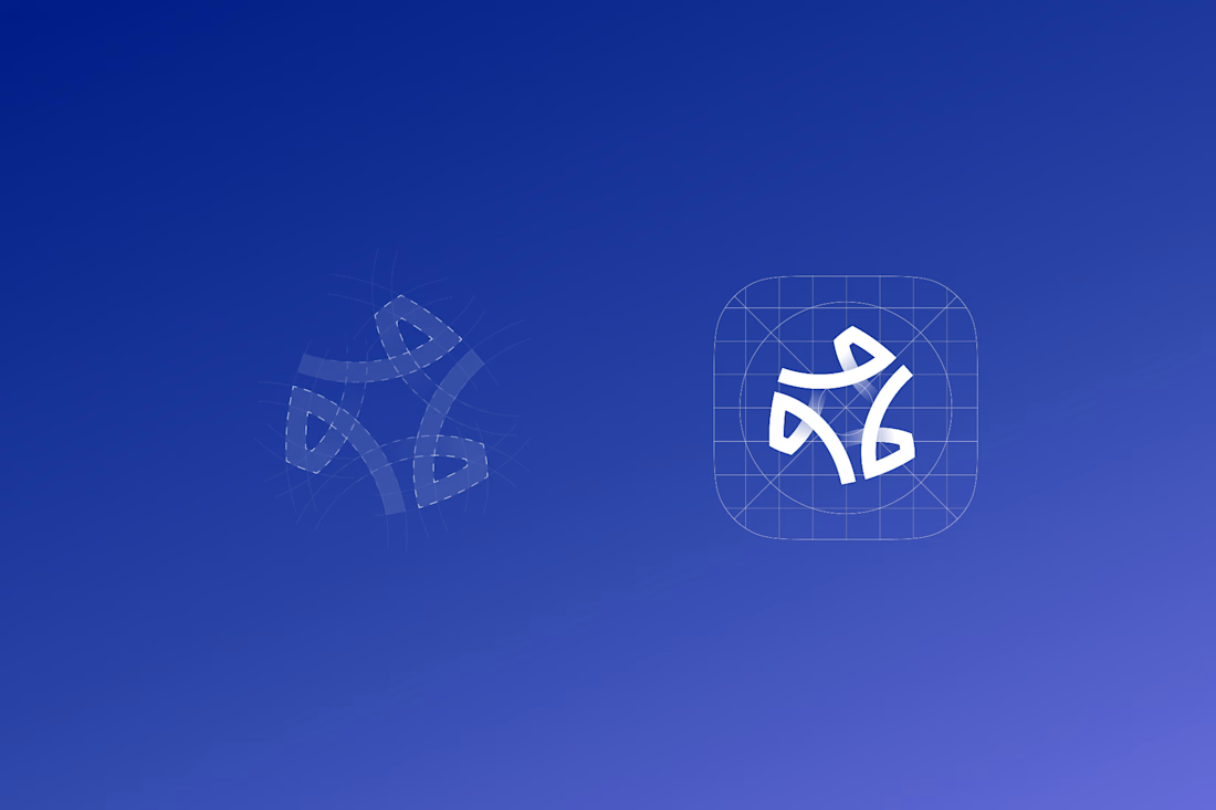

The wide counters are what let it survive the home screen — in that grid of other app icons it still reads as one shape instead of collapsing into noise, which is the real test for a CRM mark. Is the gradient locked to the logo, or does it shift across the product surfaces?

Yes and considering the app icon grid, I’m even making it a little smaller because the width of the outlines makes it look heavy. This is just a logo design project without continuously brand identity.

adore the logo!
Thank you!

Great work 🙂
Thank you!

Amazing work!
Thank you!

Ahh lovely work man! 😊
Thanks!

The mark reads as an abstract letterform without spelling anything out, that kind of ambiguity is what lets a CRM brand stretch past its first product without a redesign.

Amazing designs...
Thank you!

Really nice attention to the finer details.
Thanks!

The mark holding together at app icon size while still reading as motion is the hard part with abstract CRM logos, most flatten into a blob at that scale. Did you test it small early in the process, or was that more of a final gut check once the direction felt locked?

Good Work!
Thank you!

Such Amazing.
Thanks!

great work man
thanks!
The network for creativity
Join 1.25M professional creatives like you
Connect with clients, get discovered, and run your business 100% commission-free
Creatives on Contra have earned over $150M and we are just getting started



Related posts

Brand work for Boofi, DeFi platform
We are working on visual direction, motion and animations


So cute! Love it!


Crenaly: a booking SaaS I designed and built end-to-end for appointment-based businesses in France: salons, barbers, beauty and wellness.
The core idea: when a client cancels, the freed slot is automatically offered to clients who asked for an earlier time. The first to accept gets it, their appointment moves in place, and the slot they leave is offered next. No double booking, no manual work.
Around it, a full product:
→ Branded booking page for each business, embeddable on their own site
→ Mobile-first booking flow, no account needed
→ Agenda, client management, team roles & permissions
→ Verified reviews, analytics, Stripe billing
Product, UX/UI, frontend and backend.
Next.js · TypeScript · NestJS · PostgreSQL · Redis


Automatically offering a cancelled slot to the next client is such a practical feature for salons and barbers. Designing and building Crenaly end to end must have made those flows much tighter.

