The network for creativity
Join 1.25M professional creatives like you
Connect with clients, get discovered, and run your business 100% commission-free
Creatives on Contra have earned over $150M and we are just getting started
Back to feedPost

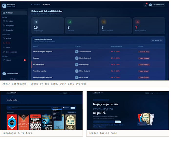
Built during an internship. A librarian tracking who has what, and what's overdue, on paper — replaced by a catalogue the public can search and an admin side that knows where every copy is. Adm


The network for creativity
Join 1.25M professional creatives like you
Connect with clients, get discovered, and run your business 100% commission-free
Creatives on Contra have earned over $150M and we are just getting started

Challenges
View all


Related posts

30+ pages, 3 weeks, and honestly one of my favorite projects in a while.
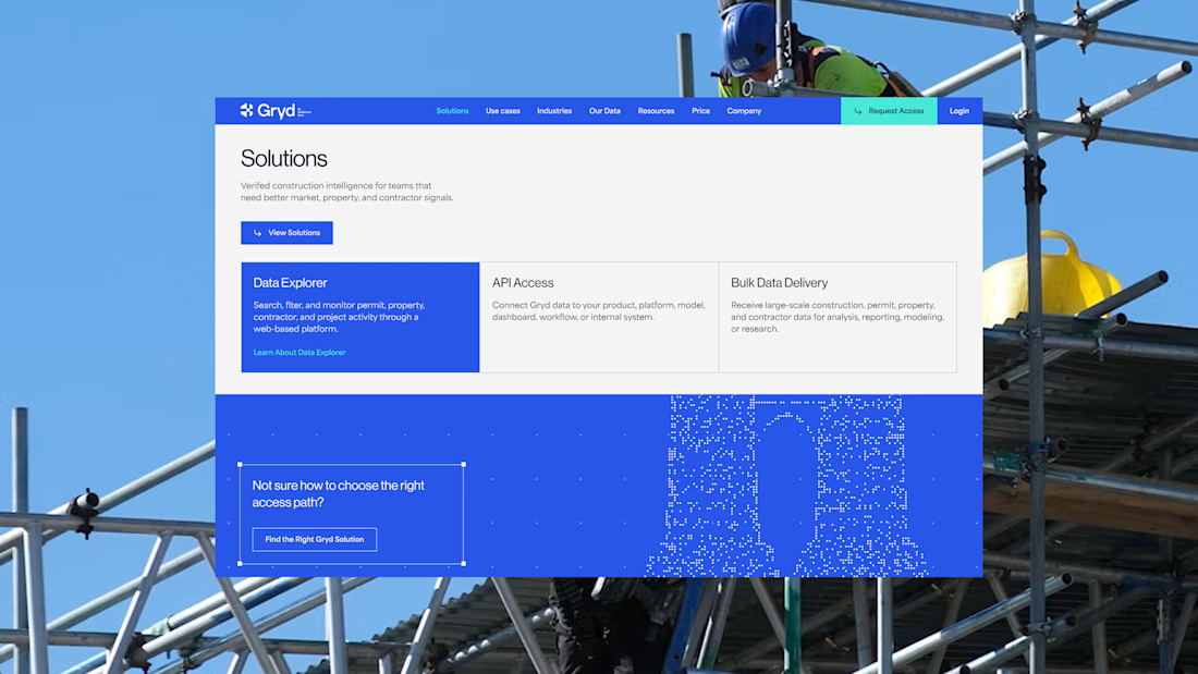
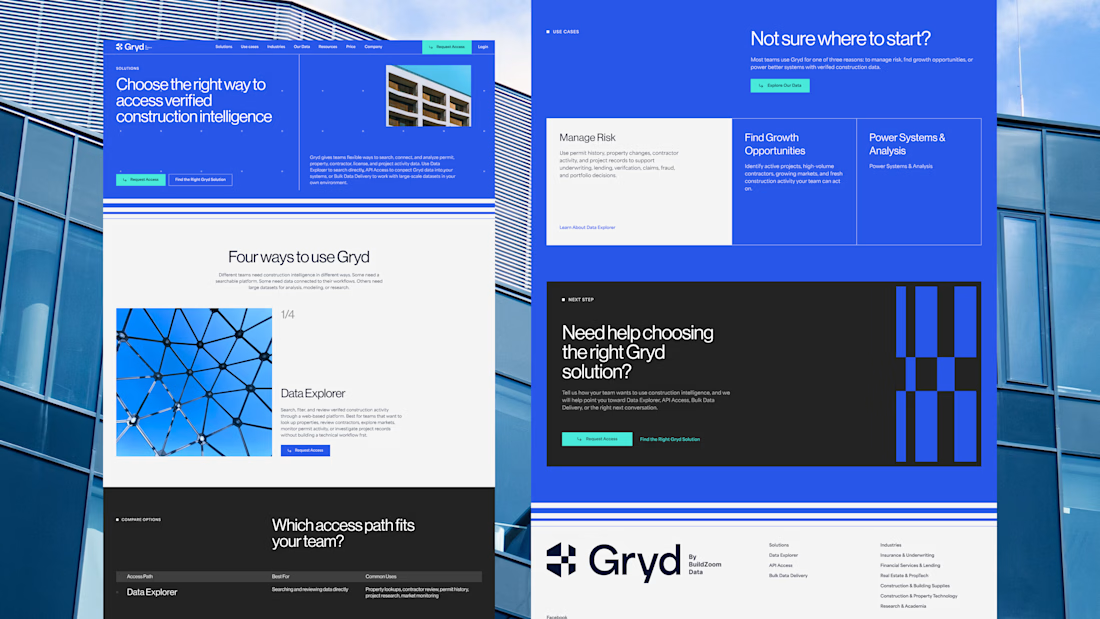
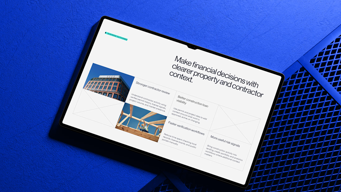
I'd been wanting to design something more tech-driven for a long time, and Gryd, a platform turning construction permit data into intelligence for insurers, lenders, and real estate teams, was exactly that.
Wireframes first, then UI across every page, fully responsive, with animation on the key screens, all built inside the brand the client had already set.
Case study's on my profile.

Clean design 😍

Most luxury eyewear brands sell frames. Very few sell the feeling of putting them on.
Orelux was designed to close that gap. Not just with product shots but with a world. Editorial campaign photography of real people wearing real confidence. A hero that says "See the World in Style" and means it before you scroll once.
The home screen sets the tone full-bleed lifestyle imagery, an in-app try-on preview, and an "Explore Collection" CTA that earns the click.
Three sections. Every reason to buy answered before the question is asked.
This is what luxury e-commerce looks like when the design respects the product as much as the person wearing it.
Does this feel like an eyewear website that converts browsers into buyers? 👇
Designed by Orbix Studio.
Tools: Figma
#WebDesign #LuxuryDesign #EcommerceUI #UIDesign #ContraFreelance #ProductDesign #FashionDesign #LandingPage


This happens to me pretty often…
A client asks for a more modern website.
At first, it sounds like a visual problem. But once I look beneath the interface, I may find that:
→ The offer is difficult to understand.
→ The strongest proof is buried.
→ The navigation reflects the company, not the user.
→ The CTA appears before enough confidence has been built.
At that point, changing the layout won’t solve the actual problem.
The work becomes defining what users need to understand, what will make them trust the business, and what should help them take the next step.
The brief says redesign.
The project says strategy.
Fellow designers: what’s the most common problem you discover hiding behind a redesign request?


Always bad positioning disguised as a visual problem. Clients think they need new UI when they really need clear messaging and proof.