The network for creativity
Join 1.25M professional creatives like you
Connect with clients, get discovered, and run your business 100% commission-free
Creatives on Contra have earned over $150M and we are just getting started
Back to feedPost

Most luxury eyewear brands sell frames. Very few sell the feeling of putting them on.
Orelux was designed to close that gap. Not just with product shots but with a world. Editorial campaign photography of real people wearing real confidence. A hero that says "See the World in Style" and means it before you scroll once.
The home screen sets the tone full-bleed lifestyle imagery, an in-app try-on preview, and an "Explore Collection" CTA that earns the click.
Three sections. Every reason to buy answered before the question is asked.
This is what luxury e-commerce looks like when the design respects the product as much as the person wearing it.
Does this feel like an eyewear website that converts browsers into buyers? 👇
Designed by Orbix Studio.
Tools: Figma
#WebDesign #LuxuryDesign #EcommerceUI #UIDesign #ContraFreelance #ProductDesign #FashionDesign #LandingPage


Modern Website ✨

Amazing

Amazing

Super refreshing color scheme, love this.

Greak Work✨

Exudes quality from every angle.

The in-app try-on preview sitting right on the home screen, not buried behind a product page, is what actually answers the one objection eyewear e-commerce always struggles with: whether it'll suit your face before you buy it.

The “See the World in Style” hero gives the product an emotional entry point before the commerce layer appears. The three-section structure and in-app try-on preview feel like a focused way to move from aspiration to action.


Lovely design !
The network for creativity
Join 1.25M professional creatives like you
Connect with clients, get discovered, and run your business 100% commission-free
Creatives on Contra have earned over $150M and we are just getting started



Related posts

Meet Silk Ribbon for Framer. A wavy image ribbon with momentum drag, hover focus and CMS support. Your gallery, finally moving.


momentum drag on a ribbon is such a nice touch. does it hold up on mobile?

🚀 Just completed the UX/UI design and website redesign for Spartan SEM!
The goal was to bring their refreshed brand identity to life with a modern, conversion-focused website and a better user experience.
Really enjoyed working with the team and seeing the design go live!


This is amazing


I've just put a new case study live.
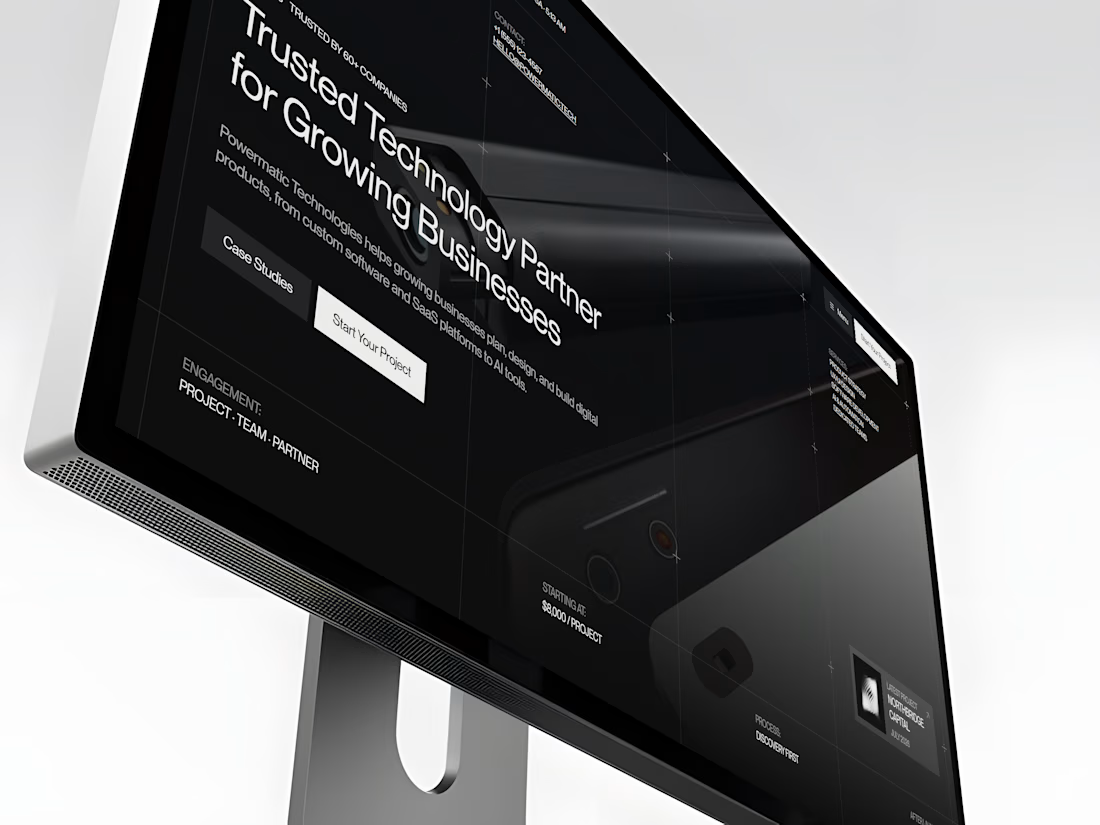
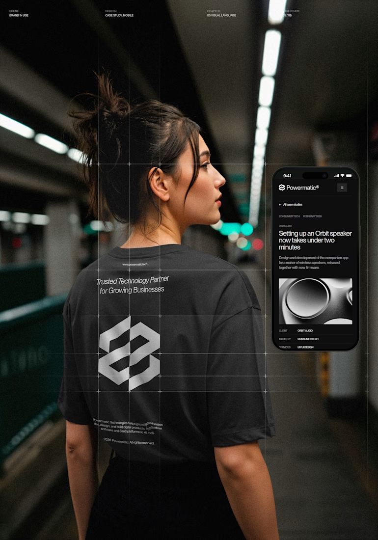
Powermatic Technologies helps growing companies with strategy, design and software. I did the whole project on my own: the logo and identity, the design in Figma, the code and the copy on the site.
The site sits on a four-column grid, and you can see its lines on the screen. Graphite palette with no pure black or white, PP Neue Montreal, and a bit of ASCII art.
The page I'm happiest with is Careers. My first idea was to repeat the home page layout. I dropped it. Now the page opens with the open roles set in 72 px type, with a filter by team. A candidate sees the role, the city and the pay before they scroll.
The menu turns like a drum. You can drag it or use the arrow keys, and it opens on the section you're reading.
It's all hand-written HTML, CSS and JS, no framework. It holds up from a phone to an ultrawide monitor.
The live site is open, so you can click through it yourself.



Nice!