The network for creativity
Join 1.25M professional creatives like you
Connect with clients, get discovered, and run your business 100% commission-free
Creatives on Contra have earned over $150M and we are just getting started
Back to feedPost
An expanded packaging exploration for Solace Soda, exploring a darker and more atmospheric visual direction through flavor-specific can designs, botanical details, and premium product art direction


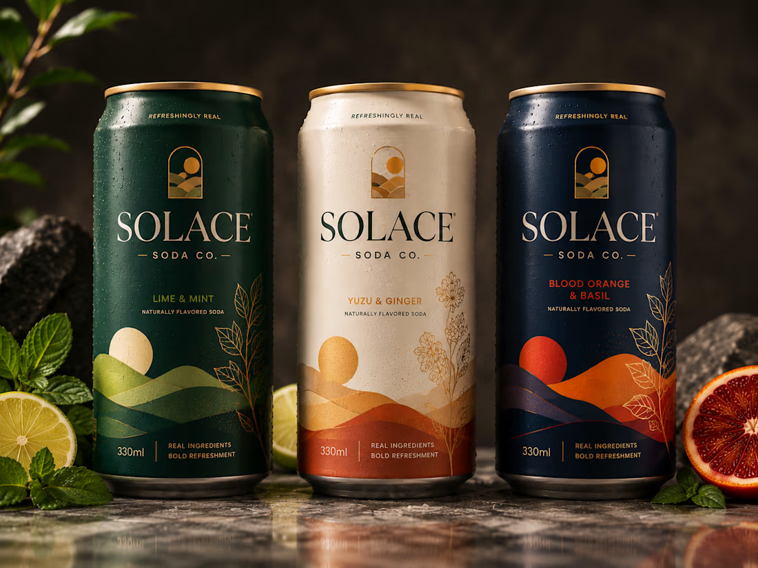

ok the cream one is my favourite of the three. is there a fourth flavour coming?

Haha, the cream one seems to be winning 😄 I haven’t planned a fourth flavor yet, but now you’ve got me thinking 👀
The network for creativity
Join 1.25M professional creatives like you
Connect with clients, get discovered, and run your business 100% commission-free
Creatives on Contra have earned over $150M and we are just getting started





Related posts

I built KolaCuts, a premium mobile barber booking platform designed to make booking a grooming appointment simple, fast, and seamless.
The app lets customers explore barber services, view pricing, choose a preferred date and time, enter their location and contact details, review their appointment, and confirm their booking, all without calling or messaging the barber.
I focused on a clean, premium, mobile-first experience that feels like a real product, not just a landing page. The booking flow also includes availability, appointment confirmation, calendar integration, and options to reschedule or cancel.
The goal was to solve a real business problem: reducing booking friction for customers while giving a mobile barber a structured way to manage appointments and deliver a better customer experience.
Built with Lovable, with a focus on responsive design, intuitive UX, and functional booking logic.


Perfect work


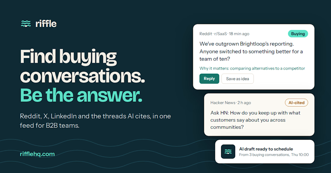
Someone asked for a tool like yours on Reddit an hour ago. Did you see it?
Riffle finds buying conversations so you can be the answer.
Waitlist open: rifflehq.com

Nice design

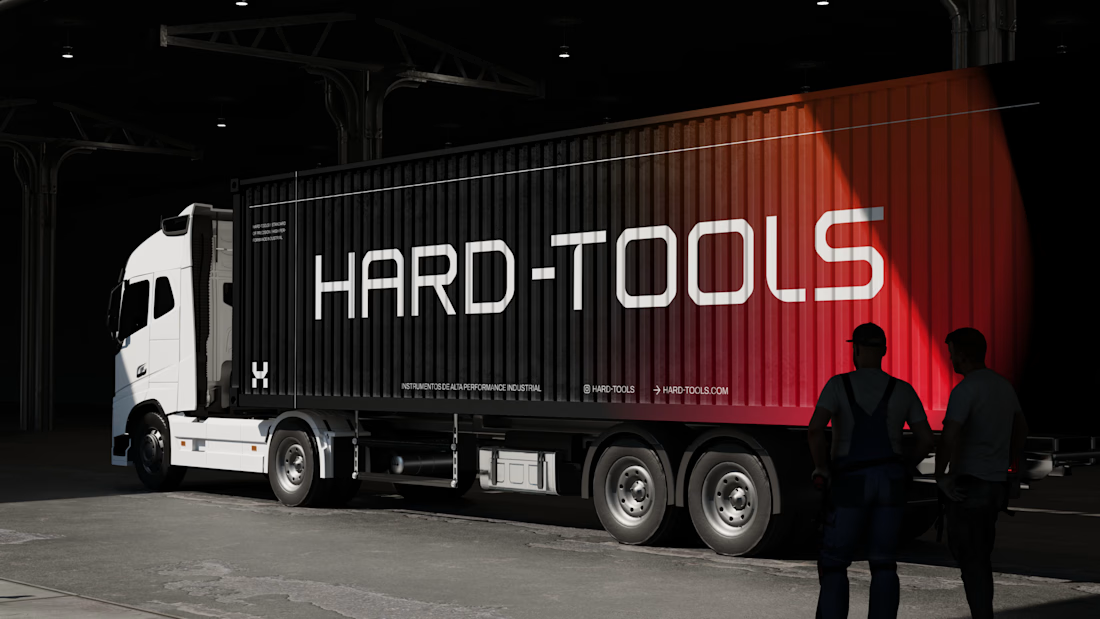
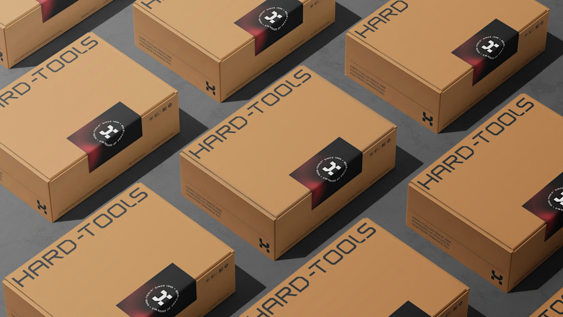
Hard-Tools needed to strengthen its brand presence and turn its communication into a clearer, more consistent, and more professional expression of the business.
The project started with a central question: how can a tools and equipment brand communicate strength, reliability, and expertise without falling into the generic visual language of the category?
The strategy focused on three main objectives:
01 — Strengthen perceived value
Build a visual communication system that conveys solidity, quality, and authority, bringing the brand’s perceived professionalism closer to the level it aims to occupy in the market.
02 — Create consistency across communication
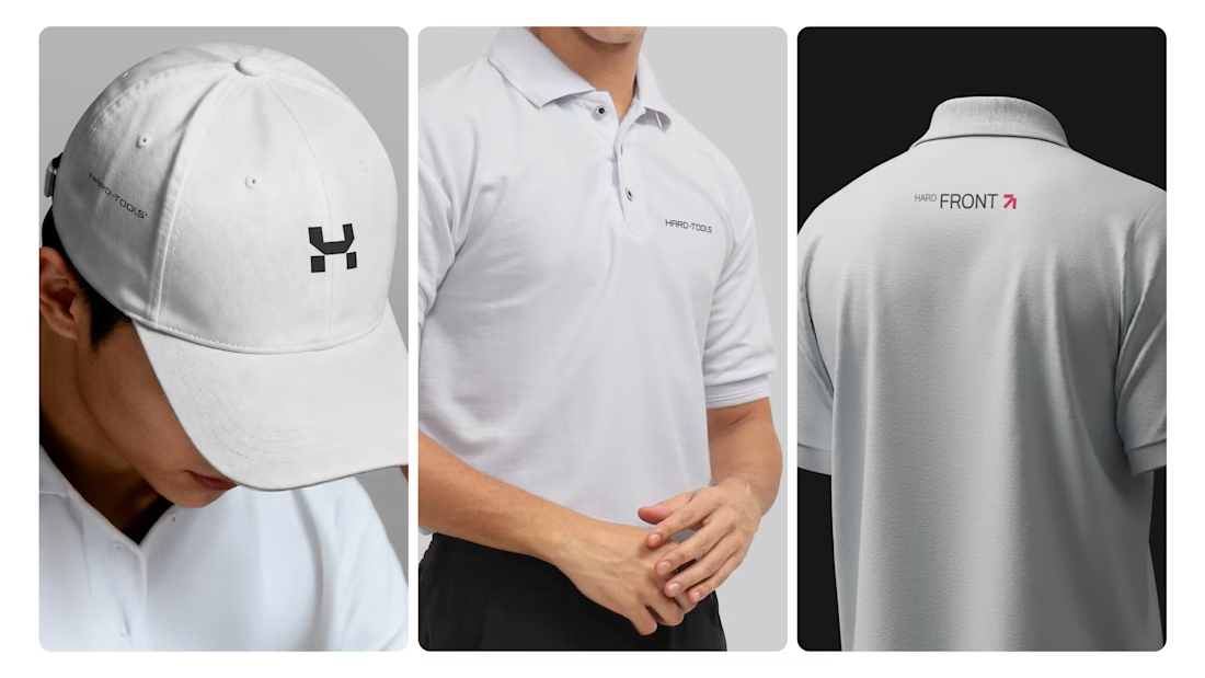
Develop a visual language that could work across different touchpoints — campaigns, commercial materials, social media, and promotional assets — while maintaining recognition and coherence.
03 — Turn products into brand communication
Rather than simply showcasing tools and products, the visual approach was designed to communicate the attributes behind the brand: performance, precision, durability, and reliability.
Based on this strategic direction, I developed the creative and visual direction and designed the communication materials, working across composition, hierarchy, typography, image treatment, identity application, and commercial layouts.


TOP!!