The network for creativity
Join 1.25M professional creatives like you
Connect with clients, get discovered, and run your business 100% commission-free
Creatives on Contra have earned over $150M and we are just getting started
Back to feedPost
Taste Test


Redesigning an old web design project I did a while back. ✨
Which hero section do you prefer?

79 voted
60%
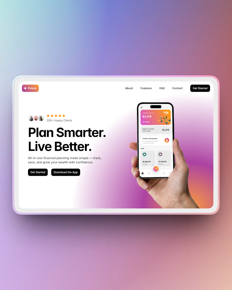
53 voted
40%
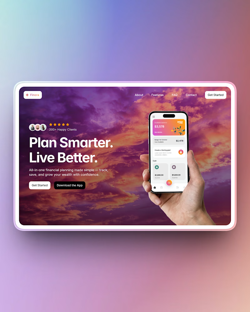
132 votes
Closed

The best hero section is usually the one users understand instantly.
True!

amazing
Thank you!

Prefer the first one
Thanks for the feedback!

Thank you for the feedback Anas!


Thank you!

They both look good!
Thank you Mohd!

Thank you for the feedback!

Thank you for the honest feedback!

looks fireee
Thank you!

"Stunning work on these! Personally, I’d lean towards Option 2. The cleaner, lighter background creates a much better visual hierarchy, which is essential for guiding the user's eye toward the CTA. In my experience with high-converting landing pages, a 'white aesthetic' helps...
Thank you Arooj, I appreciate the feedback!

I prefer option 2
Thank you!

Nice work
Thank you Amrina

I prefer option 💯
Thanks!

Great color usage! Both are nice, but Option 1 feels a tad bit distracting.
Thanks for the honest feedback!

Clarity wins always
Agreed!

Option 2, clean, and minimal with a premium look
Thank you Koonji!

The right is more visually appealing, but the left better readability
Interesting take, thanks for the feedback!

nice color 👍
Thank you Adesina!
you welcome Baskar

Great work
Thank you!

i guess i am the only one who like option 2 , i dont know why but option 2 looks comfortable to me
Your not the only one. Option 2 seems to be in the lead so far!

Love option 1

Love it, option 1 minimal


option 1 for me, the purple hits different. clean redesign

The network for creativity
Join 1.25M professional creatives like you
Connect with clients, get discovered, and run your business 100% commission-free
Creatives on Contra have earned over $150M and we are just getting started
Related posts

I redesigned the website for this project, keeping its core elements while making it more modern and techy with dark mode by default, eye-catching floating animations, and improved color contrast.
Do you think the redesign I made in Figma is better? Or is the original version better?

19 voted
40%
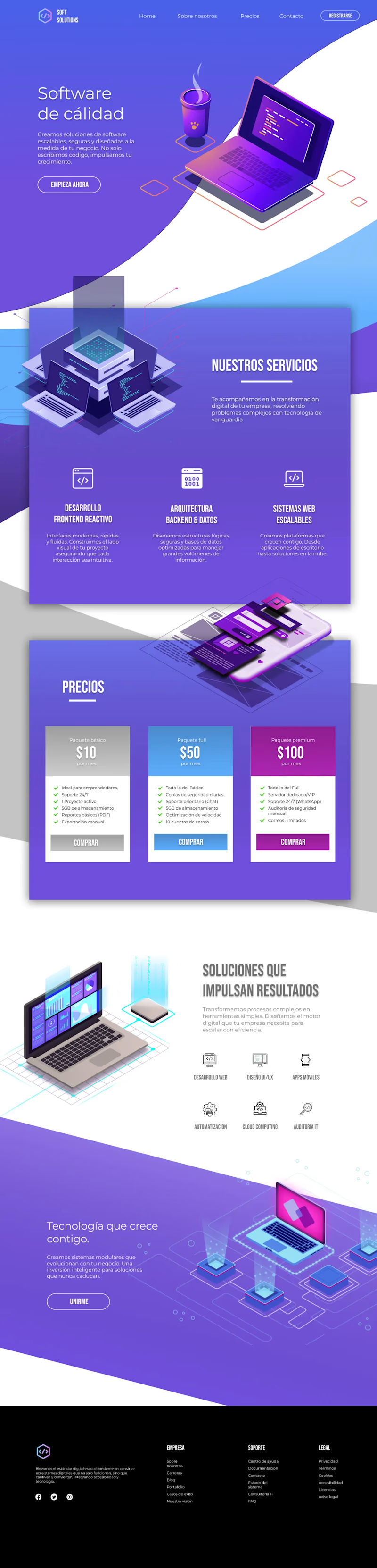
28 voted
60%
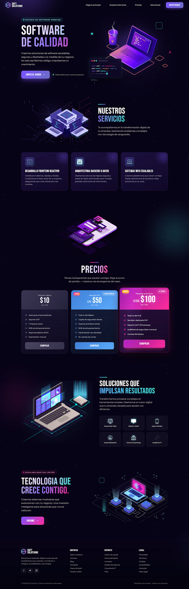
47 votes
Closed

Both of them looks nice but I can clearly see a big mistake on the footer the orig light page footer should be white or blue in color. @Grecia Valero that's why everyone's voted on the dark mode


Which hero image works best for the Lumière skincare landing page? ✨

3 voted
16%
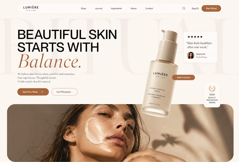
16 voted
84%
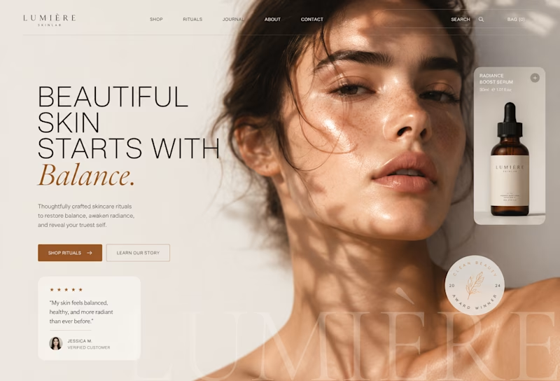
19 votes
Closed

2nd is quite attractive




Nice design! How did you generated the background image?










Trending

Claude
Claude has entered the design space. How are you using Claude Design?

Contra University
Learn from expert creatives how to earn more using next-gen AI tools.
creativeaiflow
Creative AI workflows are evolving. What tools do you use, and what are their strengths and weaknesses?
freelancerlife
Freelancer life is wins, pivots, and everything in between. What’s yours right now?