
Clement Blessing
Brand and social media designer |helping brands standout.
Profile in progress
Clement is building their profile!
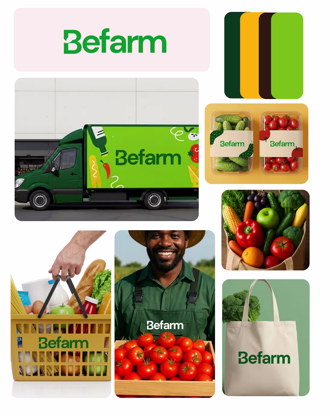
Project: Befarm – Grocery Brand Visual Identity
Befarm is a concept grocery brand designed to represent freshness, accessibility, and trust in everyday food shopping.
The idea behind the visual identity was to make the brand feel simple, honest, and farm-connected, while still working seamlessly across modern retail touchpoints.
I started with a green-focused color system to symbolize freshness, sustainability, and natural produce. The typography is clean and bold to ensure the brand remains highly visible on packaging, delivery vehicles, and grocery environments.
The identity was designed with real-world application in mind from delivery trucks and packaging to tote bags and produce containers. Each touchpoint reinforces the idea that Befarm is not just a grocery store, but a fresh food experience delivered directly from farm to everyday life.
This project explores how thoughtful branding can turn a simple grocery concept into a recognizable and trustworthy consumer brand.
1
37
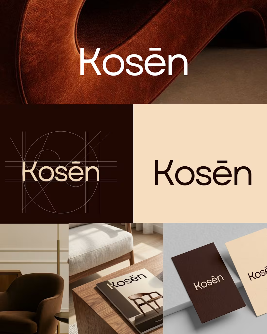
I hid a chair inside a logo
I created this logo for KOSEN, a modern furniture brand .
The K isn't just a letter its a chair. backrest, legs and structure.
I built the product directly into the typography
No decoration just intention
What is your thought about this project
1
50
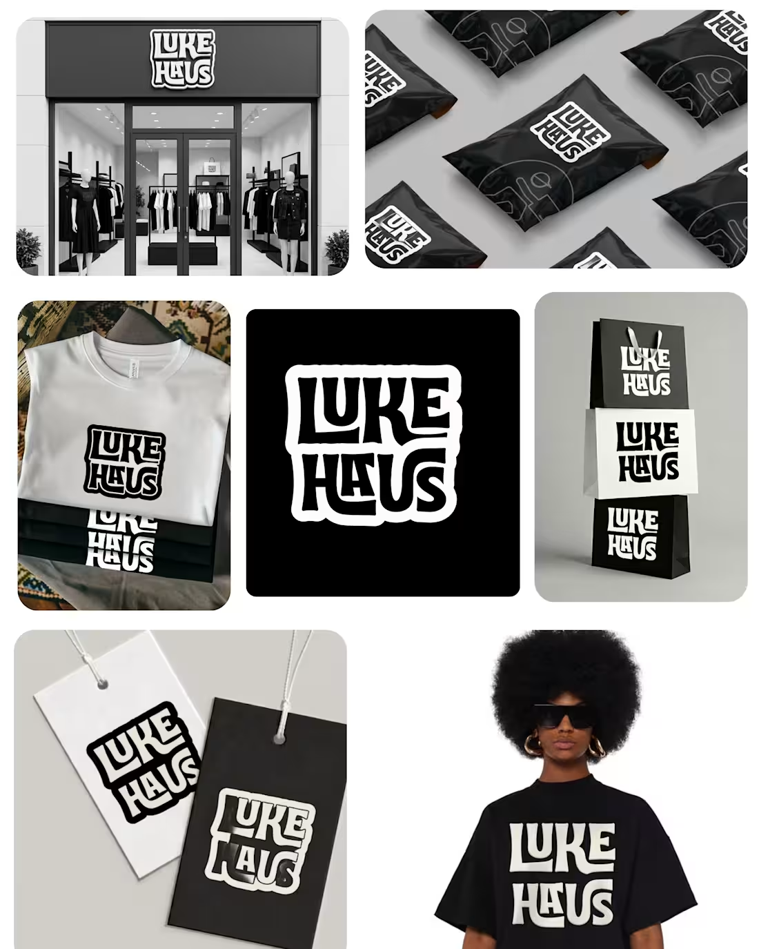
Most fashion brands look good.
Very few feel intentional.
This is a brand identity I created for LUKE HAUS built to be bold, minimal, and instantly recognizable.
Every detail was designed to scale:
– Logo that holds presence
– Packaging that feels premium
– A system that works across retail, apparel, and digital
Because branding isn’t decoration it’s positioning.
If your brand looks generic, people will treat it that way.
I am currently open to collaborations, freelance and remote roles
2
3
102