
max
Bobby Jocson
Your Video Partner Built For Marketing Teams
- $25k+
- Earned
- 8x
- Hired
- 4.75
- Rating
- 118
- Followers
Part of the work we do with clients is helping them maximize the assets we produce for them.
You spend all this time creating an evergreen piece of content. How else can we leverage it. Here is an example of that.
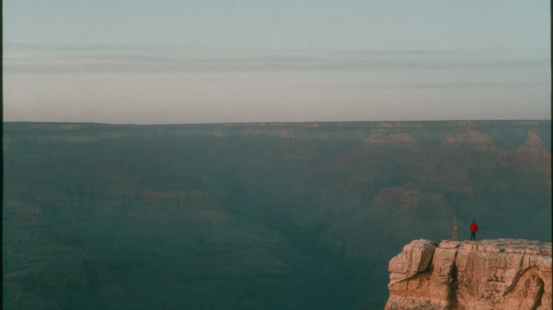
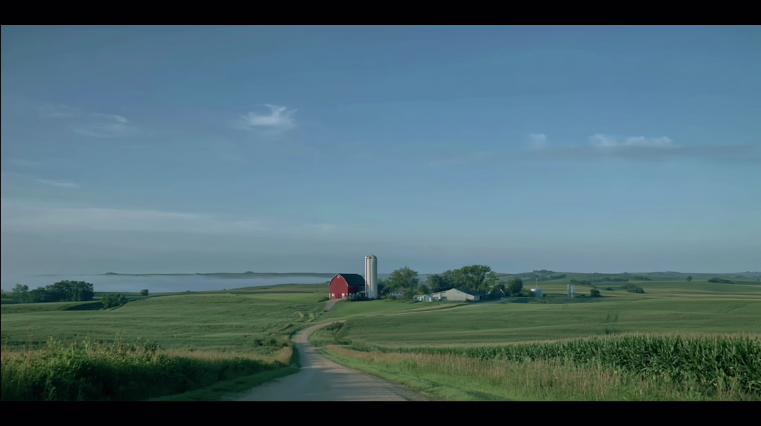
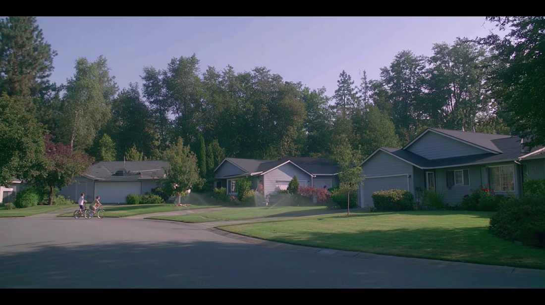
Hospitable gave us one job. Make a short-term rental host feel seen and use story to drive a feeling.
No feature walkthroughs, just a video that a new short...
The vote is in, Seedance 2.0 wins.
Which one do you like better? Same image, same prompt.
27 voted
35%
50 voted
65%
77 votes
Closed
Which one do you like better? Same image, same prompt.
27 voted
35%
50 voted
65%
77 votes
Closed
I've been having a ton of fun playing around with MidJourney 8.2 preview + Seedance 2.0. Right now its unmatched imo. The ability quickly spin up moodboards and use/blend moodboards in MidJourney is what separates it from the rest.