
Blazej (Chris) Cieslar
Framer Expert | Web Designer | No-Code Developer
- 1x
- Hired
- 5.00
- Rating
- 45
- Followers
"Light flowers" | They are moving and it's a bit trippy, so watch out | Which one do you like more?
2 voted
100%
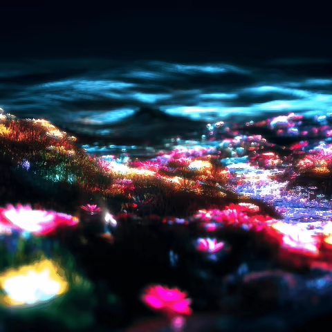
0 voted
0%
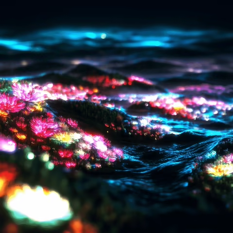
2 votes
Closed
I am NOT a poster designer, but I got an idea and decided to execute it. I made one version with halftone effect and one without it.
Which one do you think is better?🚀
Also, any poster design tips would be extremely helpful! 🤝
[THE BACKGROUND PHOTO IS NOT ORIGNALLY MINE]
2 voted
50%
2 voted
50%
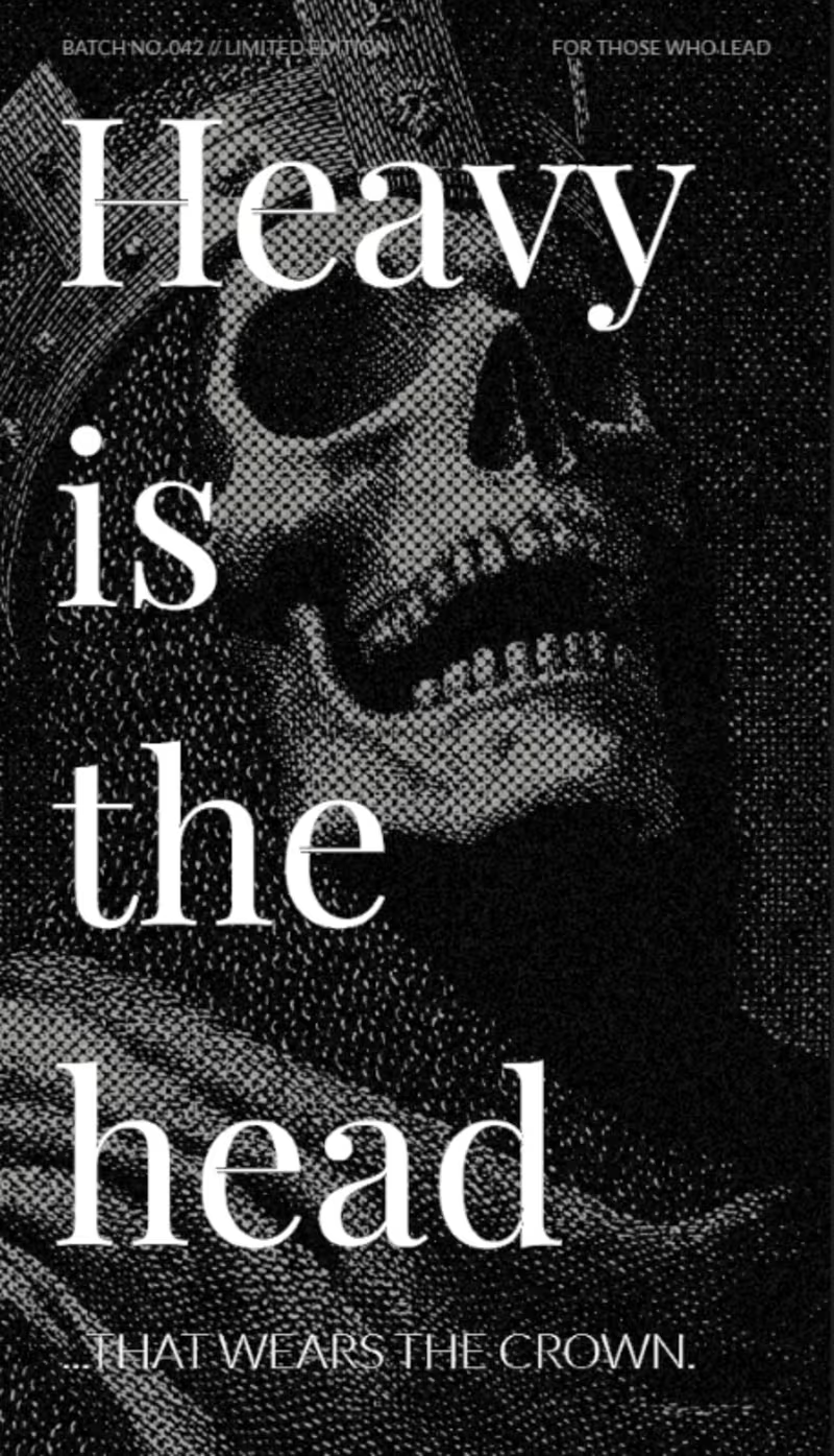
4 votes
Closed
⟡ Saw a post by @Luca Da Corte with liquid metal Contra logo. ⟡
I decided to extend the animation and try to apply the ASCII filter using only the shapes of the actual logo. Curious to know if you think it makes it better or worse.
44 voted
71%
18 voted
29%
62 votes
Closed
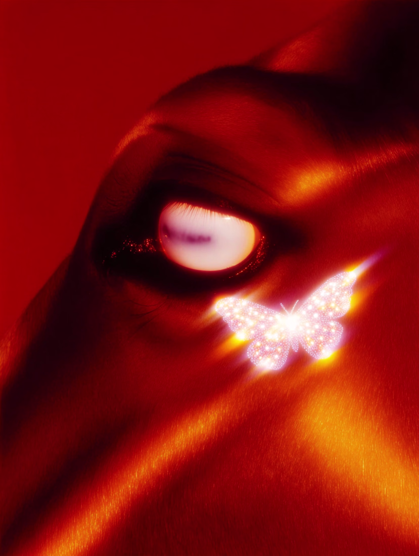
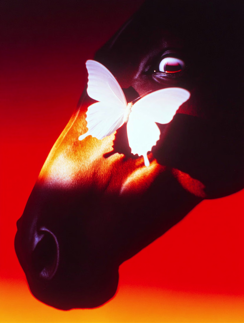
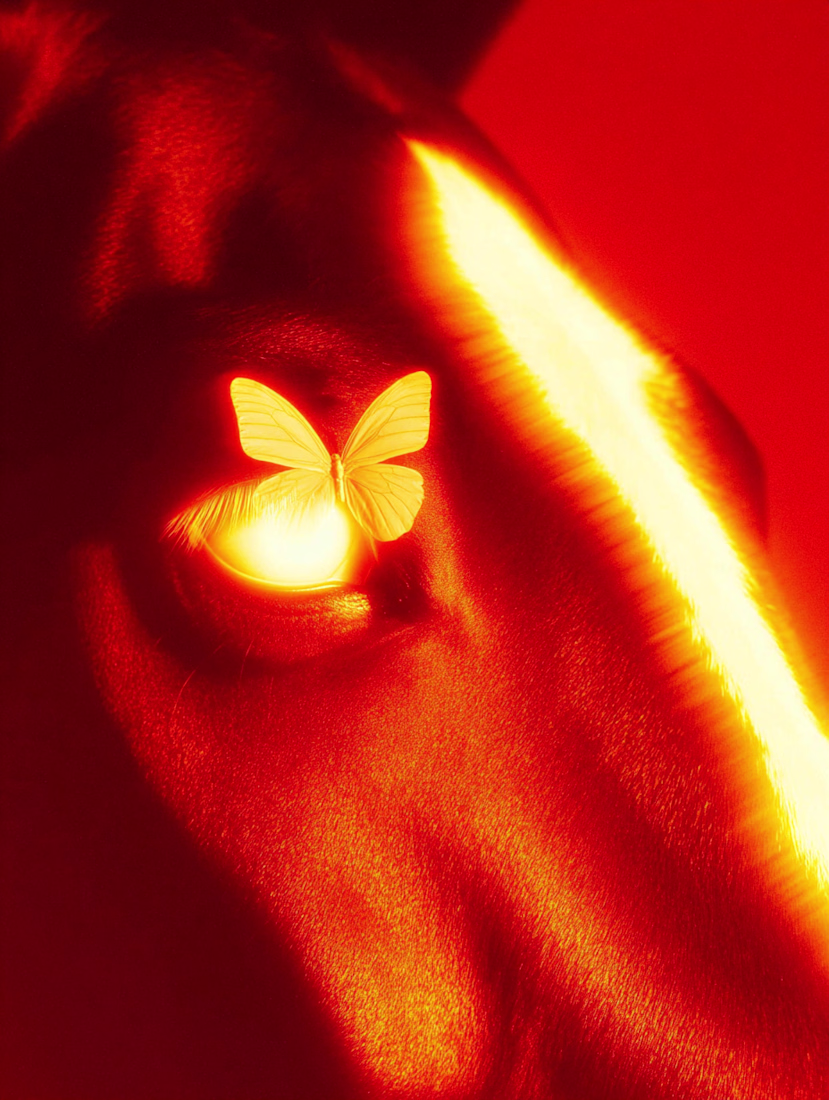
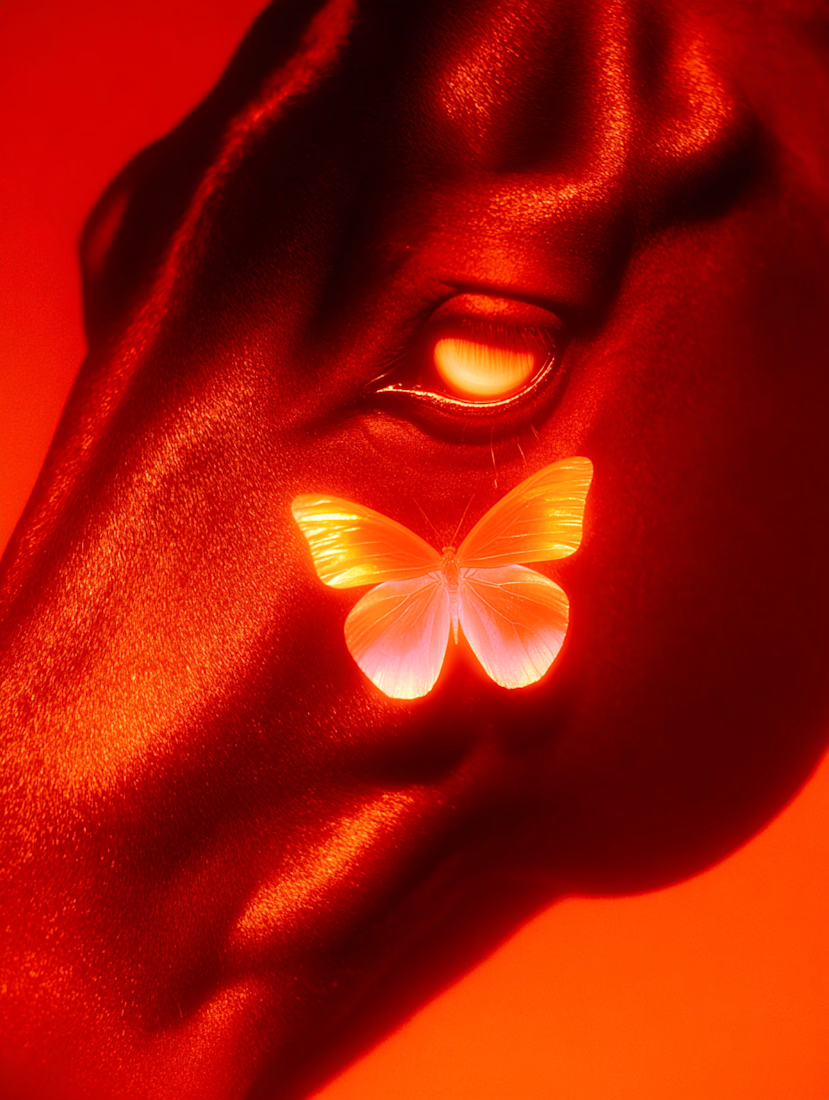
Playing with high-contrast studio lighting in the Year of the Fire Horse.
Used MidJourney to make this.
How do you like it?
Gamified self-improvement concept built in Framer. 🎮
I used ASCII art to visualize "upgrading your character" in real life. Aiming for a raw, gamelike feel.
Which vibe hits harder? Dark HUD or Light Clean?
Does the self-improvement angle come across clearly? Let me know!
54 voted
84%
10 voted
16%
64 votes
Closed