The network for creativity
Join 1.25M professional creatives like you
Connect with clients, get discovered, and run your business 100% commission-free
Creatives on Contra have earned over $150M and we are just getting started
Back to feedPost
Taste Test


"Light flowers" | They are moving and it's a bit trippy, so watch out | Which one do you like more?
2 voted
100%
0 voted
0%

2 votes
Closed
The network for creativity
Join 1.25M professional creatives like you
Connect with clients, get discovered, and run your business 100% commission-free
Creatives on Contra have earned over $150M and we are just getting started





Related posts

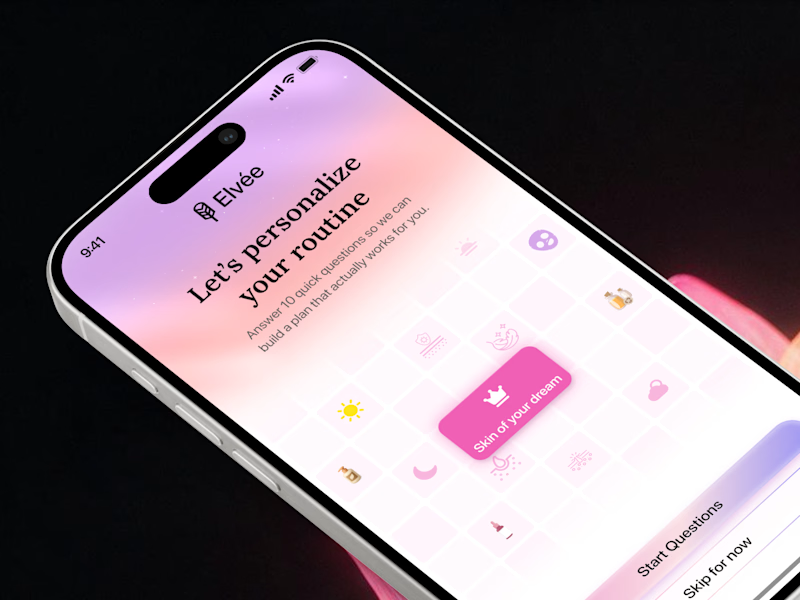
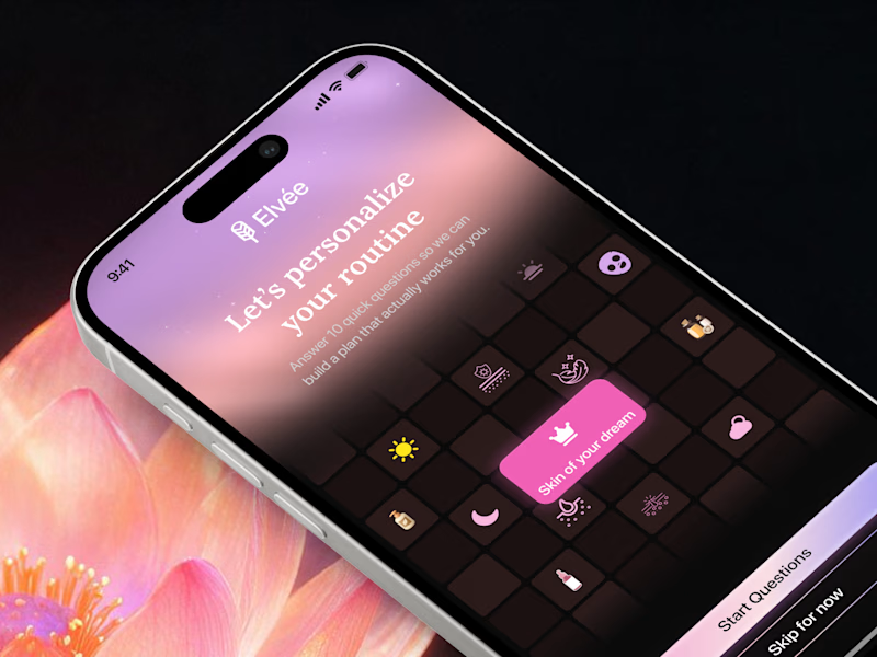
First impressions matter in onboarding 🌸 Which theme sets the right mood for a personalized wellness app? Drop your favorite light gradient or moody dark mode in the comments! 💬

7 voted
47%
8 voted
53%
15 votes
Closed

Light or dark, which one wins? ☀️🌙
Same site, two moods. Warm stone and lacquer red, or the same build after dark.
Both are hand-built with a 3D paper crumple, real physics, a stick-figure film drawn in code, and a receipt that gets a bicycle kick. 🔊 Sound on.
Tell me which you'd ship: light or dark? 👇
26 voted
59%
18 voted
41%
44 votes
Closed

I really like how the light version looks, but it has some legibility issues. Since readability is more important for users than visual appeal, I think the dark version is the better option.
BTW, I initially voted for the light version, but after analyzing both options more closely, I changed my mind 😄


Going to have to learn this! 2D,3D and now AI lol