The network for creativity
Join 1.25M professional creatives like you
Connect with clients, get discovered, and run your business 100% commission-free
Creatives on Contra have earned over $150M and we are just getting started
Back to feedPost
Taste Test
⟡ Saw a post by @Luca Da Corte with liquid metal Contra logo. ⟡
I decided to extend the animation and try to apply the ASCII filter using only the shapes of the actual logo. Curious to know if you think it makes it better or worse.


44 voted
71%
18 voted
29%
62 votes
Closed

Liquid metals looks DOPE in my opinion! But both animations are cool..

Thank you Aishwarya! 😊

I love both, but the ASCII version is SO COOL!
Thanks Evan! I'm really glad that you like it. I am happy that there are actually characters shaped like Contra logo 🔥

LOVEEE the ASCII
I'm EXTREMEEELYY glaad! 😊 Thank you Kartikai!

With ASCII looks better😍
Alright, thanks Muhhamaad! 🚀

Haha, glad that you like it Angel! 🔥

ASCII version looks something you would see in a movie.
Wow, that's great. Thank you Rishi! 🙌

I love without ascii
Thanks Adonis! 😊

Thanks Meddy!

it was really a hard pick the 2 looks really great
Alright! Thanks Simply7 🚀

this is rlly good!
Thanks!🔥

Without ASCII version provides better visual because it is lighter. The ASCII is cool still 😊🙌
Thanks Mark! 🙌

Thanks Blaq! 🚀


You cooked big time 👨🍳
Haha, thanks Kirill! 🔥

Ok, thanks Napoleon! 💯

without ASCII 🙌

ASCII just added that cherry on top effect!! love it

With ASCII version creates a unique texture that makes the liquid movement feel even more dynamic. Its impressive to see how a filter can change the whole aesthetic like that.

Without is best and more eye catching!
The network for creativity
Join 1.25M professional creatives like you
Connect with clients, get discovered, and run your business 100% commission-free
Creatives on Contra have earned over $150M and we are just getting started





Related posts

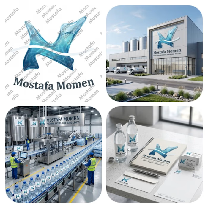
That's my case study to water bottle factory branding logo this logo is modern minimalist 3D realistic logo
This logo design is realistic water logo that was designed by curvy natural shape that has realistic water texture to make it suitable for a water bottle factory brand
This logo focus on (realism, nature feel by natural Designing)
It solves the problem of (memorization, recognition, showing trust, professionalism)
Thanks for everyone who support me❤️


Great project, well done


$1,000 on Contra. 🎉
Today, I hit a milestone I’ve been looking forward to: my first $1k on Contra.
Feels good to see the work, consistency, and showing up start to add up.
From joining Contra to reaching the top 1% of creatives, and now crossing $1k… pretty wild when I think about it.
Grateful for the clients, opportunities, lessons, and growth along the way.
On to the next $5k. 🚀
Still building. Still learning. Still growing.


Congrats🎉


you also need:
- taste
- persistence
- learn how to sell
in our recent episode at UnContrad, Wesley Bancroft, founder of Lunour Studio
gets real about self-doubt, creativity, brand activation, and the work behind growing as an independent designer.