

I stopped designing portfolio projects to look like real client projects.
I used to think a strong Product Design case study needed a lot of screens.
Dashboard.
Settings.
Profile.
Notifications.
Every possible state.
The file looked impressive.
But when I looked at it as a hiring manager might, I realized something:
More screens weren’t showing more thinking.
They were mostly showing that I could keep extending the same UI system.
So I changed how I approach portfolio projects.
Now I start with one question:
What is the most important problem this product needs to solve?
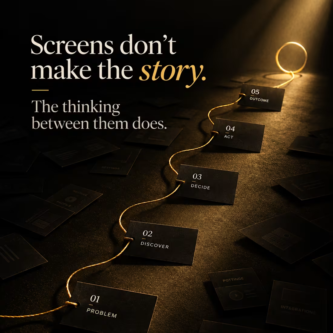
Then I build one complete journey around it.
For example:
Monitor → Locate → Diagnose → Act → Verify
Five stages can tell me much more about a designer than twenty unrelated dashboard screens.
Because now I can show:
→ why the flow exists
→ what information the user needs at each point
→ what I chose to prioritize
→ what I removed
→ how one decision affects the next screen
I’ll still design additional states when they matter.
But I no longer add screens just to make the Figma canvas look impressive.
A portfolio isn't proof of how many screens you can design.
It’s proof of how you think through a problem.
That shift has made my case studies smaller but much stronger.
Designers: when reviewing a portfolio, would you rather see 20 polished screens or one deeply considered journey?
#ProductDesign (https://www.linkedin.com/search/results/all/?keywords=%23productdesign&origin=HASH_TAG_FROM_FEED) #UXDesign (https://www.linkedin.com/search/results/all/?keywords=%23uxdesign&origin=HASH_TAG_FROM_FEED) #ProductDesigner (https://www.linkedin.com/search/results/all/?keywords=%23productdesigner&origin=HASH_TAG_FROM_FEED) #UXPortfolio (https://www.linkedin.com/search/results/all/?keywords=%23uxportfolio&origin=HASH_TAG_FROM_FEED) #CaseStudy (https://www.linkedin.com/search/results/all/?keywords=%23casestudy&origin=HASH_TAG_FROM_FEED) #UIUX (https://www.linkedin.com/search/results/all/?keywords=%23uiux&origin=HASH_TAG_FROM_FEED) #DesignProcess (https://www.linkedin.com/search/results/all/?keywords=%23designprocess&origin=HASH_TAG_FROM_FEED)
0
23
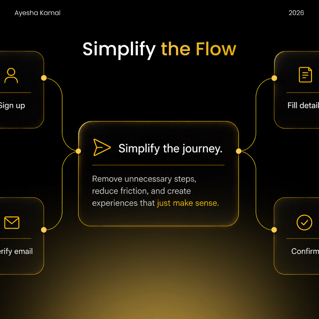
I used to think improving a user flow meant reducing the number of screens.
7 steps → 5 steps → 3 steps.
Done. Better UX.
Except that’s not always true.
A 3-step flow can feel harder than a 7-step one if every screen asks the user to make a complicated decision.
Now, when I review a flow, I’m less interested in the number of screens and more interested in the decisions we’re asking the user to make.
I look for things like:
→ Are we asking for information we already have?
→ Can two related decisions happen together?
→ Are we making users choose something they don’t understand yet?
→ Can the system provide a sensible default?
→ Did we add a confirmation because the user needs it—or because we were afraid to remove it?
Sometimes the answer is to remove a screen.
Sometimes it’s to add one so a complicated decision becomes easier.
That’s why I’ve stopped asking:
“How can I make this flow shorter?”
And started asking:
“How can I make this flow require less thinking?”
Fewer screens can look efficient.
Fewer unnecessary decisions feel efficient.
How do you decide when a step in a flow is actually necessary?
1
79
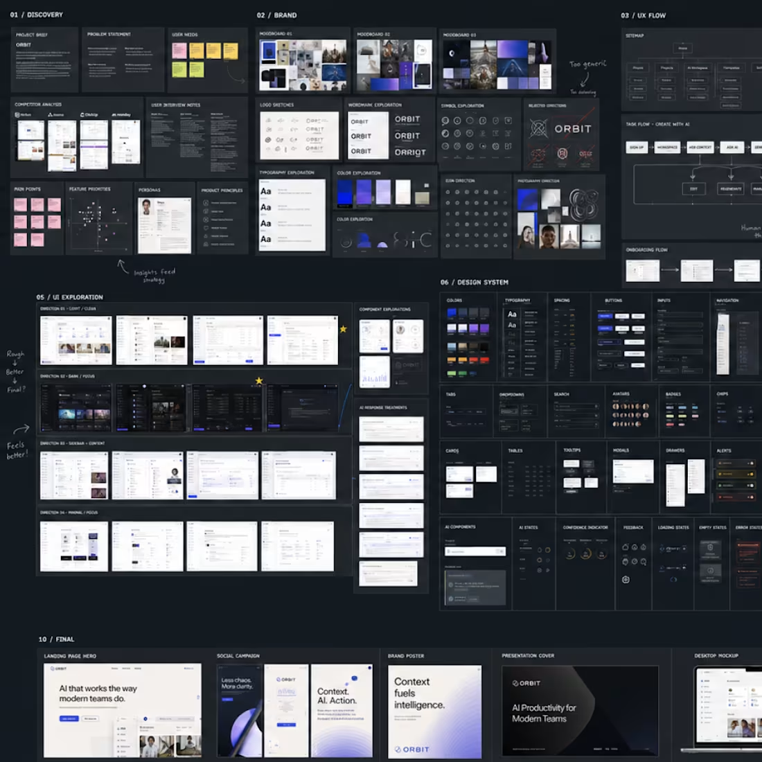
The finished case study is only a small part of the design process.
Behind it, my Figma usually looks more like this ↓
Research → visual exploration → discarded directions → UX flows → components → UI → critique → iteration → final presentation.
One thing I've changed in my process recently is designing around one strong product journey instead of trying to create as many screens as possible.
I also use AI throughout the exploration stage—to research, challenge assumptions, explore directions and move rough ideas forward faster.
But I rarely consider the first output finished.
The difficult part is still deciding:
What belongs?
What doesn't?
What needs another iteration?
And what actually solves the problem?
For me, that's where the design happens.
The polished mockups come later.
Sharing a little bit of the mess behind the final work.
0
26

Cerevo - Branding and Web design
0
5