The network for creativity
Join 1.25M professional creatives like you
Connect with clients, get discovered, and run your business 100% commission-free
Creatives on Contra have earned over $150M and we are just getting started
Back to feedPost

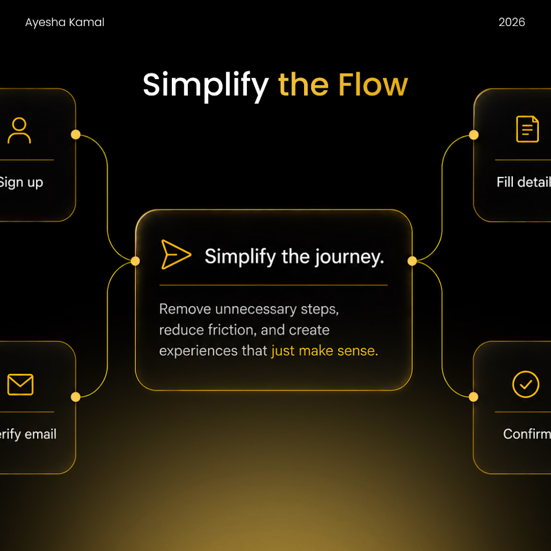
I used to think improving a user flow meant reducing the number of screens.
7 steps → 5 steps → 3 steps.
Done. Better UX.
Except that’s not always true.
A 3-step flow can feel harder than a 7-step one if every screen asks the user to make a complicated decision.
Now, when I review a flow, I’m less interested in the number of screens and more interested in the decisions we’re asking the user to make.
I look for things like:
→ Are we asking for information we already have?
→ Can two related decisions happen together?
→ Are we making users choose something they don’t understand yet?
→ Can the system provide a sensible default?
→ Did we add a confirmation because the user needs it—or because we were afraid to remove it?
Sometimes the answer is to remove a screen.
Sometimes it’s to add one so a complicated decision becomes easier.
That’s why I’ve stopped asking:
“How can I make this flow shorter?”
And started asking:
“How can I make this flow require less thinking?”
Fewer screens can look efficient.
Fewer unnecessary decisions feel efficient.
How do you decide when a step in a flow is actually necessary?

The network for creativity
Join 1.25M professional creatives like you
Connect with clients, get discovered, and run your business 100% commission-free
Creatives on Contra have earned over $150M and we are just getting started











Related posts

A flower that inflates arrives in the mail.
Next month, a phone made of shell.
STILL LIFE SERVICE. Case study dropping soon.
Which object earns your shelf? Reply below.
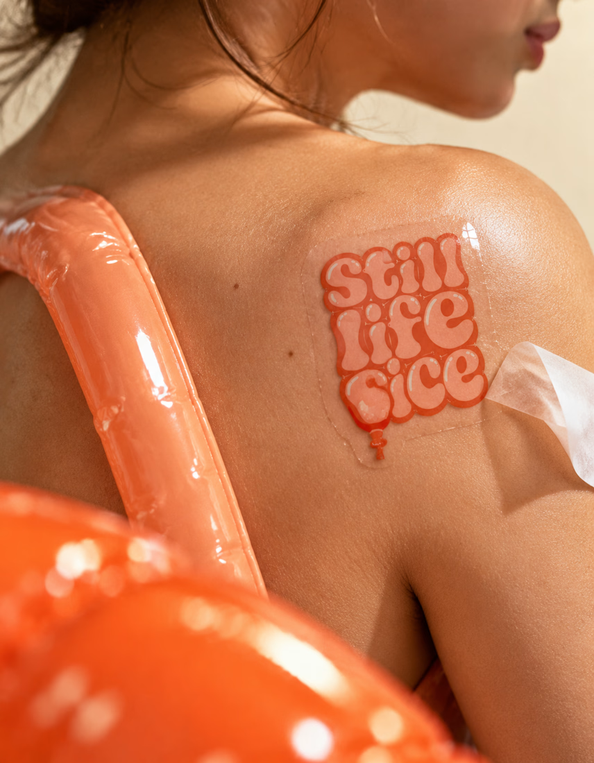

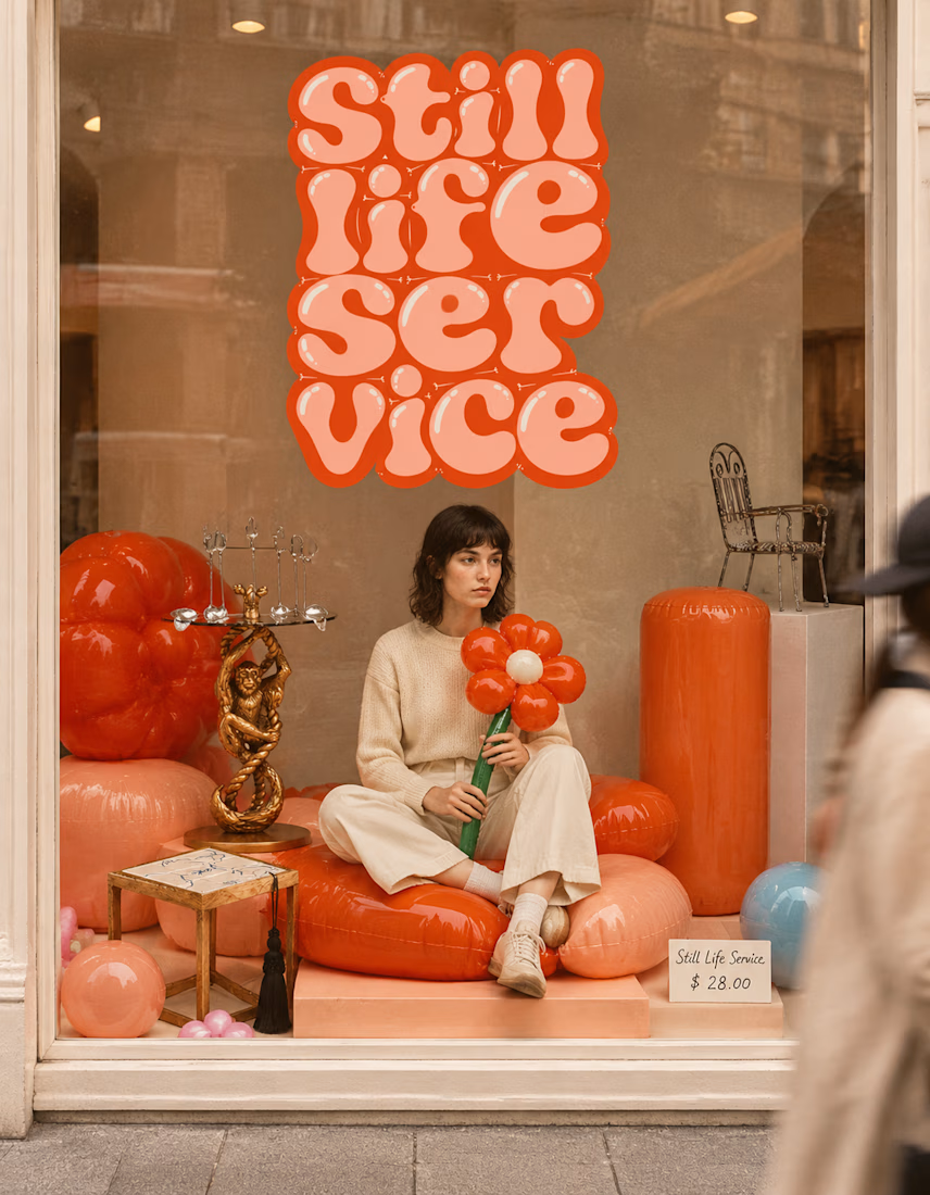

The inflatable flower. Only houseplant I'm guaranteed not to kill. Also, a new object every month is a sneaky good retention hook, people will stay subscribed just to see what's next.

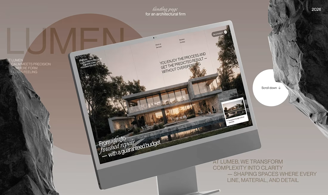
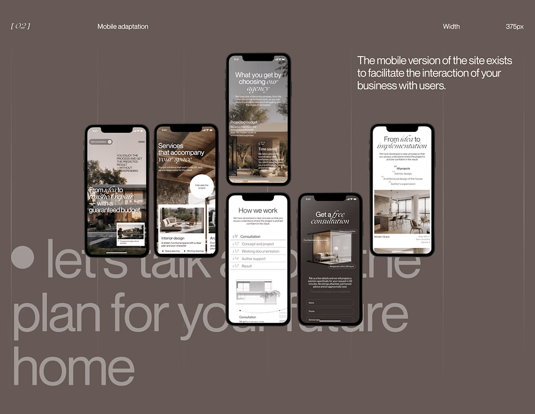
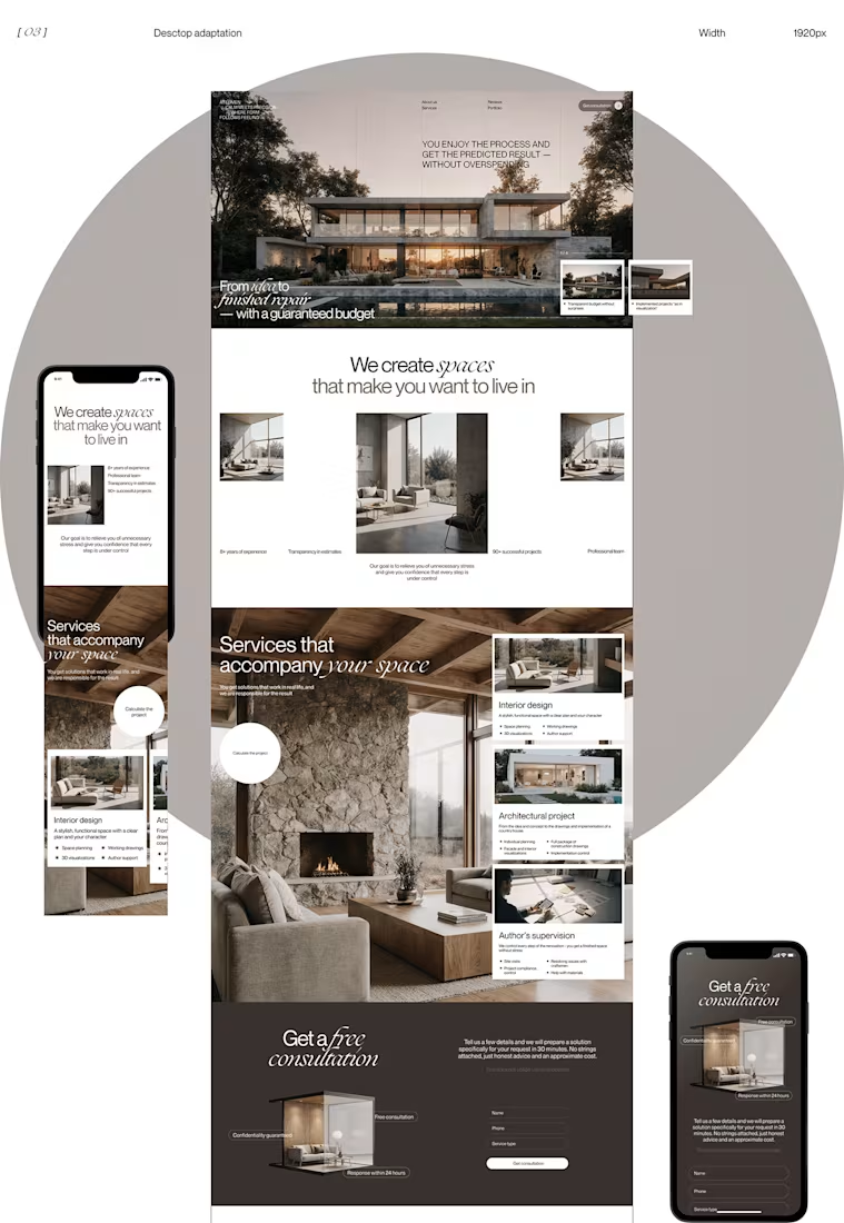
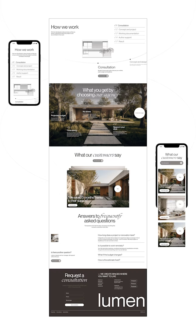
Lumen — UX/UI Design for a Premium Architecture Studio
Sometimes, the smallest details are what give a design its personality.
For Lumen, I found myself exploring how typography, architectural photography, colour, and layout could work together to tell a story before someone even starts reading.
I played with oversized text, warm brown tones, editorial layouts, and a mobile experience that carries the same visual character as the desktop design.
I especially enjoyed putting the mobile screens together. Seeing the different sections come to life on a smaller screen made the whole concept feel more complete.
It's always interesting to see how different creative decisions can change the way people experience a brand.
What's one design detail that can make you appreciate a website even before you've explored everything?
#WebDesign #CreativeDesign #UIUXDesign #Architecture


i love this soooo wellllll, i just said welll with 4 l's thats how good this is

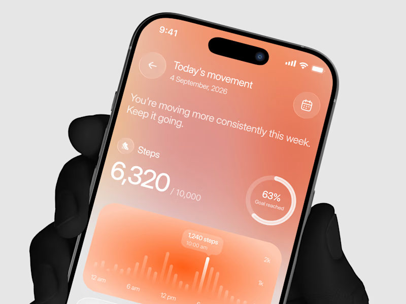
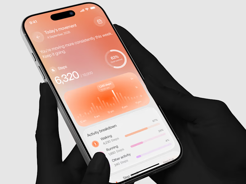
Designed a step tracking screen where you can see your daily progress and weekly trend in one glance.
Same screen, two shots. Which one would stop your scroll? 👀

11 voted
73%
4 voted
27%
15 votes
Closed
