The network for creativity
Join 1.25M professional creatives like you
Connect with clients, get discovered, and run your business 100% commission-free
Creatives on Contra have earned over $150M and we are just getting started
Back to feedPost

I stopped designing portfolio projects to look like real client projects.
I used to think a strong Product Design case study needed a lot of screens.
Dashboard.
Settings.
Profile.
Notifications.
Every possible state.
The file looked impressive.
But when I looked at it as a hiring manager might, I realized something:
More screens weren’t showing more thinking.
They were mostly showing that I could keep extending the same UI system.
So I changed how I approach portfolio projects.
Now I start with one question:
What is the most important problem this product needs to solve?
Then I build one complete journey around it.
For example:
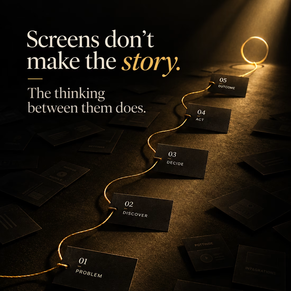
Monitor → Locate → Diagnose → Act → Verify
Five stages can tell me much more about a designer than twenty unrelated dashboard screens.
Because now I can show:
→ why the flow exists
→ what information the user needs at each point
→ what I chose to prioritize
→ what I removed
→ how one decision affects the next screen
I’ll still design additional states when they matter.
But I no longer add screens just to make the Figma canvas look impressive.
A portfolio isn't proof of how many screens you can design.
It’s proof of how you think through a problem.
That shift has made my case studies smaller but much stronger.
Designers: when reviewing a portfolio, would you rather see 20 polished screens or one deeply considered journey?
#ProductDesign #UXDesign #ProductDesigner #UXPortfolio #CaseStudy #UIUX #DesignProcess

The network for creativity
Join 1.25M professional creatives like you
Connect with clients, get discovered, and run your business 100% commission-free
Creatives on Contra have earned over $150M and we are just getting started









Related posts

Built this in Framer as a concept project. Goal was to make it feel run by ex-journalists. Choices: editorial serif (Libre Baskerville), a dark photo with one color accent, and copy that positions against blast-style PR.
Where I’m unsure: text legibility over the photo and whether the two CTAs compete. What would you change?



That's great design it feels professional I like how the background mixed with interface ❤️❤️
Great job Cheree🎉🎉

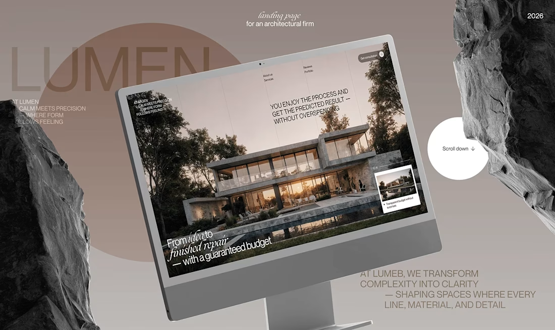
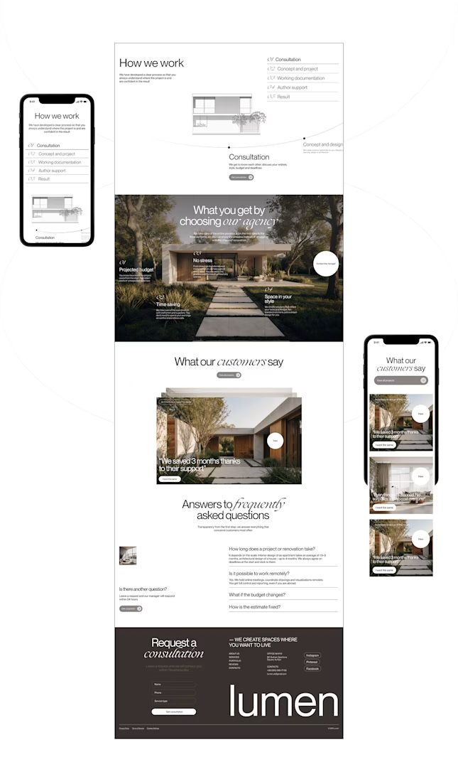
Lumen — UX/UI Design for a Premium Architecture Studio
Sometimes, the smallest details are what give a design its personality.
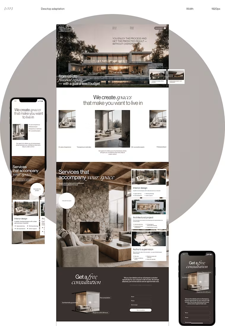
For Lumen, I found myself exploring how typography, architectural photography, colour, and layout could work together to tell a story before someone even starts reading.
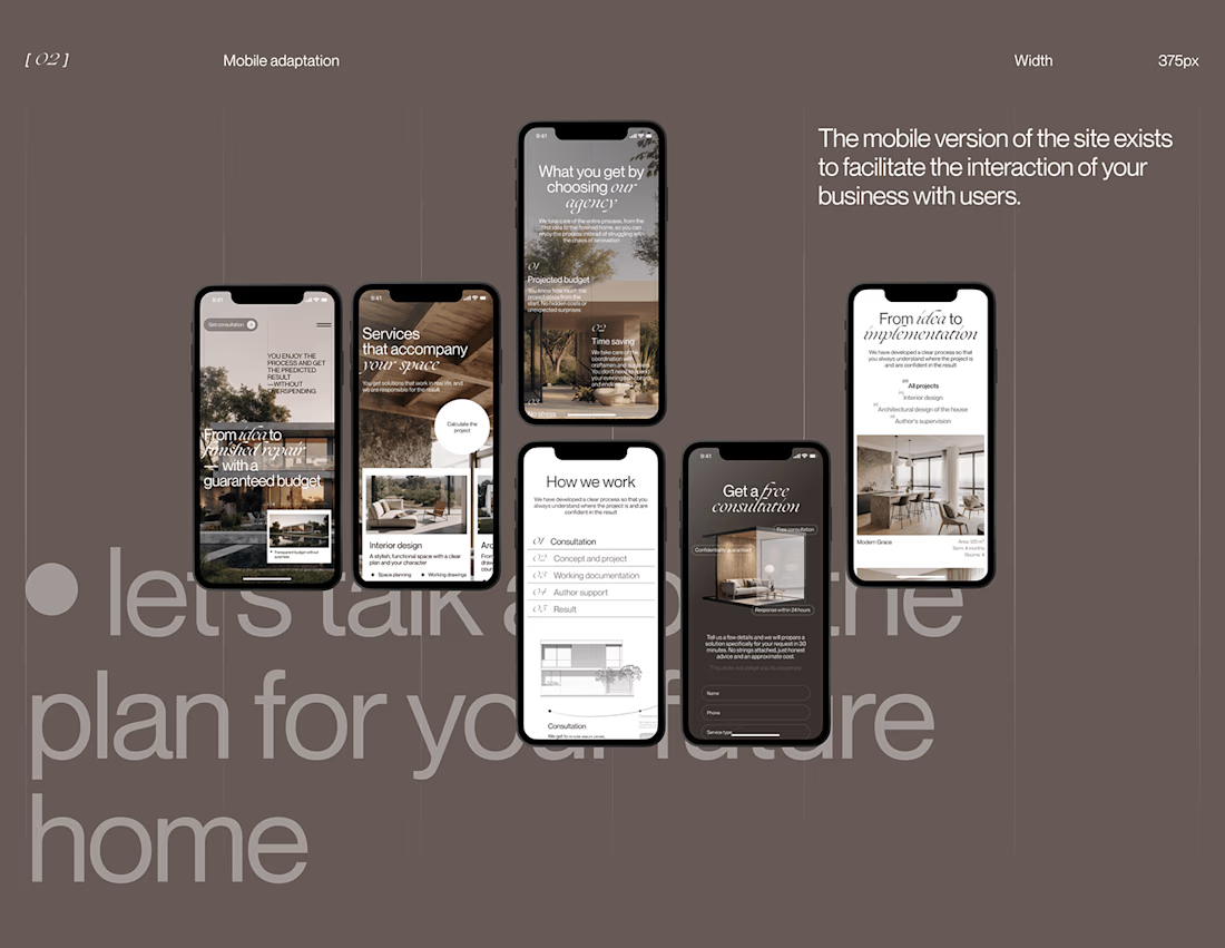
I played with oversized text, warm brown tones, editorial layouts, and a mobile experience that carries the same visual character as the desktop design.
I especially enjoyed putting the mobile screens together. Seeing the different sections come to life on a smaller screen made the whole concept feel more complete.
It's always interesting to see how different creative decisions can change the way people experience a brand.
What's one design detail that can make you appreciate a website even before you've explored everything?
#WebDesign #CreativeDesign #UIUXDesign #Architecture


i love this soooo wellllll, i just said welll with 4 l's thats how good this is

sentences
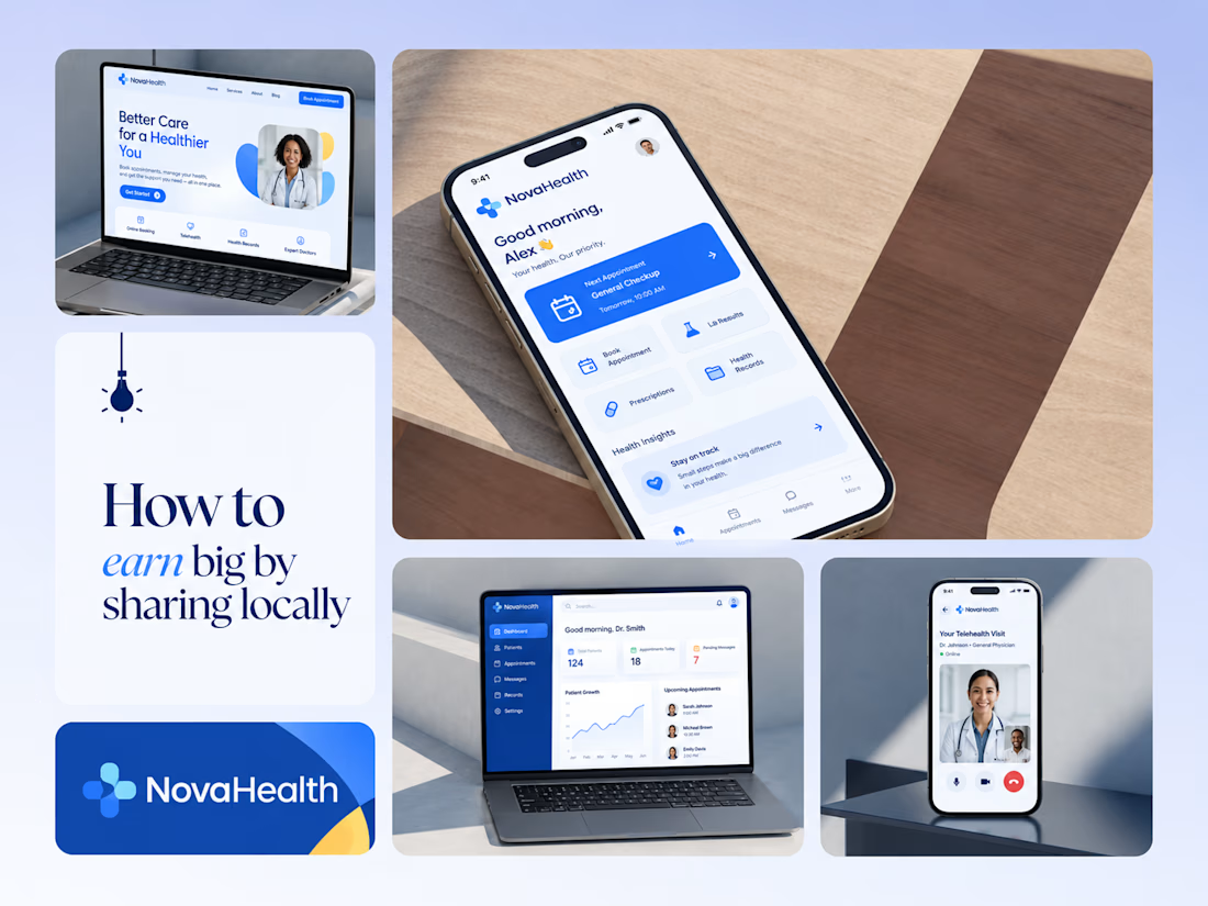
One brand, three screens: patient, doctor, and the video call between them.
NovaHealth is a healthcare brand and product system I designed from logo to apps. Healthcare software tends to feel either cold and clinical or too cluttered to open. I wanted something calm for a worried patient and quick for a doctor between appointments.
The logo breaks the classic medical cross into soft, rounded blocks in two blues, so it reads as “health” without feeling sterile.
The patient app opens with one thing: a solid blue card showing your next appointment. It’s the only fully saturated block on the screen, so nothing competes with it.
The doctor dashboard is built for a glance. Total patients, today’s appointments, and pending messages come first, in the same blue and rounded style as the patient app.
The telehealth screen has almost no UI. The doctor’s face fills the screen, with just three controls: mic, camera, and a red end-call button, the only red in the whole system.
One rule ties it together: blue means action, white space means calm, and yellow is a small spark of warmth.
Which screen should I break down next? 👇

Great medical brand design specially the phone app UI and top left laptop dashboard 🔥🔥🔥
great job Joshua ❤️🎉