
pro
Joshua Damilola
Squarespace Website Designer | Squarespace Developer


sentences
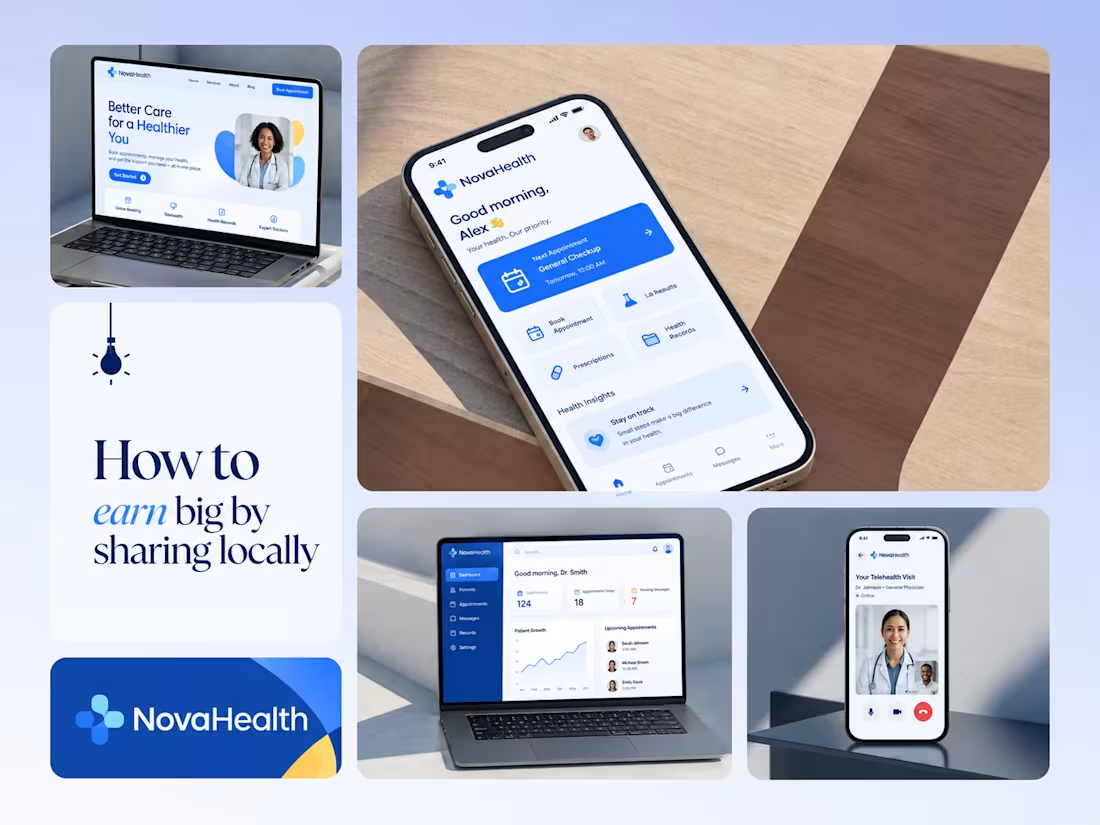
One brand, three screens: patient, doctor, and the video call between them.
NovaHealth is a healthcare brand and product system I designed from logo to apps. Healthcare software tends to feel either cold and clinical or too cluttered to open. I wanted something calm for a worried patient and quick for a doctor between appointments.
The logo breaks the classic medical cross into soft, rounded blocks in two blues, so it reads as “health” without feeling sterile.
The patient app opens with one thing: a solid blue card showing your next appointment. It’s the only fully saturated block on the screen, so nothing competes with it.
The doctor dashboard is built for a glance. Total patients, today’s appointments, and pending messages come first, in the same blue and rounded style as the patient app.
The telehealth screen has almost no UI. The doctor’s face fills the screen, with just three controls: mic, camera, and a red end-call button, the only red in the whole system.
One rule ties it together: blue means action, white space means calm, and yellow is a small spark of warmth.
Which screen should I break down next? 👇
3
49
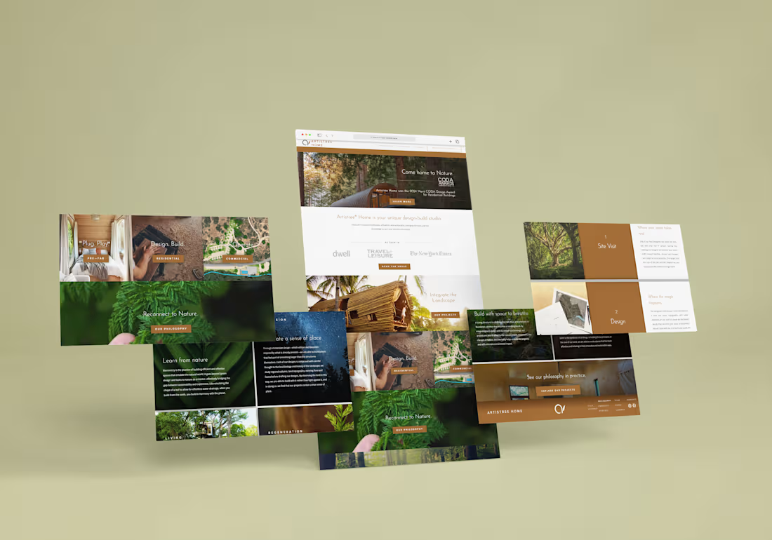
A treehouse studio shouldn't have a website that feels like a template.
Artistree Home builds treehouses and living structures that sit in the landscape instead of on top of it. Their old pitch was easy to say and hard to feel, so the site had to do the feeling.
A few decisions I'm proud of:
Each project tile gets its own verb pair. Pre-Fab is "Plug. Play." Residential is "Design. Build." Commercial is "Plan. Operate." Visitors can tell which door is theirs from one glance at the photo and two words.
Photography does the talking. A fern held between two fingers for "Reconnect to Nature." A night sky behind "Create a sense of place." A hand on raw timber for residential. Nothing is staged to look like architecture, because the point is the relationship with nature.
Copper is the only loud color. Everything else is forest green, deep shadow, or white space. The copper reads like bark and bronze and shows up only where I want a click: buttons, the process blocks, the footer.
The process is just two numbers and a tree. Site Visit and Design get big numbered copper blocks next to photos of old-growth trees and site plans. First-time clients can see what happens after they reach out before they reach out.
The philosophy section teaches without lecturing. Biomimicry is a heavy topic, so each idea gets one short paragraph over one strong image. "Learn from nature" sits over a leaf, because the example in the copy is a leaf shaping water drainage.
The result is a site where the first scroll feels like walking into the woods, and the last one ends at "See our philosophy in practice."
What would you have done differently? Genuinely curious. 👇
1
2
72
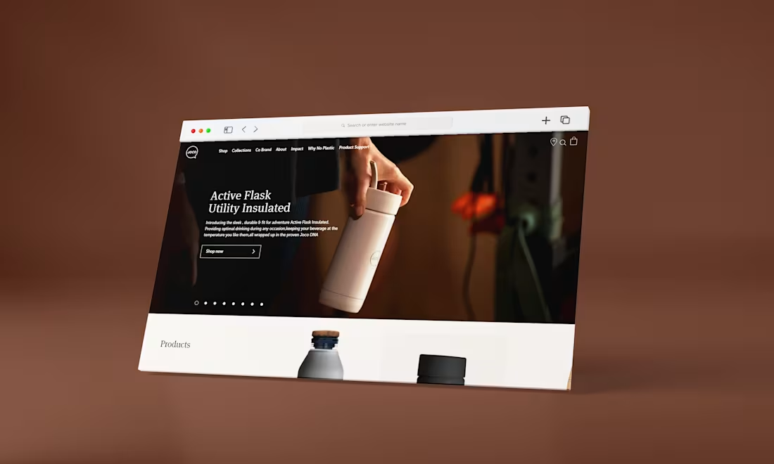
A full website design focused on making a good first impression. I paid close attention to the layout, fonts, colours and how the pages flow, so the whole site feels consistent from the first page to the last.
2
103
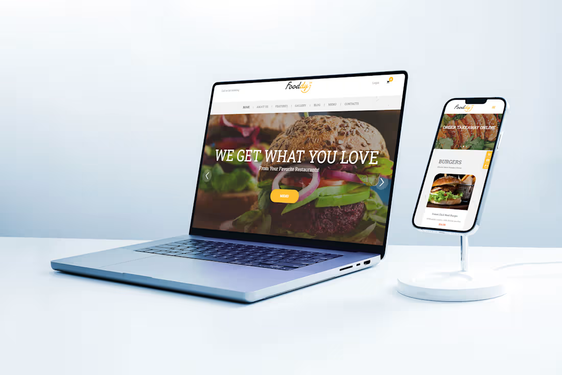
A custom Squarespace website with a few extra touches added through HTML and CSS, so the design could look exactly as planned. It looks custom, it works well on phones, and the owner can still update it without any trouble.
2
74