The network for creativity
Join 1.25M professional creatives like you
Connect with clients, get discovered, and run your business 100% commission-free
Creatives on Contra have earned over $150M and we are just getting started
Back to feedPost

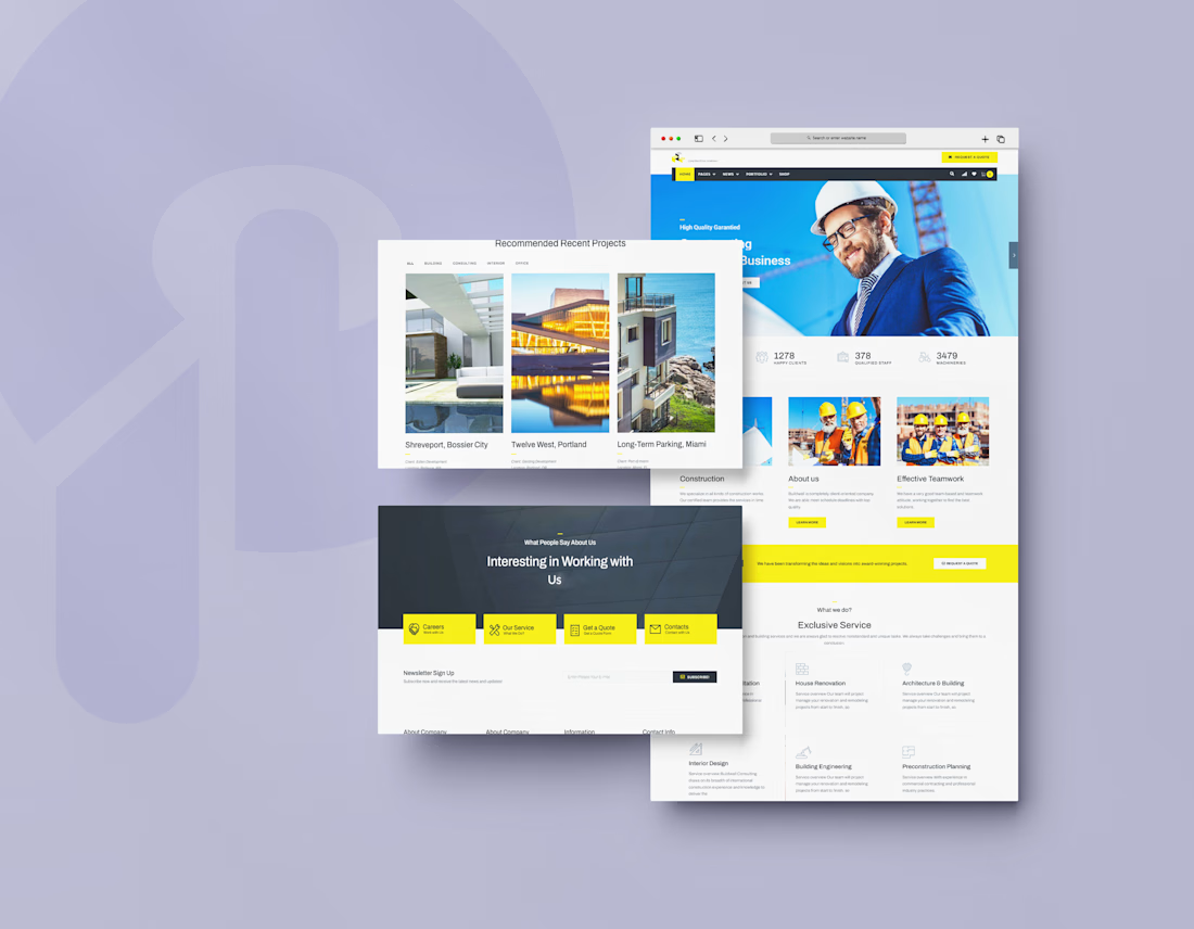
I designed the website for Buildwall, a construction company that handles building, renovation, architecture, and interior design. Contractor sites often look generic and dated. I wanted this one to feel strong, organized, and easy to trust.
The hero shows a real person. A smiling builder in a hard hat and suit sits against a bright blue background, with a "Request a Quote" button in the top bar. It signals both professionalism and approachability before anyone reads a word.
Numbers build trust fast. Right under the hero, three stats (1,278 happy clients, 378 qualified staff, 3,479 machineries) show scale at a glance.
Yellow means action. On a clean white and charcoal base, safety-yellow marks the quote buttons, the active menu tab, and the contact tiles. It nods to construction gear and tells visitors where to click.
Services are easy to scan. "Exclusive Service" lays out House Renovation, Architecture & Building, Interior Design, Building Engineering, and Preconstruction Planning as icon cards with a short line each. Visitors can tell quickly if the company does what they need.
Projects come first on a dedicated section. "Recommended Recent Projects" uses large photos with the project name, client, and location, plus filter tabs (All, Building, Consulting, Interior, Office) so visitors can find work similar to theirs.
Many paths to contact. A yellow banner repeats "Request a Quote" mid-page. Near the footer, four tiles (Careers, Our Service, Get a Quote, Contacts) and a newsletter signup catch visitors at different stages.


The network for creativity
Join 1.25M professional creatives like you
Connect with clients, get discovered, and run your business 100% commission-free
Creatives on Contra have earned over $150M and we are just getting started
Related posts

Built this free SaaS portfolio template in Framer a few months ago, and it’s been amazing to see the momentum it’s gaining! 🚀
It’s now ranked #18 in Framer’s Marketing category, bringing in more visibility, views, and commissions.
I’ve shared the full case study here, covering the project and how it came together.
Take a look if you’re curious! 🙌


This is amazing Fawaz! 🚀 Ranked #18 in Framer's Marketing category is huge! Love how you turned a free SaaS template into visibility + commissions. That's smart product thinking. Can't wait to read the full case study, congrats on the momentum!


A fresh digital identity, a premium workspace designed for creative professionals.
From an elegant, editorial-style website to a functional mobile app for bookings and studio management, the goal was to make every interaction feel as refined as the space itself.
Clean layouts, timeless typography and a deep green palette bring the whole experience together.

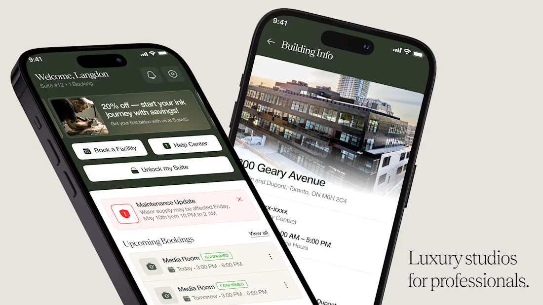
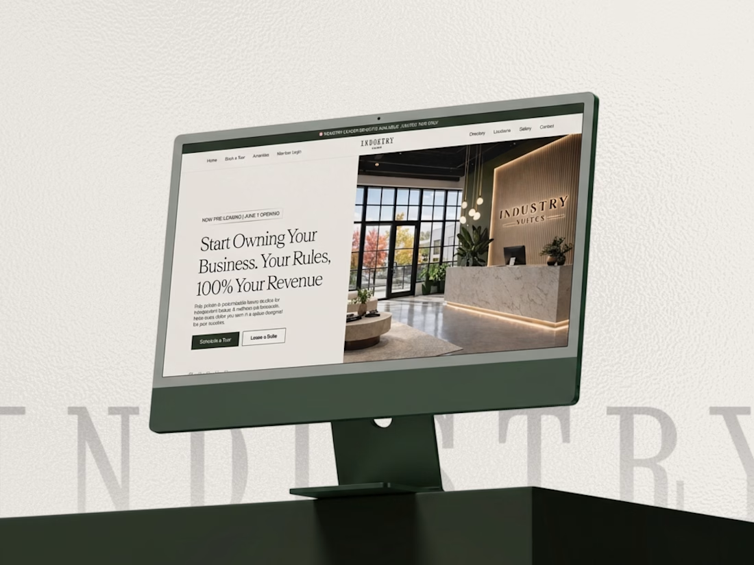
This looks super premium Kabir! Love how you carried the same refined, editorial feel from the website to the mobile app. The clean layouts and booking flow feel exactly like a high-end creative studio should - elegant but functional. The desktop + mobile mockups show the consistency really well. Great execution!

🚀 The Keel website is now live!
I designed Keel as a fintech website concept focused on presenting financial products through a clean layout, clear messaging, and a simple user experience.
I’ve also built the website in Framer. Check it out below!
🎨 Built with Framer: https://thekeel.site/
Always happy to hear your feedback!
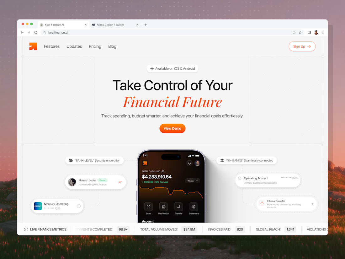
Congrats on the launch Nilkanth! Keel looks super clean — love how you kept the fintech messaging simple and focused. The "Take Control of Your Financial Future" hero with the app preview balances trust and clarity perfectly. Great job building it in Framer too!


