The network for creativity
Join 1.25M professional creatives like you
Connect with clients, get discovered, and run your business 100% commission-free
Creatives on Contra have earned over $150M and we are just getting started
Back to feedPost
Taste Test

Working on a creative studio design website, which option looks better for the section "Works"?


30 votes
Ends in 1h

B seems easier to read

Option B without any doubt😊

B for me. The staggered stack gives each project room and feels more editorial, while A's thumbnail strip reads more like a gallery viewer. Would B show project names on hover, or keep them fixed in the left column?
Thanks for the feedback Steven! Yes, you are right, the project names and description would be on the left

B 🔥

Staggered stack wins, every project breathes.
The network for creativity
Join 1.25M professional creatives like you
Connect with clients, get discovered, and run your business 100% commission-free
Creatives on Contra have earned over $150M and we are just getting started






Related posts

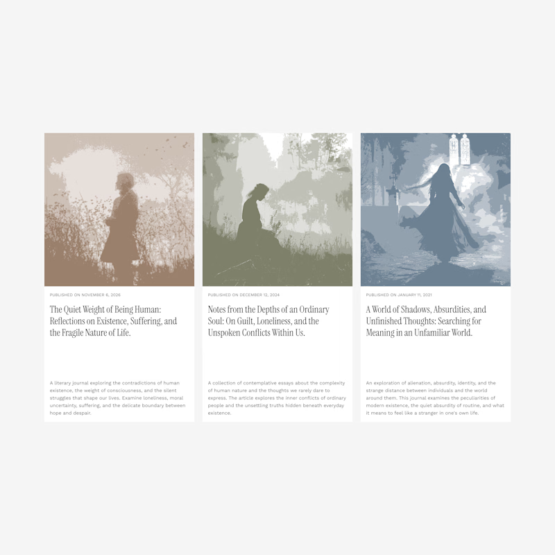
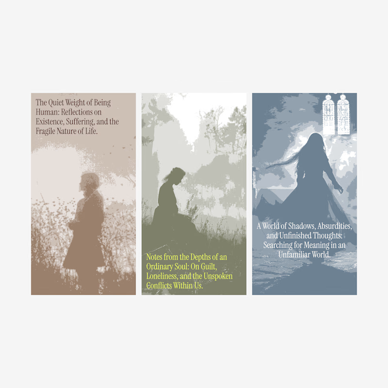
Blog card design.
Which one of these looks better?
1 voted
7%
13 voted
93%
14 votes
Closed

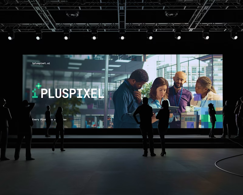
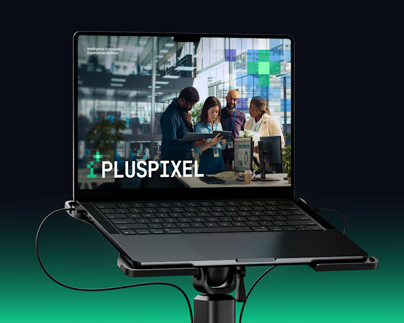
Same content, two different settings.
One designed to be seen on a big conference screen, the other experienced through a compact device. It's interesting how the same visuals can feel different depending on where they show up.
Which setting do you think brings the content to life better?
4 voted
57%
3 voted
43%
7 votes
Closed
Big screen 🔥

Exploring a few different hero directions for Frame 18.
Which one would you go with, A or B, and why?
Would love to hear your thoughts before I finalize the design!
#webdesign #uiux #framer #websitedesign #designfeedback
9 voted
50%
9 voted
50%
18 votes
Closed

A for me. The portrait grid shows the range of work right away, though B has the stronger first impression.