
pro
Joshua Damilola
Squarespace Website Designer | Squarespace Developer


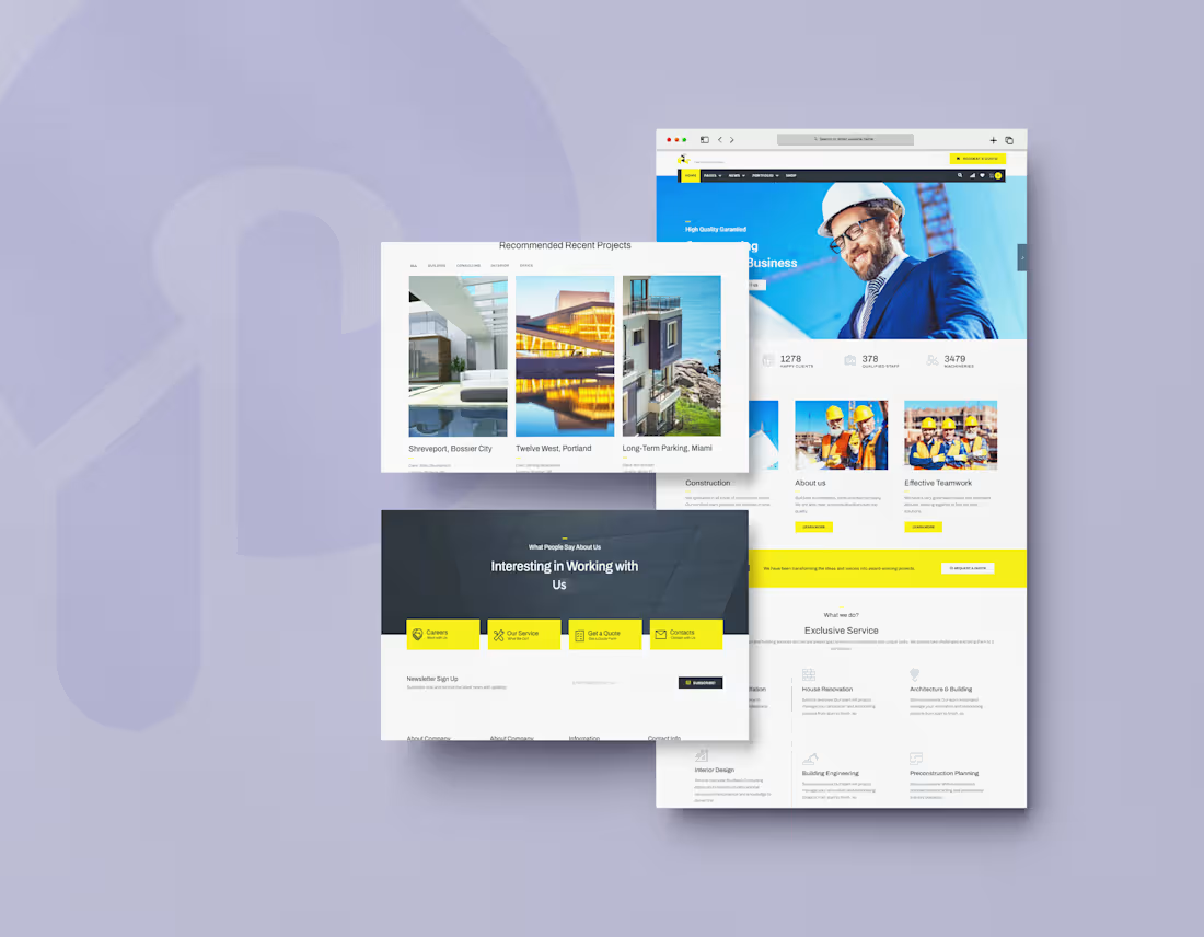
I designed the website for Buildwall, a construction company that handles building, renovation, architecture, and interior design. Contractor sites often look generic and dated. I wanted this one to feel strong, organized, and easy to trust.
The hero shows a real person. A smiling builder in a hard hat and suit sits against a bright blue background, with a "Request a Quote" button in the top bar. It signals both professionalism and approachability before anyone reads a word.
Numbers build trust fast. Right under the hero, three stats (1,278 happy clients, 378 qualified staff, 3,479 machineries) show scale at a glance.
Yellow means action. On a clean white and charcoal base, safety-yellow marks the quote buttons, the active menu tab, and the contact tiles. It nods to construction gear and tells visitors where to click.
Services are easy to scan. "Exclusive Service" lays out House Renovation, Architecture & Building, Interior Design, Building Engineering, and Preconstruction Planning as icon cards with a short line each. Visitors can tell quickly if the company does what they need.
Projects come first on a dedicated section. "Recommended Recent Projects" uses large photos with the project name, client, and location, plus filter tabs (All, Building, Consulting, Interior, Office) so visitors can find work similar to theirs.
Many paths to contact. A yellow banner repeats "Request a Quote" mid-page. Near the footer, four tiles (Careers, Our Service, Get a Quote, Contacts) and a newsletter signup catch visitors at different stages.
1
66
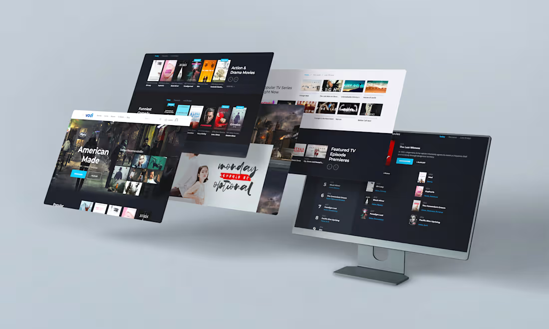
I designed the website for Vodi, a streaming platform for movies and TV shows. Streaming sites can feel like endless grids of posters, so I focused on making browsing feel fast, cinematic, and easy to scan.
The hero sells one title. A full-width featured film, "American Made," fills the top with its genre, runtime, and two buttons: a bright blue "Watch Now" and a quieter "+ Playlist." Beside it, "Today's Recommendation" shows a small poster grid for people who want options.
Dark by default. A deep navy background lets the posters carry the color, the way a cinema works. Light sections break up the page, so it doesn't feel heavy.
One accent color. Bright blue is used for the main buttons, active tabs, and "Featured" tags. It's the only color that isn't a poster, so the eye lands on the action.
Browsing made simple. Each row has a clear label, like "Action & Drama Movies," "Funniest Comedy," and "Featured TV Episode Premieres." Time tabs (Today, This week, Last 30 days) let visitors change what's trending in one tap, and arrows and "View All" keep rows from getting overwhelming.
Rankings that are easy to read. The numbered list on the desktop view shows rank, year, title, and genre in one line, so people can scan what's popular without opening anything.
A clean top bar. Browse, Home, Movies, TV Shows, and Blog, plus search and upload, keep the whole site one click away.
1
95
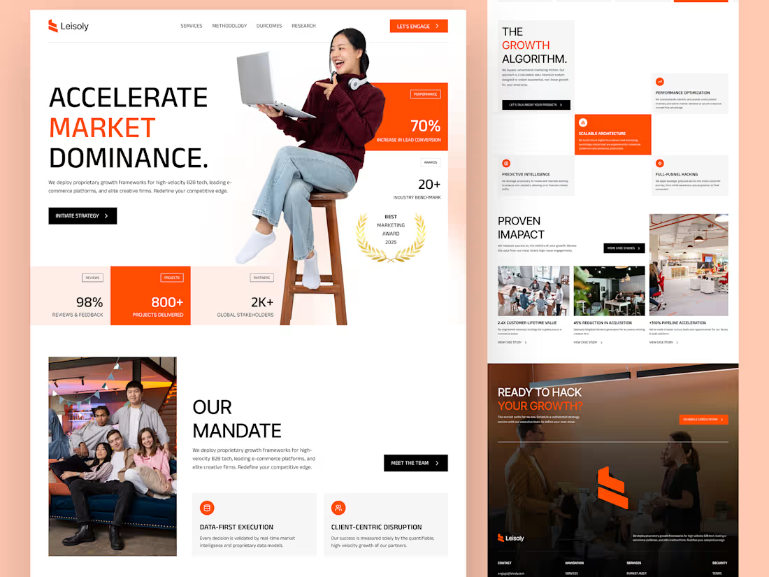
I designed the website for Leisoly, a growth marketing agency for B2B tech, e-commerce, and creative firms. Agency sites tend to be either vague or buried in jargon. I wanted this one to feel bold, sharp, and built on numbers.
The headline takes a stand. “Accelerate Market Dominance.” sits in large, heavy type, with the middle word in orange. One short paragraph says who the agency serves, and one black button, “Initiate Strategy,” gives the next step.
Proof is part of the hero. Instead of hiding results lower down, the first screen shows a 70% increase in lead conversion, a 20+ industry benchmark, a 2025 Best Marketing Award badge, and a stats row (98% reviews, 800+ projects, 2K+ global stakeholders). Credibility lands before the first scroll.
Orange is the only loud color. On a white and soft grey base, orange marks the key numbers, the active cards, and the main buttons. Black handles the secondary actions, so the eye always knows where to go.
Services are shown as a grid, not a list. “The Growth Algorithm” breaks the offer into four cards: Performance Optimization, Scalable Architecture, Predictive Intelligence, and Full-Funnel Hacking. Each has an icon and a short line, and one card is highlighted in orange for rhythm.
Case studies come with numbers. “Proven Impact” pairs photos with results such as 2.4X customer lifetime value, 45% reduction in acquisition cost, and +310% pipeline acceleration, each with a “View Case Study” link.
A human side. “Our Mandate” adds a team photo and two core values, Data-First Execution and Client-Centric Disruption, so the data-heavy brand still feels like people.
A strong close. The final dark section, “Ready to hack your growth?”, flips the page to a moody photo with one orange “Schedule Consultation” button.
1
152
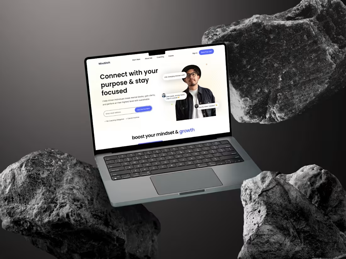
I designed the website for MindShift, a coaching brand for driven people who want to break mental blocks and stay focused. Coaching sites often lean on vague, motivational language, so I wanted this one to feel clear, calm, and credible.
The headline names the outcome. “Connect with your purpose & stay focused” leads, followed by one plain sentence on who the coach helps and how. Visitors know within seconds if the site is for them.
A low-pressure first step. The hero has one email field and a “Get Started Now” button. Right under it, “No Coaching Obligation” and “Cancel Anytime” remove the fear of committing before someone has even joined the list. A “Book Free Call” button in the navigation gives warmer visitors a faster route.
Real faces and real words. The coach’s portrait sits in the hero, with short client quotes floating beside it, like “Life-changing mindset shift!” and “Clear goals, strong habits. I feel in control.” Proof appears in the first view instead of lower down.
Color with purpose. The page is clean white, with a single indigo-blue used for the buttons and the word “growth” in the next headline. The eye goes where the action is.
A simple menu. Start Here, About Me, Coaching, and Events cover the whole journey from curiosity to booking.
3
197