
pro
Austyn McFadden
Brand, Web & Product Designer Building Better Experiences
Ready for work
Austyn is ready for their next project!

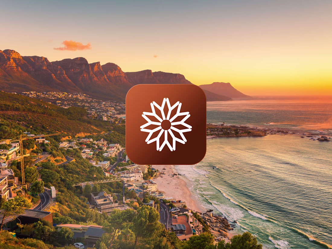
This logo mark began with research into South African heritage. I kept returning to the country’s flag, especially the green Y-shaped form at its center. I isolated that shape, refined it, and rotated it around a central axis until each piece aligned into one balanced symbol.
The...
Currently designing and building a custom web app for a friend that works as an alternative to platforms like PhotoShelter and SmugMug.
It’s becoming easier for people to replace expensive monthly tools with products built specifically around their own workflow, features, and...

I built a custom team platform for Undrafted to bring its contributor operations into one place.
Photographers can request open assignments, manage upcoming coverage, submit their photos for editorial review, access team resources, connect with other contributors, and search for...
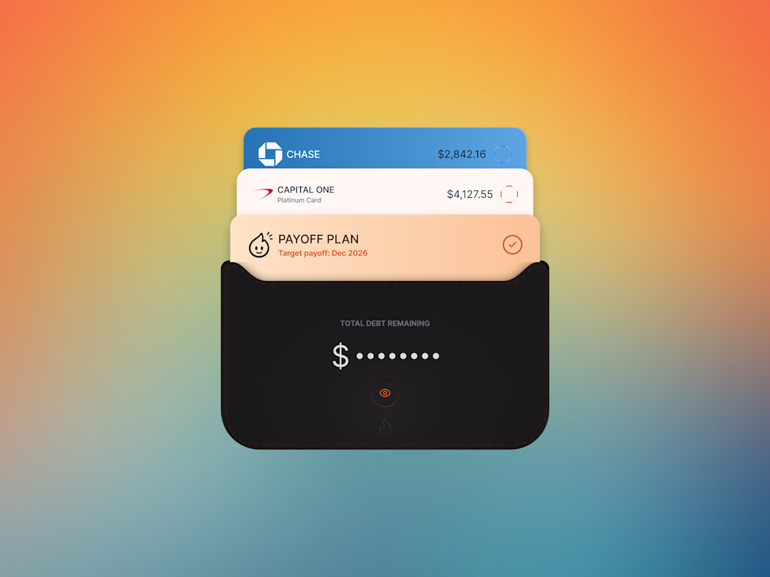
Final wallet design for Ember, created 100% in Figma.
Every detail was built from scratch, from the layered cards and stitched pocket effect to the shadows, gradients, embossed details, and small UI moments throughout.
Really proud of how this one came together.
Can Fable 5 create this level of detail?
Probably.
Can it decide which details actually matter?
That's still where designers earn their keep.
Every shadow, stitch, corner radius, and pocket was refined until it felt believable.