Gm Design studio
ART DIRECTOR | Branding, Packaging & Visual Identity


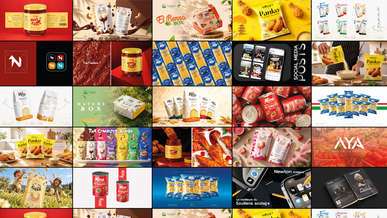
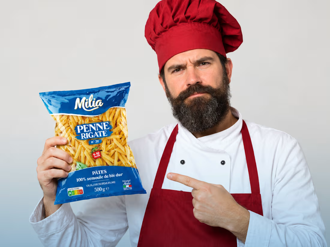
Milia — Packaging Design & Art Direction
Packaging design and art direction for Milia’s pasta range, developing a cohesive brand identity through bold typography, color hierarchy, and product differentiation across 11 pasta shapes. Designed to balance shelf impact, brand consistency, and consumer appeal ahead of its launch on the French market in late September 2026.
🔗 Explore the full project on Behance: https://www.behance.net/gallery/253093687/MILIA-Premium-Pasta-Packaging-Design
2
98
Yousr — Hot Sauce Brand Identity & Packaging Design
Turning bold flavor into a bold visual identity.
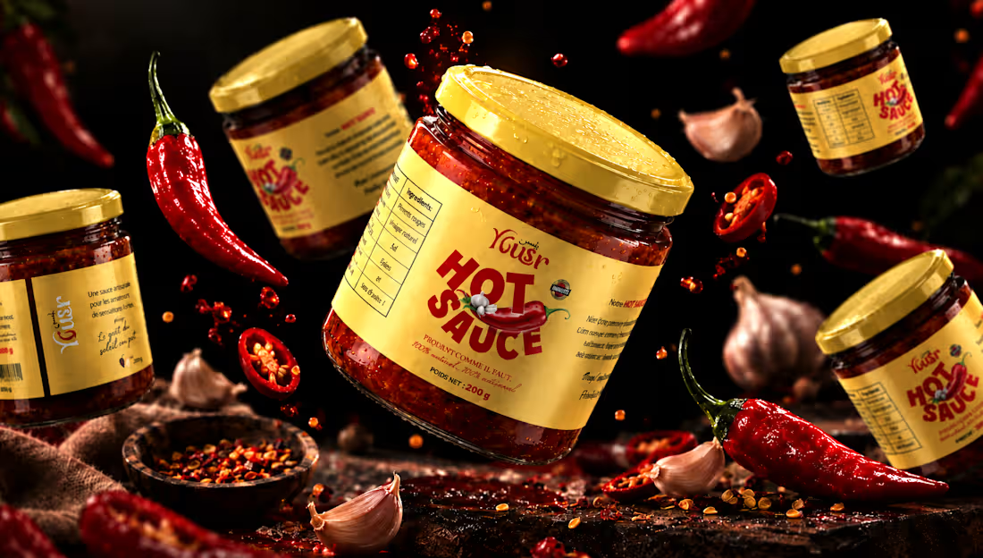
Yusr Hot Sauce is a food packaging project created to translate the intensity, heat, and character of the product into a striking visual experience.
The packaging combines a warm, distinctive color palette with bold typography and expressive graphic elements, creating an identity that immediately communicates the product's spicy and authentic character.
The visual direction was developed around the contrast between the rich red tones of the chili sauce and the warm cream of the label, creating a strong and recognizable presence across the product range.
From the label design to the final product presentation, every element was carefully considered to enhance the product's personality while maintaining clarity and brand consistency.
The final art direction brings the packaging to life through a dramatic food-focused environment, using rich textures, controlled lighting, and carefully composed ingredients to create an appetizing and memorable product experience.
A packaging identity designed to capture attention, communicate flavor, and give Yusr Hot Sauce a distinctive presence.
View the full project : https://www.behance.net/gallery/255675391/Yousr-Hot-Sauce-Brand-Identity-Packaging-Design
#PackagingDesign #FoodPackaging #HotSauce #LabelDesign #FoodBranding #ProductDesign #ArtDirection
15
31
1.6K
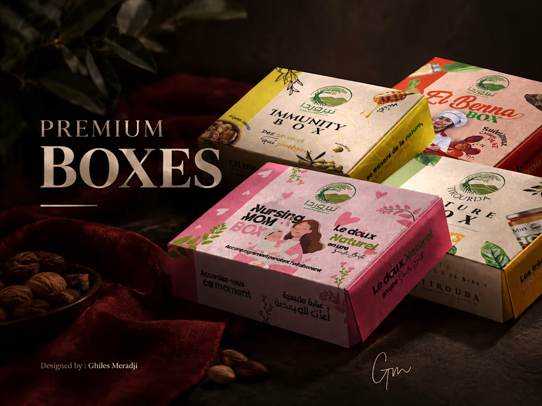
Premium boxes collection design - TIROURDA nature
Creating packaging that turns products into experiences.
Premium Boxes Collection is a packaging design project developed to create a distinctive and cohesive visual identity across a range of premium food products.
The concept explores how color, typography, illustration, and composition can work together to give each box its own personality while maintaining a consistent connection across the collection.
From the initial visual direction to the final packaging applications, every element was carefully designed to balance visual impact, product communication, and brand recognition.
The collection combines bold color palettes with refined graphic details to create packaging that feels contemporary, engaging, and memorable.
A packaging system designed to make each product stand out while creating a strong and recognizable collection.
View the full project : https://www.behance.net/gallery/252928497/Premium-boxes-collection-design-TIROURDA-nature
#PackagingDesign #FoodPackaging #BoxDesign #PackagingBranding #ProductDesign #GraphicDesign
2
174
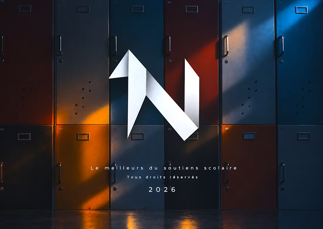
Newton Academy — brand Identity
Building structure into a modern educational identity.
Newton Academy’s visual identity was developed around the idea of precision, structure, and clarity — translating the academic nature of the brand into a contemporary visual language.
From the geometric construction of the logo to the typography, color palette, and brand applications, every element was designed to work as part of one consistent system.
The result is an identity built to feel clear, modern, and recognizable across both digital and educational environments.
VIEW THE FULL PROJECT: https://www.behance.net/gallery/255637955/Newton-Academy-brand-Identity
#BrandIdentity #LogoDesign #ArtDirection #BrandDesign
1
191