Alamgir Brands
Crafting Visual Identity for Tech Startups.


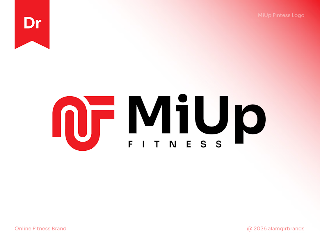
MiUp Fitness: Logo Design
I built the symbol from the letters M, U and F, drawn as one continuous line. The M's arches flow into the U and the F's arms reach out to the right, giving a sense of upward movement that fits the "Up" in the name.
Bold red adds energy, and black keeps...
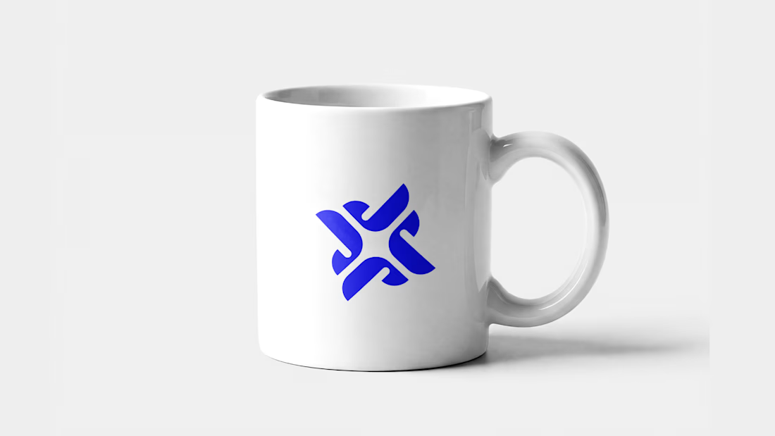
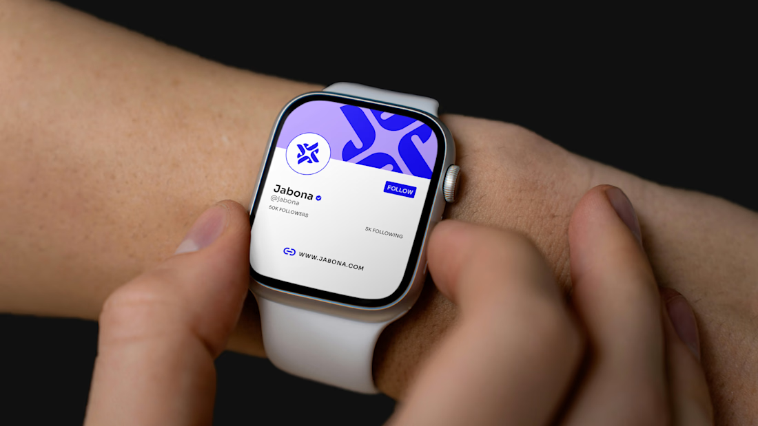
Jabona: a J that sparks ⚡
A logo concept where the letter J meets a spark. Interlocking curves rotate into a bold, energetic mark that feels alive and stays sharp at any size.
Made for AI and tech brands that want to stand out. Available as a one-time exclusive purchase.
📩 Message me to claim it.
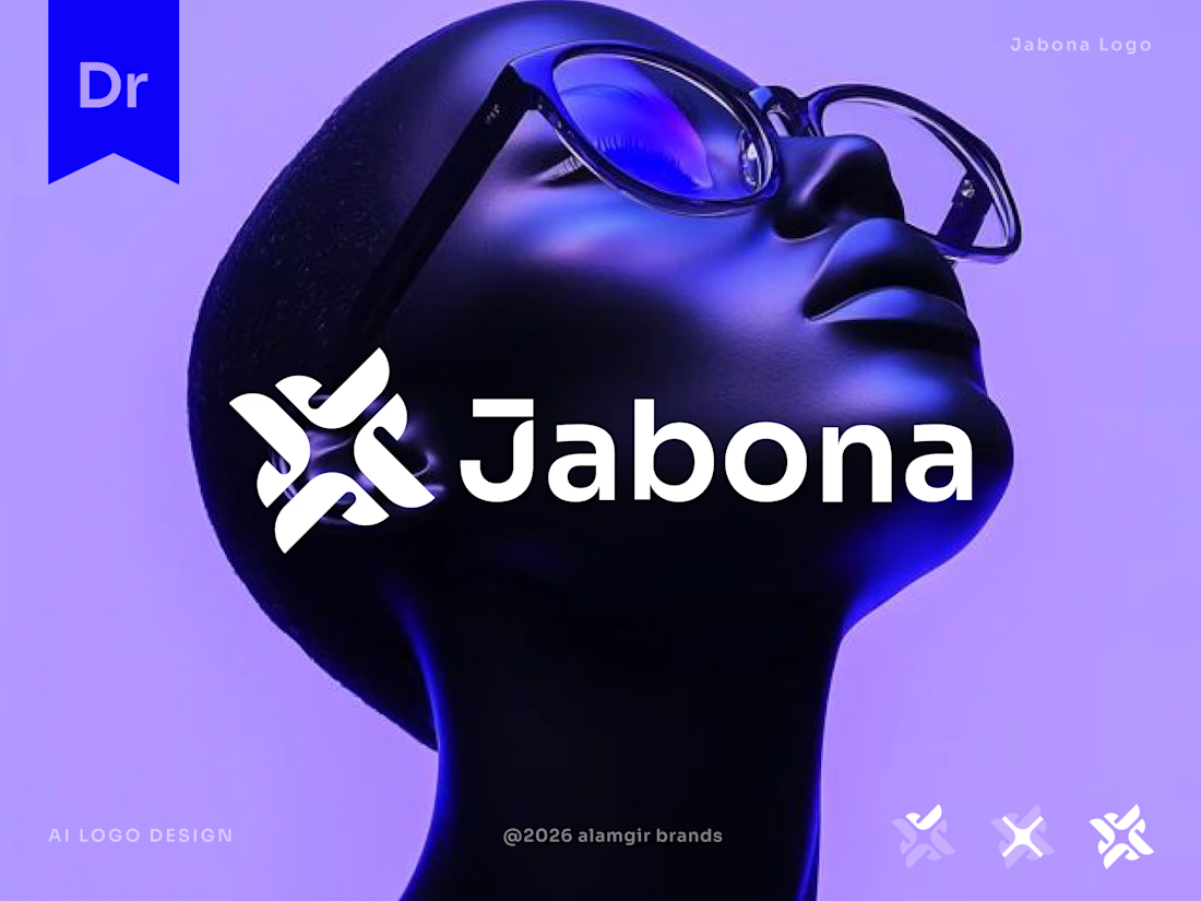
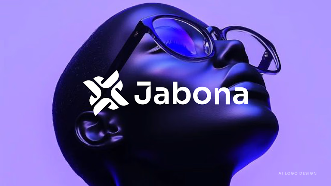
I designed Jabona as a logo for a fast-moving AI product that still needed to feel calm.
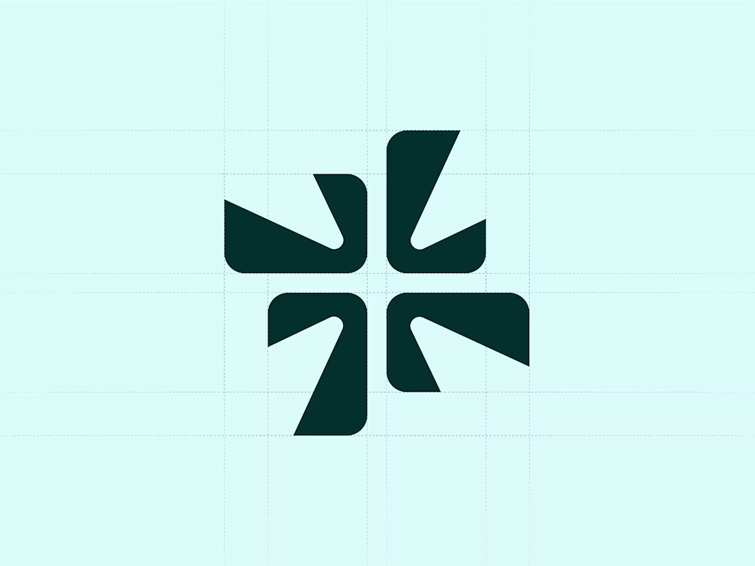
The mark is built from four rounded J shapes. They rotate around a small gap in the center, which makes a spark. It looks like motion, but it's balanced and steady. I wanted it to feel quick...


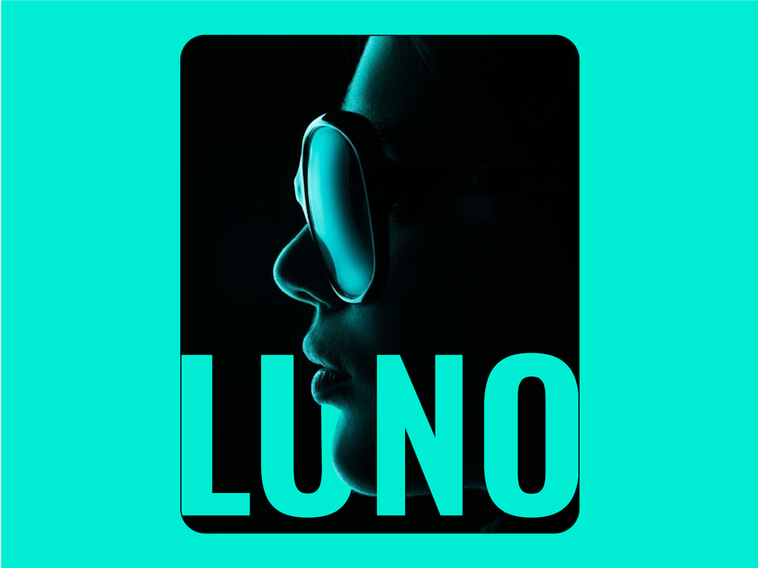
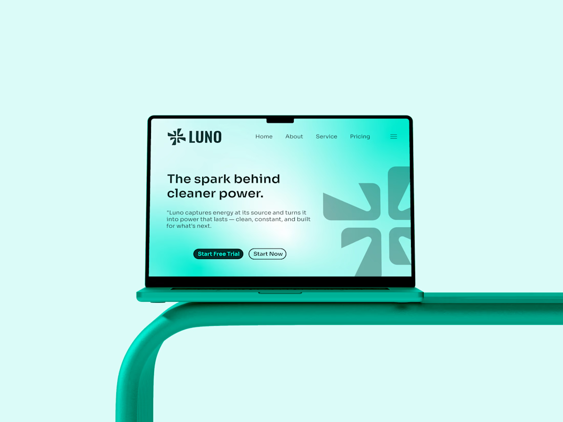
I noticed clean energy brands were either too crunchy, nobody made renewable power feel simple and exciting.
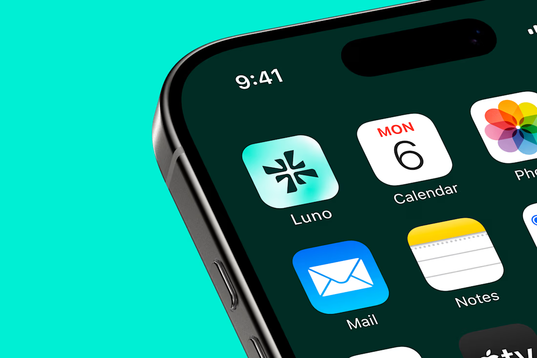
I designed Luno to be the spark that starts something bigger - clean, direct and confident. Energy without the noise.
I merged a spark with the letter "L". Four blades...