Alamgir Brands
Crafting Visual Identity for Tech Startups.


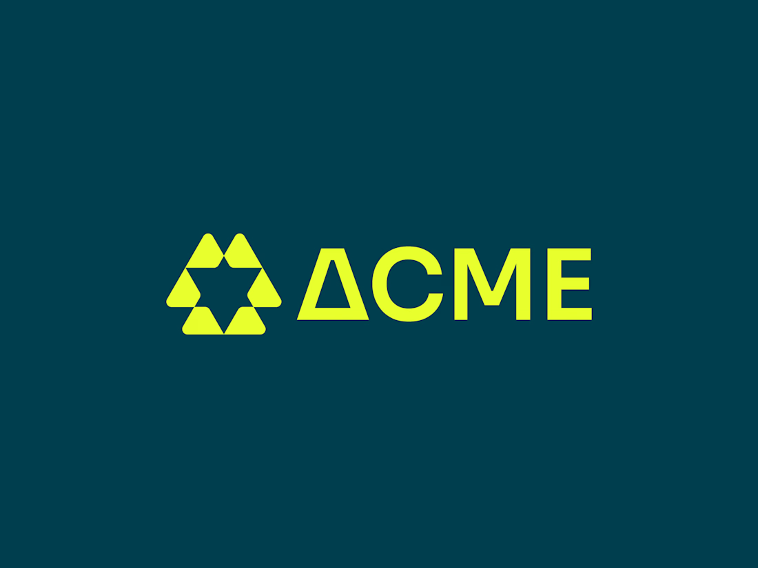
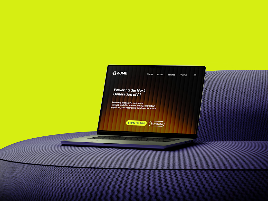
I noticed AI infrastructure brands were either cold and over-technical or stuck in the same glowing neural-network look. Nobody made the power behind AI feel solid and human.
I designed Acme to be the backbone teams build on: confident, precise and built to scale. Infrastructure...
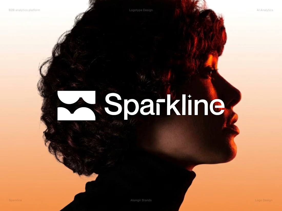
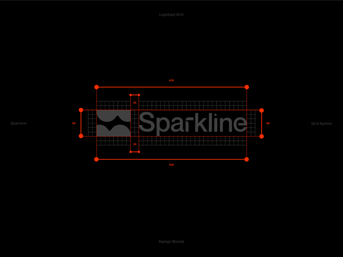
Sparkline is a concept identity I designed for a B2B AI analytics platform. A sparkline is a tiny, clear trend line, and a spark is the moment of insight, so I wanted the logo to feel both precise and energetic.
I built the symbol from the letter S, using two mirrored arc forms...


MiUp Fitness: Logo Design
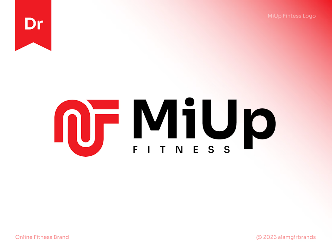
I built the symbol from the letters M, U and F, drawn as one continuous line. The M's arches flow into the U and the F's arms reach out to the right, giving a sense of upward movement that fits the "Up" in the name.
Bold red adds energy, and black keeps...
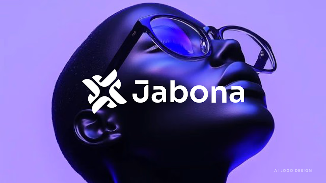
I designed Jabona as a logo for a fast-moving AI product that still needed to feel calm.
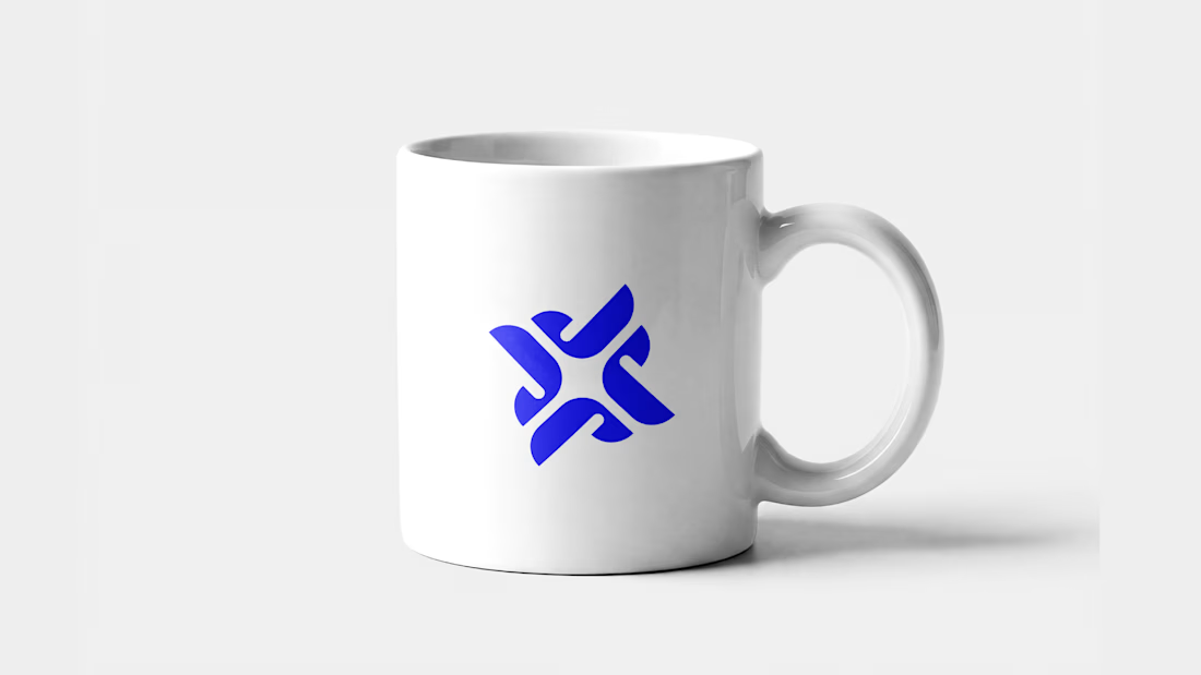
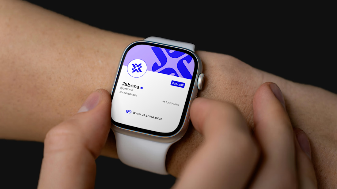
The mark is built from four rounded J shapes. They rotate around a small gap in the center, which makes a spark. It looks like motion, but it's balanced and steady. I wanted it to feel quick...