
Adegbuyi Adeoluwa
Product Designer/ Framer & Figma expert
Ready for work
Adegbuyi is ready for their next project!
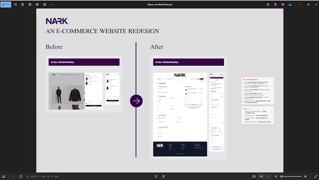
Before → After: Order Page Redesign (NARK)
The original order page lacked structure and clarity. Some key information like pricing, delivery details, and next actions were not clearly prioritized, making it harder for users to confidently complete their purchase.
In the redesign, I focused on improving visual hierarchy, simplifying the layout, and making decision-making effortless.
Key improvements:
Clear breakdown of order details and pricing
Stronger call-to-action placement for faster checkout
Better spacing and alignment for easier scanning
Improved visibility of delivery and payment information
Overall cleaner, more trustworthy interface
The goal was simple:
Reduce friction, increase clarity, and help users complete their orders with confidence.
0
20
Redesigning the NARK category page with my focus on clarity, structure, and better product discovery.
Simplifying the experience so users can browse, decide, and act without friction.
2
2
40
Rounding up the case study for anE-commerce ongoing project that just went through development to live...
https://narkstore.com/
1
48
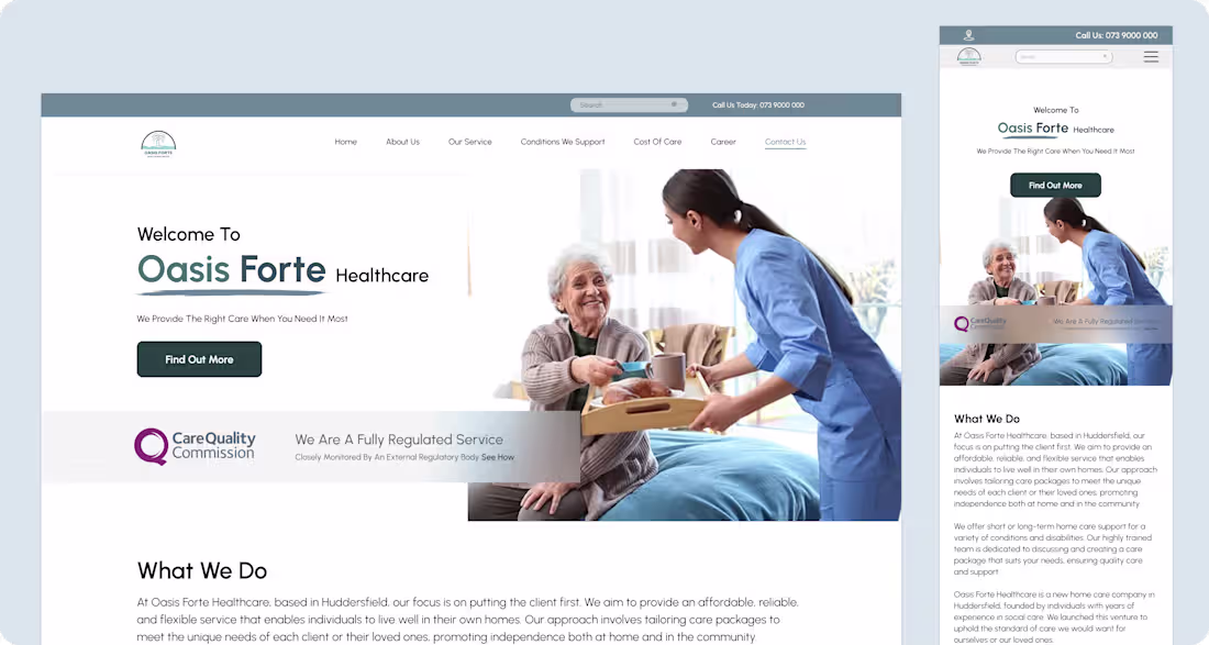
Oasis Forte Healthcare Website Design
0
6
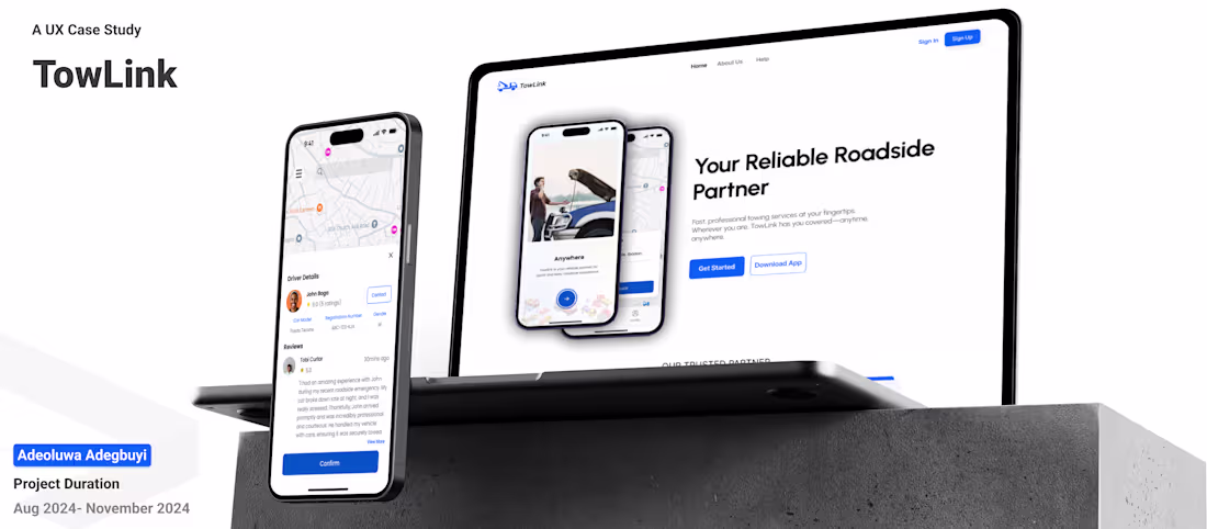
TowLink (Roadside Assistance and Vehicle Transport)
0
6
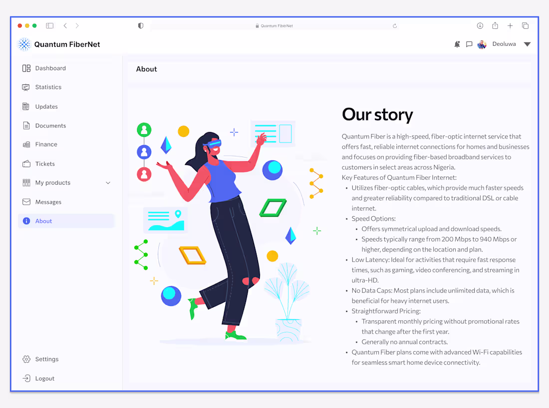
QUANTUM FIBER INTERNET SERVICE
0
0
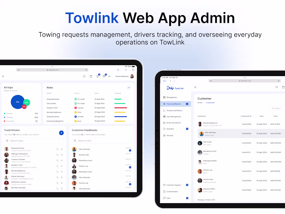
Towlink WEBAPP ADMIN DASHBOARD DESIGN :: Behance
0
3
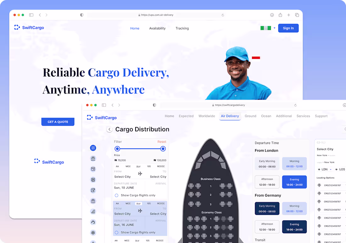
SwiftCargo :: Behance
0
10
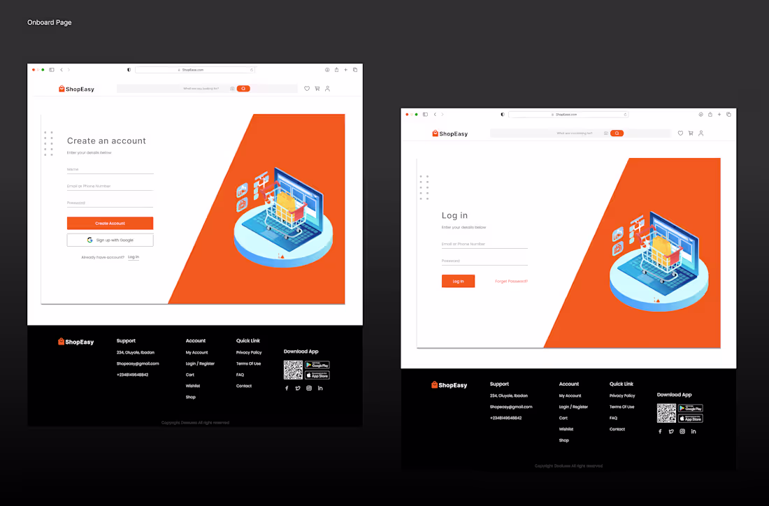
ShopEasy. An E-commerce Website
0
5
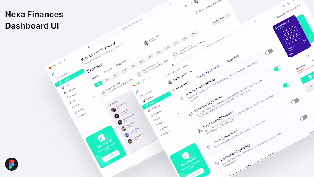
Nexa Finance :: Behance
0
8