The network for creativity
Join 1.25M professional creatives like you
Connect with clients, get discovered, and run your business 100% commission-free
Creatives on Contra have earned over $150M and we are just getting started
Back to feedPost
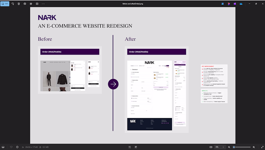
Before → After: Order Page Redesign (NARK)
The original order page lacked structure and clarity. Some key information like pricing, delivery details, and next actions were not clearly prioritized, making it harder for users to confidently complete their purchase.
In the redesign, I focused on improving visual hierarchy, simplifying the layout, and making decision-making effortless.
Key improvements:
Clear breakdown of order details and pricing
Stronger call-to-action placement for faster checkout
Better spacing and alignment for easier scanning
Improved visibility of delivery and payment information
Overall cleaner, more trustworthy interface
The goal was simple:
Reduce friction, increase clarity, and help users complete their orders with confidence.
The network for creativity
Join 1.25M professional creatives like you
Connect with clients, get discovered, and run your business 100% commission-free
Creatives on Contra have earned over $150M and we are just getting started
Related posts
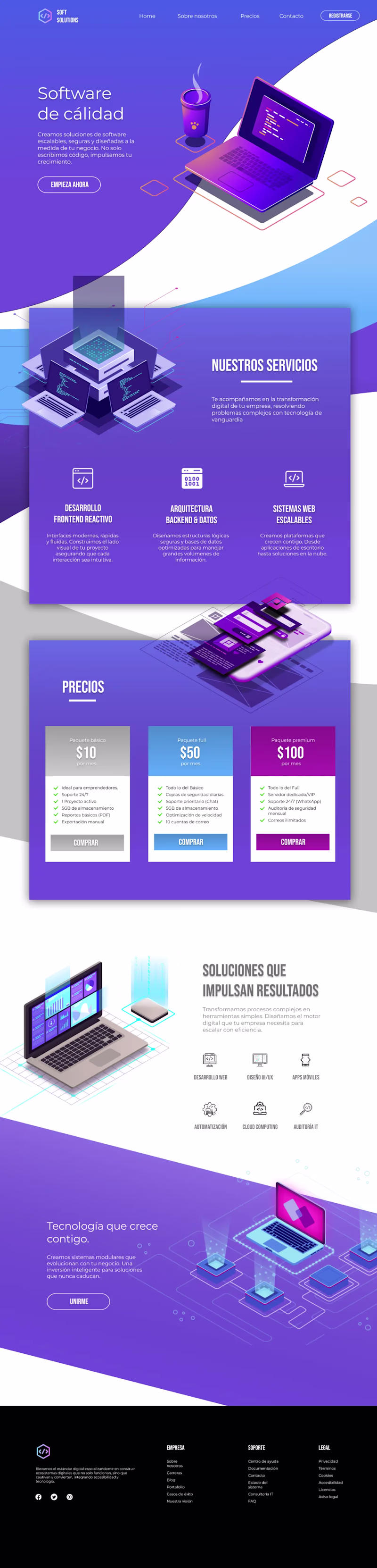
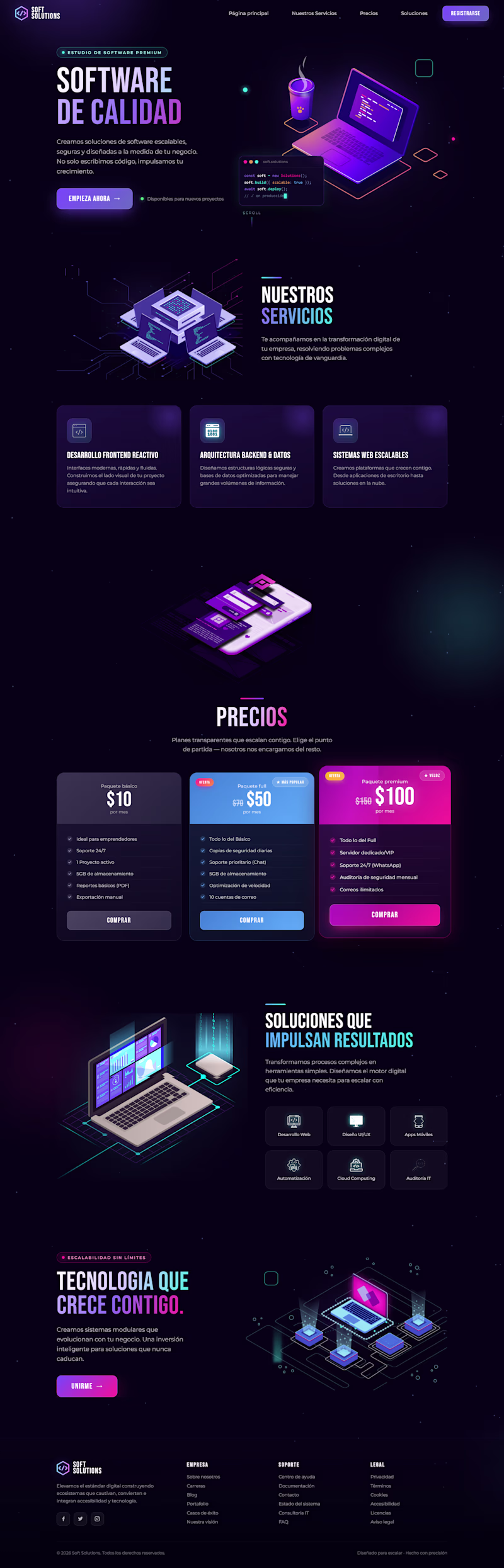
I redesigned the website for this project, keeping its core elements while making it more modern and techy with dark mode by default, eye-catching floating animations, and improved color contrast.
Do you think the redesign I made in Figma is better? Or is the original version better?
19 voted
40%
28 voted
60%
47 votes
Closed
Both of them looks nice but I can clearly see a big mistake on the footer the orig light page footer should be white or blue in color. @Grecia Valero that's why everyone's voted on the dark mode
Love this!
Retro Reel Timer — Minimal Cartoon UI
A playful reinterpretation of a classic reel-to-reel timer, redesigned with a softer colour palette, simplified shapes and a clean cartoon-inspired visual style. The interface keeps the nostalgic character of analogue recording equipment while presenting the controls in a modern, friendly and easy-to-understand layout.
The design focuses on strong visual hierarchy, balanced spacing and clear interaction states. Bold timer typography, rounded controls and subtle depth help the interface feel approachable without becoming visually cluttered, creating a distinctive concept suitable for a mobile timer, audio recorder or productivity application.
The reel spools doubling as eyes is a smart way to add character without adding extra elements, keeps the layout clean while still being playful. Nice fit for a productivity tool that doesn't want to feel sterile.
Trending
Claude
Claude has entered the design space. How are you using Claude Design?
Contra University
Learn from expert creatives how to earn more using next-gen AI tools.
creativeaiflow
Creative AI workflows are evolving. What tools do you use, and what are their strengths and weaknesses?
freelancerlife
Freelancer life is wins, pivots, and everything in between. What’s yours right now?