
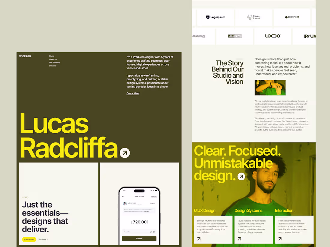
pro
10am Space
Website & Product Design | Figma to Framer/Webflow
- $5k+
- Earned
- 3x
- Hired
- 5.00
- Rating
- 76
- Followers
Nuevoweddings.de Website Redesign
10
15
Website Redesign for kvark.ai
9
12
10amspace.com (http://10amspace.com) isn't just a portfolio. It's a home we own, control, and can never be locked out of — portfolio-first, with two intentional ways to experience the work, and details built to respect your time wherever you are in the world.
8
14
224
We explored a pitch deck for an AI-powered smart home concept focused on reducing energy waste through automation.
To help communicate the idea more clearly, we added motion in Jitter to guide the story and make the content easier to follow.
Would love to hear your thoughts on the flow.
8
17
375
Excited to share Nomago, a high-protein, healthy meal delivery service designed to help you eat smarter and feel better without compromising on taste. From personalized meal plans to convenient door-to-door delivery, every aspect of the service is designed to support your lifestyle goals.
3
13
364
Exploration for Naliko Creative — a forward-thinking creative studio blending bold editorial aesthetics with modern digital clarity.
A refined serif takes the lead, paired with a warm, cinematic red tone to create a strong and expressive visual identity. The layout balances elegance and impact, combining large-scale typography, curated imagery, and a clean grid system to reflect confidence and craft.
2
11
393
Designed to feel minimal yet alive, the layout puts sound first — using bold typography, strong contrast, and image-led sections to reflect the raw atmosphere of the club.
6
17
432
This email template is designed as an editorial-style announcement for Miraggle’s new wardrobe arrival, aiming to elevate a standard email notice into a more engaging visual experience that reflects the brand’s fashion-forward identity.
3
10
385
A bold exploration of modern fashion through clean layouts, sharp typography, and confident visual storytelling.
This concept reimagines a fashion magazine with an editorial approach—where whitespace becomes a statement, structure feels intentional, and every spread balances elegance with attitude.
5
14
385
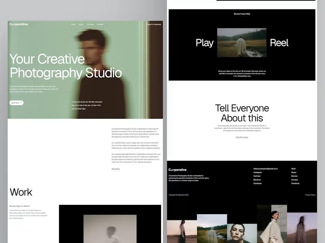
Run Force Running Club Community is a collective of runners united by passion, discipline, and the belief that running is more than just a sport, it’s a lifestyle. We bring together individuals of all levels, from beginners to seasoned athletes, to train, grow, and push boundaries together.
2
7
291
A clean, elegant skincare website design focused on premium visuals, clear product hierarchy, and smooth shopping experience. This concept highlights modern UI, intuitive UX, and conversion-focused layouts, ideal for beauty, skincare, and lifestyle brands looking to elevate their online presence.
5
9
322
First drop of 2026!
Exploring a clean and modern e-commerce experience for Sewan Furniture — blending craftsmanship, comfort, and understated luxury into a seamless shopping journey.Soft typography, airy layouts, and a focus on product storytelling to elevate every piece.
12
35
395
This exploration focuses on how an AI-powered productivity platform can help users automate tasks, make smarter decisions, and work more efficiently—all wrapped in a calm, modern, and human-centered interface.
6
9
326
Hi Everyone! 🙌
A modern website concept for Onihouse—crafted to showcase architectural projects with balance, simplicity, and strong visual hierarchy.
Clean typography, calm space, and structured layout bring focus to what matters most: craftsmanship and timeless design.
5
14
313
Designed an Event Organizer interface with an editorial approach, featuring a dark, atmospheric palette contrasted by sharp bright-yellow accents.
The combination creates a visual identity that feels modern, confident,
And energetic, just like a well-executed event.
3
11
318
Grawing® blends clean editorial design with nature-driven visuals to create a refreshing digital experience for agriculture technology.
Inspired by wide farmland textures, earthy green tones, and soft modern layouts — the page communicates innovation while staying rooted in environmental harmony.
The concept focuses on sustainable farming, smart technology, and real farmer impact, delivering a design that feels both trustworthy and future-forward.
11
42
392
The idea behind Alinea is simple: "Sometimes working from the same room every day feels too heavy"
A little change of space can open new ideas, new focus, and even new opportunities. So I created a clean, editorial-style layout that feels like reading a modern magazine — soft visuals, warm tones, and spaces that breathe 🧘🏻
5
15
318
Welcome to Galileo, where your dream home becomes reality! We transform visions into stunning spaces. We help you find the ideal property.
4
13
342
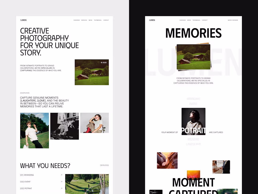
A refined editorial-style portfolio created for Narumi, a photographer whose work blends emotion, narrative depth, and visual elegance.
This exploration takes inspiration from modern magazines—clean grids, delicate typography, generous whitespace, and a quiet confidence that lets the photography take the lead.
7
15
359
Our November Works
A month full of clean design, bold ideas, and better experiences.
3
10
314
This concept focuses on an editorial and atmospheric direction, blending bold typography, cinematic photography, and quiet storytelling. Each section is crafted to reflect the mood, identity, and visual rhythm of the band — turning moments of noise and silence into a cohesive digital experience.
8
18
281
Presenting OXAGON - Renewable Energy Landing Page.
A landing page concept for Oxagon's renewable energy platform—built to communicate complex sustainable solutions with clarity. The design approach focuses on clean layouts, natural color palettes, and structured storytelling that guides users from awareness to action.
3
13
323
Here’s my Tanaloka design exploration — a bold editorial-style website that celebrates the colors, rhythm, and soul of Indonesia’s cultural events 🇮🇩
Through Tanaloka, users can explore traditional festivals, performances, and art experiences across different regions. The website lets you search events by area, discover featured events, and even read testimonials from people who’ve experienced the magic themselves ✨
8
19
337
Alright, here’s our updated contra for Lumina. Simple, clear, and ready for your review
6
14
351
A clean and modern landing page concept for a natural skincare brand.
Focused on soft visuals, elegant typography, and a calm shopping experience that highlights ingredients and products clearly.
14
20
429
Exploring a clean editorial layout with bold typography and uniquely crafted imagery.
A mix of structured grids + strong visual personality to make every section speak louder.
Hope you enjoy this direction!
16
34
460
Presenting Stevano Design, a landing page design for fashion designer portfolios or agencies. A portfolio experience built with the essence of high-end fashion editorial style.
Strong visuals, compelling typography, and storytelling that elevate the designer's identity.
30
70
533
Design exploration for Noehat, a mental health platform focused on slow healing and mindful progress.I aimed to create a visual atmosphere that feels warm, human, and comforting — a space where users can breathe and feel understood.
Design Focussed on Warm tones, gentle typography, and spacious layout to evoke a sense of safety and ease.Would love your thoughts! 🌿
5
12
388
This pitch deck explores that idea through bold layouts, systemized rhythm, and a clean editorial tone.
Every slide reflects how IPSUM merges creativity and technology — scaling visuals just as software scales ideas.
6
18
345
Decked is a bold and expressive landing page that captures the raw spirit of skate culture through design. It blends street energy with modern minimalism — balancing gritty textures, high-impact typography, and vibrant neon highlights.
Built for skaters and creators alike, the layout celebrates freedom, motion, and community — featuring event highlights, rider stories, and authentic moments from the crew.
10
43
397
Here’s my Futureflow pitch deck — a bold exploration built with a brutalist approach.
Futureflow was made to challenge that. It’s a visual story about breaking old systems, building better ones, and scaling into something stronger for the next chapter.
6
22
374
Visual exploration mode: ON 🚀
Mixing shapes, colors, and micro-interactions to find a fresher vibe for the concept. Love how motion adds that extra charm, all done using Jitter for a clean, fun finish!
9
12
359
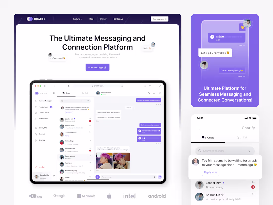
Played around with some motion in Jitter, made the flow feel more alive ⚡️
Check out the full design on Chatify • Message Landing Page (https://contra.com/p/skovqsBZ-chatify-message-landing-page?r=wildanux_9u22kcem):
8
10
454
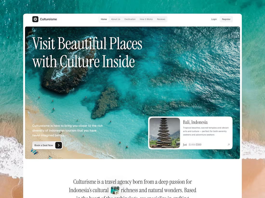
We explored more than just web design this time, played around with motion in Jitter to make things feel more alive.
A small experiment for a travel agency concept, but a fun one 🚀
Check it out here: Culturisme - Travel Agency (https://contra.com/p/YmBElbRY-interactive-travel-agency-landing-page-design?referralExperimentNid=DEFAULT_REFERRAL_PROGRAM&referrerUsername=10amspace)
7
11
467
1
9
28
1
8
15
1
3
9
1
8
37
1
8
31