Built with Jitter
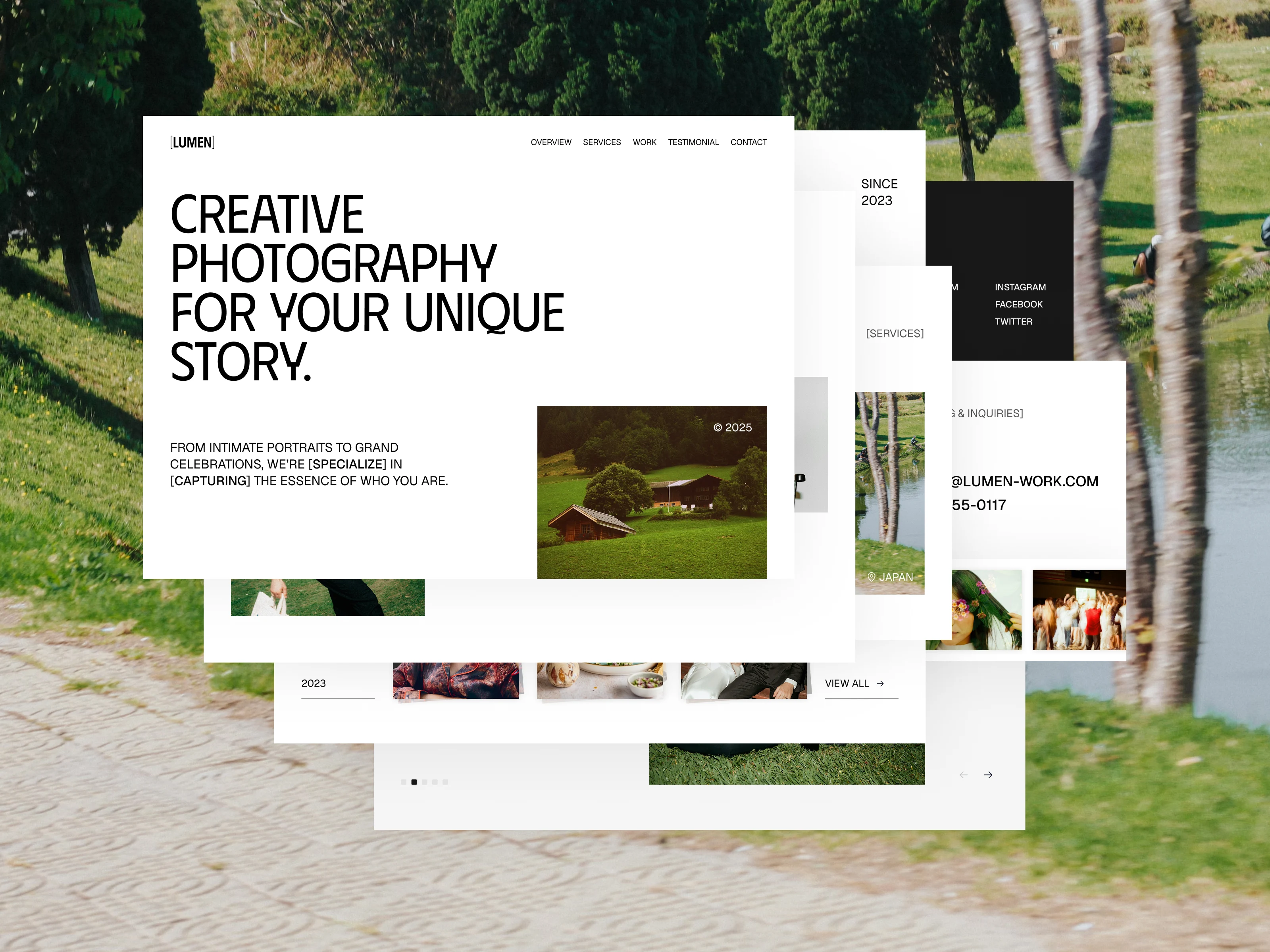
Lumen - Photographer Portfolio Landing Page
This project started with a simple question:
how can a photography portfolio feel clean, minimal, and still engaging?
With Lumen, I wanted to design more than just a place to show photos. My goal was to create a landing page that’s easy to explore, makes the brand feel approachable, and gives clients a clear path to book a session.
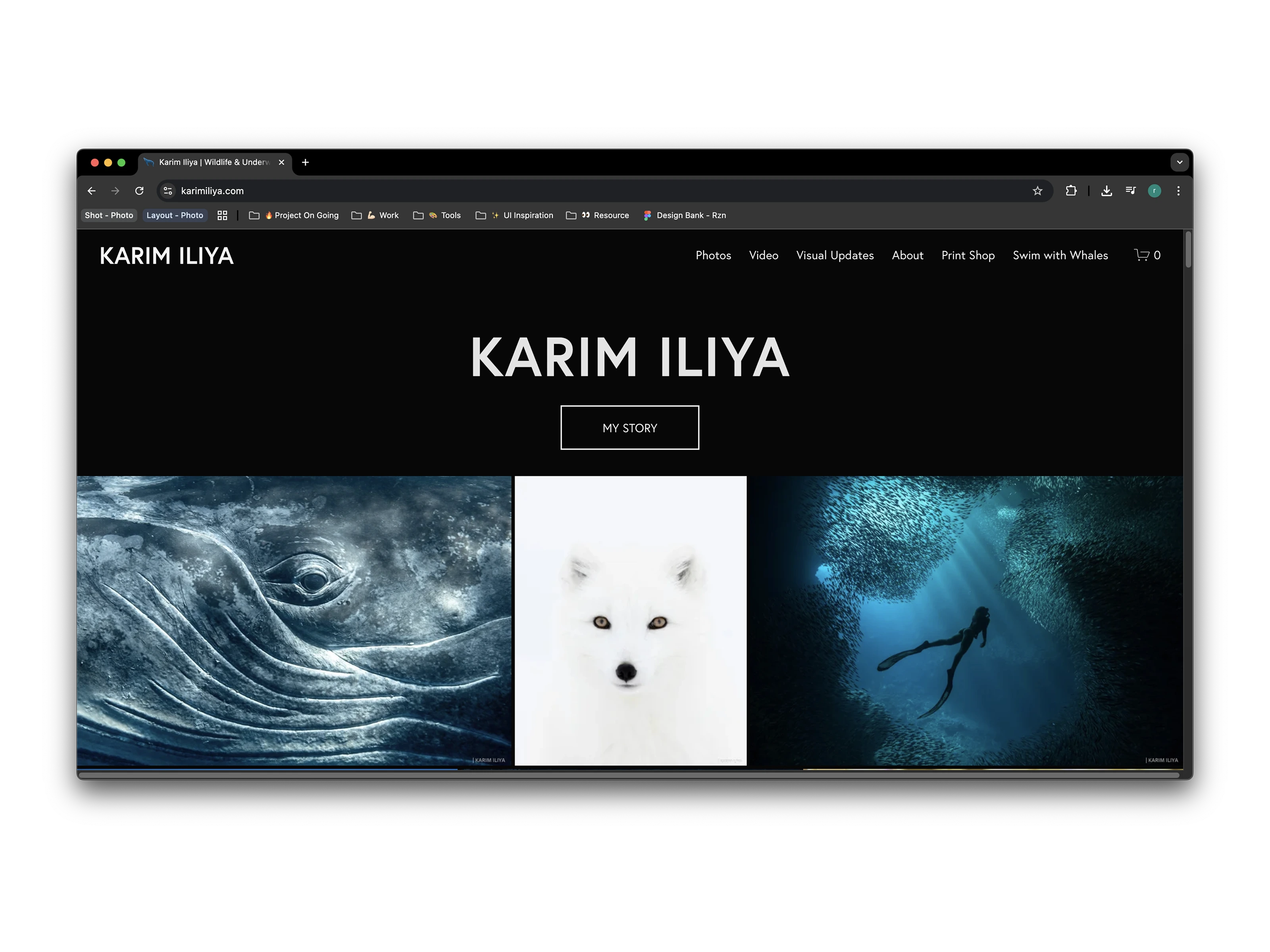
Why I Designed This Landing Page
Photography isn’t just about capturing images — it’s about preserving memories, emotions, and moments people want to remember. That belief shaped the direction of this project.
Lumen was designed with a general audience in mind — families, couples, individuals, or anyone needing their story documented. The main focus was to keep things minimalist and timeless, while ensuring visitors could immediately see what Lumen offers and how to get in touch.
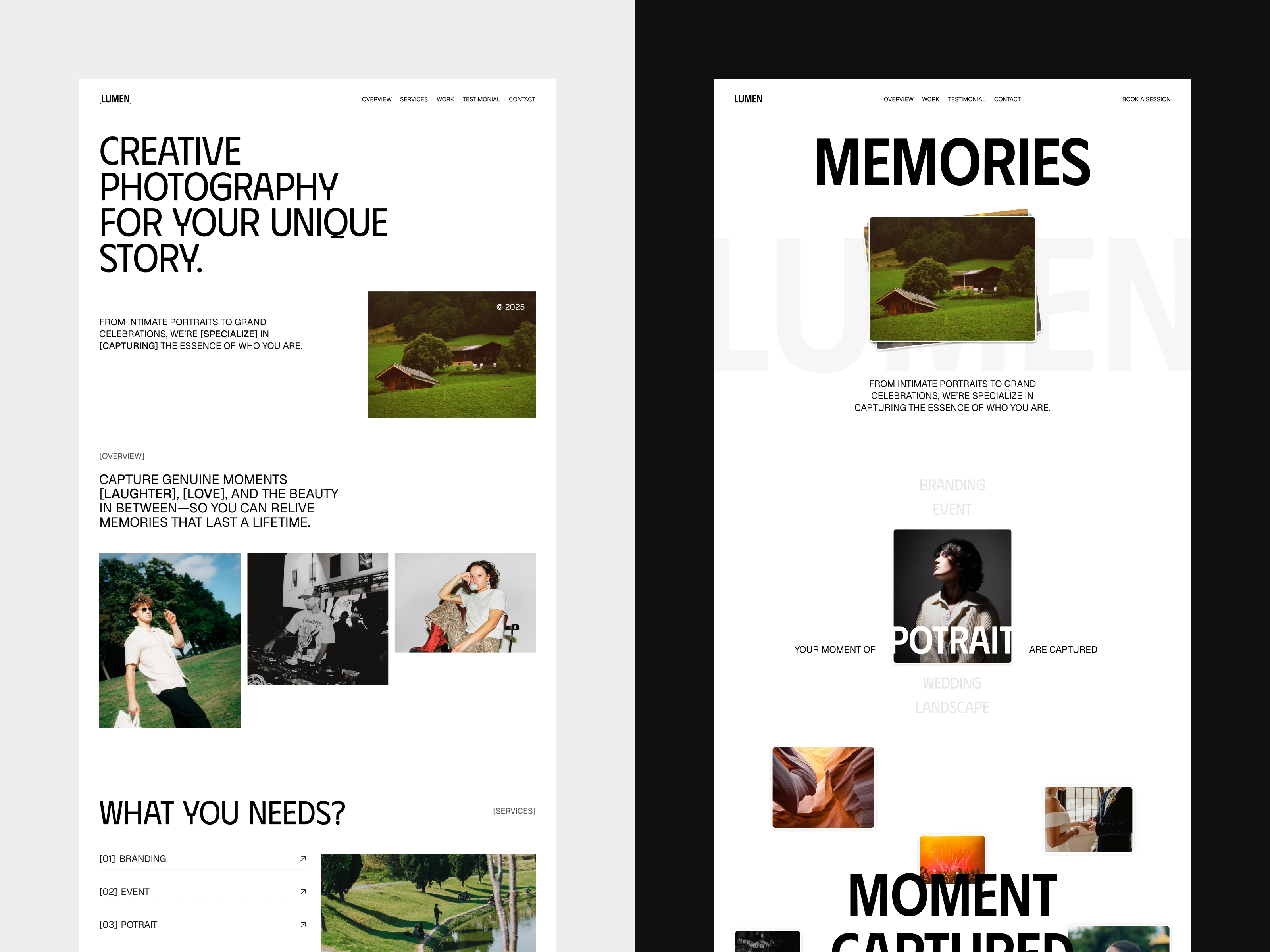
To tell the story in a simple way, I broke the landing page into a few essential sections:
Hero Creates a bold first impression with strong imagery and tagline.
About Us
Builds trust and adds a human touch.
Services
Outlines session types and what clients can expect.
Work Gallery
Showcases past projects as proof of quality.
Testimonials
Lets real client voices speak for the experience.
Call to Action
Guides clients to easily book a session.
Footer
Provides quick access to email and WhatsApp for direct contact.
Every section was chosen to make the client journey simple and straightforward.
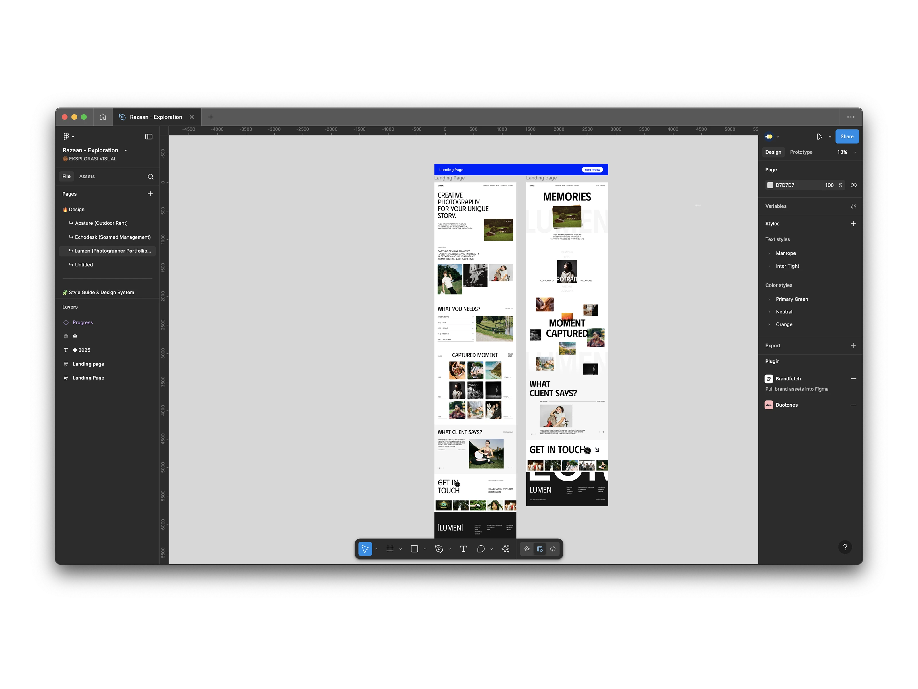
Two Approaches: Static vs Animated
While working on this project, I created two versions of the landing page.
The first version focused on clear information — a static, structured layout that makes it easy for visitors to understand Lumen’s services and browse the work.
The second version experimented with animations and interactions — offering a more dynamic experience where movement adds personality and keeps visitors engaged.
Both versions share the same content and goal, but they show how design choices (clarity vs interactivity) can shape the way a brand is experienced.
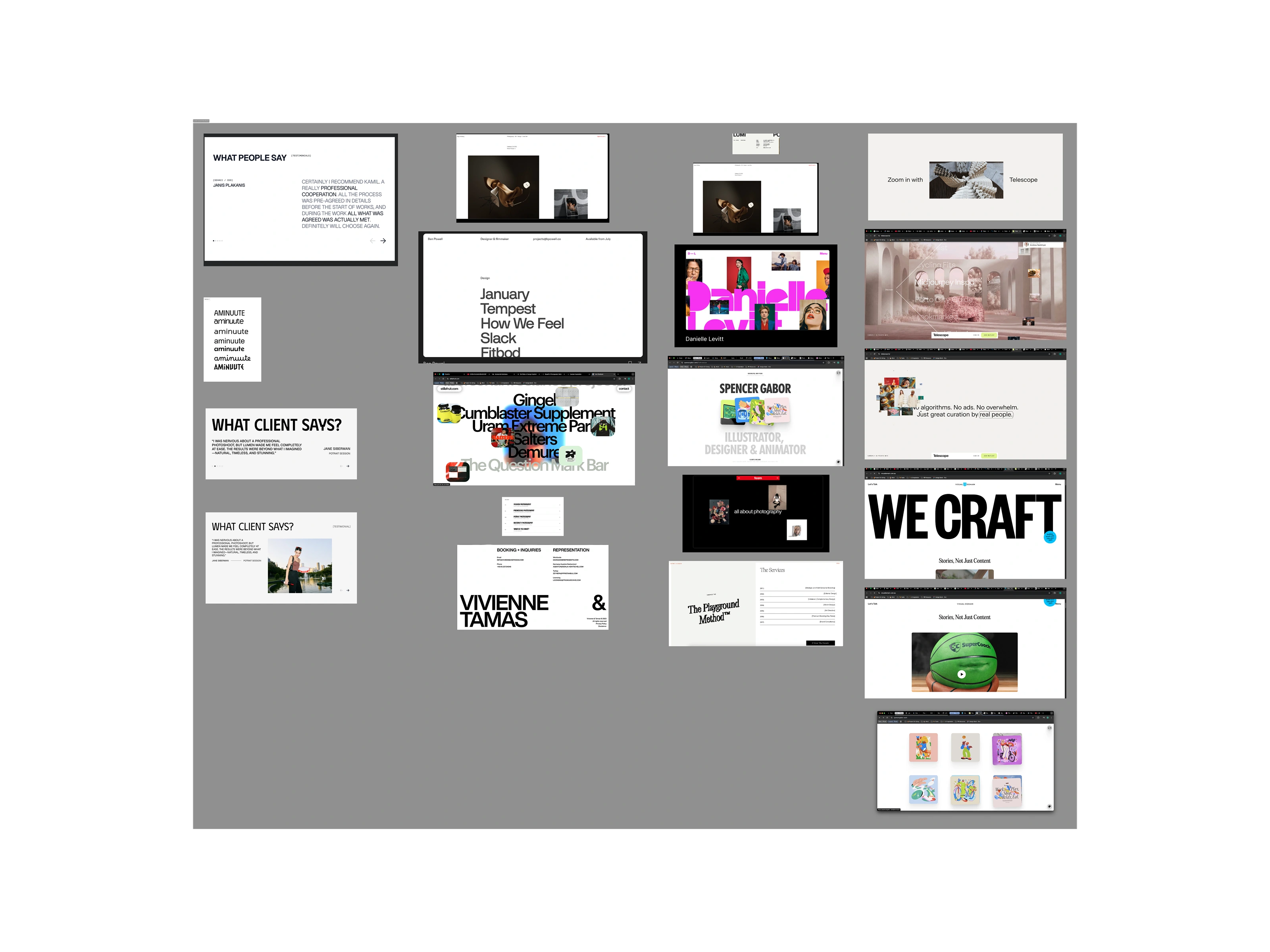
Designing the Page in Figma
The pages were fully designed in Figma, which allowed me to experiment with grids, typography, and imagery. I leaned into clean layouts, generous spacing, and soft tones to reflect Lumen’s minimalist style.
One of the main challenges during this process was finding a way to create a layout that felt different from typical photography portfolios, while still making sure the content stood out. The goal was to let the photos do the talking, without overwhelming them with heavy design elements.
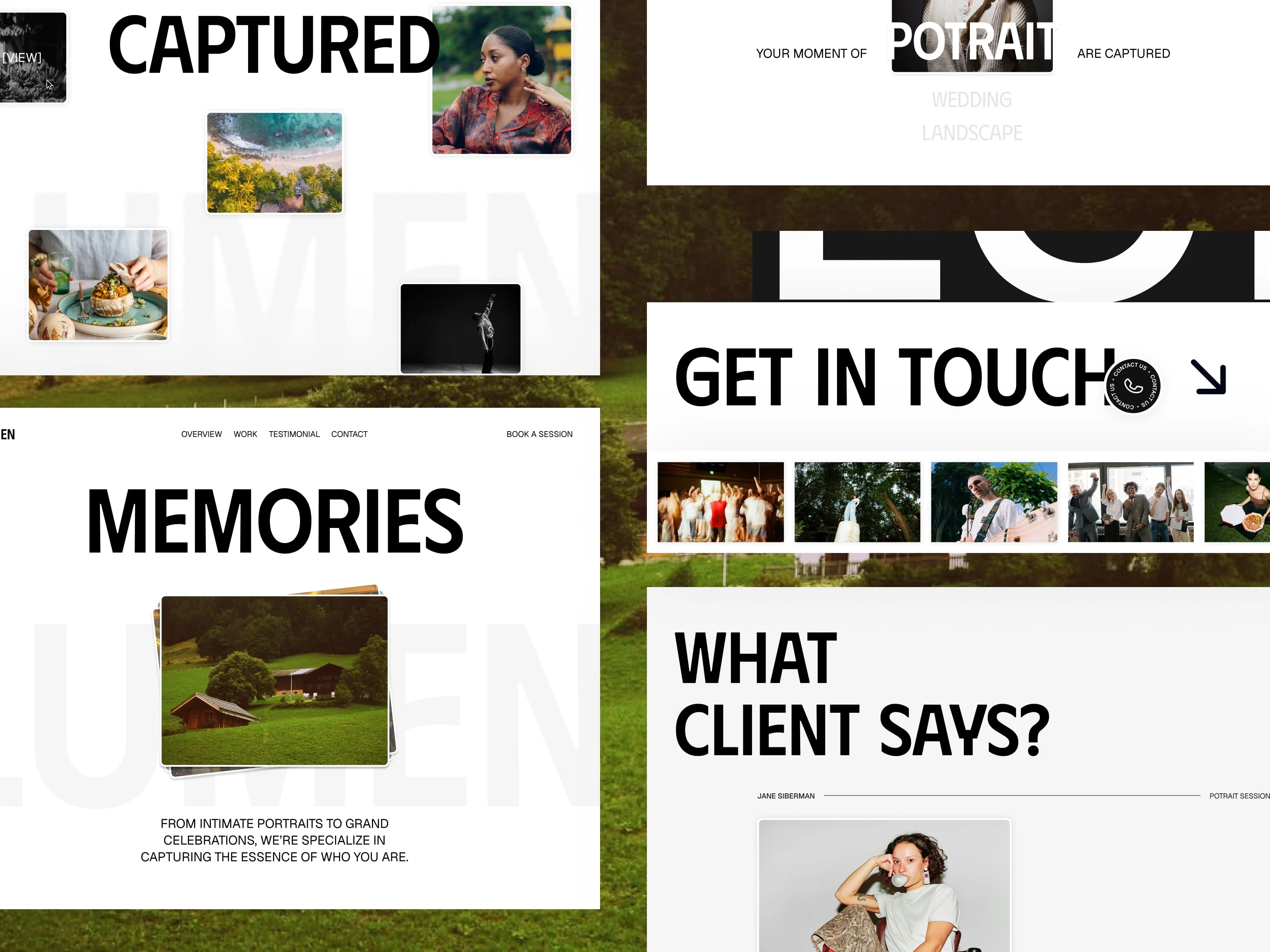
Reflection on the Project
This project became more than just a landing page. It was about translating the feeling of Lumen’s photography into a digital storytelling experience.
The static page shows how simplicity and structure can create trust.
The animated page shows how interactivity can make browsing more memorable.
Together, they reflect Lumen’s brand: clean, professional, and designed to capture life’s moments in a way that feels approachable.
Thanks for taking the time to check out this project story. Designing Lumen taught me how the same content can be shaped in different ways — one version through clarity, the other through motion. Both approaches helped me explore how design can turn a photography portfolio into something that feels alive, inspiring, and client-friendly.
Like this project
Posted Nov 4, 2025
Excited to share Lumen, a creative photography portfolio website that celebrates authentic storytelling through the lens! 📸

