Built with Jitter
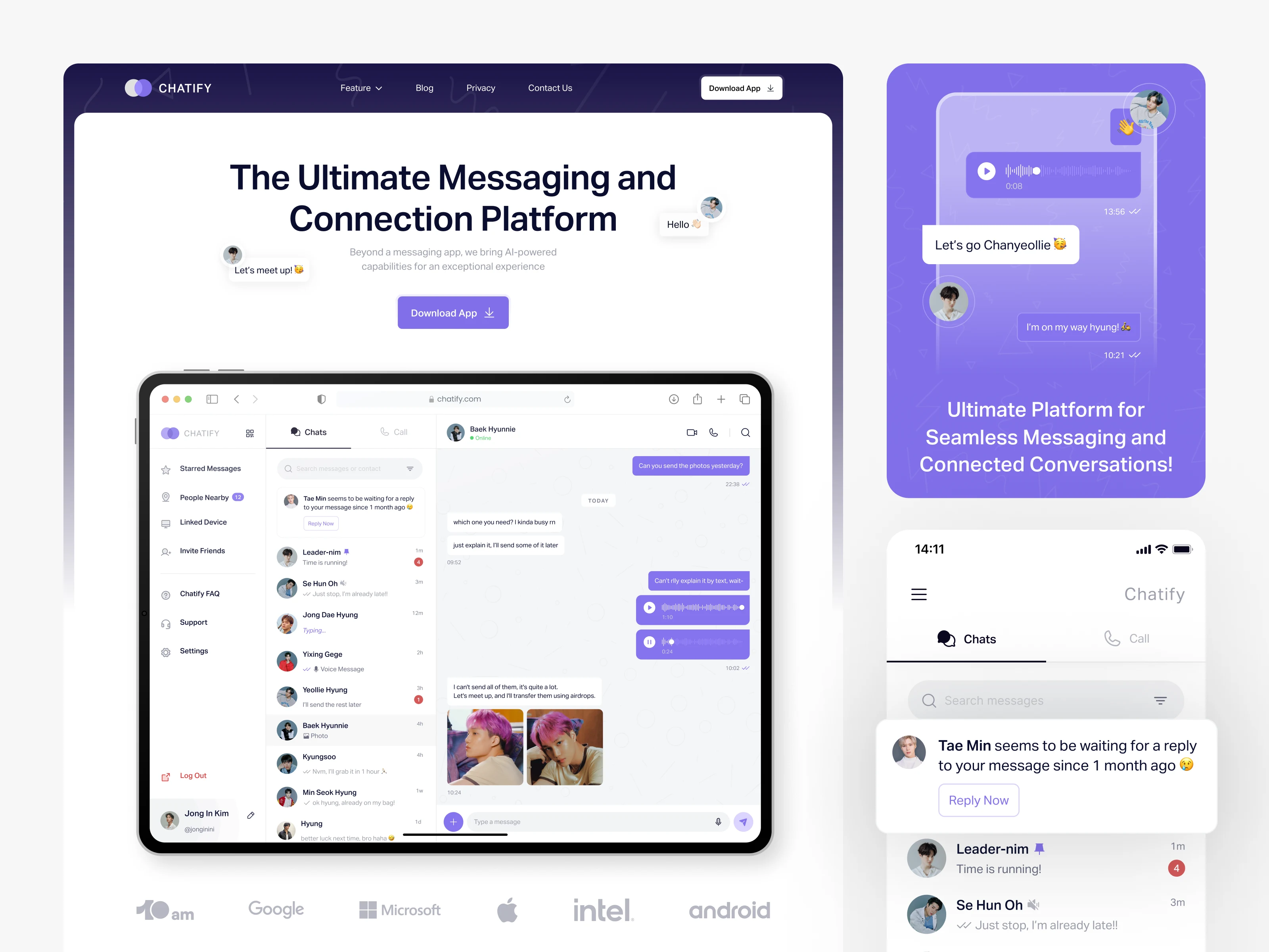
Chatlify Messaging Platform Design
10am Space
1 collaborator
This project started from a simple curiosity:
How far can I push the idea of a messaging platform by rethinking the parts we often overlook—like unread messages, reminders, and how information surfaces?
What began as a small exploration inside my canvas turned into a full design exercise across mobile, dashboard, and a landing page.

Project Overview
Chatlify is a conceptual project where I explored how a messaging platform could feel more intuitive and supportive—not just as a chat tool, but as a connection system.
I acted as the sole designer, responsible for ideation, UX flows, UI design, visual direction, and interface production.
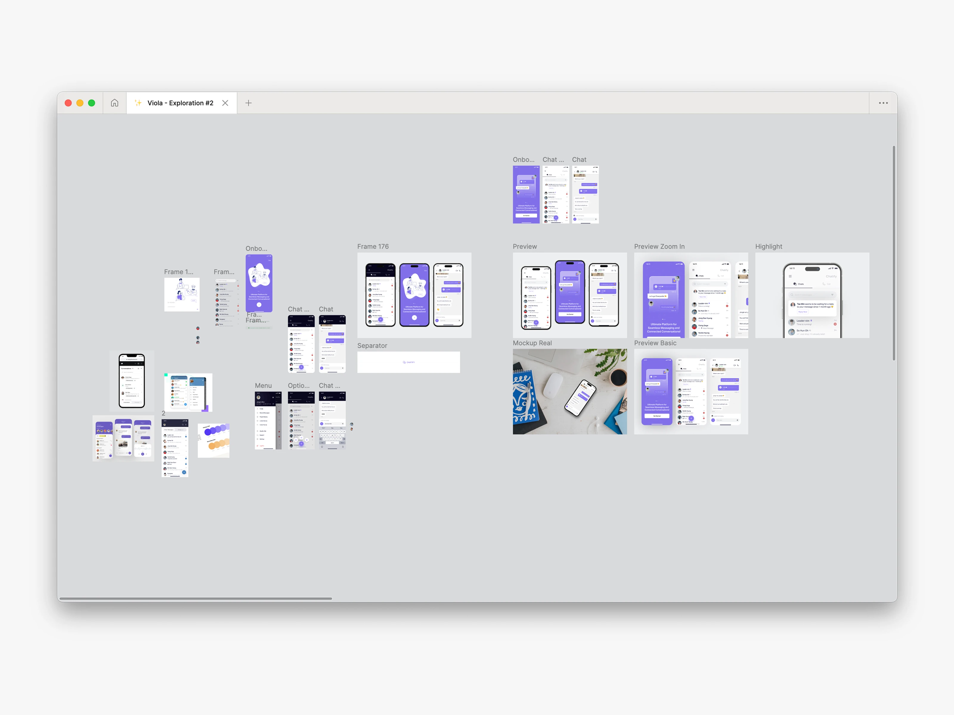
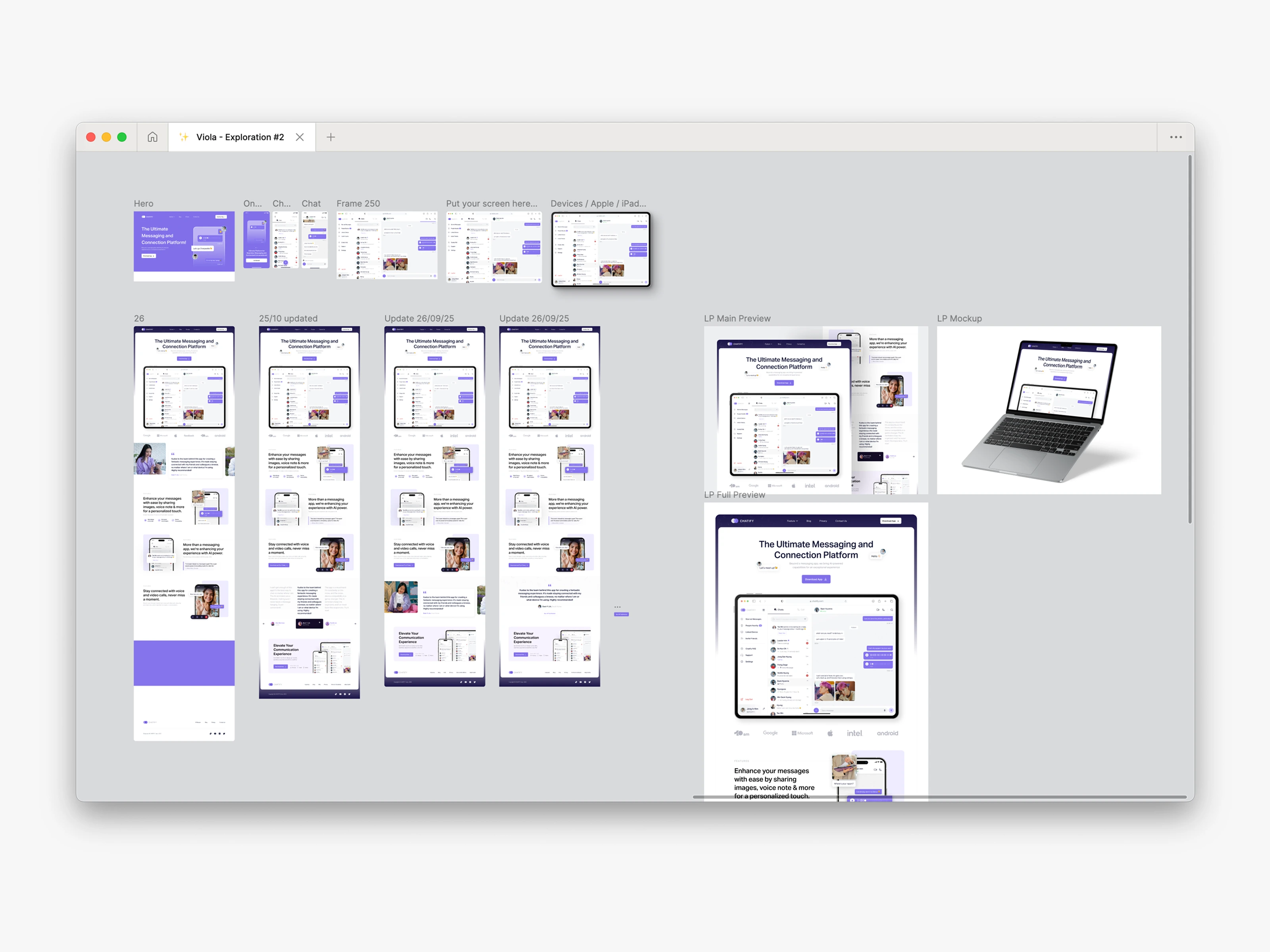
Process & Exploration
I started with the mobile app. I tried many layouts, sections, and UI elements, experimenting freely to find a visual language that felt refreshing and clear.
During this process, I discovered an interesting gap:
People often forget to reply, and unread messages pile up.
So I came up with a feature that quickly became the highlight of the project:
An AI-powered reminder for unreplied messages.
From there, I iterated across:
Component exploration
Iconography
Layout spacing
Color consistency
Notification patterns
Mobile → Desktop adaptability
This exploration helped the design evolve into something more structured and functional.
Challenges & Solutions
Challenge: Making the design flexible for multiple devices without relying on heavy visuals.
Solution: I rebuilt key screens for the desktop dashboard, focusing on spacing, information hierarchy, and adaptable grids.
Challenge: Keeping the experience consistent across message views.
Solution: I created reusable components and a shared color & spacing system.
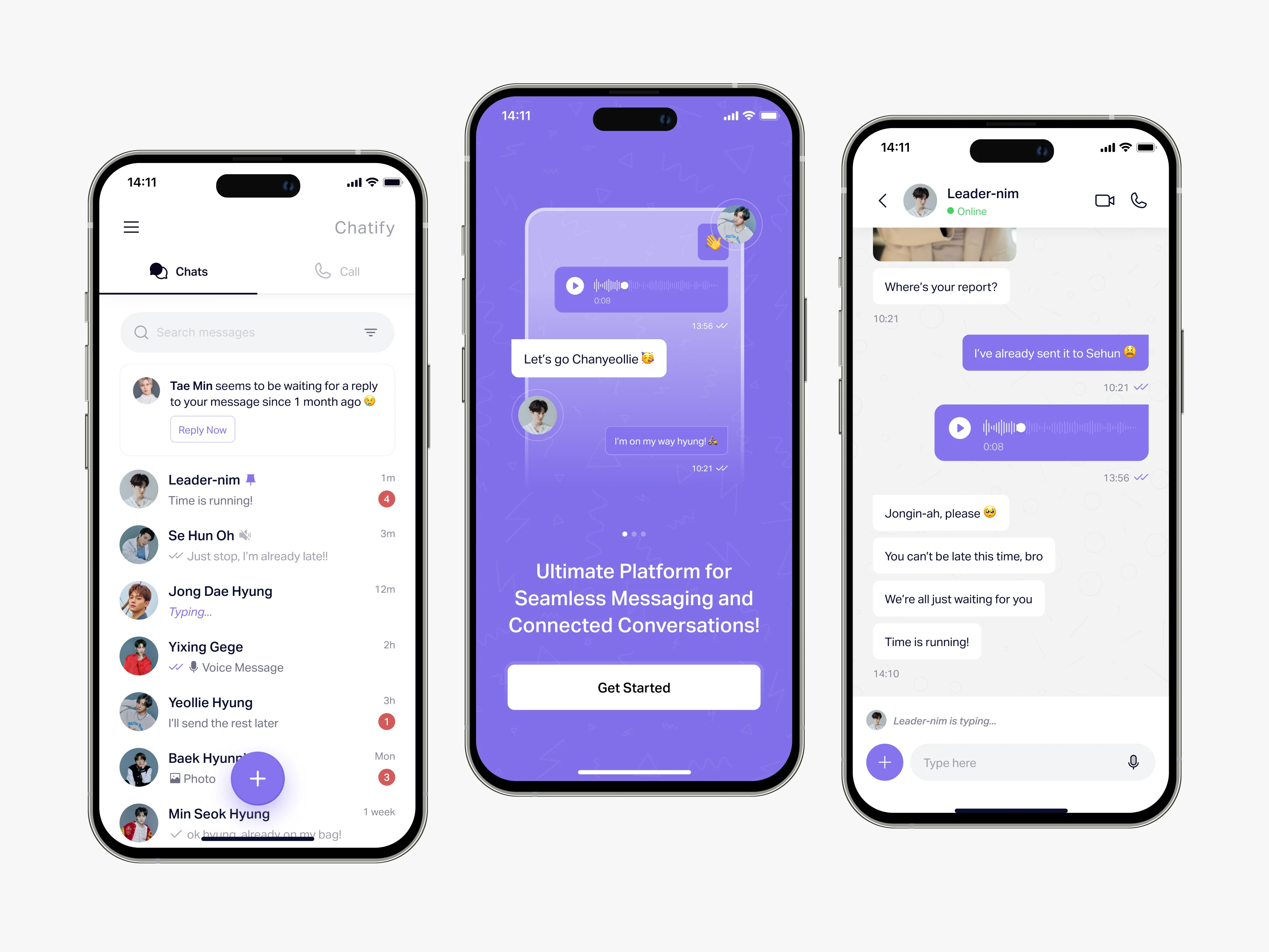
First Execution: Mobile App
The mobile version reflects clarity and ease of use, with a strong focus on conversational flow and reminders.
I added small personal elements—like using my favorite K-pop group (EXO) as mock users—to keep the process fun and natural.
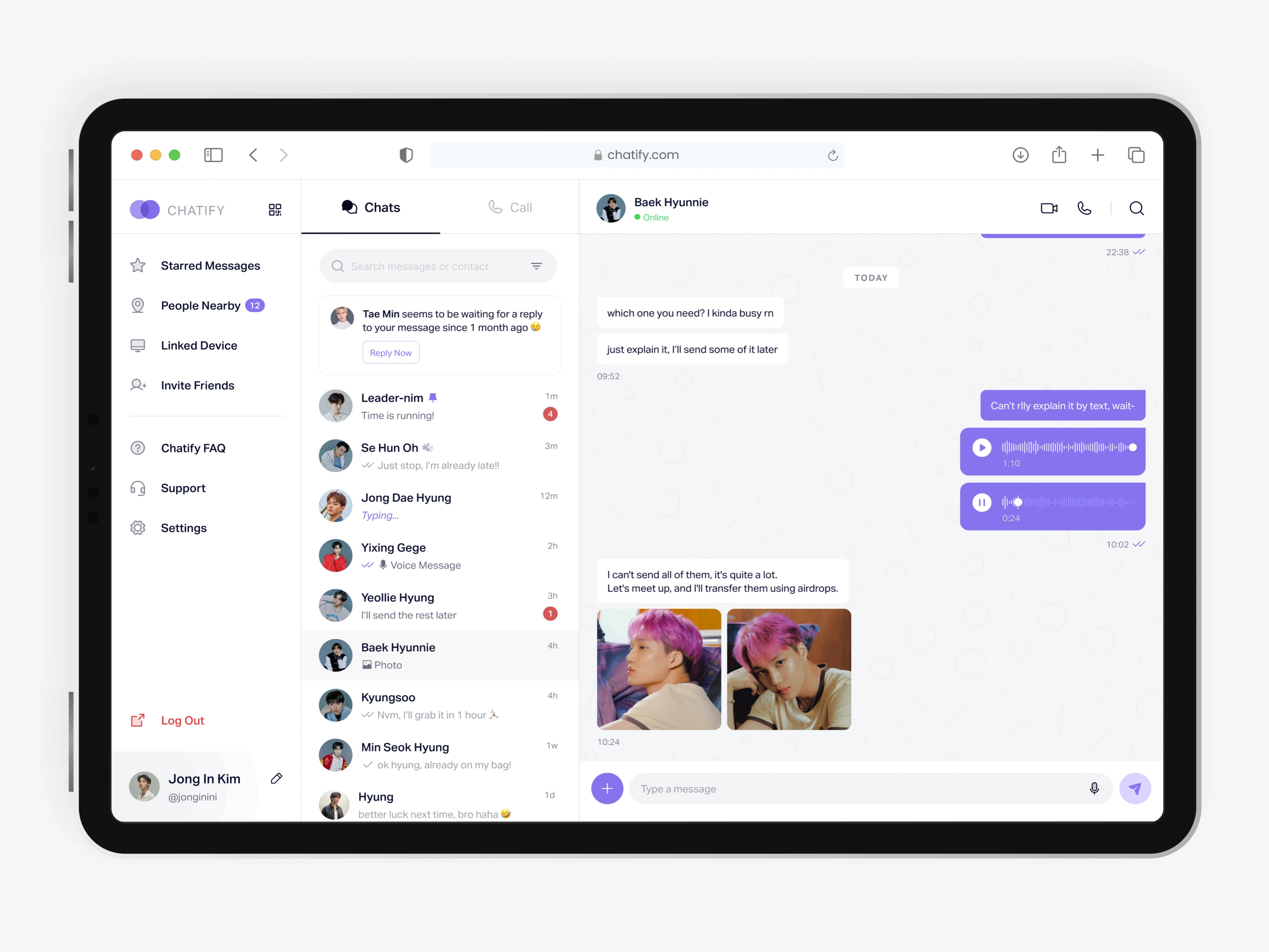
Second Execution: Desktop Dashboard
The dashboard elevated the project. It pushed me to refine structure, spacing, and how information lives in a broader layout.
Working on the dashboard helped me think more about layouts, spacing, and how information could be shown clearly when there is more screen space. This step made Chatify look more complete as a product.
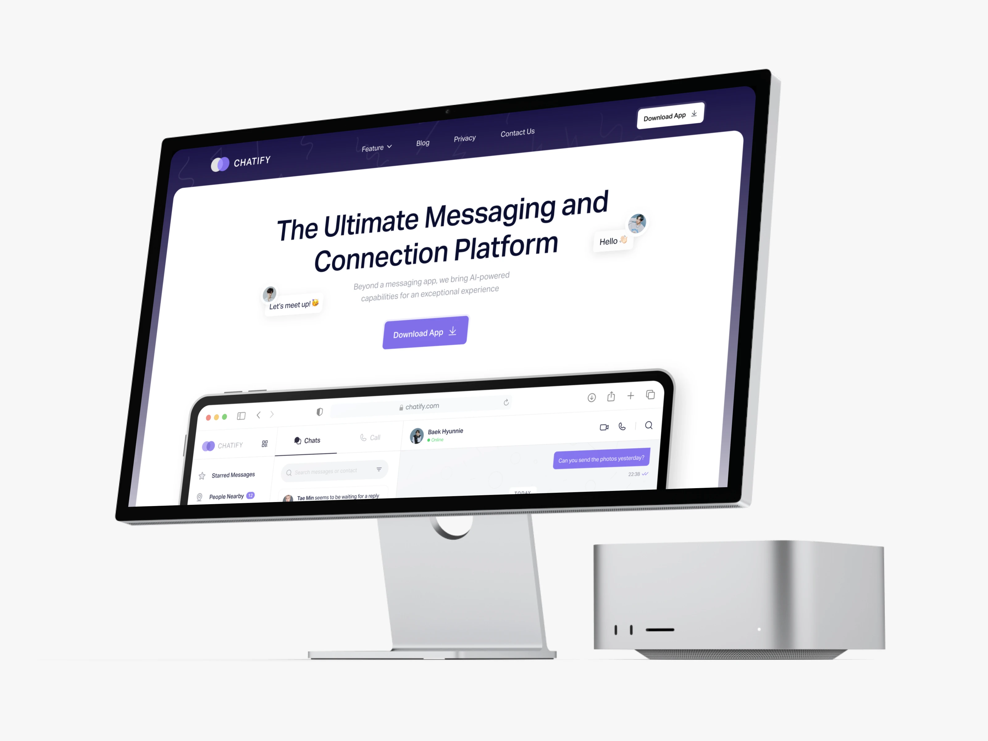
Third Execution: Landing Page
I wrapped the project with a landing page showcasing the platform and its main features, giving a full picture of Chatlify as a polished product.
This video isn’t the real design. I made some adjustments because Jitter couldn’t support everything I created in Figma
Results & Final Outcome
The final design became a multi-device concept with a strong identity, consistent visual logic, and an AI-centered feature that adds real value.
It also helped me sharpen my skills in system thinking, cross-platform layouting, and visual clarity
If you reached this far—thank you for reading my exploration journey! 🥳
I really enjoyed crafting this concept from scratch, and I hope you found value in seeing the process.
Can’t wait to share the next one soon! 👋
Like this project
Posted Nov 24, 2025
Designed Chatlify, a multi-device messaging platform with AI reminders, enhancing UX and visual clarity.