
zakaria simerabet
graphic designer
New to Contra
zakaria is building their profile!

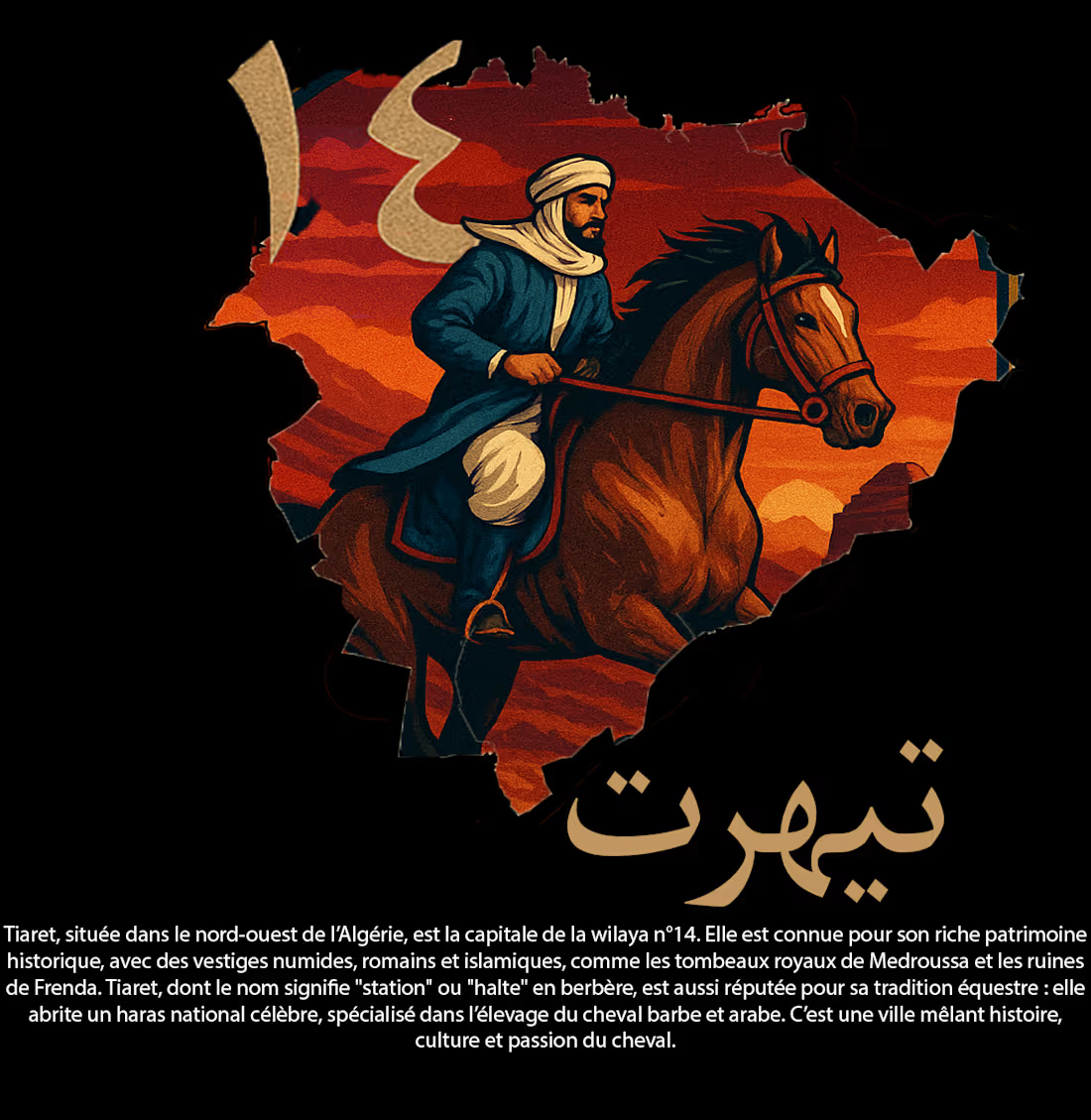
Tiaret Heritage – T-Shirt Brand Identity
I created a T-shirt brand concept inspired by Tiaret’s history, culture, and strong connection to horses and equestrian heritage.
The visual identity combines a modern streetwear style with traditional elements representing Tiaret’s identity. The horse is the main visual symbol, reflecting the region’s equestrian culture, strength, freedom, and heritage.
I focused on creating bold and memorable graphics that can work effectively on T-shirts while remaining visually clean and commercially appealing.
The designs were developed with typography, historical references, and equestrian elements to create a distinctive local identity with a modern fashion approach.
The project demonstrates my ability to transform cultural and historical concepts into modern branding and visual designs suitable for clothing and social media.
0
5
Algeria Ships – Brand Identity & Logo Design
I designed a modern logo concept for Algeria Ships, a brand operating in the maritime and shipping sector.
The concept was developed around the ideas of shipping, movement, connectivity, and Algeria’s maritime identity. I focused on creating a clean and professional symbol that could work effectively as a standalone mark as well as alongside the brand name.
The visual identity was designed to communicate reliability, strength, professionalism, and international connectivity, while remaining simple and recognizable.
The logo was created with versatility in mind, allowing it to be used across digital platforms, social media, business documents, shipping materials, signage, and other brand applications.
0
9
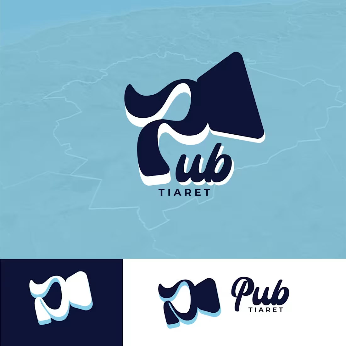
Tiaret City Media – Logo Design
I designed a modern visual identity for Tiaret City Media, a media and advertising brand focused on communication and publicity.
The logo uses blue as the primary color, reflecting trust, professionalism, communication, and a modern media presence.
For the symbol, I creatively incorporated the letter “P” into the shape of a speaker/loudspeaker, representing publicity, broadcasting, communication, and reaching a wider audience.
The concept was designed to be simple, recognizable, and memorable, while making the connection between the brand name and its media/advertising activity immediately clear.
The logo was also designed to remain versatile and effective across social media, advertising materials, digital platforms, and print applications.
1
15
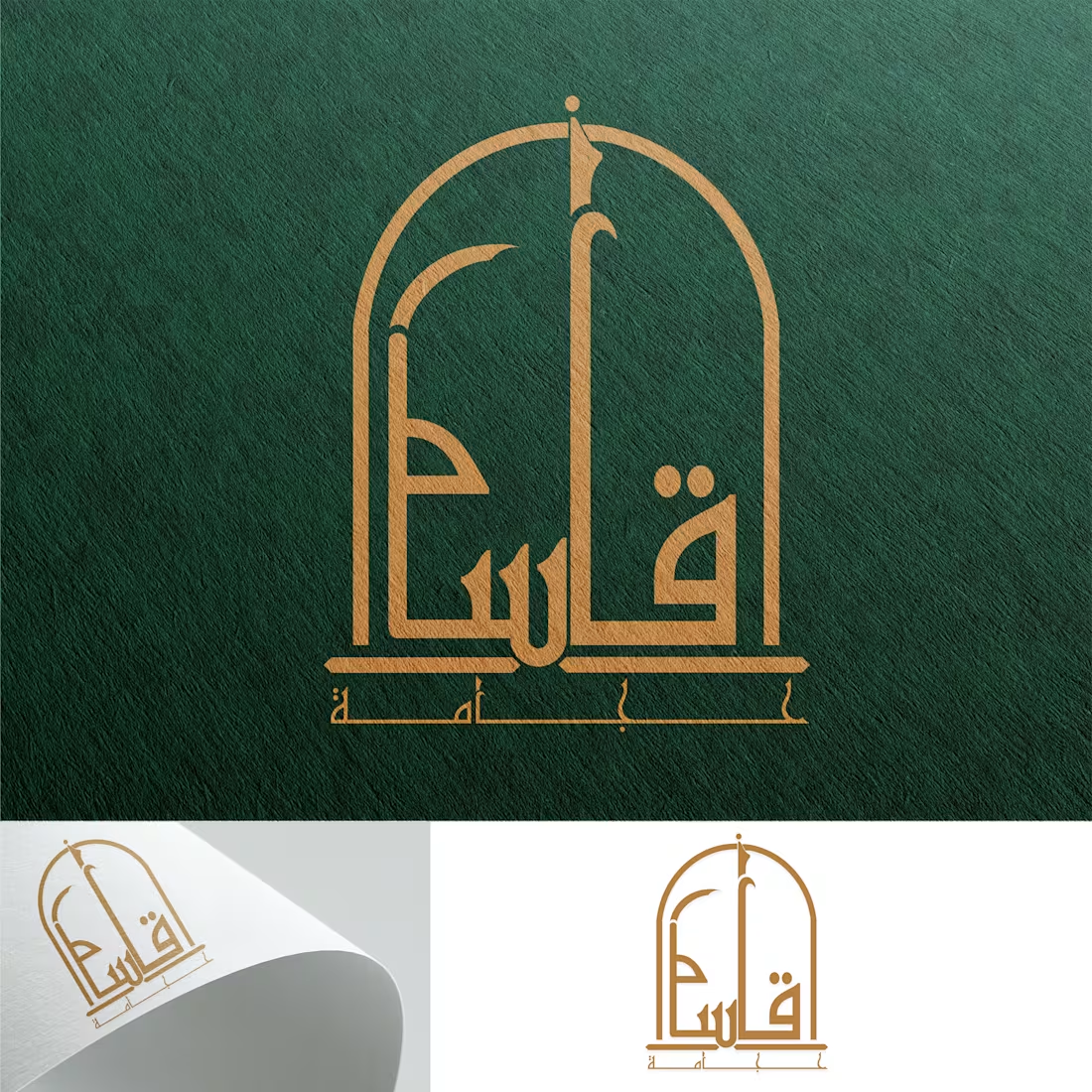
Hijama Brand Identity – Logo Design
I designed a professional visual identity for a Hijama (cupping therapy) brand, focusing on creating a clean and trustworthy appearance while maintaining an authentic Arabic character.
The logo combines green and gold as the main brand colors. Green represents health, wellness, nature, and healing, while gold adds a sense of quality, elegance, and professionalism.
A key part of the concept was the Arabic typography, with the brand name carefully designed to become an integral part of the logo rather than simply placing standard text beside an icon.
The overall design was kept minimal, recognizable, and versatile, allowing the logo to work effectively across social media, signage, business cards, promotional materials, and other digital platforms.
I also designed the identity with scalability in mind, ensuring that the logo remains clear and recognizable at both large and small sizes.
0
17