Manaswee Singh
I design brands & websites that are loud & brings business.
New to Contra
Manaswee is ready for their next project!
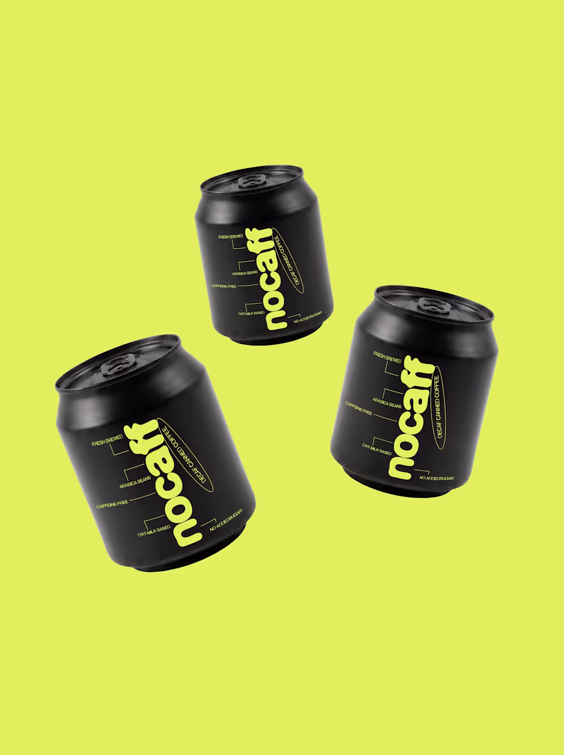
Nocaff is a decaf coffee brand made for drinking coffee without the caffeine. It keeps the taste and ritual of coffee while removing the rush that usually comes with it. It's simple and a self-aware, offering a relaxed way to enjoy a coffee.
#branding (https://www.instagram.com/explore/tags/branding/) #coffeebranding (https://www.instagram.com/explore/tags/coffeebranding/) #packagingdesign (https://www.instagram.com/explore/tags/packagingdesign/) #branddesign (https://www.instagram.com/explore/tags/branddesign/)
0
85
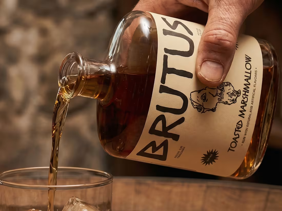
Brutus is a Rum brand inspired by the human emotion of betrayal, with its roots in Shakespeare's Julius Caesar based in ancient Rome.
Alcohol often becomes a companion in moments of hurt, anger, or introspection, and Brutus is designed to live within that emotional space.
The branding brings this idea to life. The typography reflects an old-world Roman influence, while the color palette is inspired by Rome but uses deeper tones to express emotional intensity.
The half-cut face of Caesar is where it all comes together. It represents the feeling of betrayal in a subtle way, almost like a moment frozen in time.
3
3
145
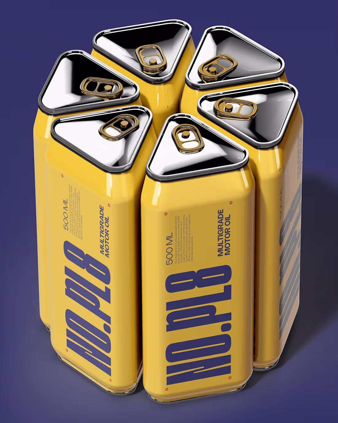
NO.PL8 - Portable Fuel Brand Identity.
Case Study out now.
https://contra.com/p/LE6QePl7-nopl8-portable-fuel-brand-identity?r=yours_loudly_hum8bptz
0
105
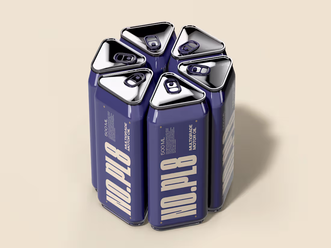
NO.PL8 Portable Fuel Brand Identity
0
4
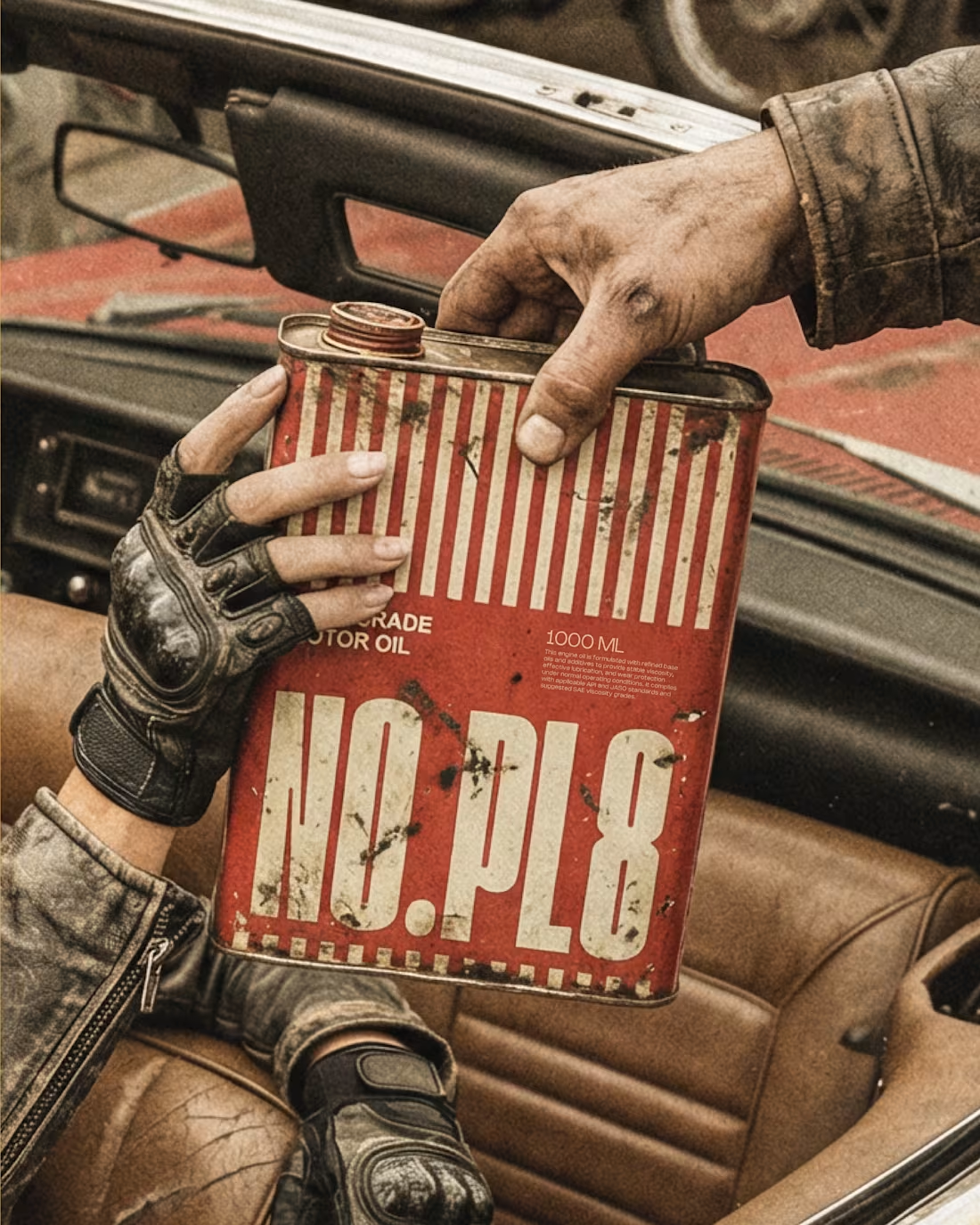
I’ve been designing a portable fuel brand called NO.PL8, and seeing it through these mockups has been a big step in understanding how the idea holds up visually. The concept is built for travellers, something you could rely on if you run low on fuel during a journey. To support that, I went with a retro-industrial direction to give it a rugged and slightly rustic feel, paired with colours inspired by industrial systems that people already associate with safety and function. The brand is being developed across three different sizes, each with a specific purpose, which I’ll be sharing soon. The full case study goes live tomorrow, this is just an early look.
1
118
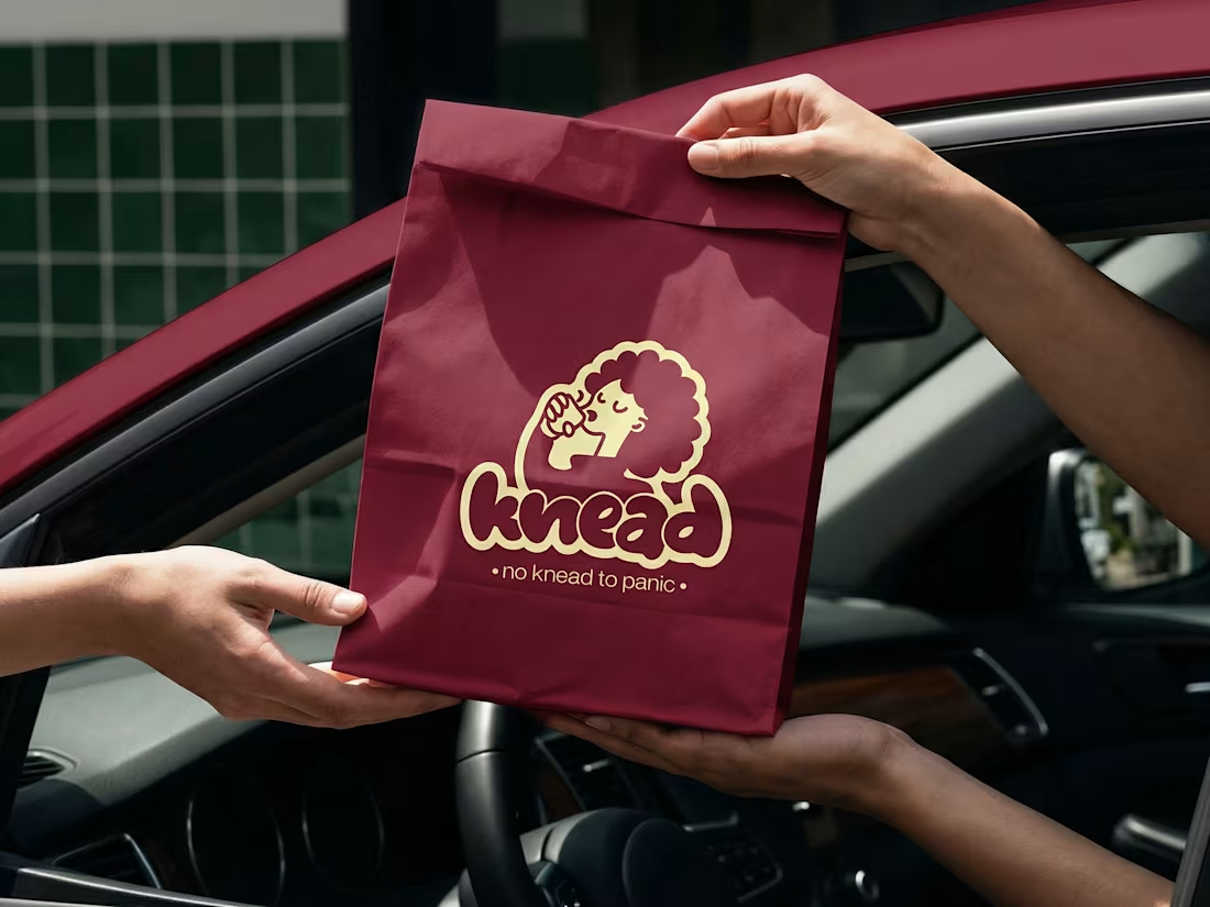
Knead: Bakery & Cafe Brand Identity Design
0
6