NO.PL8 Portable Fuel Brand Identity
Manaswee Singh
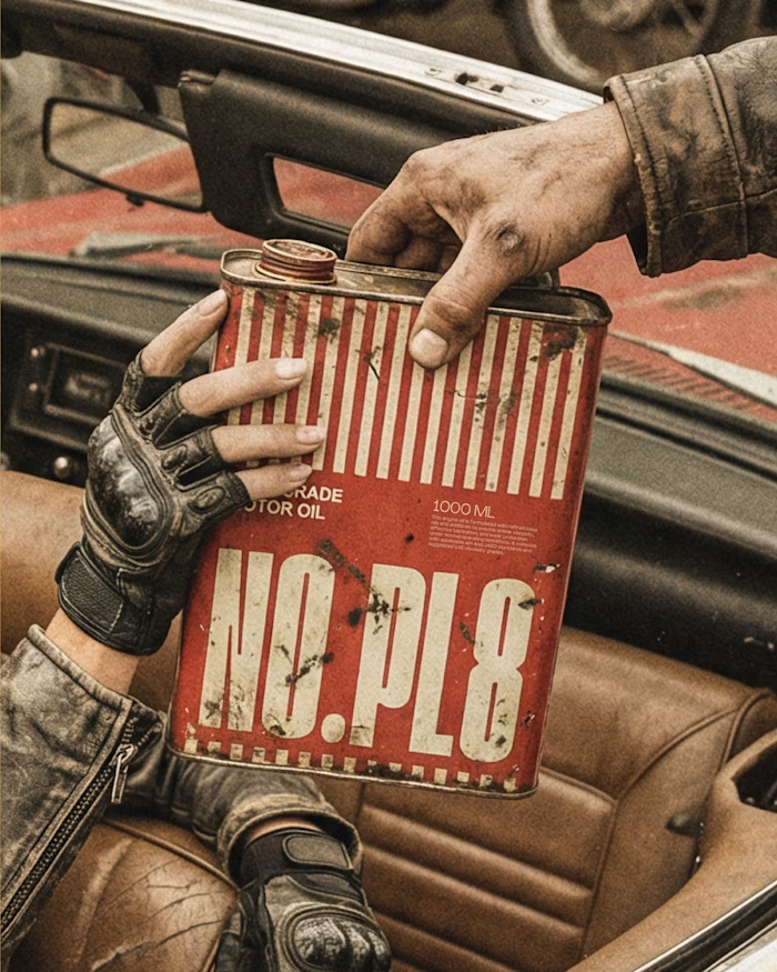
NO.PL8
Portable Fuel Brand Identity
This idea started with a simple observation. Every time we run low on fuel, even slightly, we’re forced to stop find a petrol pump, wait, and interrupt the journey. It’s not a major issue, but it’s a consistent one. That led to a straightforward question:
what if small amounts of fuel could travel with you instead?
While this sits in a conceptual space (and isn’t entirely practical or legal), it opens up an interesting design direction treating fuel not just as a commodity, but as something portable and immediate.
The Idea
Designing Within Road Culture
Instead of building a new visual language, the approach was to use what already exists. Roads are full of systems people understand instantly number plates, lane markings, safety colours. They’re designed for clarity and speed, not decoration. The brand borrows directly from that world.
The goal was simple: make the product feel like it already belongs on the road.
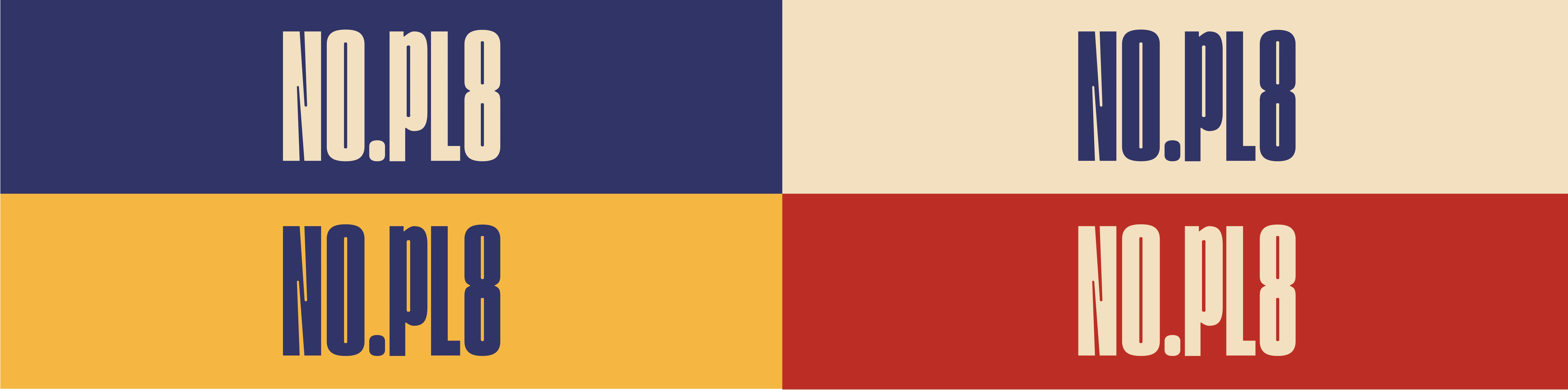
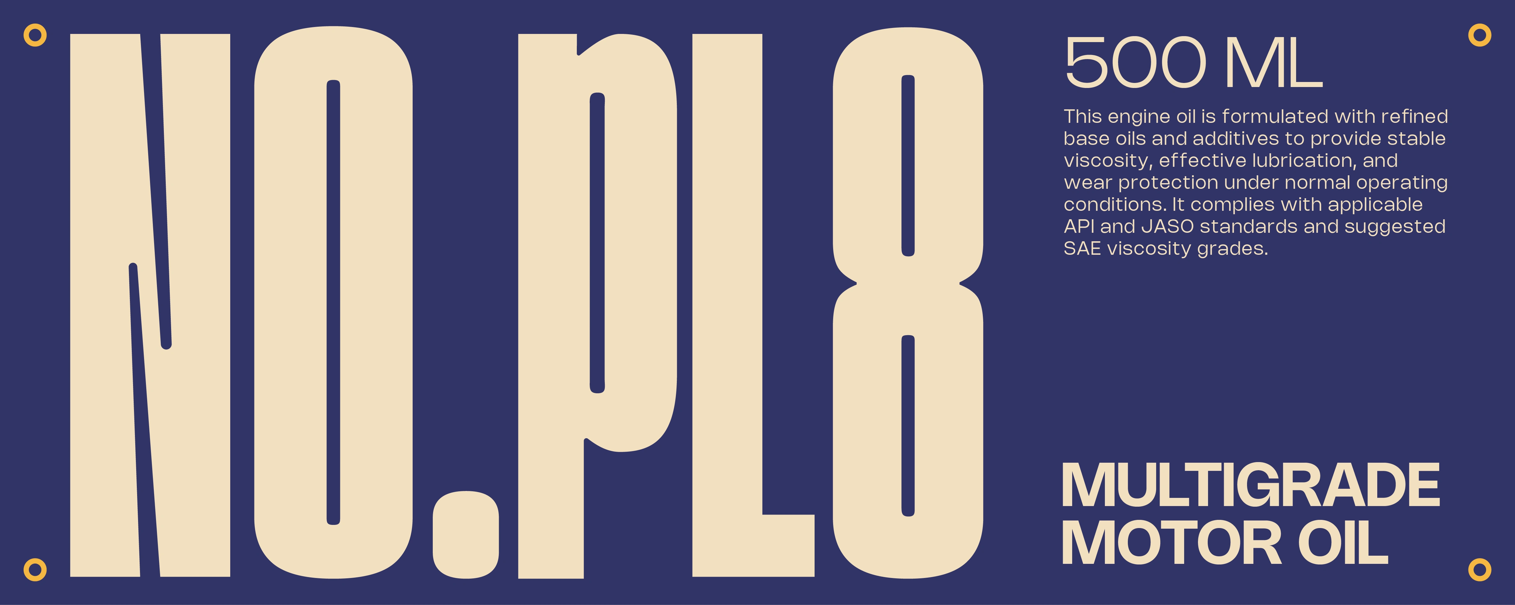
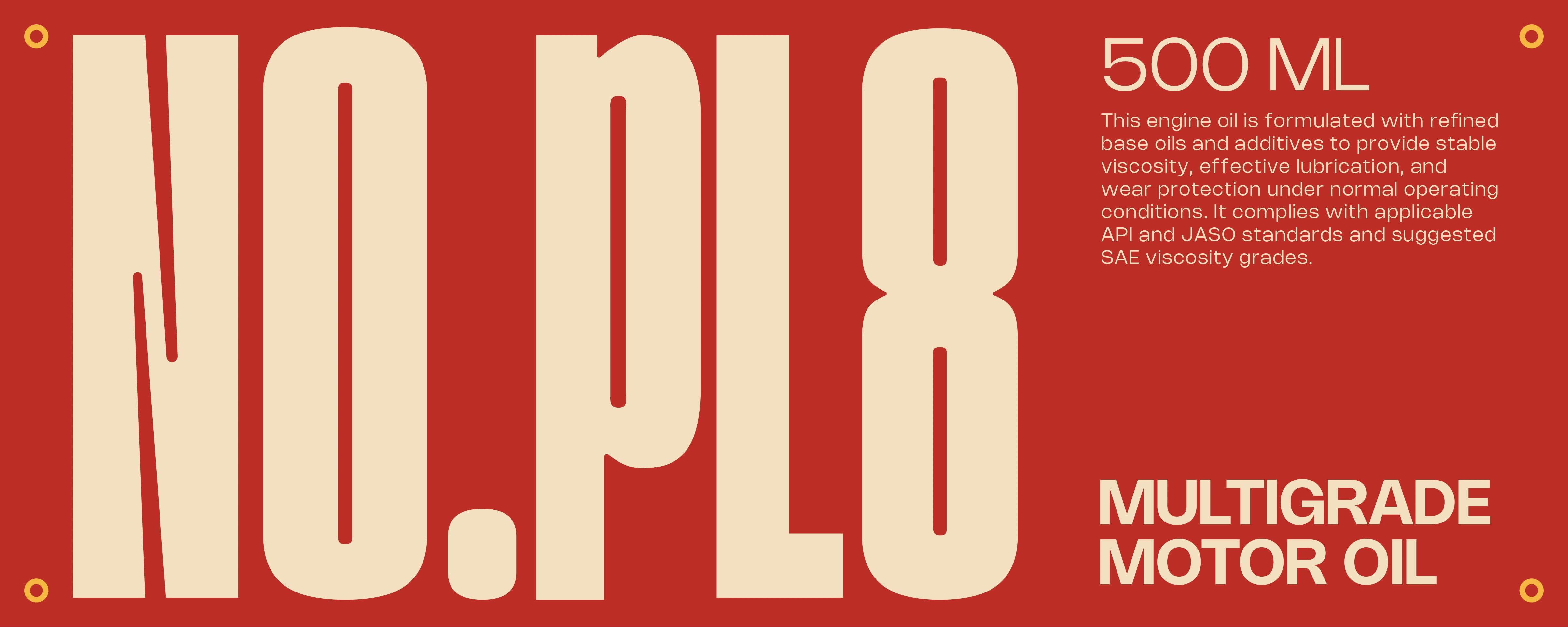
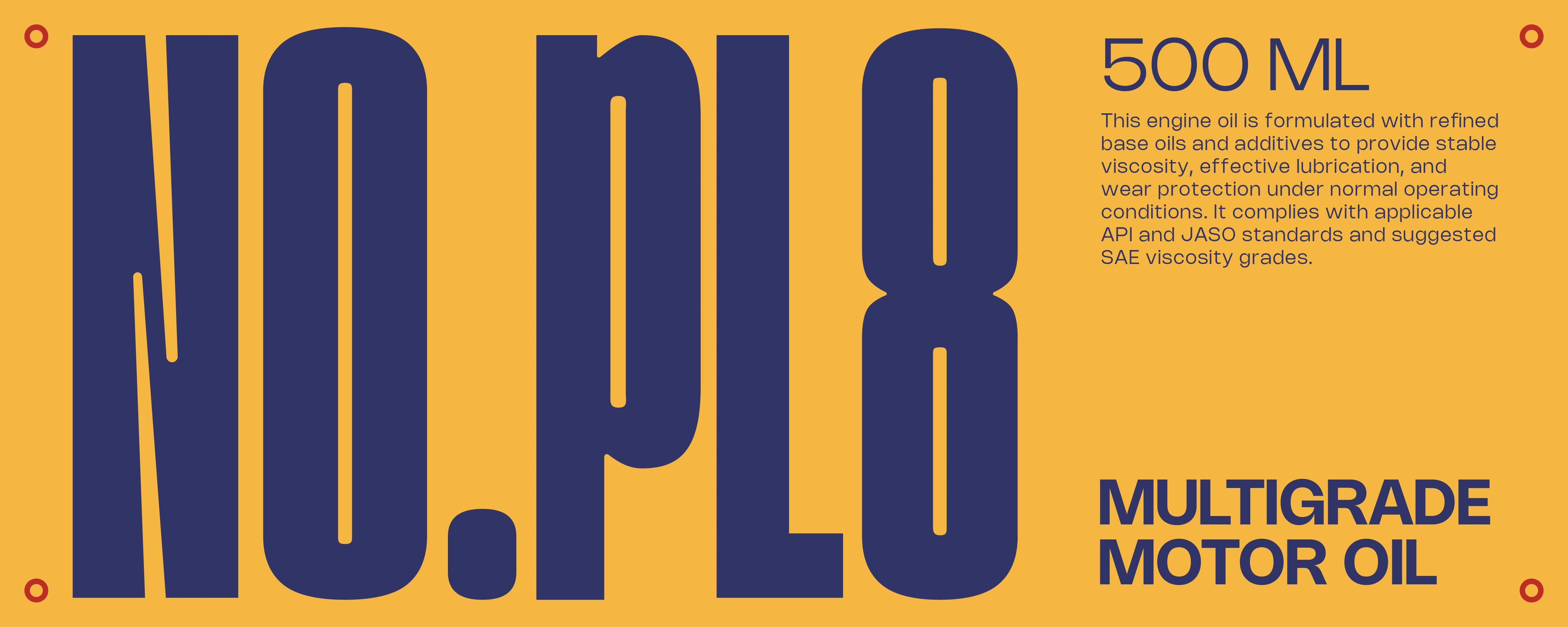
A Functional Approach to the Logo
The logo follows the same thinking - keep it simple, clear, and rooted in context.
A tall, condensed sans-serif structure was used to echo the proportions of number plates. This makes the identity feel structured, visible from a distance, practical rather than decorative. The intention wasn’t to create something expressive, but something that feels usable and believable in the real world.
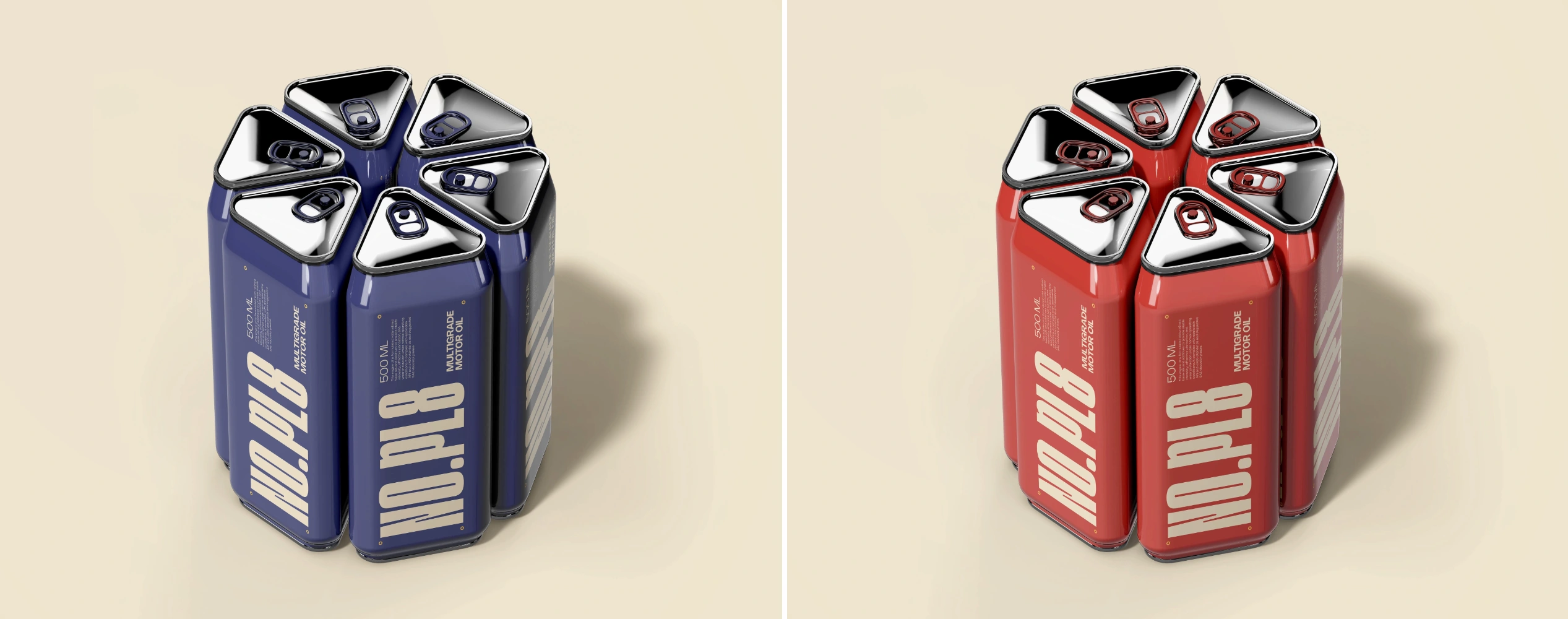
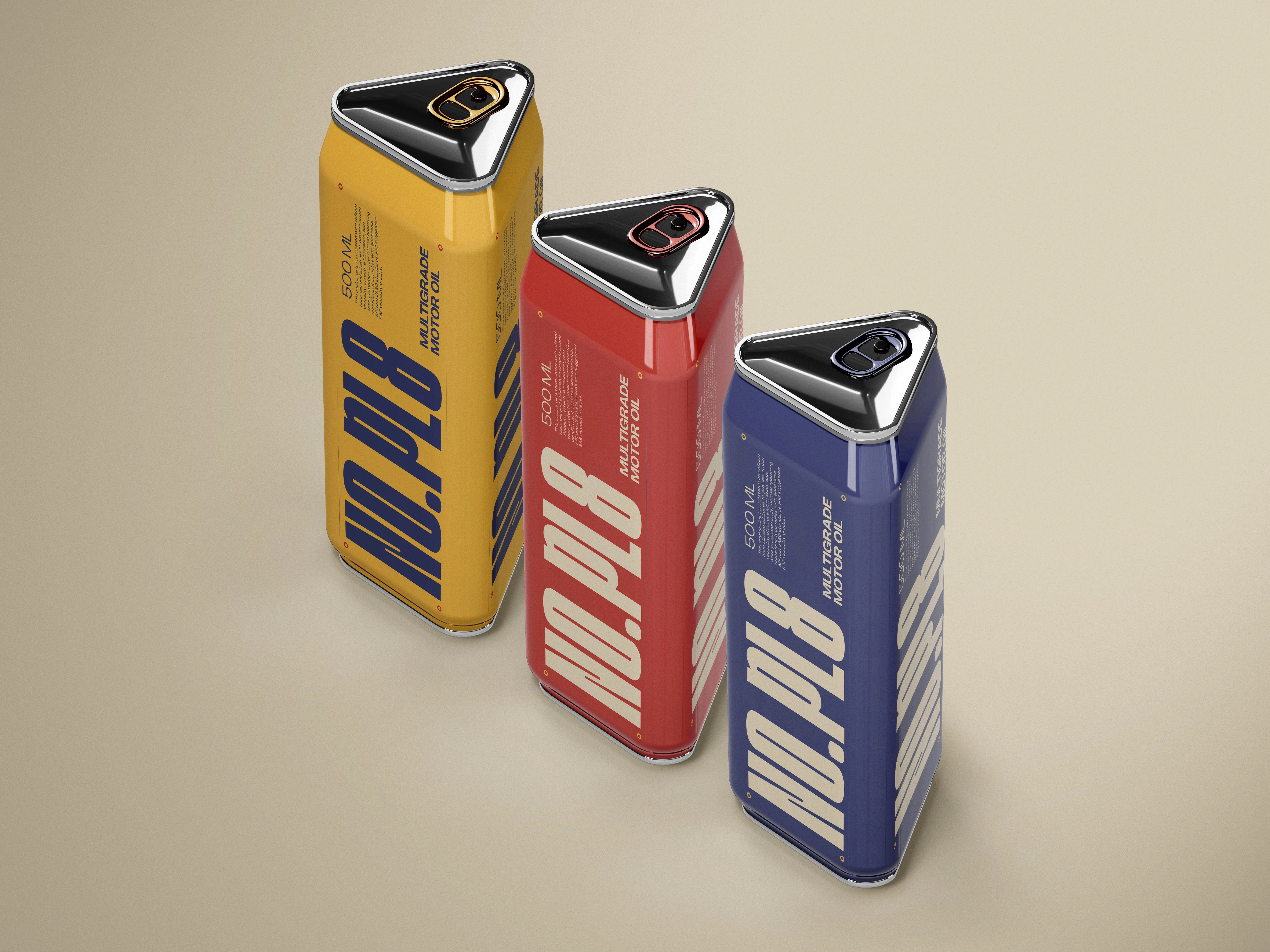
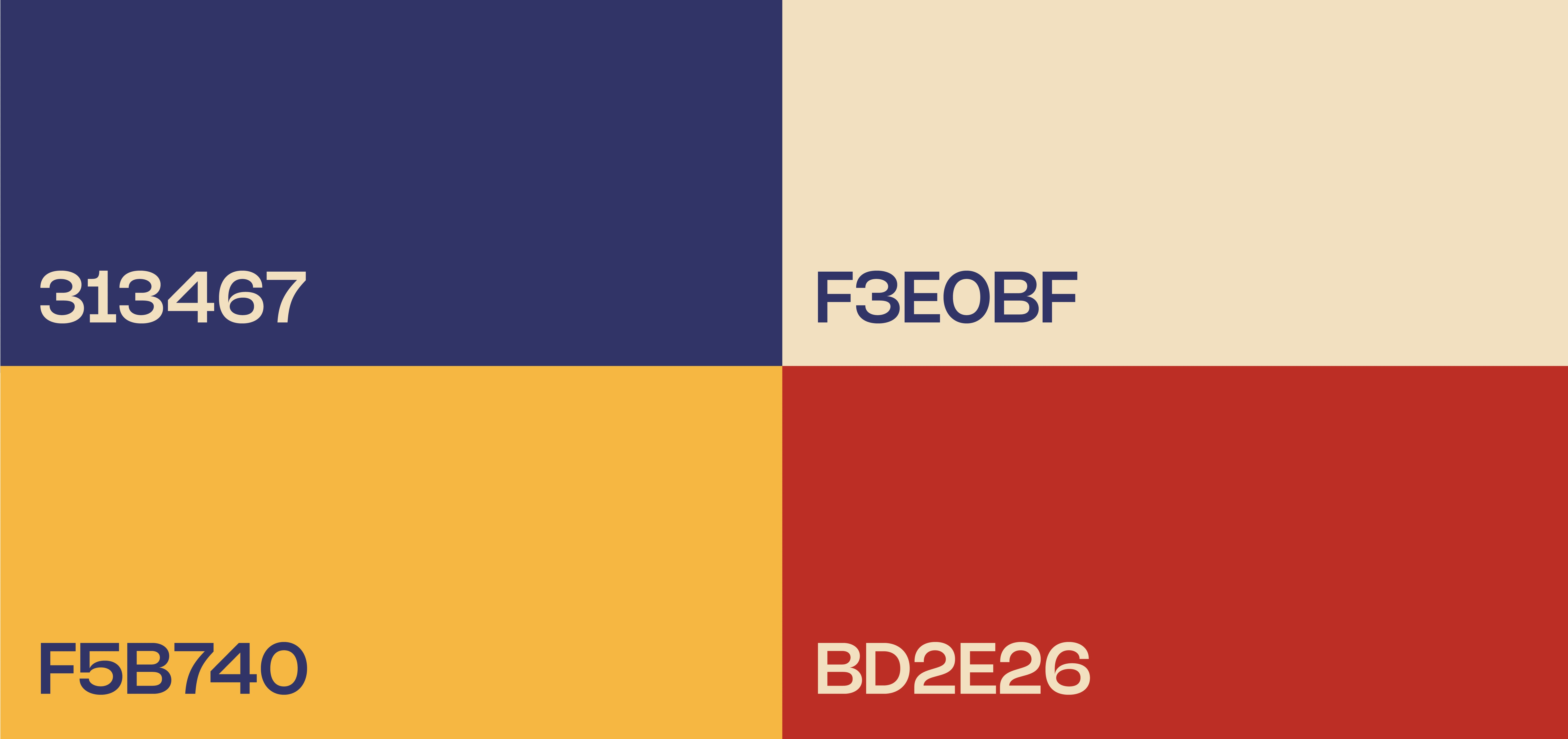
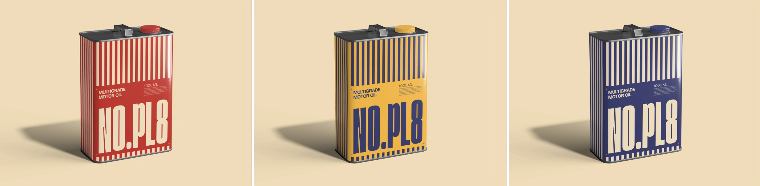
The Colour Palette
The colour palette is drawn from industrial and road safety environments
Yellow, red, and blue aren’t random choices. They’re already associated with -caution, urgency & reliability. Because of this, the brand doesn’t need to “teach” the user anything. It feels familiar from the first glance.
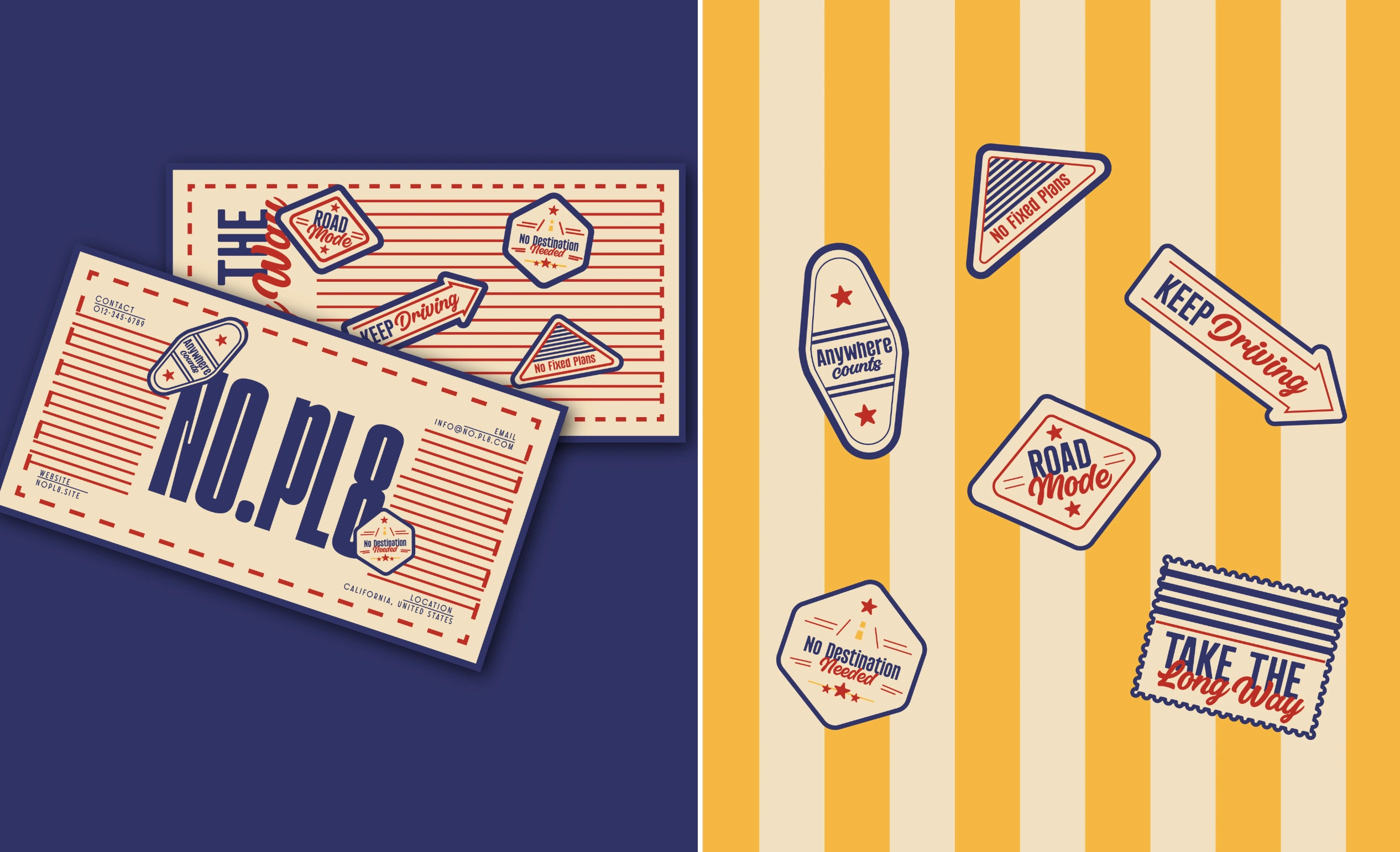
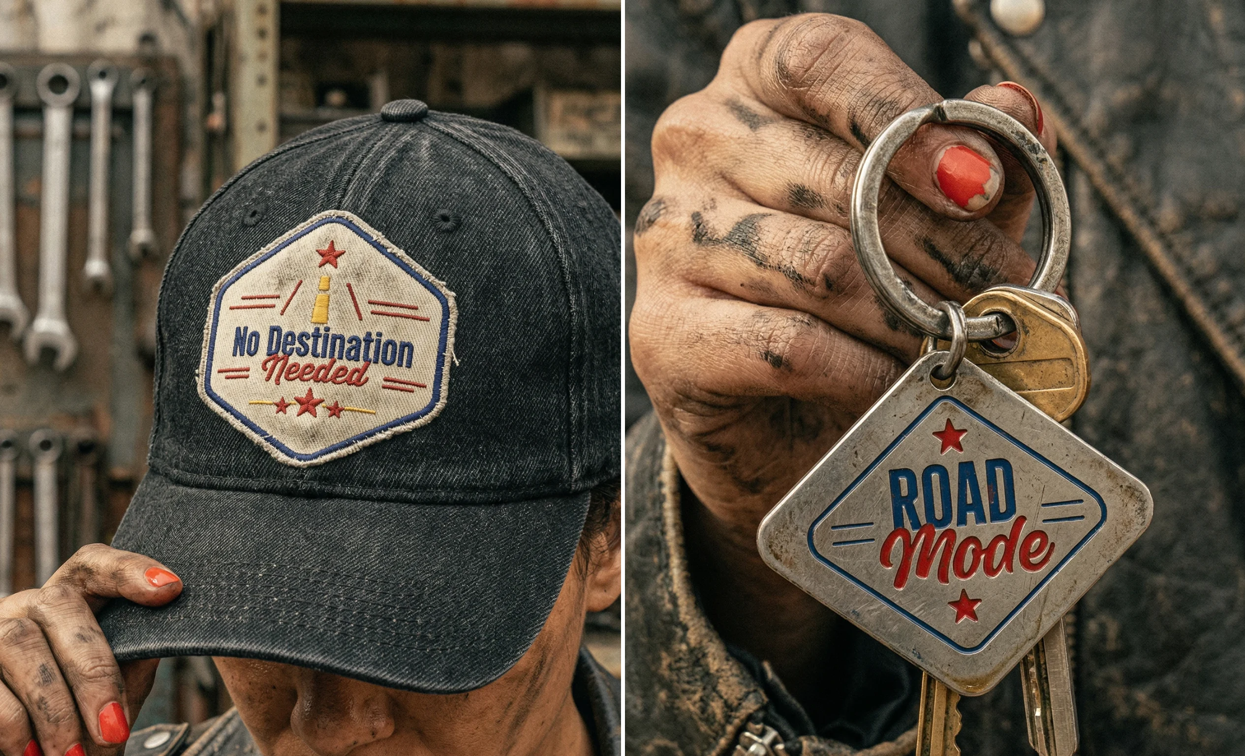
Iconography & Brand Extensions
To support the system beyond packaging,
I developed a functional iconography style.
These icons are designed to communicate key information quickly - such as usage, moving the right way, or category without relying heavily on text. These can acts as fun brand collaterals which reminds the user of the brand time to time and eventually increases the user base of this product. Alongside this, I explored small extensions like utility cards, imagining how the brand could exist beyond just the product. Together, these elements help position NO.PL8 not just as packaging, but as a cohesive and expandable brand system.
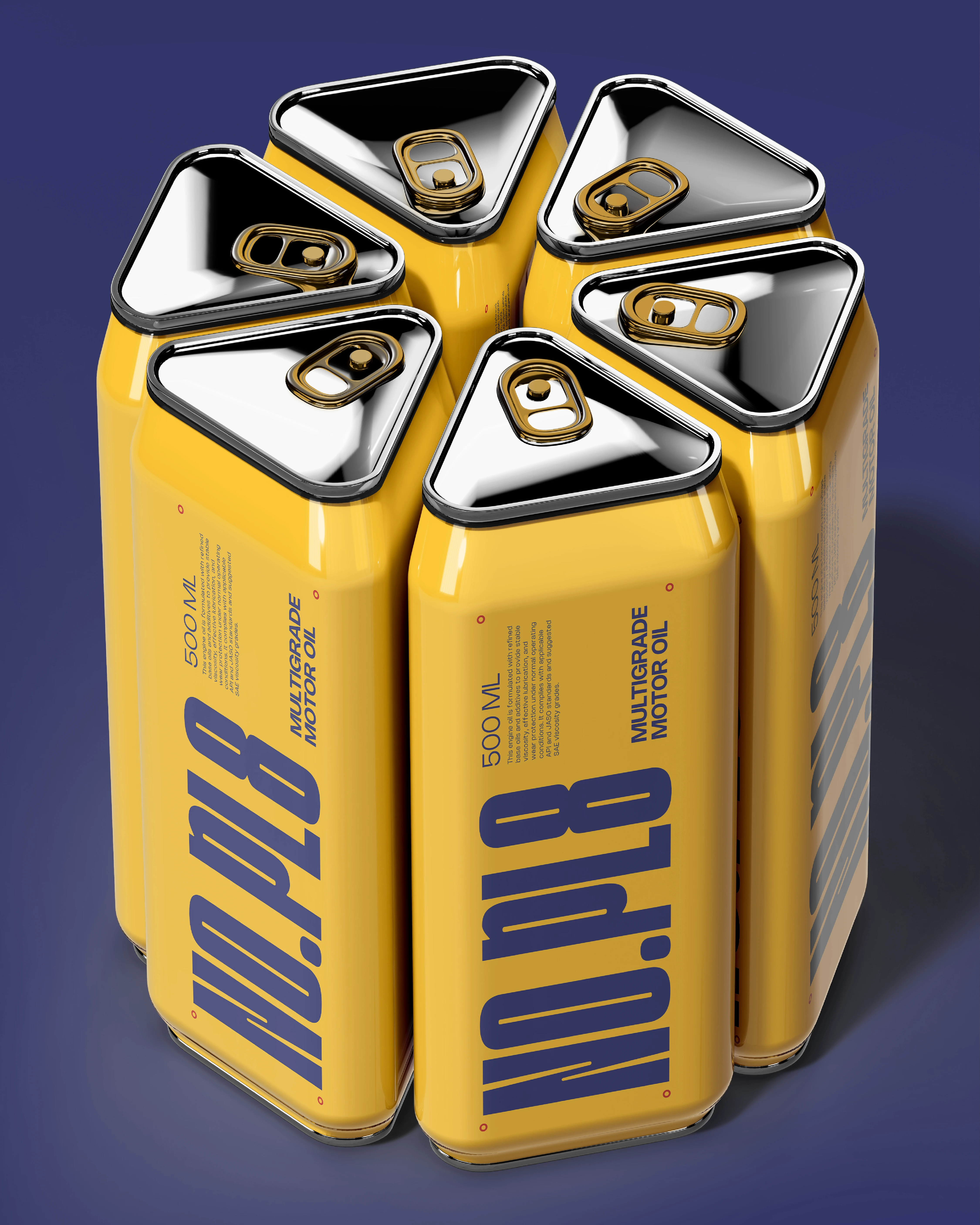
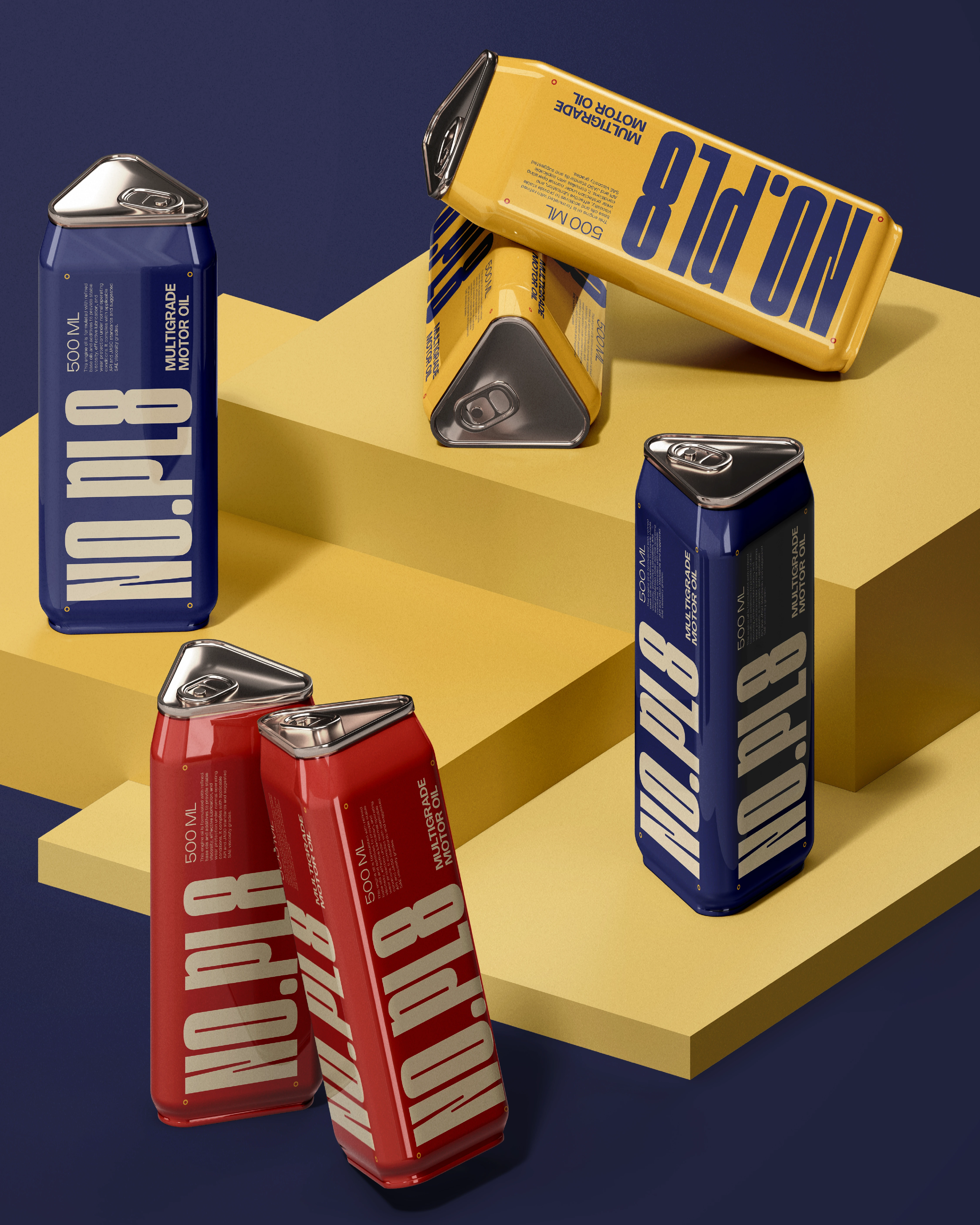
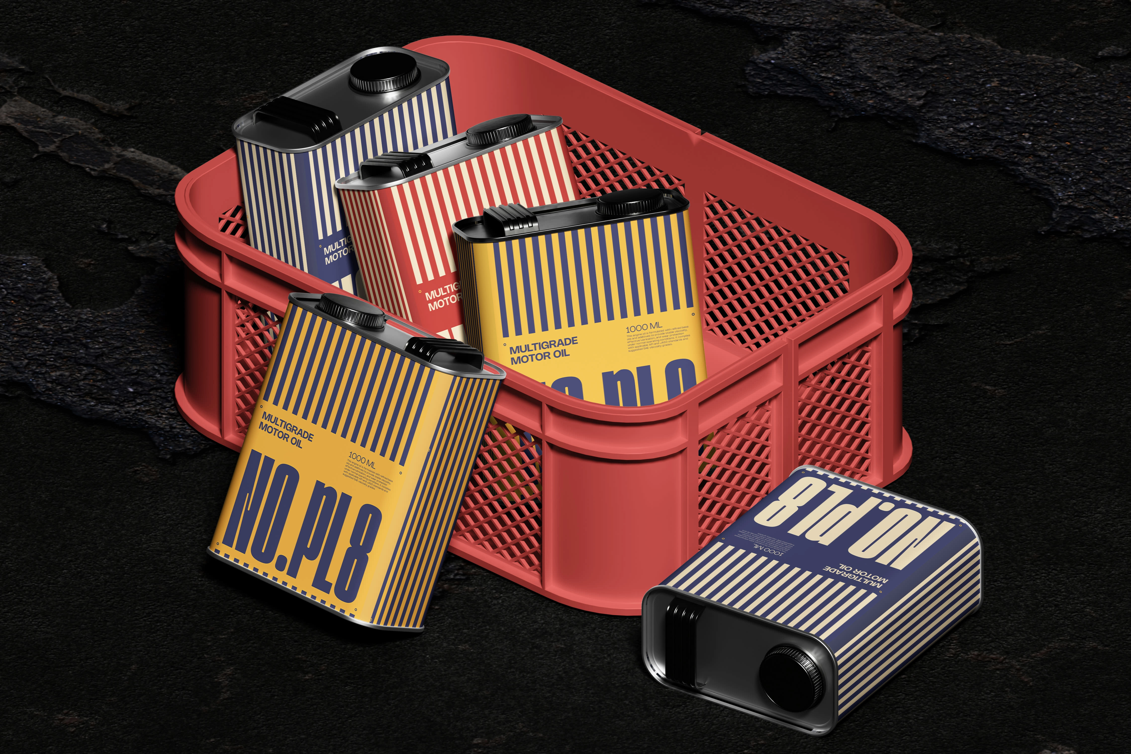
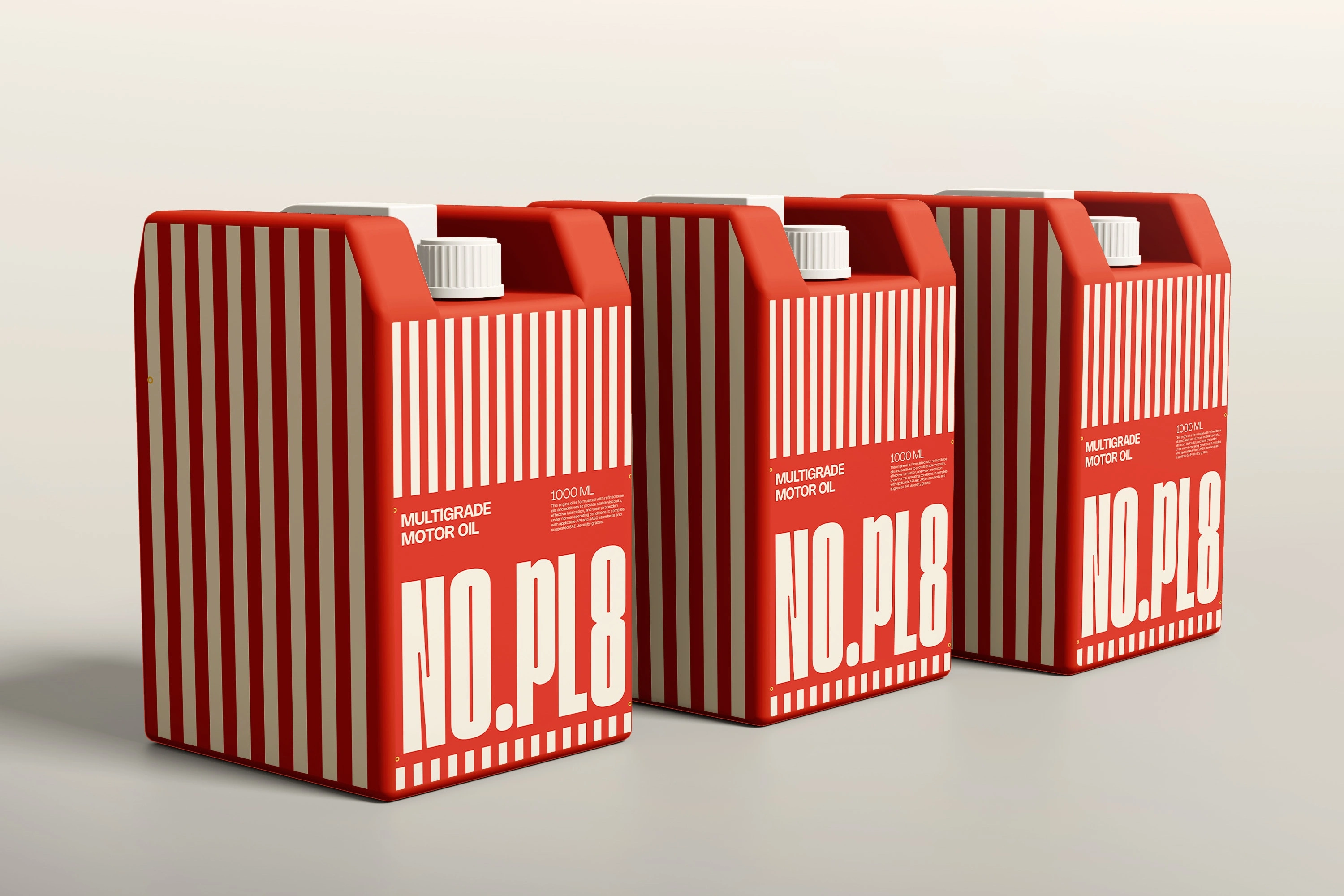
Packaging Inspiration - From Detail to Scale
The packaging system was designed by scaling the core idea across different formats, while keeping each one contextually relevant.
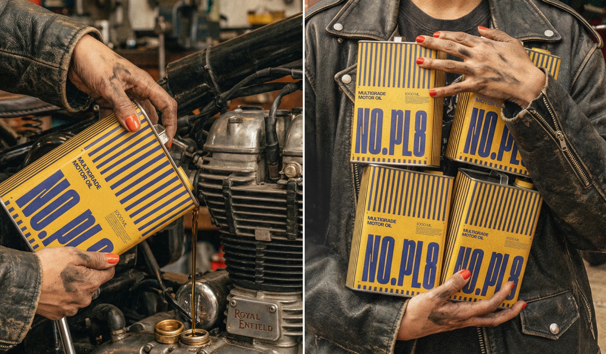
For the smaller packs, the design is directly inspired by number plates. The proportions, layout, and surface treatment reflect that reference closely, making the connection to the concept immediate and clear. As the format scales up, the approach shifts slightly. The mid-sized containers introduce striped graphics inspired by road dividers. This adds visibility and movement, while still staying rooted in the language of the road. For the larger containers, the focus becomes purely functional. These are treated as bulk storage units, where clarity and usability take priority over form-driven references.
Portable Packs - Designed for Real Situation
The smaller packs are where the idea becomes more personal.
They are compact, easy to carry, and designed for moments when fuel isn’t readily available. The form and surface design take cues from number plates, keeping them visually connected to the overall system. The intention was to make them feel like something that naturally fits into a rider’s or driver’s routine.
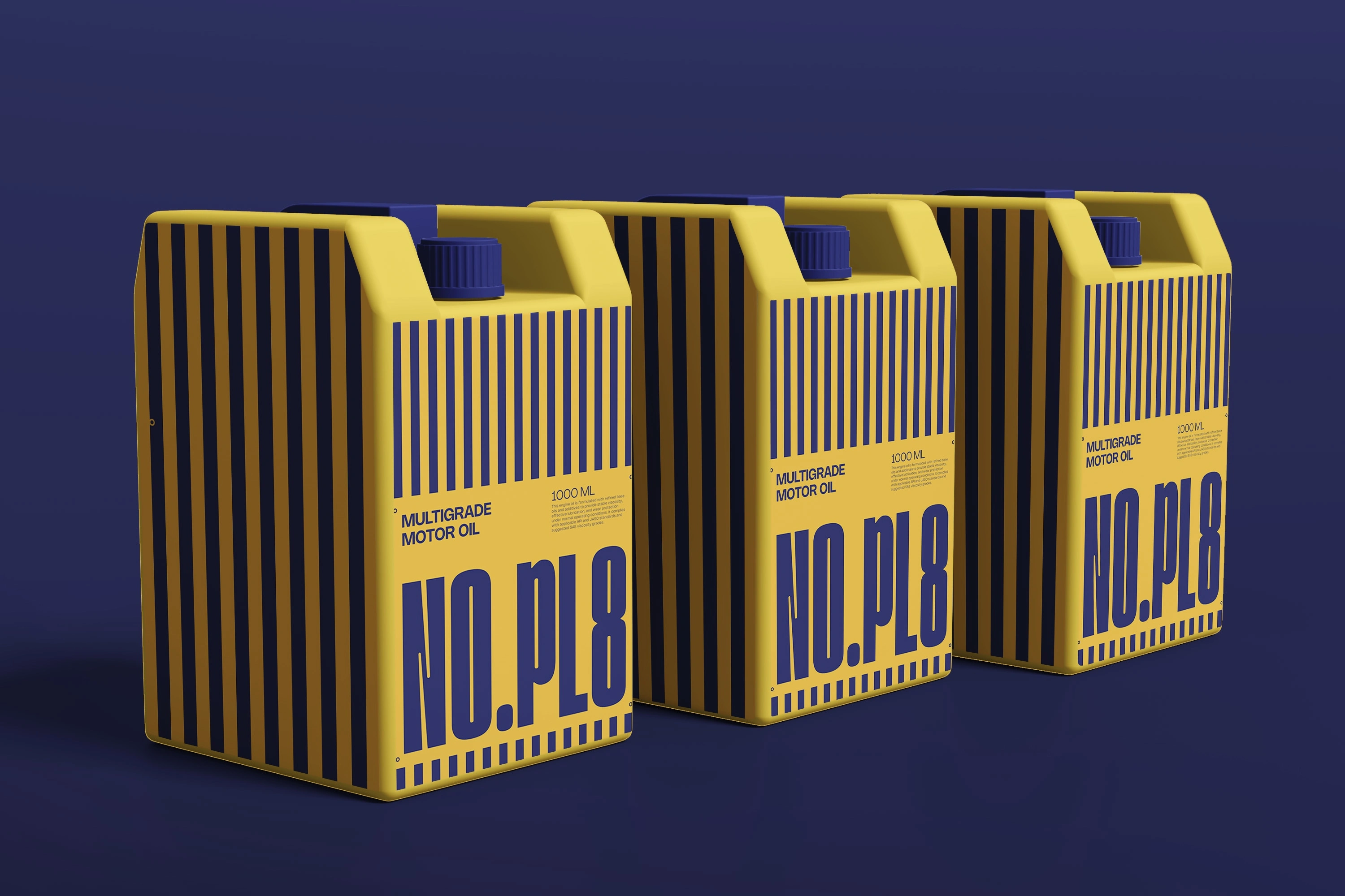
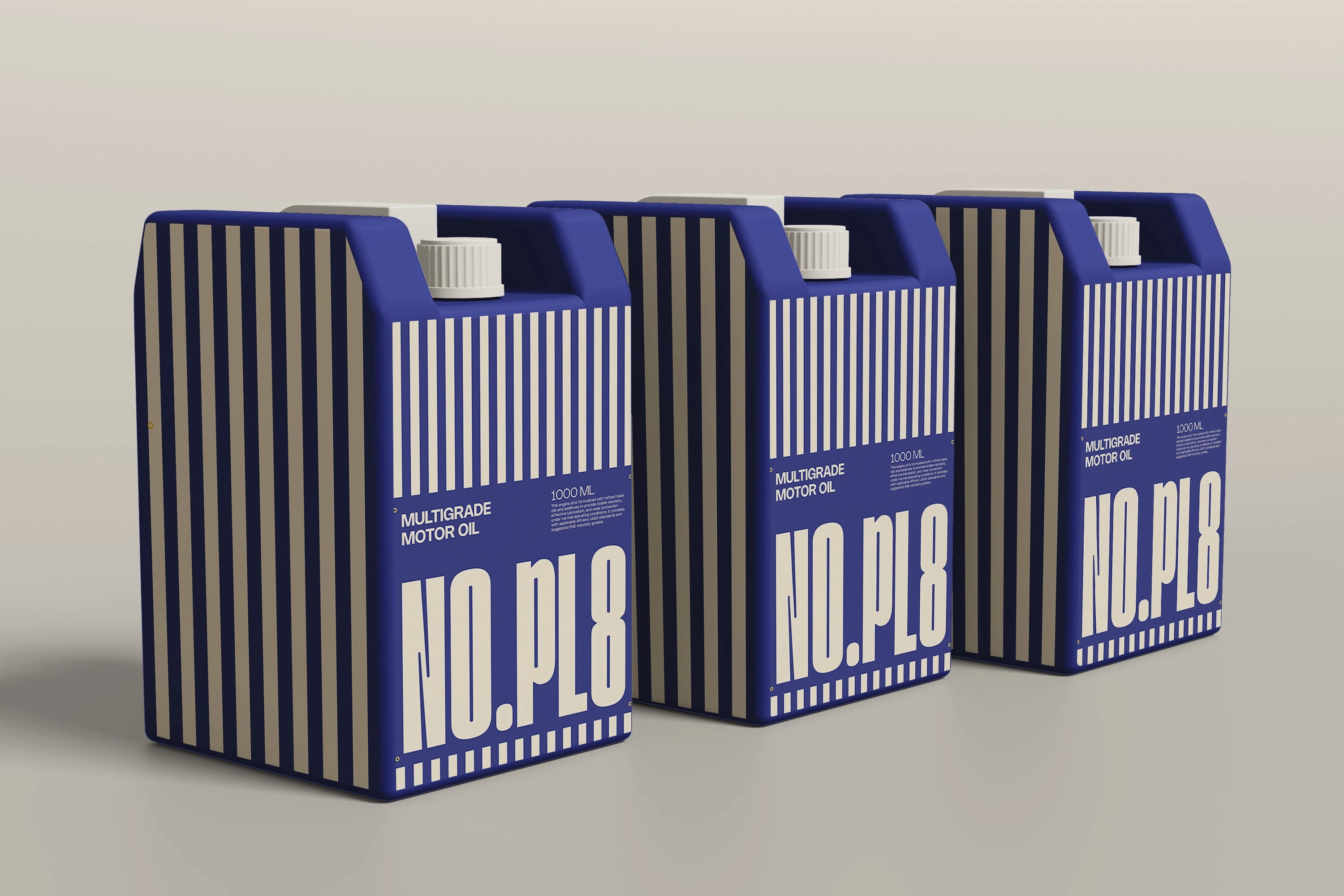
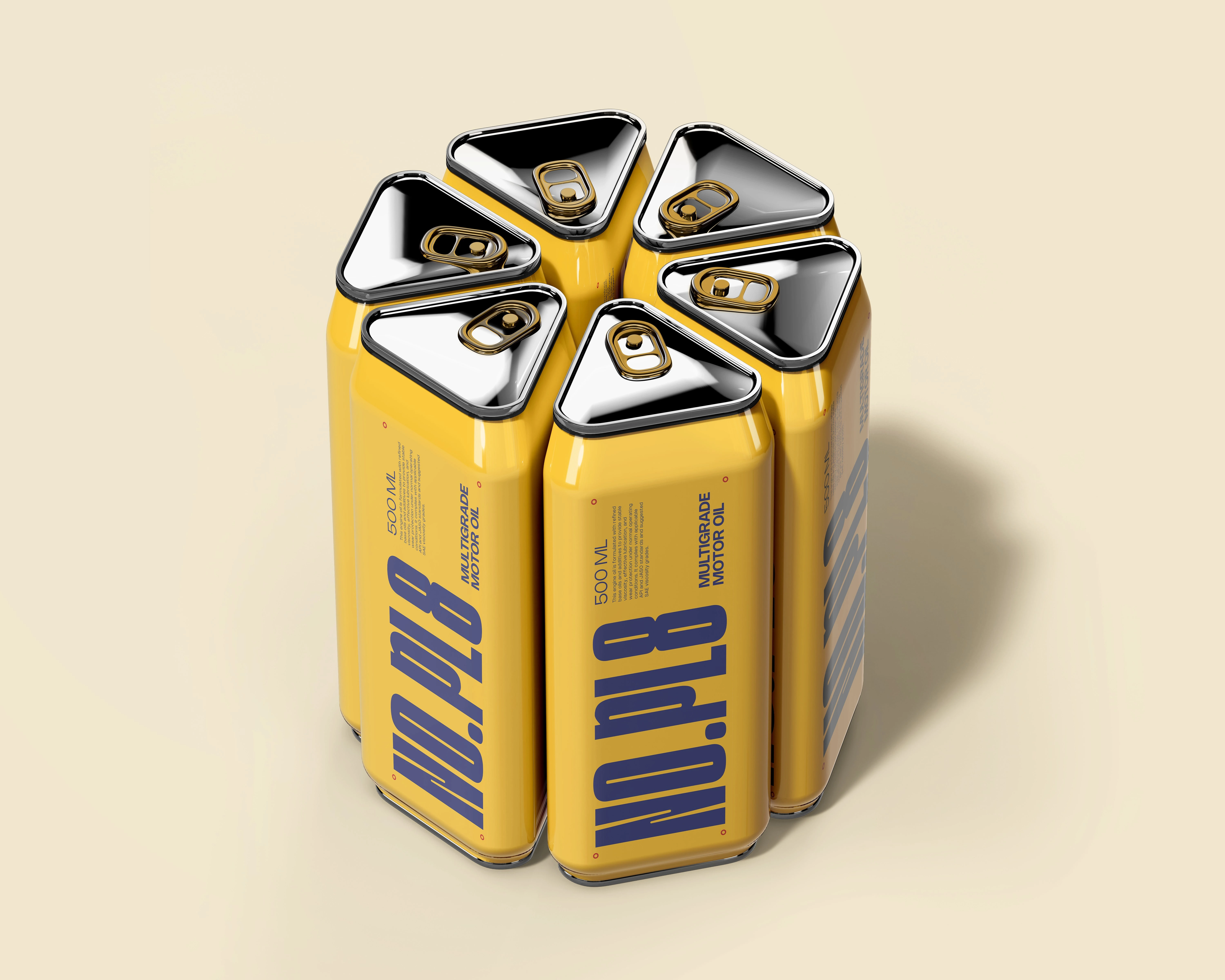
Mid-Sized Containers - Identity and Visibility
For these, I combined two key references from the road.
The mid-sized containers sit between portability and storage, so the design needed to do both carry the concept forward while improving visibility. The base structure and layout take cues from number plates, keeping the connection to the core idea intact. On top of that, I introduced striped elements inspired by road dividers and zebra crossings. This combination of the containers are more noticeable, especially in real-world environments.
Why the Larger Containers Are Kept Simple
As the packaging scales up, the role of the product changes.
The larger containers are not meant for quick use or visual impact - they’re designed for storage, transport, and reliability. In these cases, clarity and practicality matter far more than strong visual references. Adding too many design elements at this scale can actually reduce usability. So instead of forcing the number plate or graphic language onto them, the design is intentionally simplified. This allows the containers to feel: stable, utilitarian & easy to handle and store.

Into the Project Reflection
The closing Perspective
This project came down to making a speculative idea feel believable. The decisions were not about adding style, but about using familiar systems people already trust. Number plates, road markings, and safety colours are not just references, they are proven visual tools. As the packaging scales, the design becomes more restrained. Smaller formats carry the idea more directly, while larger ones prioritise function. That shift is intentional.
For me, the value of this project is in that balance.
Knowing when to push the concept and when to step back.
Let’s Build Something Thoughtful
If you’re looking to build a brand that goes beyond aesthetics and is grounded in clear thinking and real-world context, I’d love to collaborate. I focus on creating identities that are not just visually strong, but strategically built to make sense, connect, and scale.
Feel free to reach out always open to discussing new ideas and opportunities.
Like this project
Posted Apr 11, 2026
Developed NO.PL8 brand identity using road culture elements for portable fuel packaging.