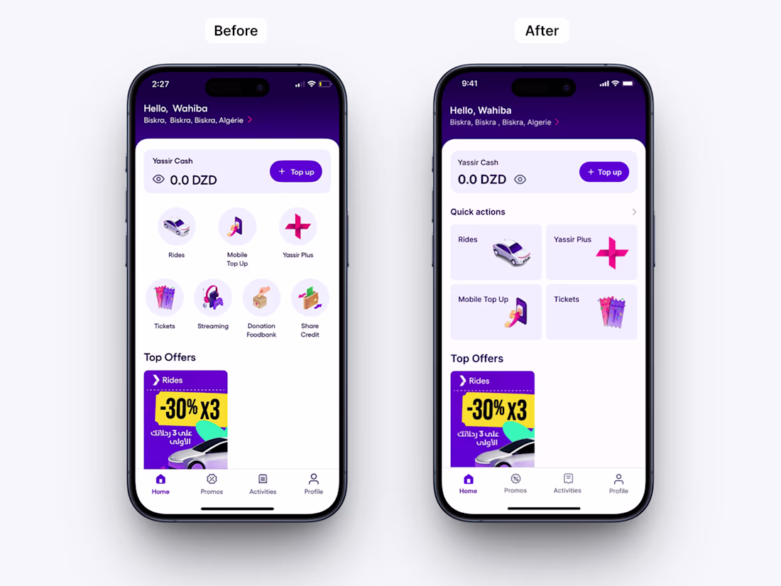
Super App Home Screen Redesign (Yassir-inspired)
Problem
The original “Services” section relied on circular icons, which limited clarity and slowed down user decision-making. All services were given equal visual weight, even though some—such as the donation feedback service—are...
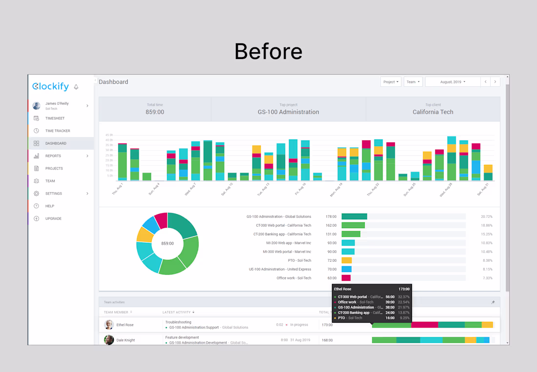
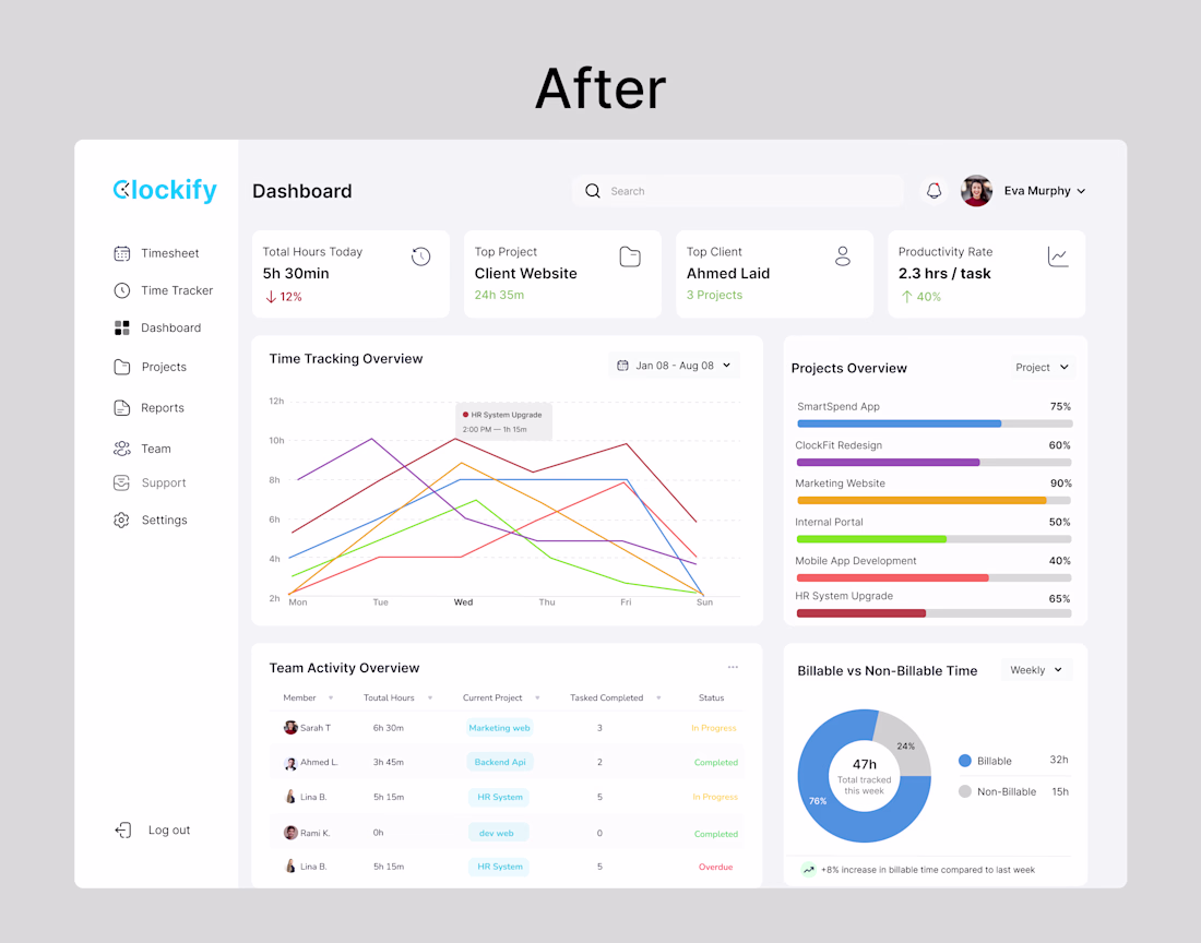
Clockify Dashboard Redesign Simplifying time tracking with a clean, data-driven interface. Designed to improve clarity, highlight key metrics, and support faster decision-making for teams.