The network for creativity
Join 1.25M professional creatives like you
Connect with clients, get discovered, and run your business 100% commission-free
Creatives on Contra have earned over $150M and we are just getting started
Back to feedPost
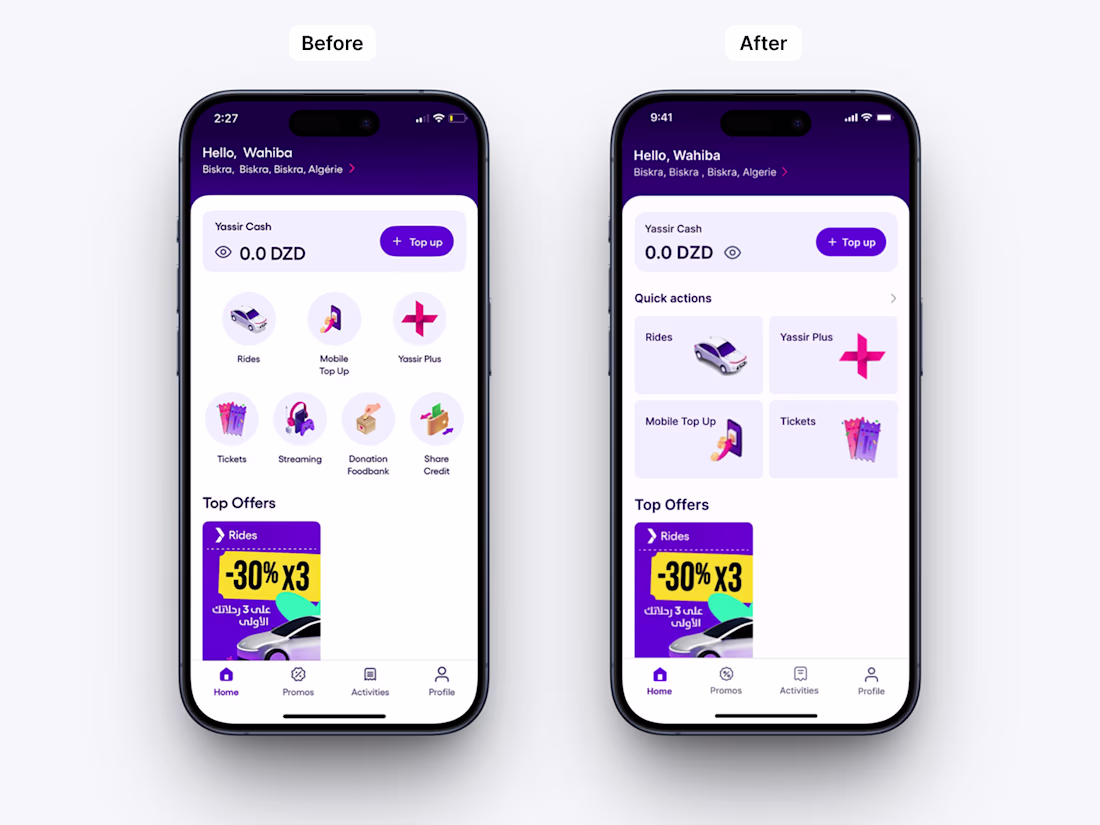
Super App Home Screen Redesign (Yassir-inspired)
Problem
The original “Services” section relied on circular icons, which limited clarity and slowed down user decision-making. All services were given equal visual weight, even though some—such as the donation feedback service—are rarely used. This created unnecessary cognitive load and reduced the efficiency of the home experience.
Solution
I redesigned the structure by replacing circular icons with card-based Quick Actions, allowing better hierarchy and faster access to key user flows. This shift emphasizes the most frequently used actions directly on the home screen, improving scanability and interaction speed.
The home layout was also reorganized to prioritize high-frequency services, while secondary actions were visually deprioritized to maintain focus and reduce clutter.
Additionally, I refined the balance visibility interaction by repositioning the eye icon after the amount, ensuring users perceive the balance first before choosing to hide or reveal it. This small adjustment improves natural reading flow and interaction logic.
Outcome
A more focused and structured home experience with improved visual hierarchy, reduced cognitive load, and faster access to essential actions.
The network for creativity
Join 1.25M professional creatives like you
Connect with clients, get discovered, and run your business 100% commission-free
Creatives on Contra have earned over $150M and we are just getting started
Related posts
Neon Flow — A Smooth UI Motion Component for Modern Interfaces.
Lately I’ve been exploring how motion can make interfaces feel more “alive” without becoming distracting.
So I built this Neon Flow component — a minimal animated UI element with smooth transitions and soft neon aesthetics.
What I enjoyed most while building it:
- balancing glow without overdoing it
- keeping performance smooth
- making the animation feel natural instead of flashy
I genuinely think modern UI is shifting toward subtle interaction design rather than heavy animation.
Where do you think components like this fit best — SaaS products, portfolios, or creative websites?
I think it fits SaaS the most
dark one, has more contrast
The smallest interactions are often the most memorable.
A custom cursor won’t change the structure of a website —
but it can completely change how the experience feels.
That kind of detail matters.
INKY was designed with this approach in mind:
combining structure, rhythm, and subtle interaction to create a more intentional experience.
Explore it here:
https://www.framer.com/marketplace/templates/inky/?fpr=nowmo
Available for:
— Framer website design
— Template customization
— Interactive components
This work is good
Trending
Claude
Claude has entered the design space. How are you using Claude Design?
Contra University
Learn from expert creatives how to earn more using next-gen AI tools.
creativeaiflow
Creative AI workflows are evolving. What tools do you use, and what are their strengths and weaknesses?
portfolioreview
The best portfolios tell a story, not just show a grid. Share yours for feedback.
freelancerlife
Freelancer life is wins, pivots, and everything in between. What’s yours right now?