The network for creativity
Join 1.25M professional creatives like you
Connect with clients, get discovered, and run your business 100% commission-free
Creatives on Contra have earned over $150M and we are just getting started
Back to feedPost

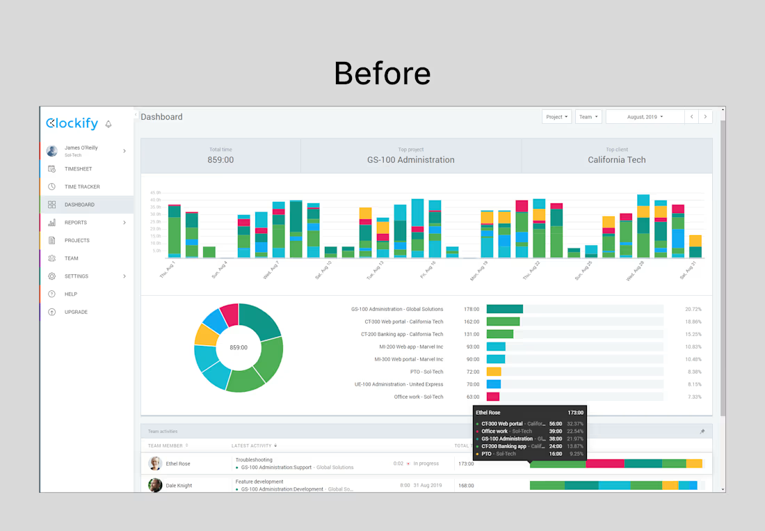
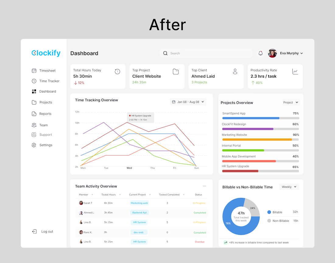
Clockify Dashboard Redesign Simplifying time tracking with a clean, data-driven interface. Designed to improve clarity, highlight key metrics, and support faster decision-making for teams.
The network for creativity
Join 1.25M professional creatives like you
Connect with clients, get discovered, and run your business 100% commission-free
Creatives on Contra have earned over $150M and we are just getting started







Related posts

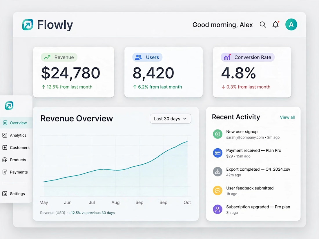
Designed a clean and modern SaaS dashboard UI in Figma, focusing on usability, clear data visualization, and a smooth user experience.


That's really clean modern Minimalistic dashboard UI❤️
Great job Naim 🔥🔥

A little exploration in dashboard UI ✳️
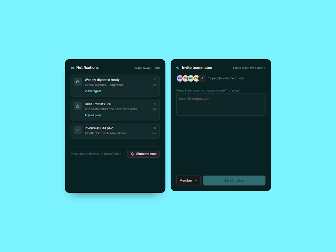
Two small SaaS components focused on making everyday interactions feel clearer and more intuitive — from notifications to inviting teammates.
Exploring clean layouts, subtle details, and a dark interface with a pop of cyan.
Designed in Figma. Built with HTML, CSS & JavaScript.
I design in Figma and develop in Webflow and Framer.



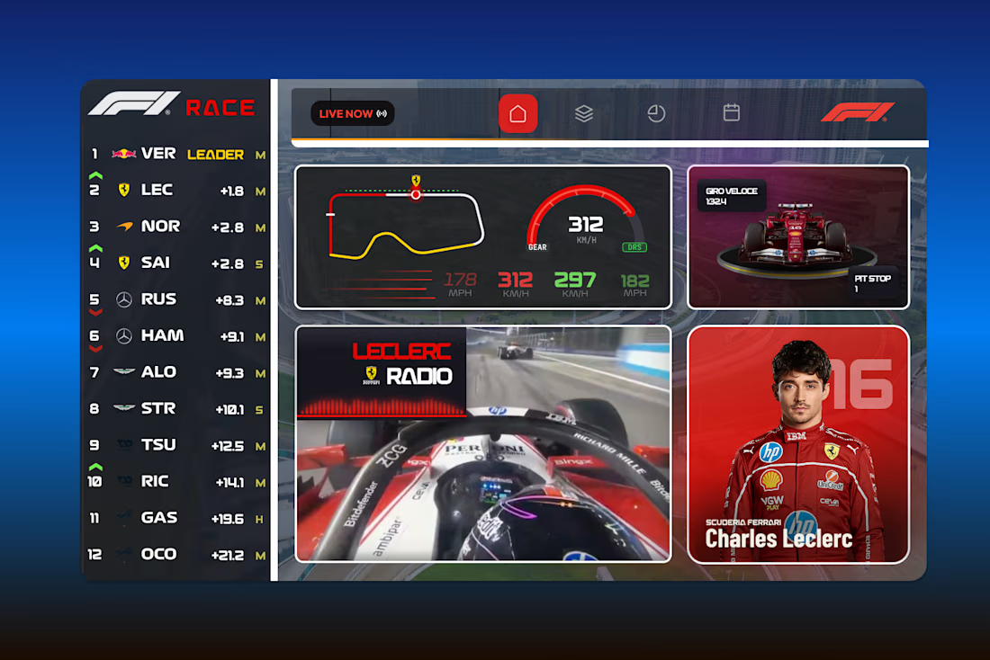
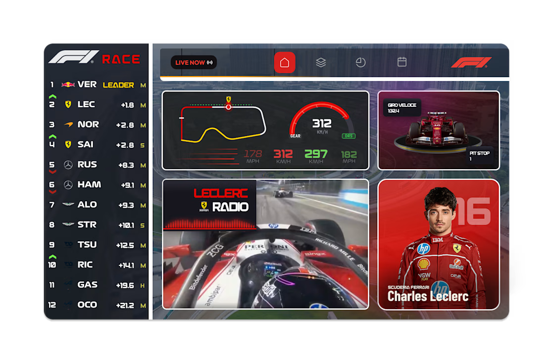
F1 Live Race Dashboard - UI Concept
A live race dashboard concept designed for fans who want the full picture at a glance. Real-time leaderboard, track position, speed and gear telemetry, team radio and driver spotlight, all in a single bento-style layout.