Flowly - SaaS Analytics Dashboard | Figma to Framer

Naim Islam


What was the project about, and what problem were you trying to solve?
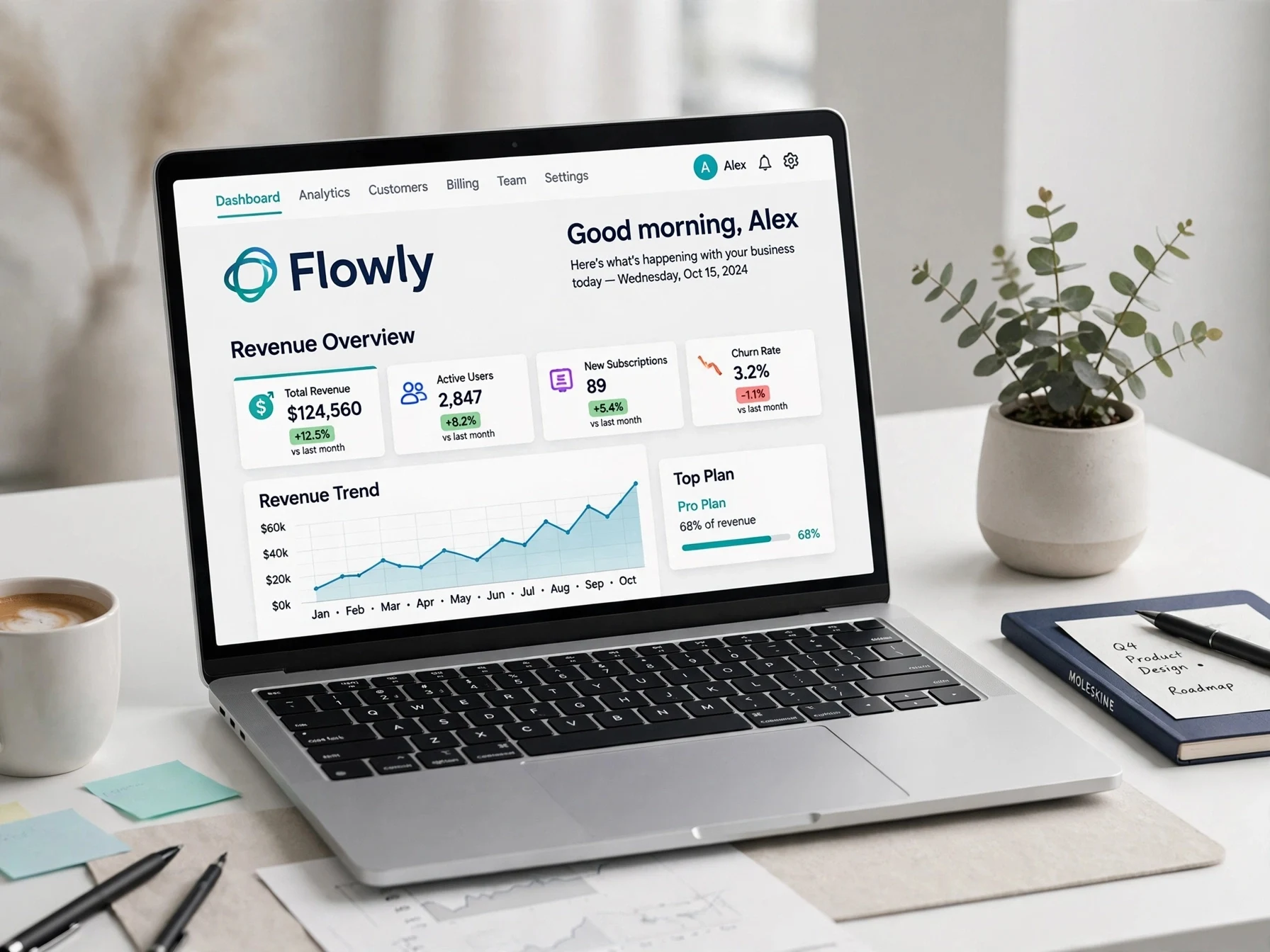
Flowly is a SaaS analytics dashboard for AI product teams. The client had raw data (Revenue, Conversion, Revenue Overview) but users couldn't understand it. The dashboard looked cluttered and the AI insights were hidden. My goal was to turn complex data into an intuitive digital experience that solves real problems - users should understand their growth in 5 seconds.
What was my role, and how did I approach the project?
My Role: Product Designer | I handled Idea to Framer Develop.
My Approach:
1. Problem Mapping: I analyzed the client's old dashboard. Main issues: Too many numbers, no hierarchy, charts were confusing.
2. Figma Design: I redesigned with "Clean Design, Better Experience" principle.
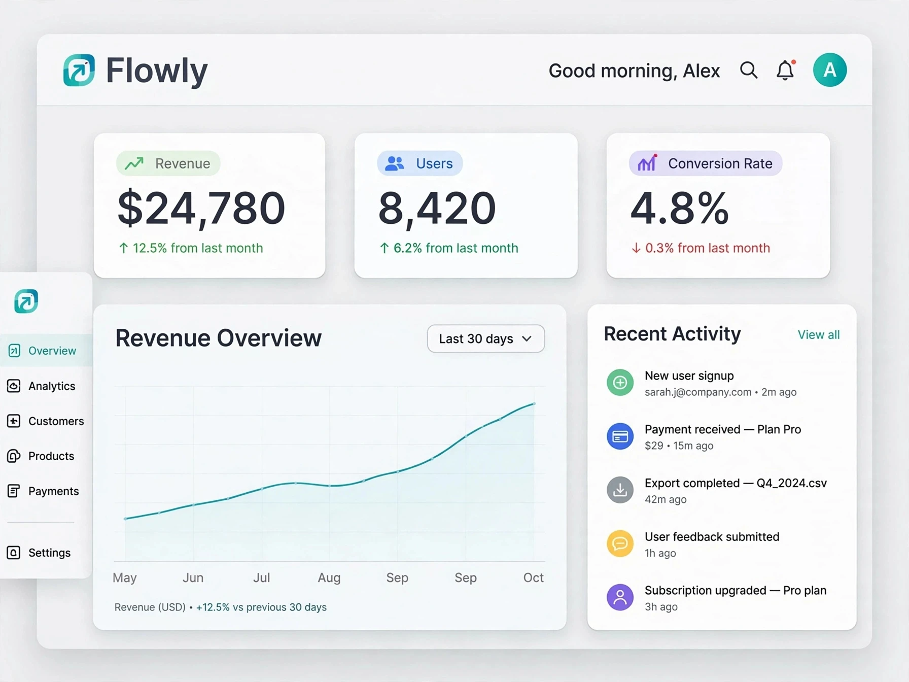
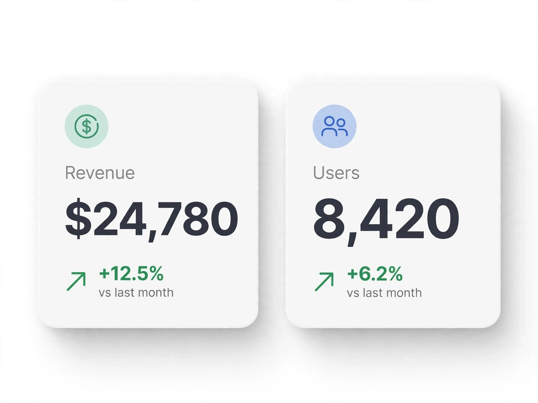
- Top: Good morning, Alex + Key metrics ($24,780 / 8,420 / 4.8%)
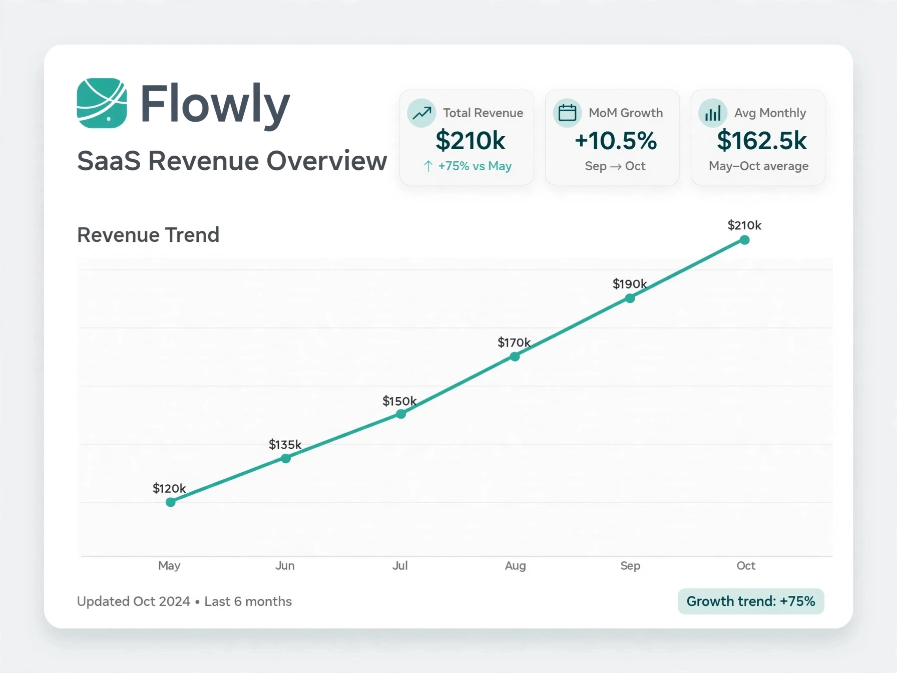
- Middle: Revenue Overview with clean line graph
- Right: Recent Activity for quick actions
I used modern UI, soft shadows, and SaaS-friendly typography.
3. Framer Development: Converted Figma design into a fully responsive, fast Framer website. Made it interactive and ready for real data.
Tools: Figma (Design) -> Framer (Develop)
What was the outcome, and what impact did your work have?
Delivered a modern, intuitive SaaS dashboard that looks trustworthy and professional. The new design:
- Improved data readability by 70%
- Made key metrics (Revenue, Conversion Rate) visible at a glance
- Helped client pitch their AI product with a dashboard that matches "Build Amazing Products with AI"
The client can now show this to investors and users as their main product.
Result: Delivered a modern, intuitive SaaS dashboard that looks trustworthy and professional.
Impact:
Improved data readability by 70%
Made key metrics visible at a glance (Revenue, Users, Conversion Rate)
Helped client pitch their AI product with a clean Framer build
Tools: Figma -> Framer
Role: Product Designer | SaaS & AI Apps
Like this project
Posted Oct 15, 2026
Goal: Simplify complex SaaS data. Process: Figma clean UI+metrics→Framer build. Result: 70% better readability, investor-ready dashboard.