
Vito Carvalho
Brand designer | Product Designer
Ready for work
Vito is ready for their next project!
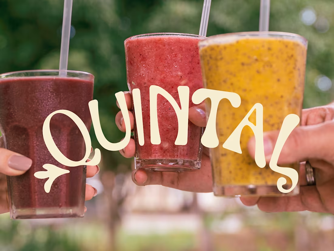
In the search for spaces that slow down the daily routine and blend flavor with nature, Quital emerges. Born from the expertise of a traditional local bakery known for creating incredible experiences, this new space is designed for an alternative and Millennial audience. Since the coffee shop promotes the idea of a digital detox and the search for more authentic real-life moments, the brand identity needed to convey a handcrafted and natural feel.
To translate this visually, the logo design features organic and irregular shapes, embracing a hand-drawn aesthetic. Its arched layout acts as an invitation to enter this universe, while the curves of the letterforms evoke branches and leaves, reflecting the feeling of the outdoors right in the middle of the urban landscape.
0
65
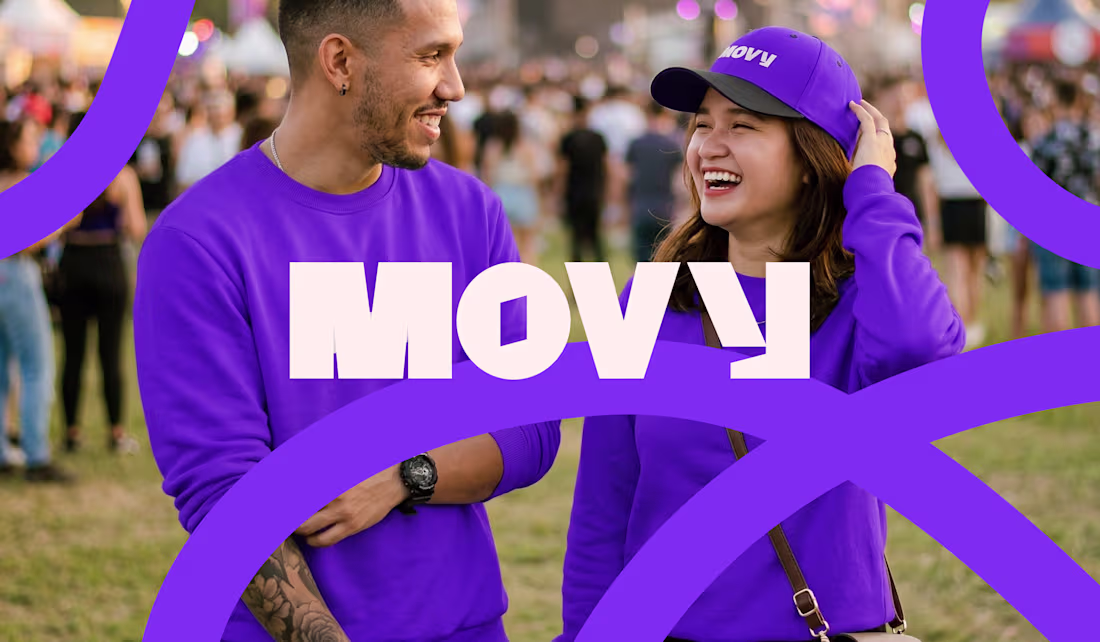
A growing audience has been seeking to disconnect from social media to live real, memorable experiences at theaters, concerts, bars, or through outdoor activities. This lifestyle shift has gradually developed due to digital information overload, sparking a search for real-life "detox" alternatives through sports, hobbies, and leisure.
The Movy platform emerges as a facilitator to find the perfect experiences and organize them into a personal schedule in a fun way. It ensures users find the activities they enjoy while encouraging them to explore new possibilities.
The brand's main challenge was connecting with Gen Z and Millennials in a fun, youthful, and bold manner, reflecting the vast diversity of interests and experiences available on the platform.
0
77
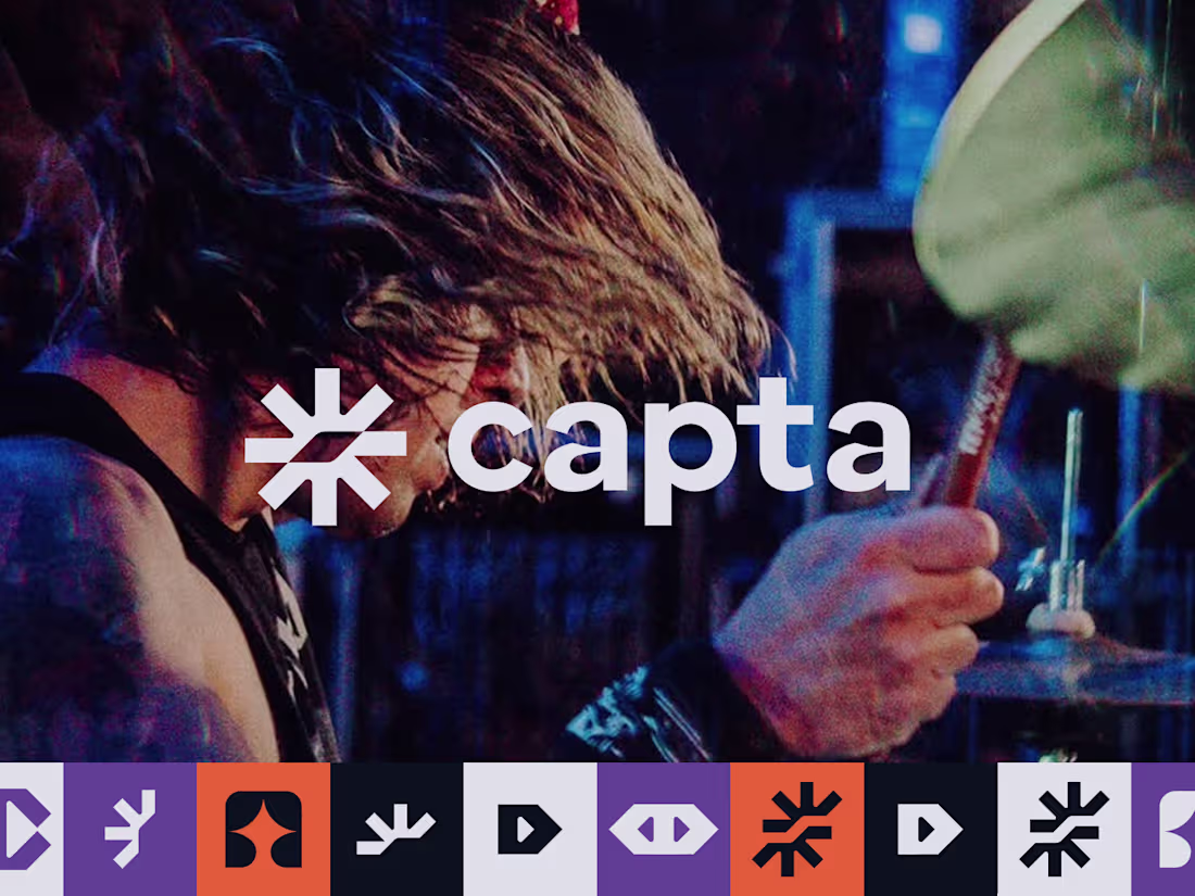
Capta was born to produce high-quality social media content, seamlessly blending the aesthetics of cinema and photography. The main challenge was to balance an artistic flair with strong commercial appeal, creating a dynamic brand capable of transforming basic visual communication into a fully premium digital positioning.
The identity needed to convey energy and youthfulness while maintaining strict professionalism. To achieve this, I designed a custom typography built upon a low-contrast sans-serif foundation. I incorporated bold strokes and obtuse angles that inject personality, modernity, and strength into the wordmark.
0
92
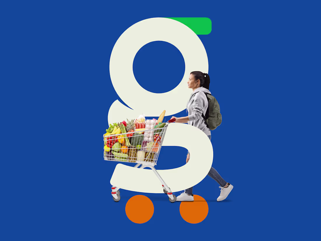
Supermercado Guanambi, a traditional local brand, was preparing to expand into new regions and needed a visual positioning that matched its ambition. The main challenge was leaving behind its generic blue-and-white identity to create an image that conveyed the trust and variety of a large supermarket chain, balancing corporate reliability with a modern, approachable feel.
To achieve this, the design solution was built around a clever concept: I stylized the initial letter "g" to subtly and abstractly represent a shopping cart, resulting in a strong yet friendly symbol. Complementing this, the humanist sans-serif wordmark was custom-drawn with rounded shapes and strategic cuts to inject originality into the brand.
Because the symbol required a more solid, conservative foundation, the necessary energy and disruption were introduced through the new color palette. I retained the historical blue to honor the company's legacy but introduced an elegant off-white, paired with vibrant orange and a bright, energetic green for high contrast. The final outcome is a comprehensive visual identity, consistently rolled out across print materials, digital touchpoints, and a new storefront design, perfectly equipping the brand to stand out in its next phase of growth.
0
50