The network for creativity
Join 1.25M professional creatives like you
Connect with clients, get discovered, and run your business 100% commission-free
Creatives on Contra have earned over $150M and we are just getting started
Back to feedPost
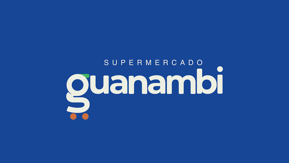
Supermercado Guanambi, a traditional local brand, was preparing to expand into new regions and needed a visual positioning that matched its ambition. The main challenge was leaving behind its generic blue-and-white identity to create an image that conveyed the trust and variety of a large supermarket chain, balancing corporate reliability with a modern, approachable feel.
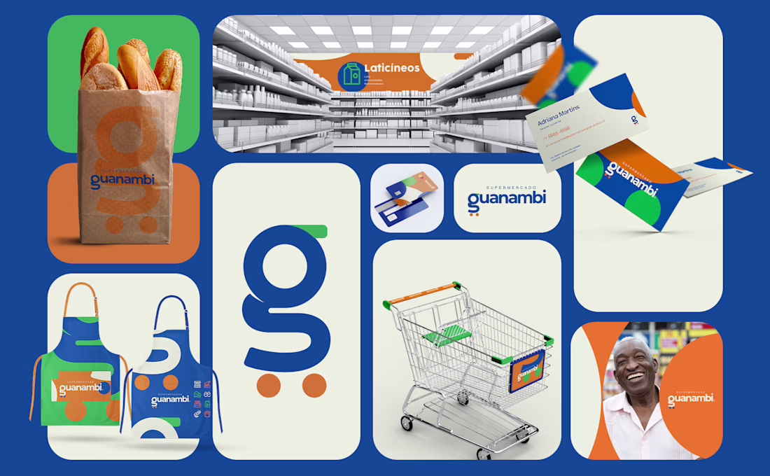
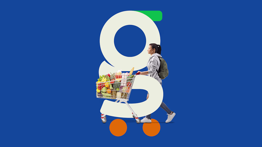
To achieve this, the design solution was built around a clever concept: I stylized the initial letter "g" to subtly and abstractly represent a shopping cart, resulting in a strong yet friendly symbol. Complementing this, the humanist sans-serif wordmark was custom-drawn with rounded shapes and strategic cuts to inject originality into the brand.
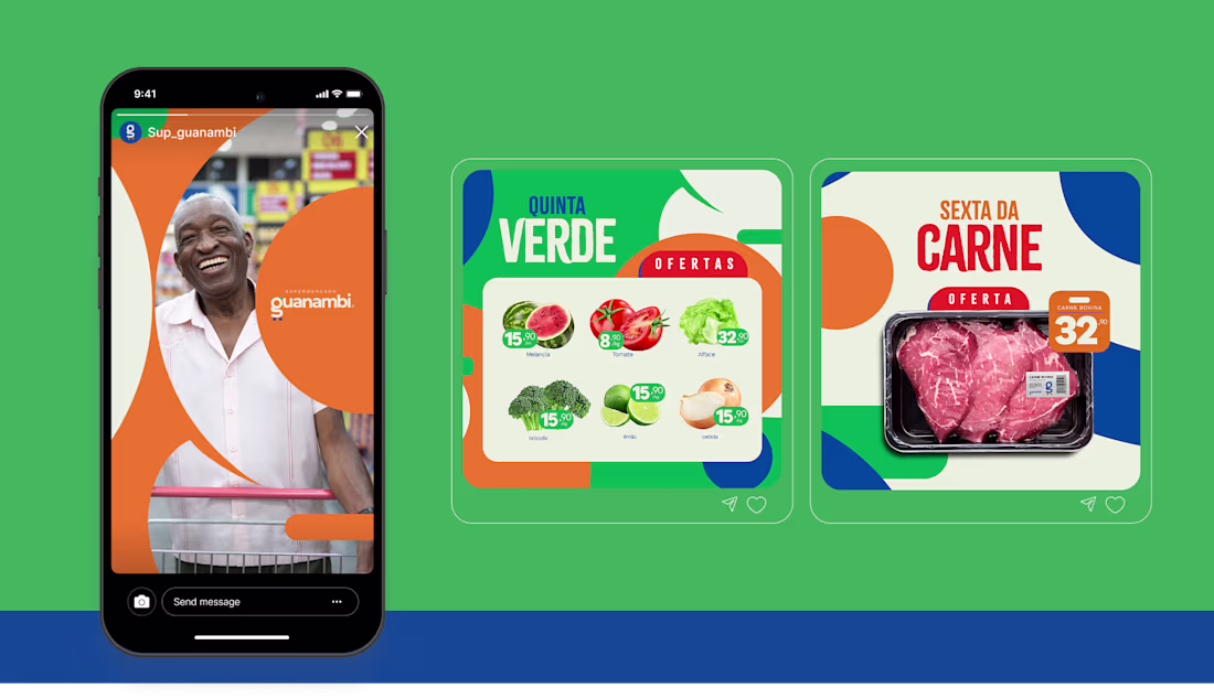
Because the symbol required a more solid, conservative foundation, the necessary energy and disruption were introduced through the new color palette. I retained the historical blue to honor the company's legacy but introduced an elegant off-white, paired with vibrant orange and a bright, energetic green for high contrast. The final outcome is a comprehensive visual identity, consistently rolled out across print materials, digital touchpoints, and a new storefront design, perfectly equipping the brand to stand out in its next phase of growth.
The network for creativity
Join 1.25M professional creatives like you
Connect with clients, get discovered, and run your business 100% commission-free
Creatives on Contra have earned over $150M and we are just getting started
Related posts
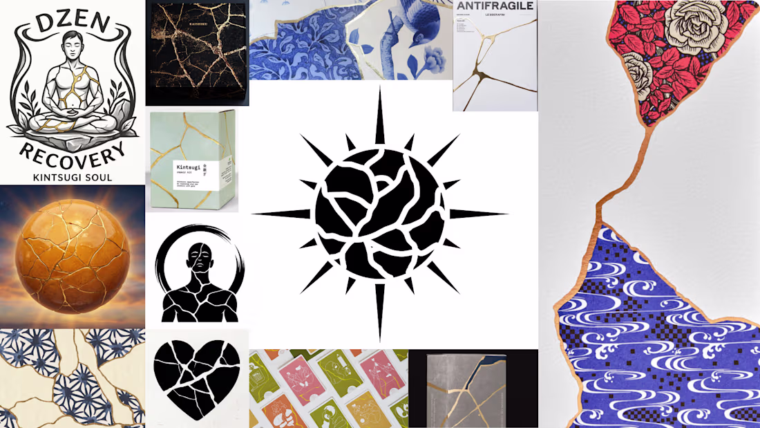
Do you know what kintsugi is?
Kintsugi is the Japanese art of repairing broken ceramics – but instead of hiding the cracks, you fill them with gold.
The damage becomes the most beautiful part. What was broken and put back together ends up more valuable than it ever was before.
Not "good as new." Better than new – with its story showing.
That idea is the core element of the new branding concept.
More soon. ✨
This idea resonates with me far beyond design.
The notion that scars, mistakes, and difficult experiences don't need to be hidden, but can become part of what makes something meaningful, is incredibly powerful.
Excited to see where you take this concept next ✨
Abstract Logo Visual Identity — Available for purchase
Thoughts on the design?
Really polished project. 🔥
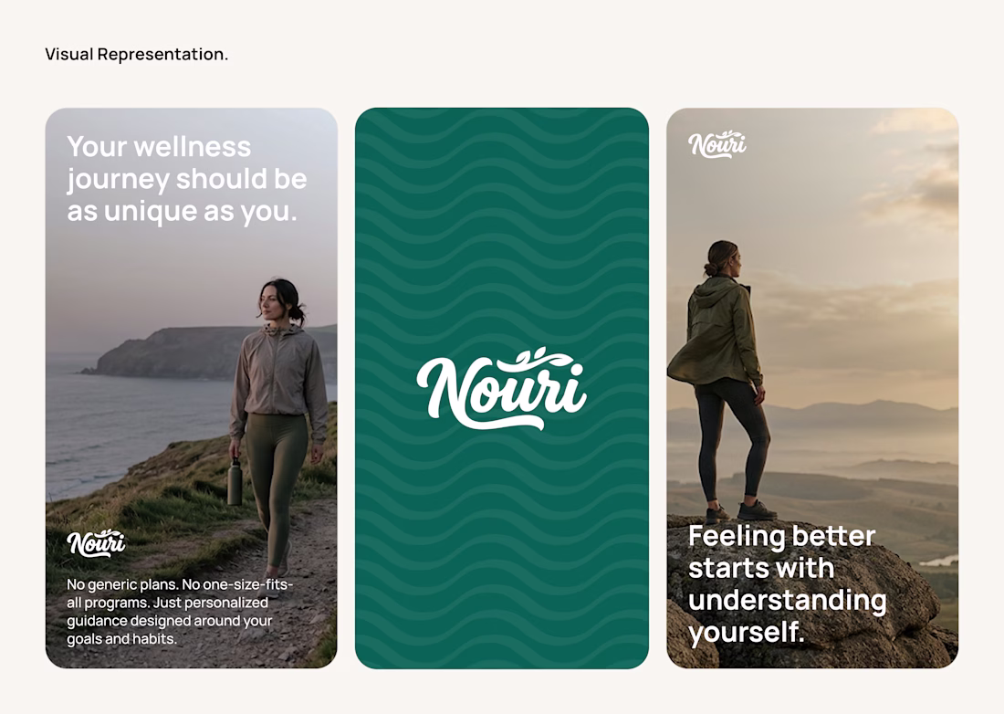
Brand Identity Exploration for a Wellness Product
A brand identity exploration created for a wellness-focused product, centered around building a visual system that feels calm, approachable, and memorable while supporting the product's positioning.
Love everything about this.
Trending
Claude
Claude has entered the design space. How are you using Claude Design?
Contra University
Learn from expert creatives how to earn more using next-gen AI tools.
MagicPath
The canvas is infinite, and exploration is becoming the workflow. How are you using MagicPath?
creativeaiflow
Creative AI workflows are evolving. What tools do you use, and what are their strengths and weaknesses?
freelancerlife
Freelancer life is wins, pivots, and everything in between. What’s yours right now?