
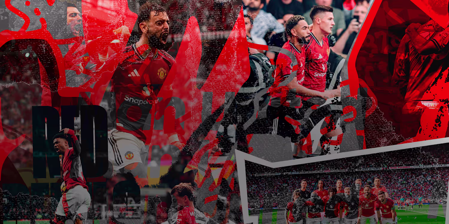
Verdugo Graph
Art Director shaping stories for brands & sports.
Ready for work
Verdugo is ready for their next project!
😊
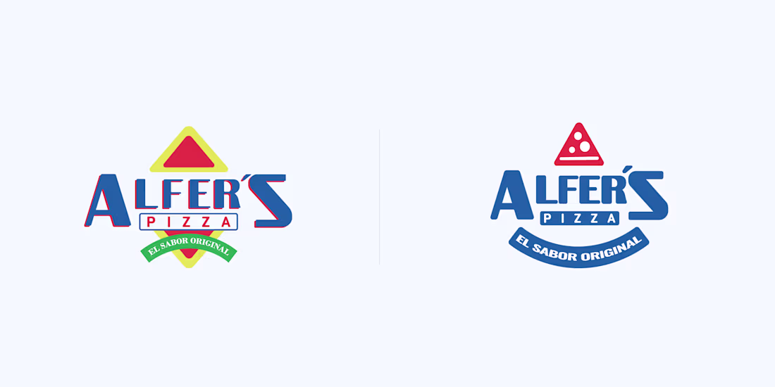
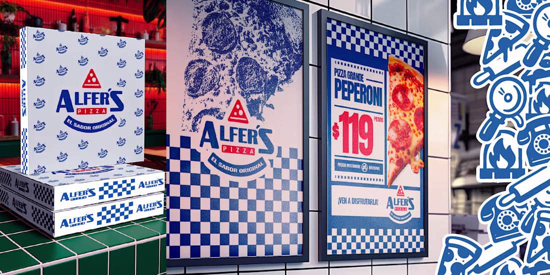
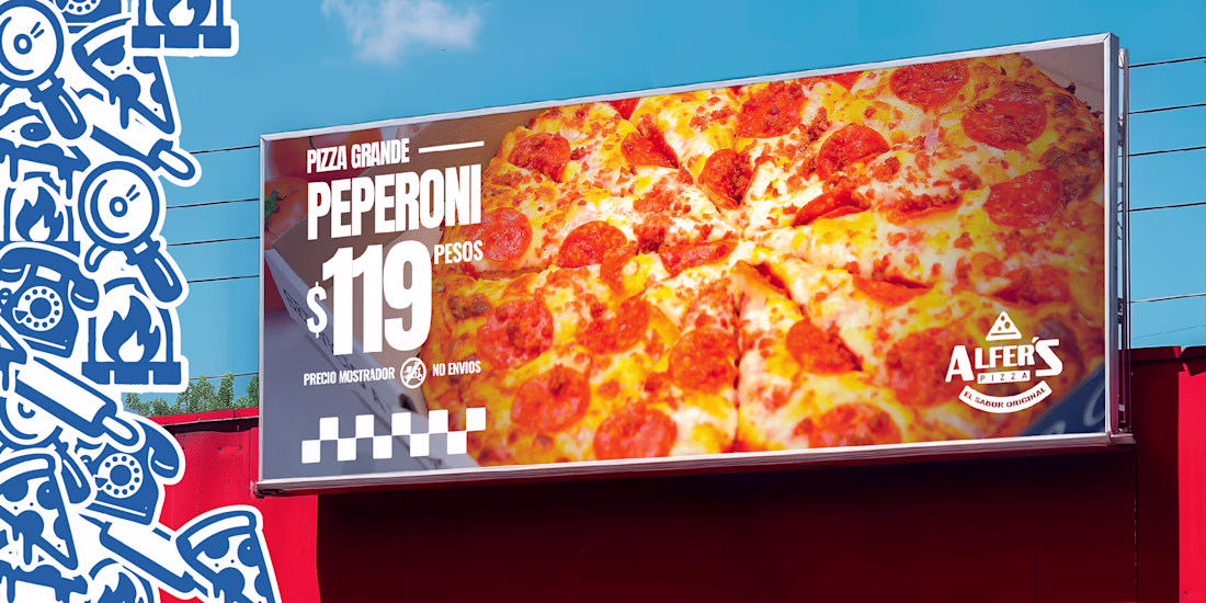
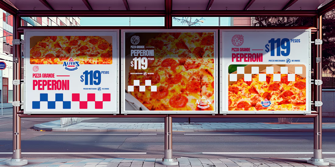
A rebrand doesn’t always mean changing everything.
Sometimes it’s about understanding what the founders wanted to express at the beginning, preserving that essence, and updating it so it continues to shine today.
Alfer’s Pizza was born with a clear idea: original flavor,...
💓
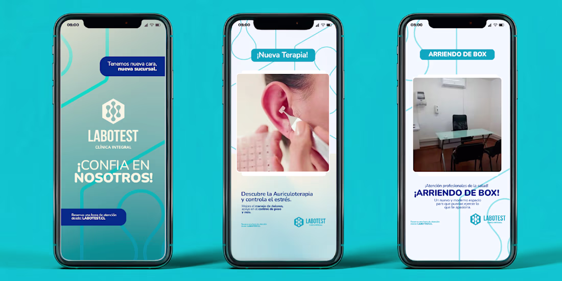
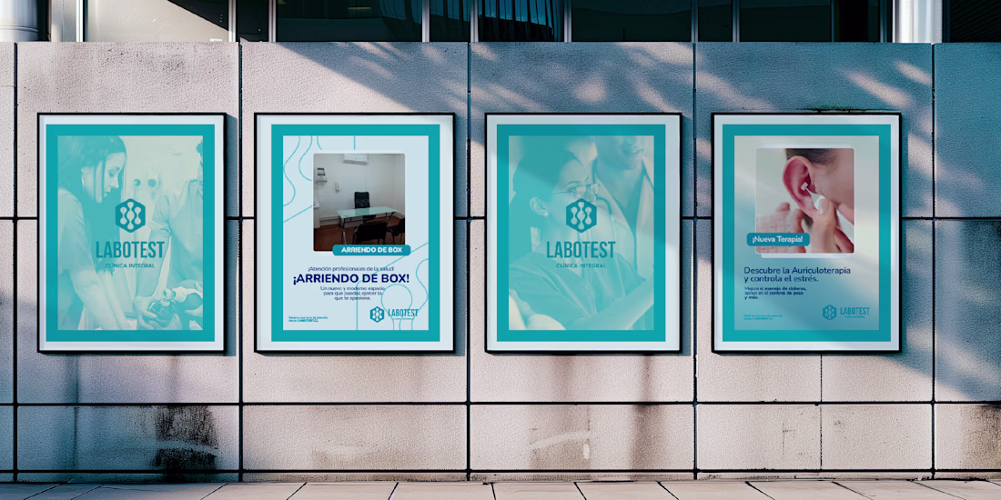
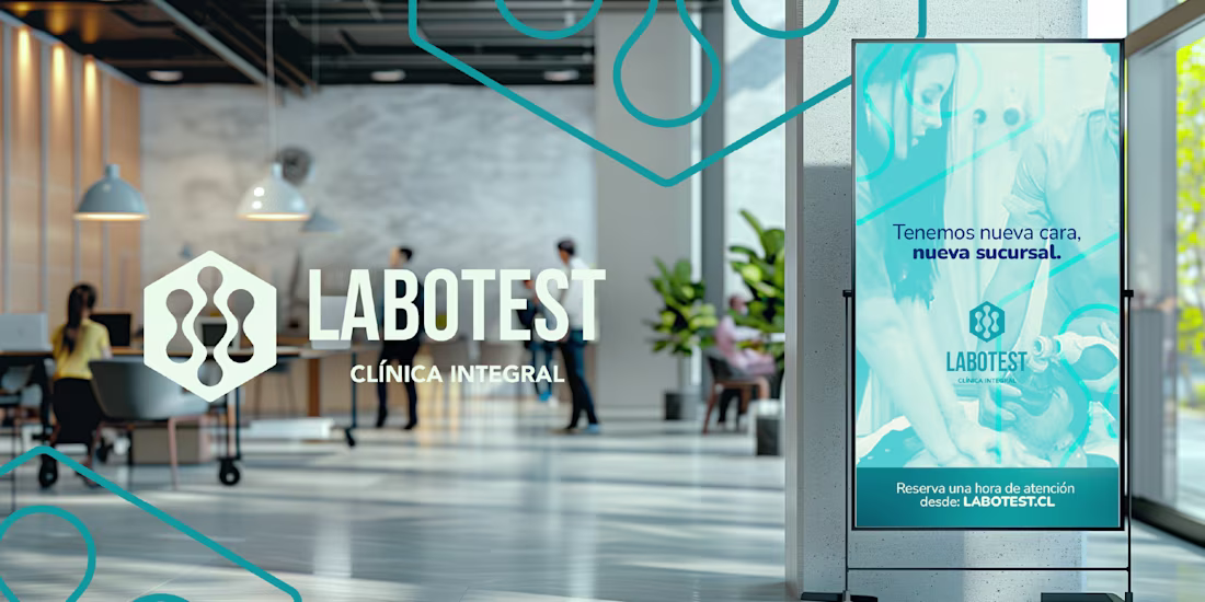
Labotest is a local Chilean healthcare company experiencing steady growth, now expanding across three regions of the country. The opening of its new branch presented the perfect opportunity to unify and modernize its visual identity.
This project is more than a rebrand — it’s a...
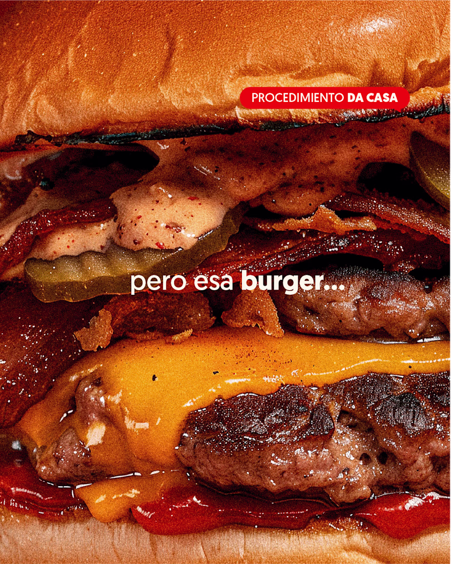
🍔 ñam ñam 🍔
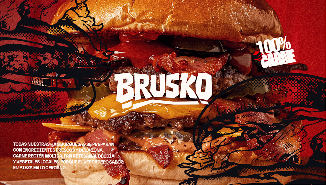
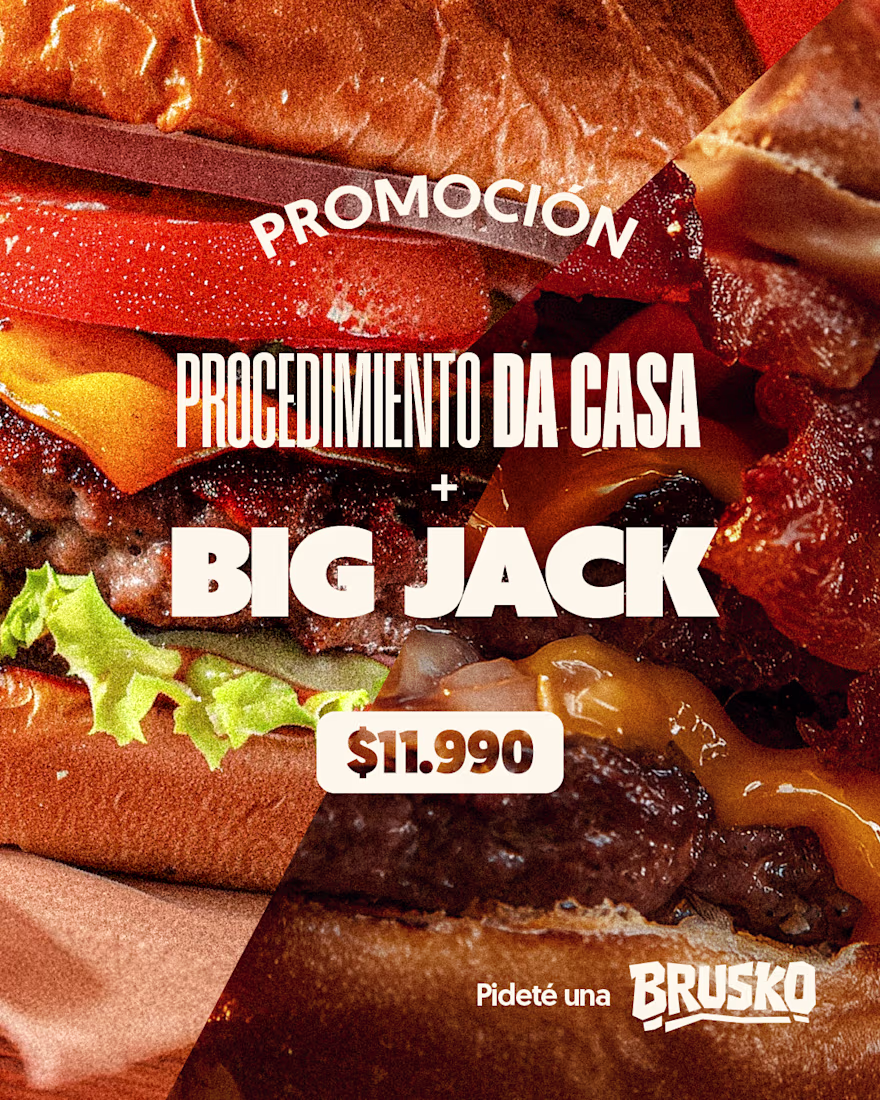
Brusko is a fast-growing local fast-food brand, rapidly expanding across the city. The launch of their new flagship location presented the perfect opportunity to create and solidify a bold, unique visual identity.
This project is more than just a logo — it's a complete brand...
Brusko is a fast-growing local fast-food brand, rapidly expanding across the city. The launch of their new flagship location presented the perfect opportunity to create and solidify a bold, unique visual identity.
This project is more than just a logo — it's a complete brand...
🧠
A rebrand doesn’t always mean changing everything.
Sometimes it’s about understanding what the founders wanted to express at the beginning, preserving that essence, and updating it so it continues to shine today.
Alfer’s Pizza was born with a clear idea: original flavor,...