Creative experiment.
Using AI as the illustration tool, then bringing everything to life with motion design, typography and sound.
MADE THIS TUTORIAL
DO CHECK IT ON INSTAGRAM (https://www.instagram.com/reel/DaNOm1zC4xI/?utm_source=ig_web_copy_link&igsh=MzRlODBiNWFlZA==)
2
50
What character intro would hook you more while watching a spy movie?
A) Retro & Clean
B) Spider-Verse & Messy
Same character.
Same scene.
Two different visual languages.
Which one would make you want to know more about the character?
3
5
221
Two different ways I like to explore ideas.
One starts with imagination and AI.
The other starts with a real photo, then grows through doodles, editing and storytelling.
Neither is "better."
They're just different creative tools for different ideas.
Which direction would you naturally gravitate towards?
A) AI-assisted concepts
B) Photo + Doodle storytelling
5
111
Created for me.
A collection of random thoughts, alternate timelines, GTA loading screens, underwater server cooling systems, spider-sense incidents, and a room that exists somewhere in another dimension.
Not every project needs a client.
Sometimes personal experiments become the place where taste develops, ideas connect, and creative risks feel worth taking.
Instagram: @bhagtani_varun
(https://www.instagram.com/p/DZ7evGDk8oJ/?utm_source=ig_web_copy_link&igsh=MzRlODBiNWFlZA==)Do check it out here as well and let me know on insta as well !
Where does your best work come from?
A) Design for Client...
B) Design For you..
This time - i felt it was "Design for you" - for me :)
GTA and underwater Selfie is my favorite...
5
4
263
Built a brand identity for Pixtap - a modern NFC-powered business card brand.
Traditional business cards are often forgotten minutes after they're exchanged.
Pixtap was designed to bridge physical networking and digital identity through a simple tap experience.
The visual identity is built around the idea of transfer, connection, and interaction, creating a system that feels technological without relying on common tech clichés.
Full project:
Check it out! Tell me your thoughts. (https://www.behance.net/gallery/251141019/Pixtap-NFC-Business-Card-Brand-Identity?platform=direct)
1
103
You're handed both cards at a networking event.
One leans on the brand name.
The other relies almost entirely on the symbol.
Which one are you more likely to keep?
A) Option A
B) Option B
Exploring directions for Pixtap, an NFC-powered business card brand.
2
2
262
Designing a brand identity for Pixtap. An NFC-powered digital business card.
The challenge wasn't making it look "technological".
It was creating a symbol that communicates transfer, connection, and interaction without relying on the usual "tech clichés" :- WiFi waves, arrows, circuits, or network graphics.
The final mark is built around a single extracted pixel, becoming part of the letterform itself and forming the foundation of the wider identity system.
From the logo to the packaging and card design, every element follows the same geometric language.
Still refining the system, but it's starting to feel like a brand.
What are your thoughts on this?
1
142
Recently started watching Suits and found myself paying attention to more than just the story.
The confidence, accountability, and clarity in Harvey Specter's character inspired this typographic poster exploration.
The goal wasn't to recreate a scene, but to capture a mindset through hierarchy, contrast, and composition so i chose "BRUTALISM".
A reminder that design inspiration often comes from unexpected places.
Curious to know - which movie or series has influenced your creative thinking recently?
2
166
When browsing a fashion collection, what do you prefer?
Option A - Sticky Card Layout
Option B - Traditional collection grid
Concept exploration for a modern full stack developer portfolio.
The direction focused on balancing a clean contemporary interface with subtle developer-inspired elements, instead of relying entirely on a terminal-style aesthetic.
The navigation system was designed to resemble an active VS Code file tab, while monospaced typography and structured layouts help reinforce the developer identity throughout the experience.
1
254
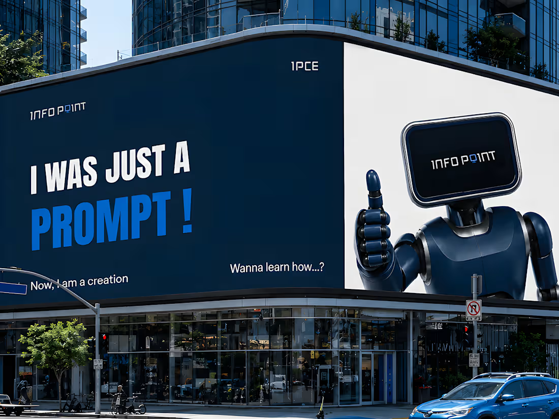
A visual developed for the IPCE Brand identity system.
Infobot(robot with screen) was designed to bring a more engaging and recognizable personality to digital education branding.
Infobot can be used for Advertisements, Posters, Campaigns or even for animation as brand mascot for brand recognition.