The network for creativity
Join 1.25M professional creatives like you
Connect with clients, get discovered, and run your business 100% commission-free
Creatives on Contra have earned over $150M and we are just getting started
Back to feedPost
Taste Test
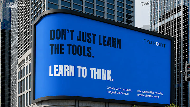
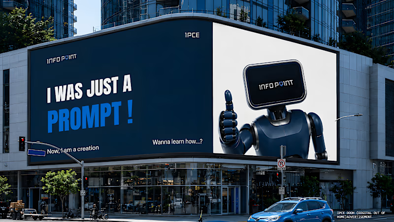
Which advertisement style caught your attention first, without character or with character(Robot)?
you can give your review on : https://www.behance.net/gallery/254502477/INFO-POINT-Rebranding-a-Legacy


1 voted
50%
1 voted
50%
2 votes
Closed

The character-led board grabs attention quickly, but the cleaner “learn to think” version has stronger message clarity at a glance. I’d choose based on whether the goal is recognition or comprehension.

Makes sense. Thanks for the feedback 🙌

without character..
The network for creativity
Join 1.25M professional creatives like you
Connect with clients, get discovered, and run your business 100% commission-free
Creatives on Contra have earned over $150M and we are just getting started



Related posts




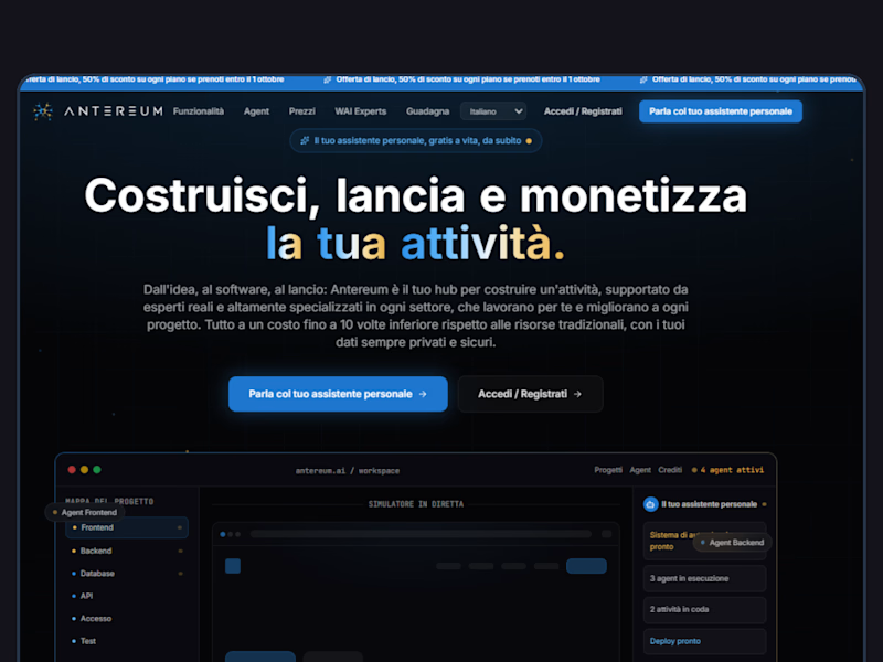
Webiste redesign for Saas company


2 voted
4%
44 voted
96%
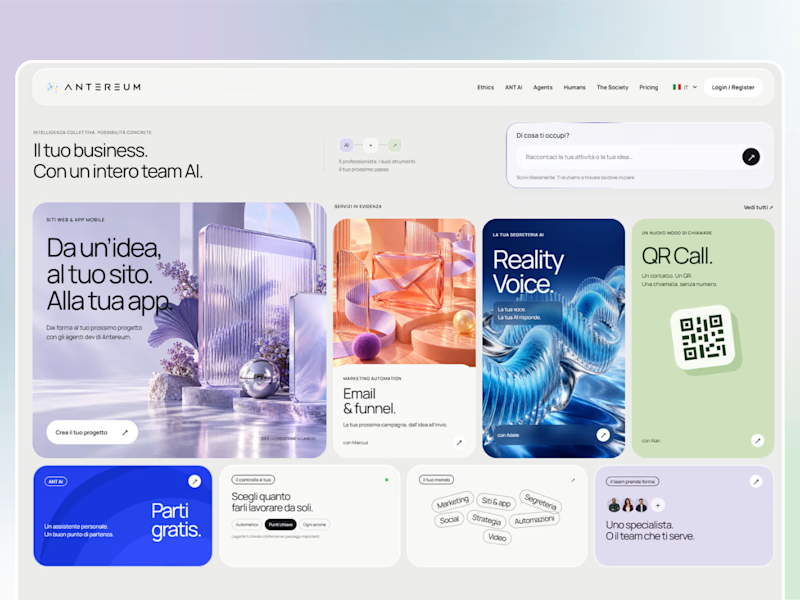
46 votes
Closed


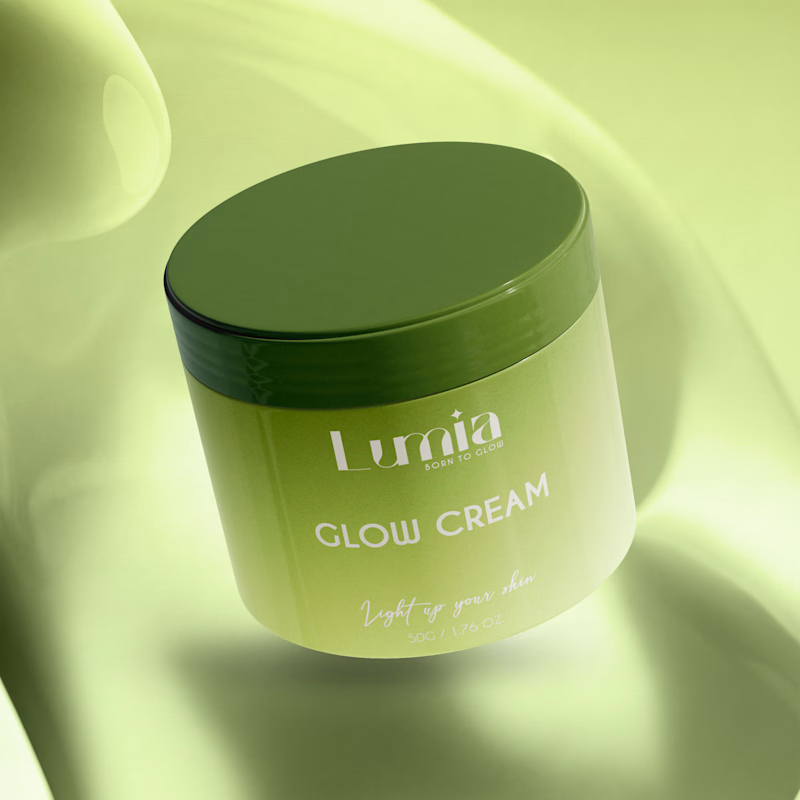
Which packaging color catches your eye first?

6 voted
46%
7 voted
54%
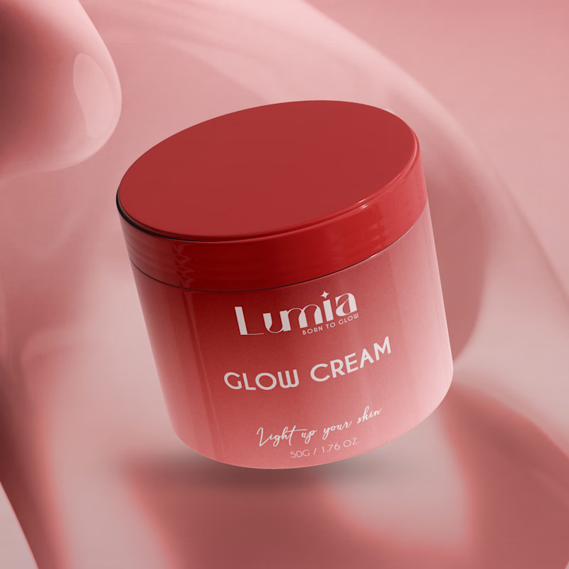
13 votes
Closed

The green version catches my eye first: the dark olive lid gives the lighter jar a clear focal point. I would also test the small white label text at thumbnail size, since the soft lighting reduces its contrast in both versions.