played with demostack a bit more, and bro the product needed to feel simple even when there are a lot of moving parts, workspaces, demos, videos, resources, all that, so we kept the screen calm and easy to move through
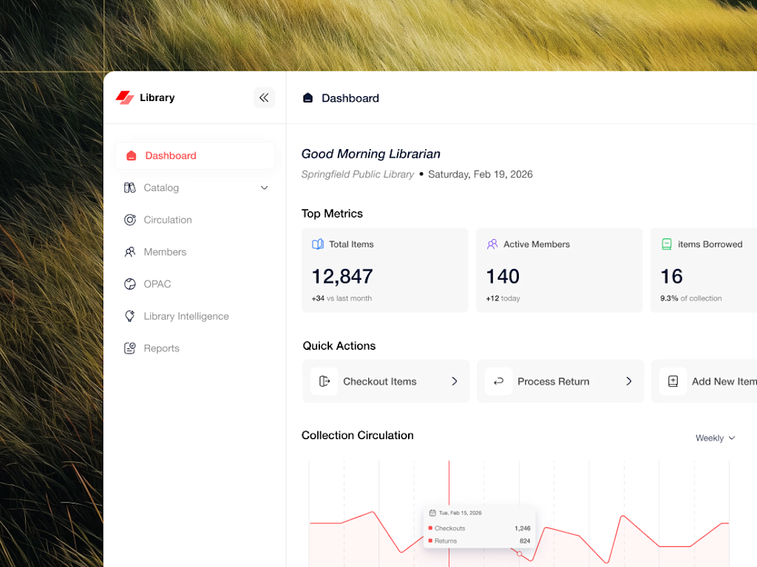
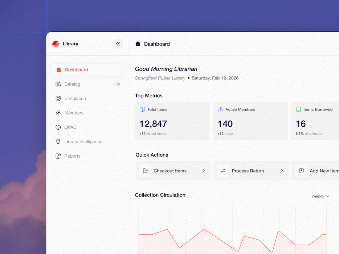
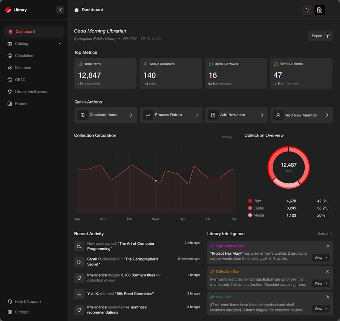
keep thinking about this library dashboard haha. the rule the whole time was simple, if it doesnt help the librarian move faster it doesnt go on the screen. tools get bloated cause everything feels important. the actual useful move is cutting not adding
bro the underrated part of demostack for me is the left nav. supademos, showcases, videos, demo hub, admin stuff, its all there but tucked to the side so it never shouts at you. power stays, noise doesnt. thats the whole trick with feature heavy products
the library intelligence panel is still my favorite bit lol. most dashboards throw a wall of charts at you and call it insights. this one just says what needs attention, demand alerts, collection gaps, auto-sort. thats it. you dont read it, you glance at it and move
was messing with demostack again and the thing i kept coming back to, a demo tool can do a LOT, workspaces demos showcases videos all of it, but the home screen still needs to feel calm or people just freeze lol. so we made the top just 3 moves, create a demo, run a tutorial,...