
Valeriia Hamzatova
Actionable UX Audits for startups and scaling businesses



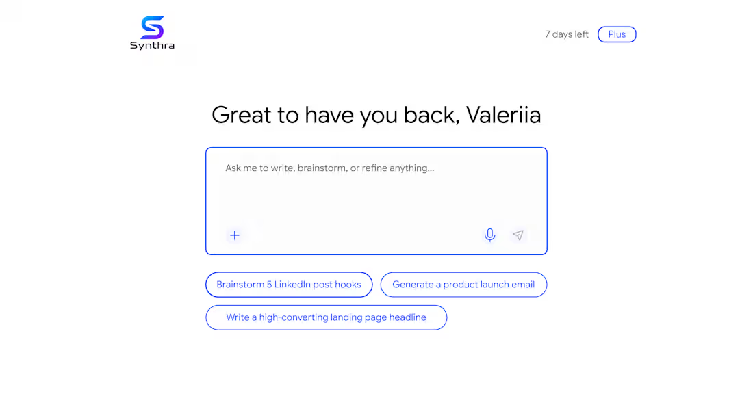
In a recent review of AI product, I noticed next: to help users getting over a blank state - there are pre-made prompts.
Unfortunately 🥲 they acted as a pure ‘conversation starters’ - in the end, user still needs to start typing 👩🏻💻 in order to accomplish a task. Such pattern just postpones the moment user gets an actual value 💫
To fix this, pre-made prompts are better to work as templates 🙌🏻 It would reduce friction and improve the overall user experience 😉
1
175
UX Redesign Suggestion — Swimming Lesson Registration Form
Zwembad & Sportcentrum Wethouder Duran, Diemen
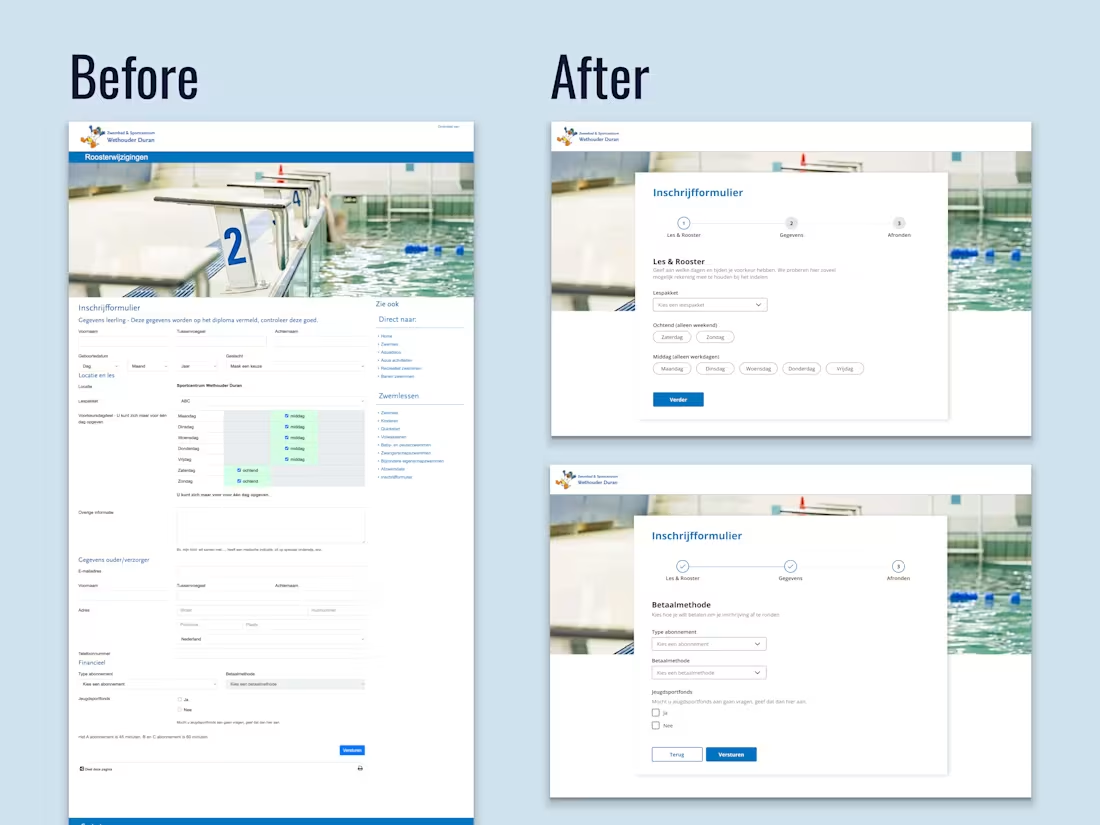
A municipal swimming centre's registration form was technically functional but created unnecessary friction for parents signing up their children a task that should take minutes but felt overwhelming.
Core problems identified ⬇️
1. Single long-scroll form with no sense of progress or completion time
2. All time slots pre-selected by default, forcing parents to manually deselect irrelevant options
3. Poor scannability: inline labels, inconsistent field widths, and section headers in colour rather than hierarchy made it hard to read at a glance and easy to miss fields entirely
Redesign approach:
Restructured into 3 logical steps: lesson preference first, personal details second, payment last. This order follows the parent's natural decision flow: does this work for us → here's who we are → here's how we pay.
The day selection was rebuilt from a confusing pre-checked grid into clear pill buttons grouped by ochtend/middag to reduce cognitive load and eliminating the default-selection error pattern.
No new content was needed, only reframing what was already there.
Speculative redesign based on a publicly accessible form, created to demonstrate UX audit and form design methodology
0
181
UX Review & Redesign Suggestion for a Career Coach 💼
☝🏻Photos replaced and some details blurred with the client's permission
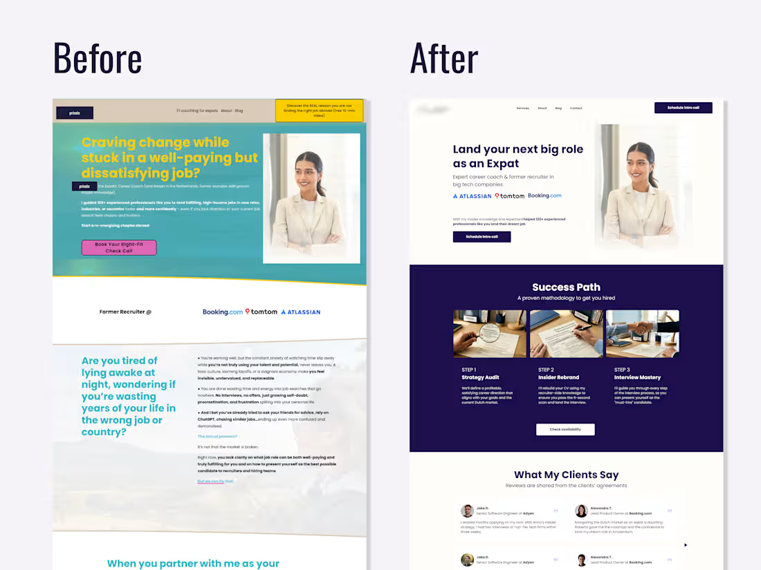
In this redesign I focused on two main issues: credibility and clarity.
Trust signals existed but were invisible. Logos from recognizable companies (Atlassian, TomTom, Booking.com (http://Booking.com)) and client testimonials were buried below the fold thus invisible to most visitors. Moving them above the fold immediately signals legitimacy before a potential client decides whether to keep reading.
The target audience wasn't clear enough. The original headline spoke to a broad, emotionally frustrated audience without specifying who exactly the coach helps. The redesign suggestion narrowed the positioning so a potential client knows within the first scan: "this is for me."
Nothing new was added, I just reframed what was already there 👩🏻💻
0
199
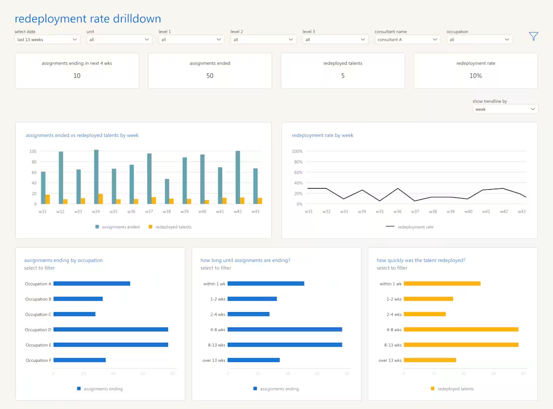
Created a global dashboard aligning 39 operating companies under one standardized performance view, enabling real-time insights and supporting the transition from local to centralized tools.
0
232