Valentino Mateski
Brand Designer | Brand Strategy & Visual Identity | Branding
Ready for work
Valentino is ready for their next project!
There’s a point where design stops trying.
And just fits.
Palette, typography, layout, everything holds the same tension. Just a brand that knows exactly what it is.
What if strength looked a bit quieter?
When working on Restore, the goal wasn’t to make it feel like “wellness.”
It was to make it feel like something people in high-pressure roles would actually trust.
So the system leans on restraint. A grounded serif to carry weight, paired...
Can typography carry a whole package?
That was the starting point. Instead of building around graphics or effects, I let the type define the structure, how it sits, how it scales, how it holds everything together.
Once that was in place, the rest became a matter of restraint....
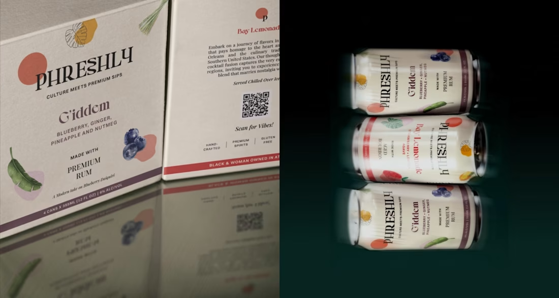
What should a cocktail brand feel like before you even open the can?
When I started working on the identity for SeventhWave, that question shaped everything.
This isn’t a drink designed for a bar counter. It’s designed for the in-between moments: warm air, late afternoons, and...
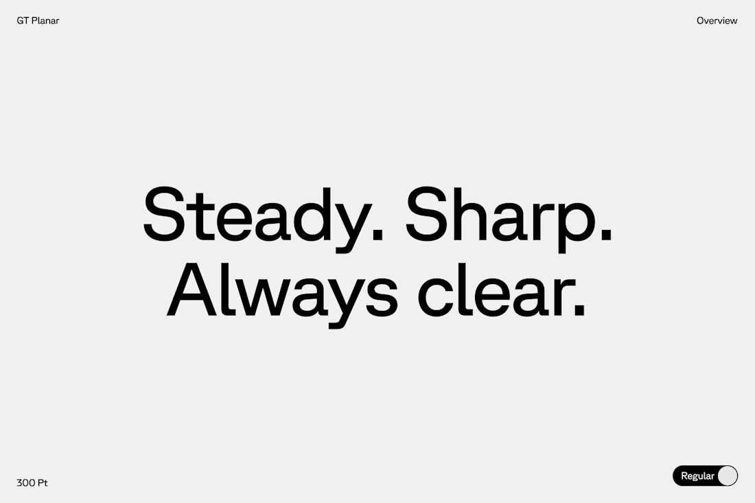
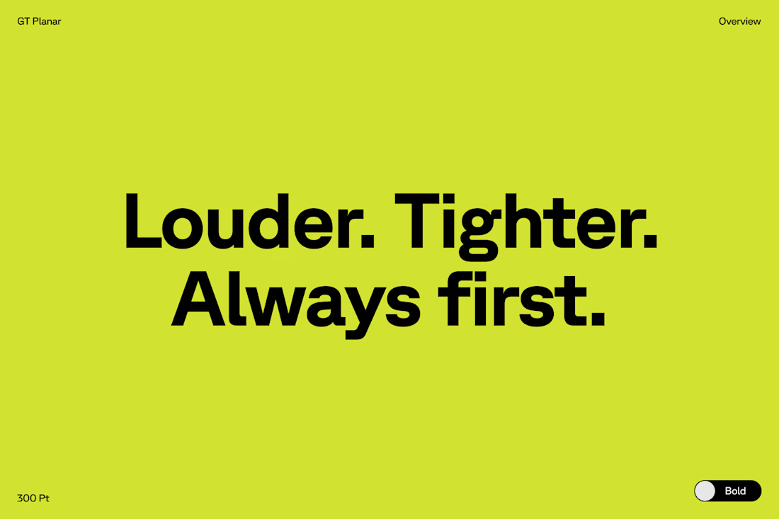
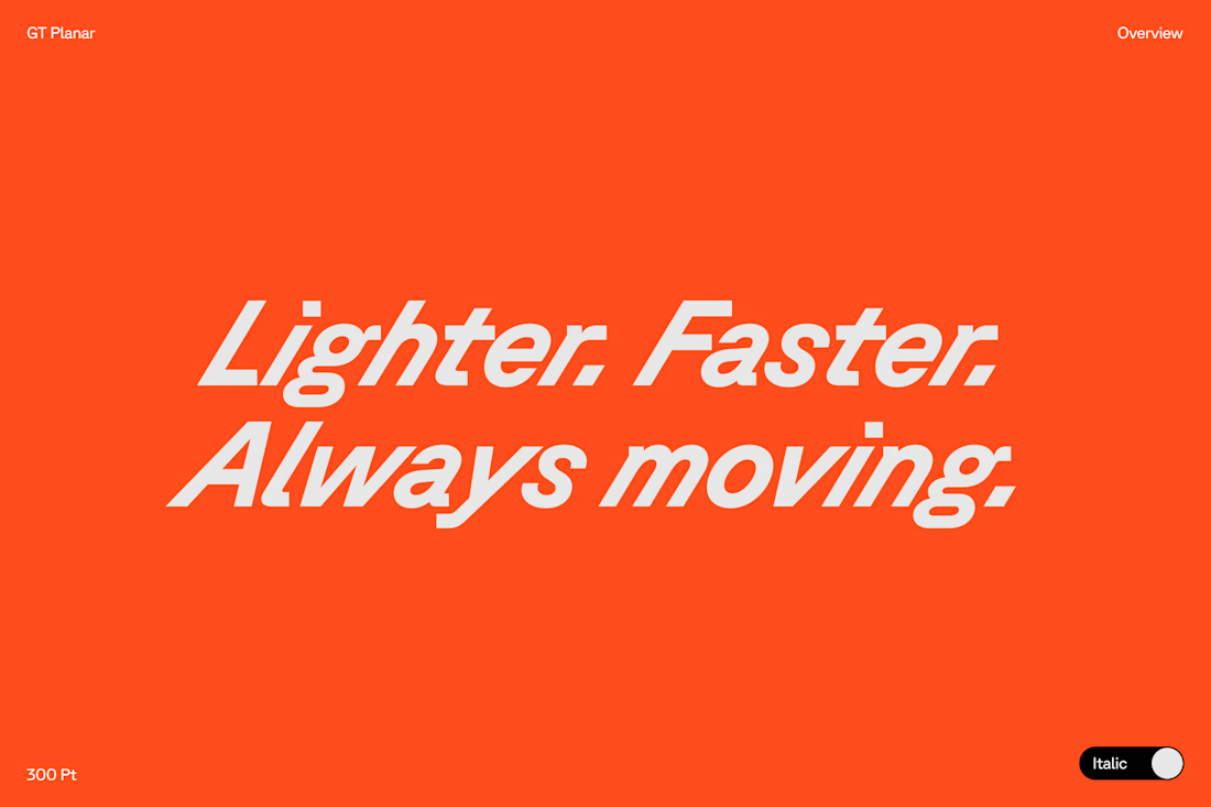
Typography exploration for a client. ⬇️
As a brand designer, typography is one of the first places I test a brand’s personality. I ask myself: how should this brand sound if it could only speak through type?
I play with weight, spacing, and rhythm. Small shifts change...