

Bestie Vet is a conceptual project created to explore a real gap in the veterinary industry. This is not a real brand.
— The problem
Every vet clinic looks the same: green cross, white background, generic typography. They speak to a customer who only shows up when something’s wrong. But the 25-35 year old urban pet owner treats their dog or cat like family — monthly checkups, premium food, Instagram accounts. No clinic today speaks their language.
— The challenge
Build the first vet brand that feels as bold and culturally relevant as the other brands this audience consumes — without losing the trust and seriousness a medical context demands.
— The process
Positioning first. The insight: this generation doesn’t see themselves as pet owners. They’re pet parents. That single shift changed every decision — name, color, tone, content strategy.
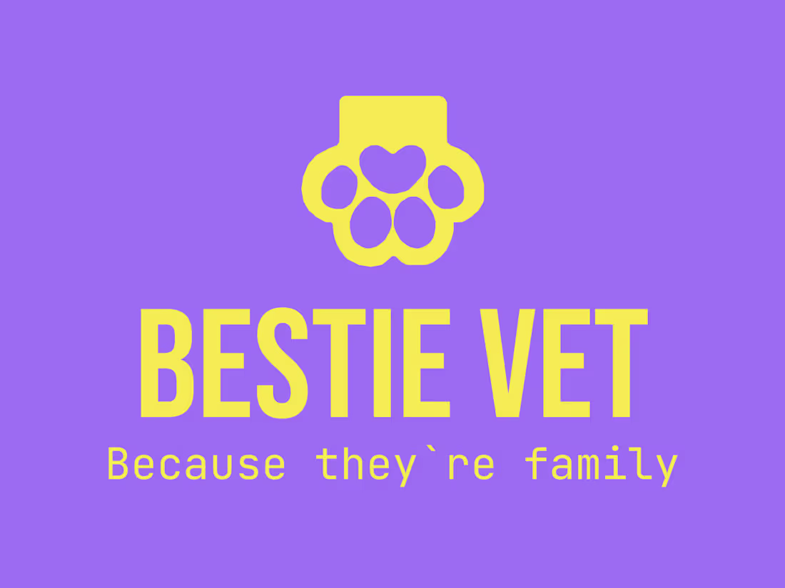
The visual identity was built around energy and contrast: a multi-neon palette — green, pink, yellow, orange, violet — on shifting backgrounds, so no two applications feel the same but all feel unmistakably Bestie. The symbol is a paw print, the most universal mark of pet culture, reframed through bold color and clean geometry. No cross, no clinical references. Just personality.
— The proposal
Multi-neon logomark with a flexible background system. Content strategy built around education and humor: pet CPR, annual vaccines, cat tail behavior, salmon treats with Omega-3. A brand that teaches, entertains and converts — all in the same feed.
— The result
A veterinary identity that a 28-year-old would actually follow on Instagram. Because the best vet is the one your pet’s owner trusts before they even walk in.
2
173
Raíz Studio is a conceptual project created to explore a real problem in the wellness industry. This is not a real brand.
📍 The problem
Yoga studios tend to fall into one of two traps: too spiritual or too fitness-oriented. Neither connects with the urban woman in her 30s who's looking for a genuine space to pause in her week.
🔥 The challenge
A brand that feels warm without being naive. Sophisticated without being cold. One that builds trust before anyone walks through the door.
🧠 The process
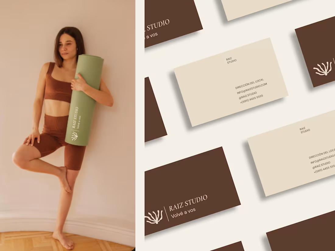
Positioning first, symbol second. The result is an inverted root with a seed at its base. The root growing upward instead of downward represents the inner growth yoga proposes — not an external goal, but a movement inward. The seed is the human figure: the origin of the entire system.
🚀The proposal
Organic variable-stroke logomark, Cormorant Garamond, an earthy beige palette. System built on an 8-point grid. A tone of voice with no exclamation marks and no performance language.
🙌The result
An identity the brand can use on its own, without relying on the designer for every piece.
2
180
Context
This brand emerged from the need of an Argentine company to take its business beyond borders. With a tight timeline, the challenge was clear: move fast without compromising clarity, professionalism, or the brand’s established credibility.
Opportunity
In a crowded and traditional market, the opportunity was to stand out while staying true to the brand’s roots. The goal was to project experience and trust, while introducing a subtle layer of innovation and playfulness—classic at its core, but unmistakably modern in attitude.
Solution
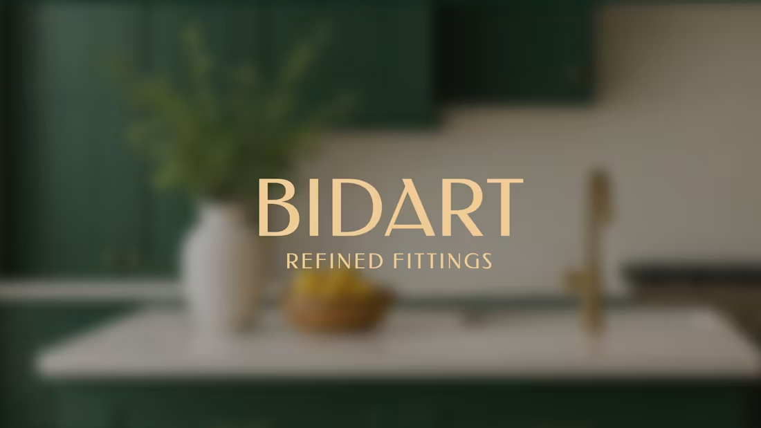
Through a focused competitive analysis and a deep understanding of the brand’s needs, we crafted a distinctive logo, selected a refined typographic system, and built a visual language that feels confident, clear, and contemporary—positioning the brand to compete and grow internationally.🙌
6
220
✨ Context
Grossa was created as part of an NGO initiative to help women who had experienced homelessness build a sustainable future through learning a craft: making fresh pasta.
Behind each product are skilled cooks who bring passion, resilience, and dedication to their work.
⚠️ The Challenge
The NGO needed a brand that could communicate its social impact without positioning the product as “charity-driven,” while reinforcing premium quality and taste.
🚀 The Solution
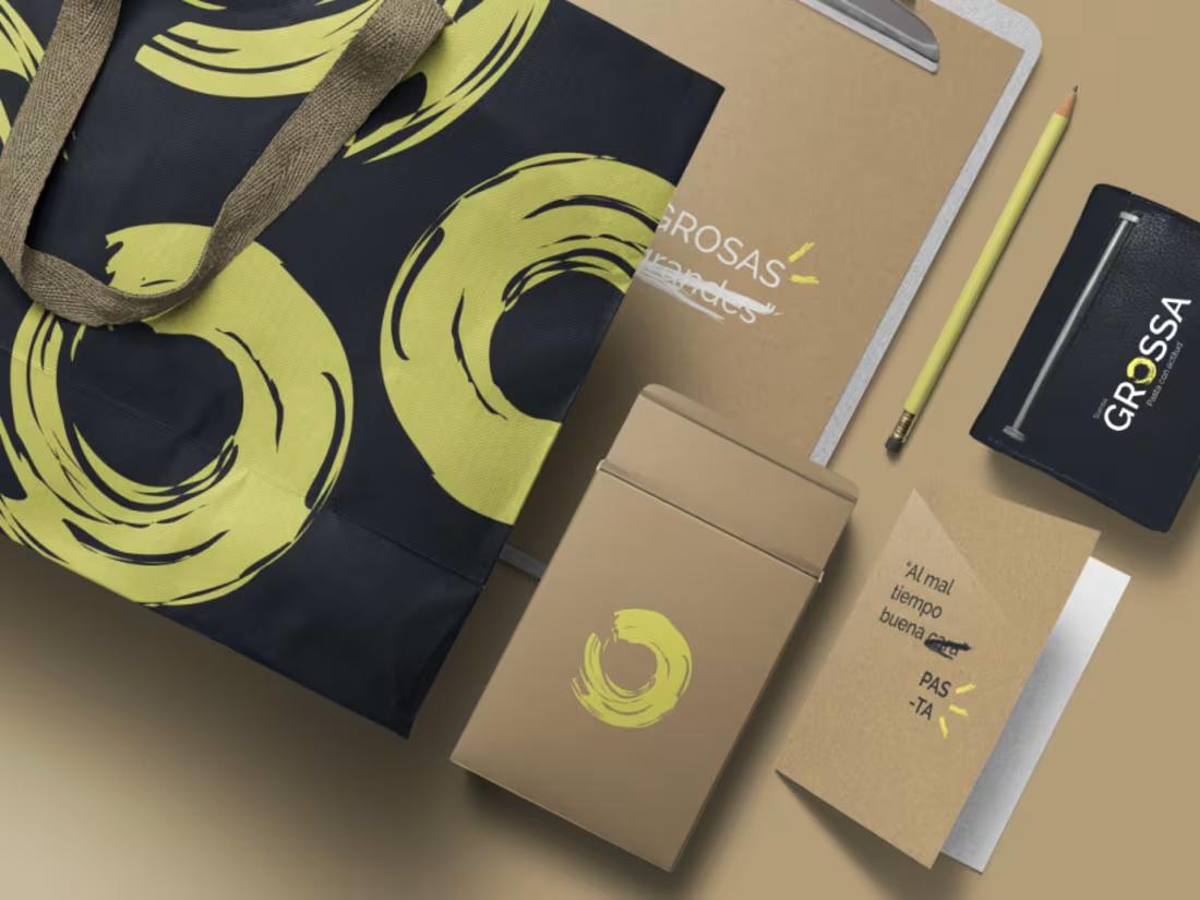
We developed a distinctive name and a cohesive brand system, aligning language, tone, and visual identity.
We crafted a narrative that balanced purpose and excellence, and delivered a comprehensive brand book with clear guidelines to ensure consistent brand decisions.
1
3
248